Creative agency CapeRock has developed the visual identity of Veronica to unify its multiple channels. In a highly competitive media landscape, a strong brand positioning is more important than ever.
 In the case of Veronica, different brand channels were communicating with their own look and target group: Veronica TV, Radio Veronica and Veronica Magazine. CapeRock developed one strong media brand that unifies Veronica TV and Radio Veronica as one brand, using one name: Veronica.
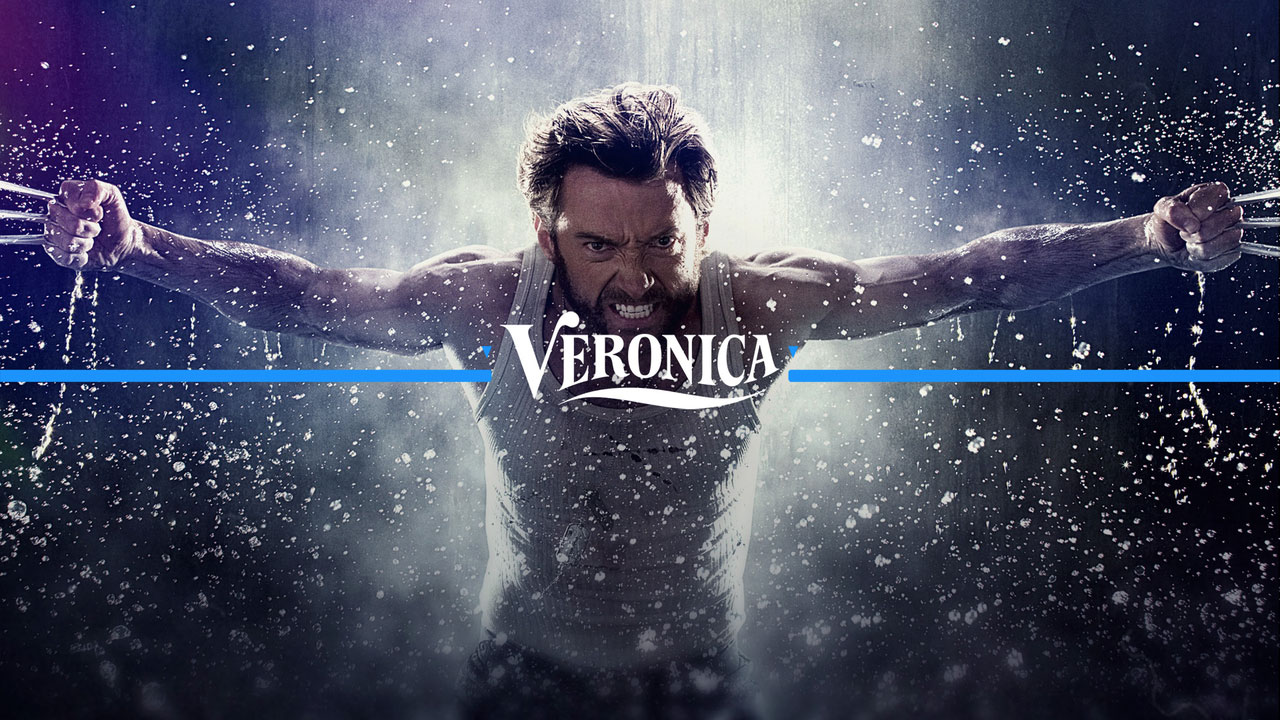
Veronica TV and Radio Veronica have been visually reunited by tracing back to the origins of Veronica: the pirate radio station at sea where it all began. This shared history still resonates in the brand that is adventurous, bold and rebellious.
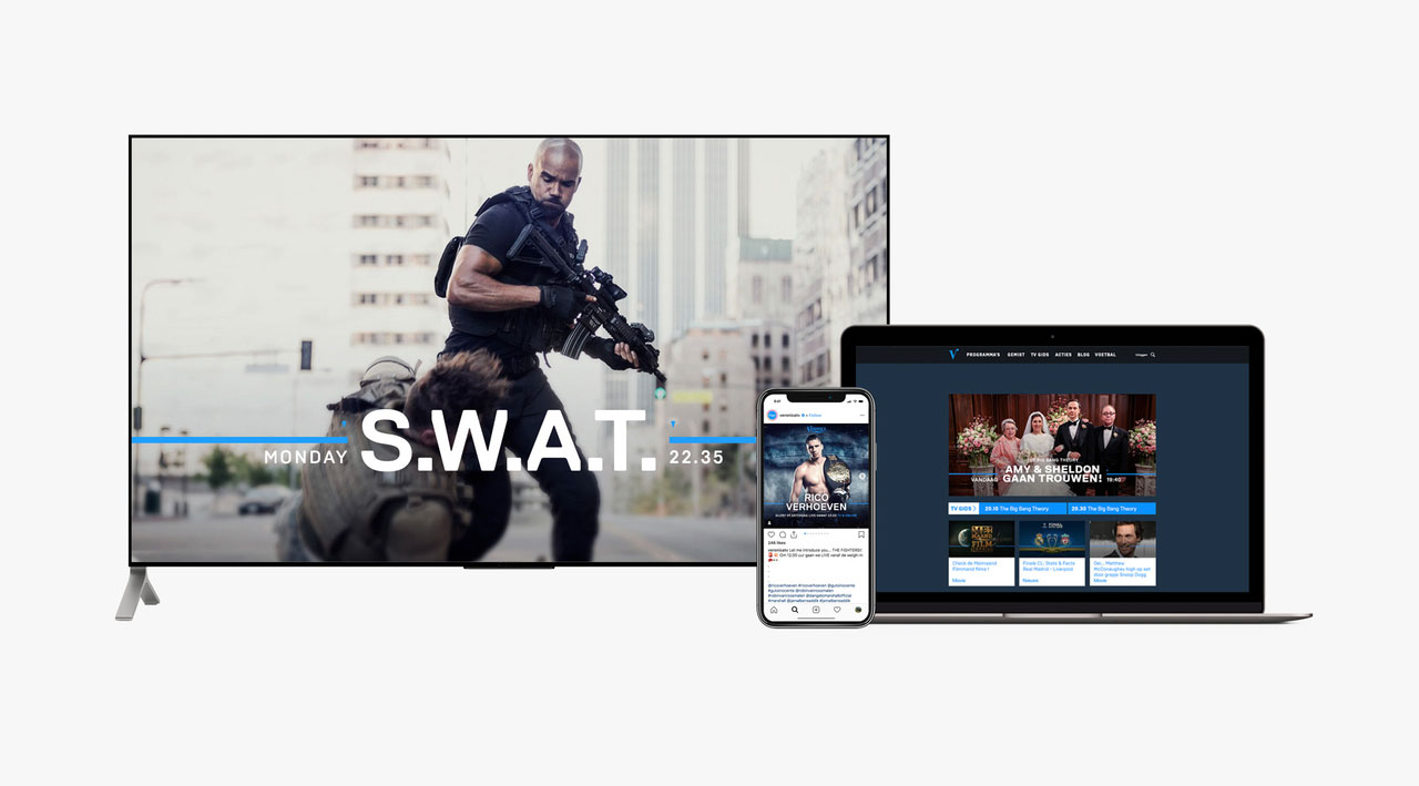 The biggest challenge was to develop an identity system that is distinctive and unique, yet flexible enough to be used consistently over various platforms. In order to do so, CapeRock developed recognisable elements inspired by the nautical heritage that are easy to apply on TV, digital and print.
The horizon line and compass needles navigate the viewer or visitor through the content. Also, the font is derived from the typeface that can be found on the first ships with Veronica written on it.
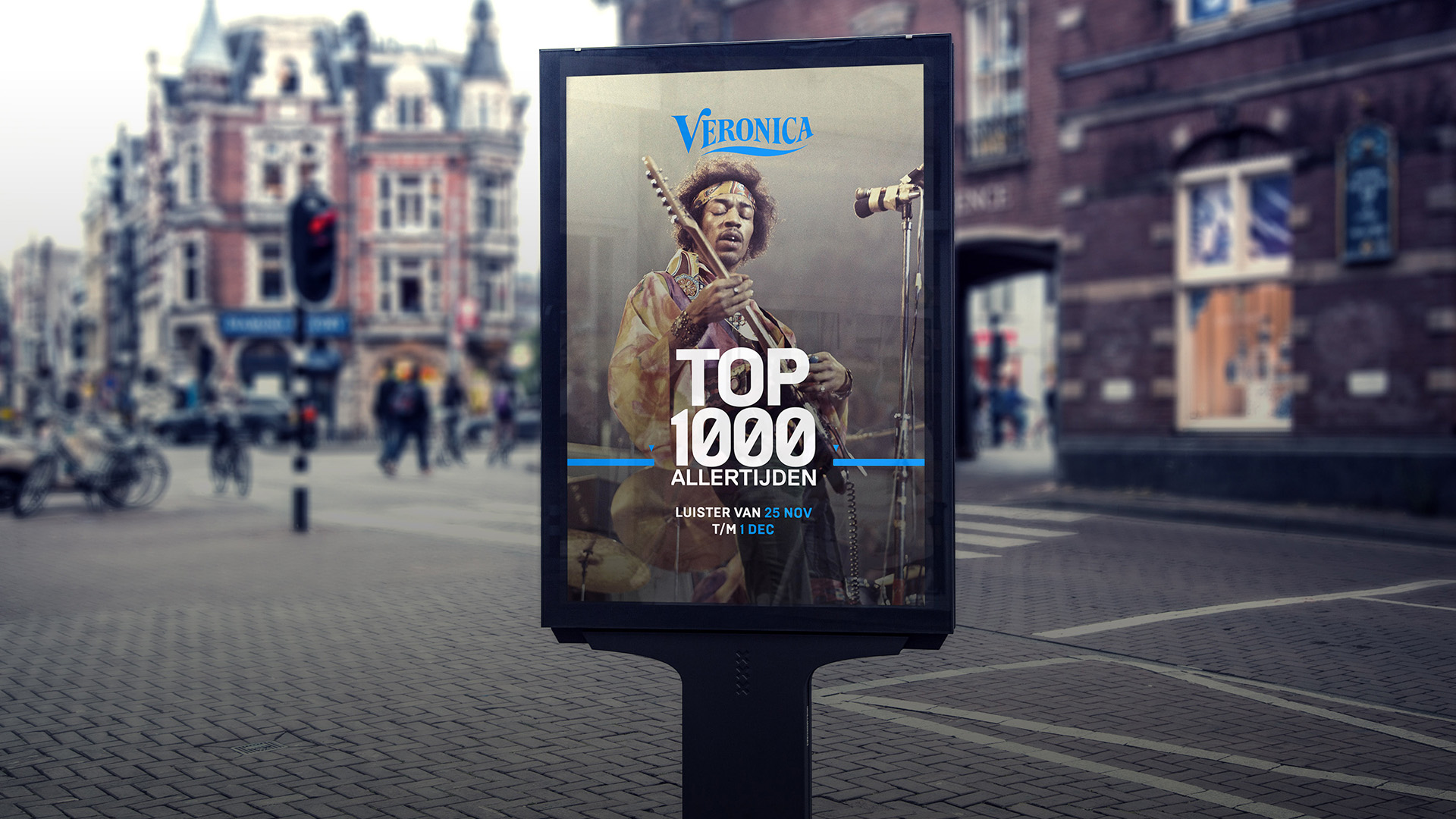 With blockbuster content as a starting point, CapeRock developed a design that is bold, contemporary and flexible. The passion for blockbuster content is the blue thread for Veronica.
“The simplicity of the design allows for easy application on all kinds of different programs and themes. This is important now that Veronica is putting a lot of effort into new sports programming and also into specific themes, such as the Halloween special ‘Fearonica’ or the well-known Veronica ‘Mei Film Maand’,” says Marco-Paul de Jeu, Parnter & Strategy Director at CapeRock.
Source: CapeRock
CapeRock creates one strong media brand for Veronica added by newsroom on
View all posts by newsroom →
You must be logged in to post a comment Login