![]() Consultancy Earth has created the new look for the Commonwealth – an intergovernmental voluntary organisation of 54 member states.
Consultancy Earth has created the new look for the Commonwealth – an intergovernmental voluntary organisation of 54 member states.
The states, which were mostly territories of the former British Empire, have no legal obligation to one another, but are united by shared values of ‘democracy, human rights and the rule of law’, according to the Commonwealth charter.
Earth has worked with the Commonwealth for the last three years on a number of projects, including designing the Women as Agents of Change campaign.
It began work on the new visual identity around eight months ago, aiming to create a more consistent look for the organisation.
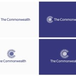
The new illustrative identity is based on the tilting axis of the earth.
Martin Johnston, Earth managing director, says, ‘We wanted to release the idea that they are a modern, dynamic and a vibrant organisation. The Commonwealth was formed to encourage democracy and human rights, but that wasn’t being represented in the [previous] identity’.
He adds ‘We needed to consolidate the brand and work to represent what the Commonwealth is in the modern day’.
A new shade of blue with ‘a hint of magenta’ was chosen for the colour palette to represent xenon – the 54th element in the periodic table, as a nod to the 54 Commonwealth member states.
Other colours were chosen for the new colour palette to represent the different regions comprised by the Commonwealth, such as fuchsia pink to symbolise the Caribbean, the native territory of the plant where the colour originated, according to Johnston.
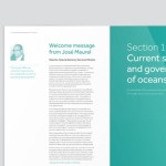
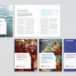
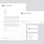
The new branding will roll out across all the Commonwealth’s touch points, including event and speech collateral, stationery, the website and annual reports.
Earth creates new identity for the Commonwealth added by newsroom on
View all posts by newsroom →
You must be logged in to post a comment Login