 Pearlfisher London creates new brand identity and packaging for Little Moons – artisan producers of premium gelato mochi ice-cream.
As the UK’s foodie culture grows, consumers are increasingly looking to exotic flavours for newness, excitement and intrigue.
With the history of a family baking business specialising in mochi-making – a traditional Japanese rice dough ball – entrepreneurial brother and sister, Vivien and Howard Wong, are challenging the UK frozen treat market with new brand Little Moons: hand-made and bite-sized balls of premium gelato ice-cream wrapped in mochi.
 Having gained shelf space in Whole Foods and Selfridges and being served at high-end eateries such as Nobu and Sushi Samba, Little Moons set a vision to expand into the wider European market.
To do so, a new identity and packaging design were needed to unify the two ranges – frozen and chilled Tsuki Mochi – moving on the previous charming and simplistic design with a more striking and sophisticated expression inspired by the unique story and consumer experience.
 Chief Strategy Officer at Pearlfisher, Yael Alaton, said, “Mochi is challenging the sweet taste landscape in the UK in much the same way as sushi did when it first arrived on British shores. We needed to clearly educate consumers on what mochi is – using design to bring to life the delicious range of ingredients and flavours. Little Moons creates an experience that surprises and delights through its striking contrasts and combinations. Our strategic vision focused on partnership – from the energy and imagination of its creators, to the marrying of tradition and innovation – which resulted in a design vision that looked to capture ‘unexpected harmony.”
 Harriet Ferguson, Senior Designer at Pearlfisher, explained “We wanted to retain the existing accessible and honest charm of Little Moons whilst elevating the brand into a more distinctive and ownable space. By conveying a world of flavour, texture and colour, we sought to capture the product’s taste credentials and exciting proposition as a new way to experience a delicious bite-size treat.”
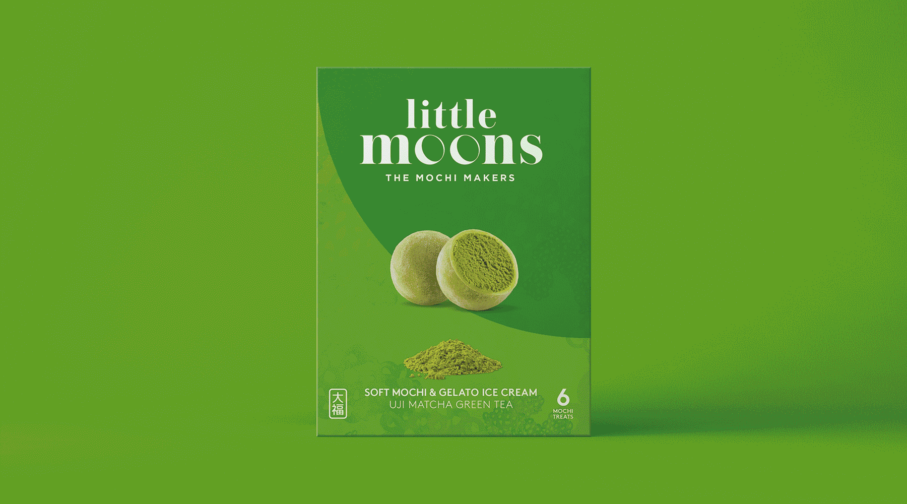
The identity is simple and iconic and places the product at the heart of the brand: complementing a classic typeface, the ‘o’ of Moons replicates the shape of the mochi themselves. ‘The Mochi Makers’ sign-off establishes the brand, with a stamp of credibility, and gives the brand an artisanal feel.
A hand-drawn crescent moon pattern is central to the look of the new Little Moons brand world and is suggestive of both the product experience and the delicate, hand-crafted nature of the products.
 The beautifully scripted strapline – ‘Enjoy the little things’ – communicates authenticity, and the bold, bright shots of colour evoke the intense hits of flavour brought to life in each variant.
All the elements of the design work aim to entice the consumer into the creative, culinary and curious world of Little Moons, offering a moment of indulgence to savour whilst ensuring that the brand stands out in a challenging freezer section.
In addition to the identity and packaging, Pearlfisher has created the aesthetic for in-store brand development and POS systems – within retailers including Whole Foods Market and Selfridges.
 Commenting on the new design, Howard Wong, said, “We are thrilled with our new identity. The design had a lot to convey, and Pearflisher has exceeded our expectations with an identity and visual world that is contemporary, educative and artistic, whilst still referencing our mochi making heritage. We can’t wait to see it on the shelves and start using the new identity and materials to build the Little Moons brand world and unique experience for our consumers.”
The new-look Little Moons range will appear in London stockists Whole Foods Market, As Nature Intended and Partridges from March 2018 and will also be available from Ocado and Waitrose nationwide from April 2018.
Source:Â Pearlfisher LondonÂ
Pearlfisher transforms an exotic speciality into a universal pleasure added by newsroom on
View all posts by newsroom →
You must be logged in to post a comment Login