 Amsterdam based design agency PROUDdesign has developed a new packaging design for the Quaker Cruesli brand. Recently introduced in the Netherlands and soon to be introduced across Europe.
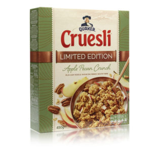
Quaker Cruesli is very successful and known for it’s tasty crunchy muesli (hence Cruesli). As part of the global repositioning and redesign of the Quaker brand, in which PROUD also had a part, a striking new design for Cruesli was created. Where taste is combined with the goodness of oats.
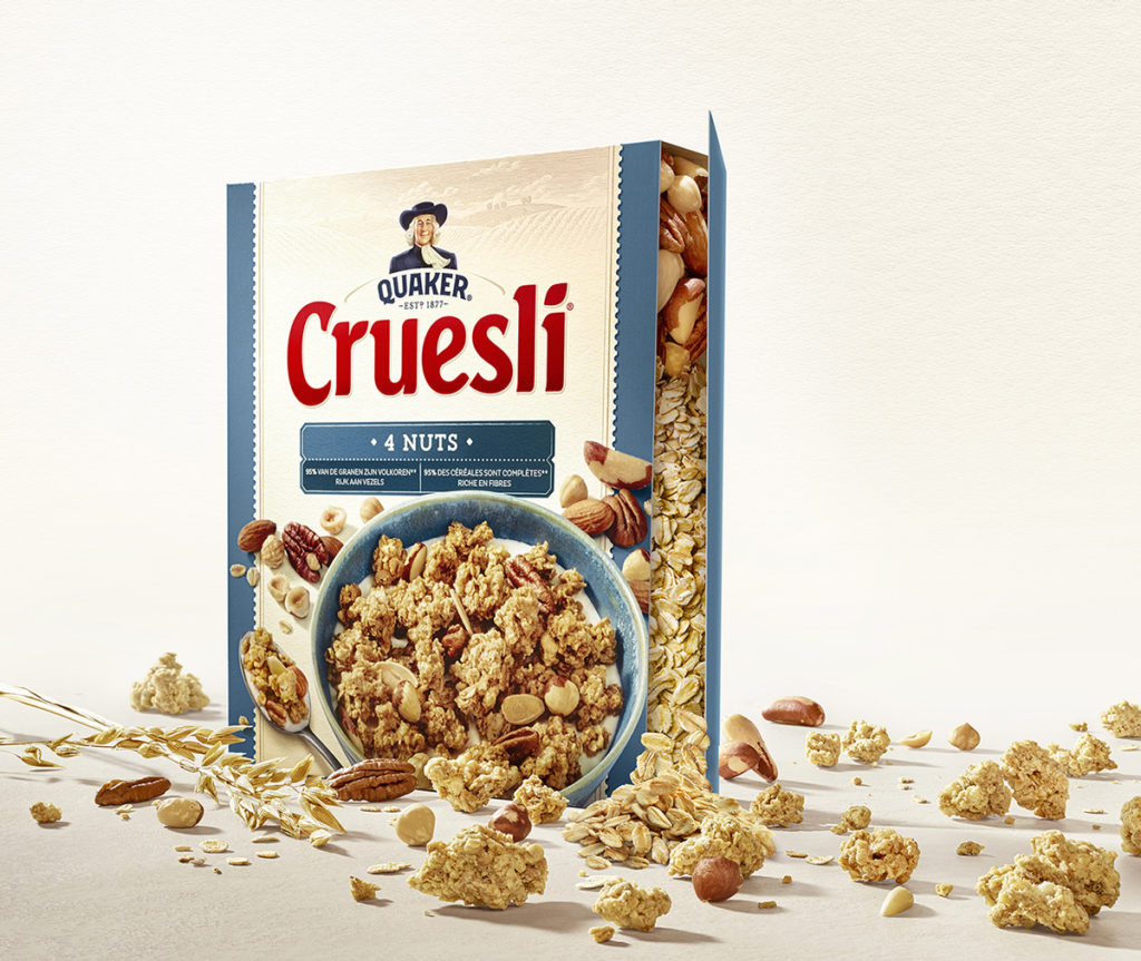
The new Cruesli design is supported by a strong, natural and crafted Quaker identity. In which the heritage is proudly reflected in the free standing Quaker in the fields. It is proudly nested in the slightly changed, yet still distinctive Cruesli word mark.
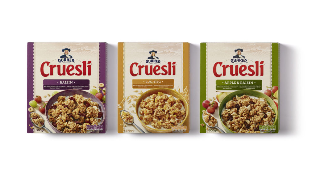
In this new design PROUD moved from striking variant colour to the off-white sub brand colour. Supporting not only a stronger branding block, but also introducing naturalness. The new photography is tasty, inviting and definitely more natural and human.
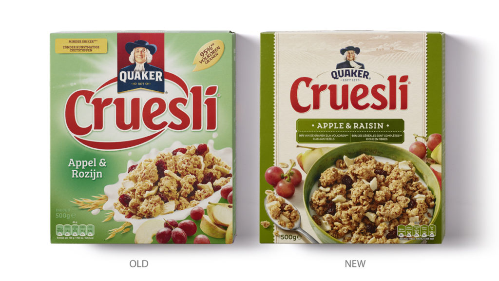
The craftsmanship that goes in to the product is reflected in all the details of the design, like labels, typography and illustrations. The back of pack is designed with the same intention and attention as the front. The whole pack breaths the same message: taste and natural goodness.
Source: PROUDdesign
PROUDdesign Develop New Packaging Design For Quaker Cruesli added by newsroom on
View all posts by newsroom →
You must be logged in to post a comment Login