 The Wellcome Trust has launched The Crunch, a major new public engagement initiative around
our food, our health and our planet, featuring brand, visual identity, messaging, website and digital assets by creative design consultancy Blast.
Major new initiative
The future of food is one of the biggest challenges on our plate. Our relationship with food is changing, affecting our health and the world around us in new and uncertain ways. The Wellcome Trust is launching The Crunch to encourage the nation to explore these changes and connections,
to inspire us all to create a recipe for a happier, healthier future.
Throughout 2016 The Crunch will reach a wide range of audiences across the UK in the following ways:
- More than 33,000 experiment kits produced, with every school and FE college in the UK receiving one
- Interactive experiences for families, aiming to reach more than 100,000 people, both face-to-face and digitally
- Interactive dialogue sessions, combining theatre and discussion
- Development of a network of ambassadors, who will be empowered to deliver more grassroots
A brand to inspire
 “This is a significant new initiative, not only for The Wellcome Trust, but for the 15 project partners, and indeed for the UK as a whole,” says Lynn Huynh, Marketing Communications Project Manager at The Wellcome Trust. “It was critical that we created a name, brand, visual identity and messaging that would unite all involved and become even more than the sum of its parts.”
She continues: “More than this The Crunch will encompass the entire UK, will last for all of 2016, and involves us communicating complicated topics to a very wide range of audiences, many of whom, for very valid reasons, do not have environment, nutrition and health as a high priority. So the name, look and feel needed to feel contemporary, relevant, and fun, allowing us to convey a serious message and inspire people to care about the issues.”
Creative, agile and proactive
Following a competitive tender, The Wellcome Trust appointed creative design consultancy Blast as project lead, co-ordinating the 14 other project partners, and as creative lead, developing the name, brand guidelines, visual identity, messaging, and, together with digital partner agency Itineris, the website and all digital assets.
Huynh says: “Right from the outset Blast had a good grasp of what we were trying to achieve.
They invested time to understand us, asked the right questions and the creative they produced demonstrated just the right balance of playfulness and seriousness that is so essential to The Crunch.”
She adds: “Also, they were able to be nimble, agile and flexible – an essential attribute for an agency on a complex project. They took the initiative, for example in the creative of the introduction film, which brilliantly captures what The Crunch is about and will be an invaluable asset as we begin to take the concept out to our audiences.”
From naming to launch film
The first step was to devise the name. “It needed to reach and inspire a wide range of audiences across multiple channels,” explains Colin Gifford, Creative Director at Blast. “It needed to resonate
as strongly and positively with both a four-year child and a food scientist. Our solution, The Crunch, encapsulates the essence of the initiative. Fun, foody and impactful, it also highlights that we’re at
a crucial moment in which we need to reconsider our relationship with food and drink. So while The Crunch is playful and energetic, it also has a serious and thoughtful dimension. This versatility helps us engage with all our audiences, from children to foodies and policy makers.”
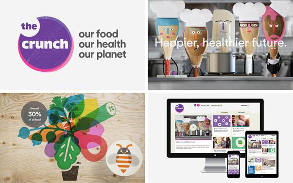
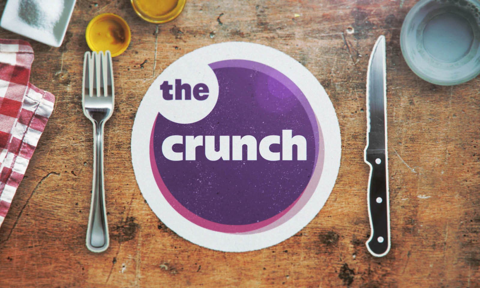
 In the same way the visual identity is bold, colourful, friendly and positive. It is based around the concept of inter-connections, which makes it especially relevant to the overall objective of the initiative. “The logo is comprised of three overlapping circles which represent the connections between food, health and environment,” says Gifford. “In addition to the logo we’ve created a range
of icons, infographics and illustrations, which give us a visual way to talk about the connections and communicate the variety of subjects covered by the initiative.”
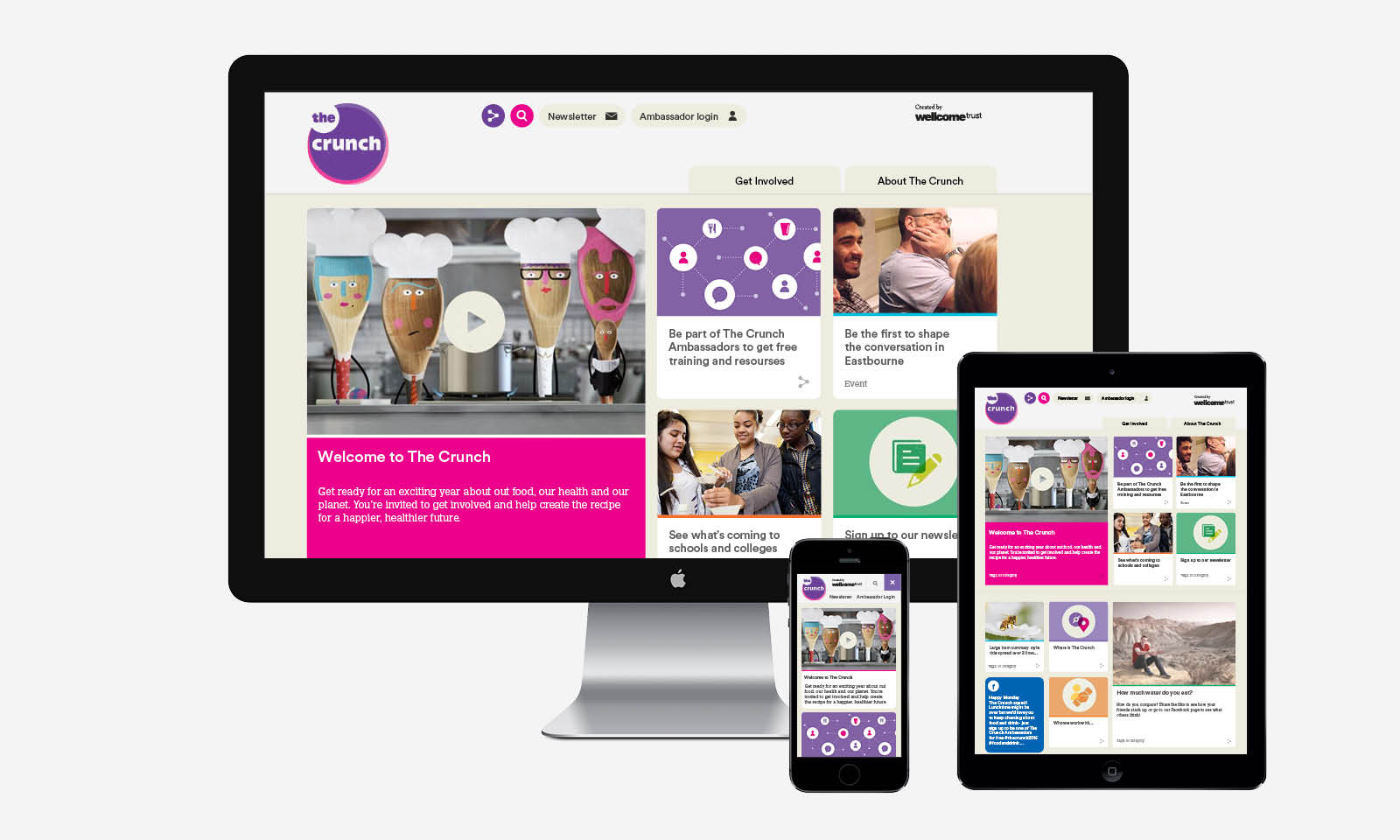
Overall it is a flexible identity, with a clear tone of voice and communications style, which The Crunch and its partners will be able to use in a variety of high impact ways – from communicating simple ideas to complex subjects and information. This flexibility and broad appeal is demonstrated in the launch film created by Blast and animated by Nipple. Working with its digital partner, Itineris, Blast have also created the website which will be the portal for all activities, and a range of assets for
social media.
The excitement begins
The first stage of the website launches in November 2015 and the first pilot session takes place in Eastbourne on 16th January 2016. The official launch of The Crunch will take place in March 2016
and after that the full range of activities will commence.
“Our stakeholders are responding very positively to the brand,” concludes Huynh. “Even at this stage people are beginning to feel inspired by what we can achieve with The Crunch. We can’t wait for the next stage, and to bringing even more people into this exciting and important conversation.”
Wellcome Trust launches The Crunch featuring brand identity & communications from Blast added by newsroom on
View all posts by newsroom →
You must be logged in to post a comment Login