WPP CEO Mark Read has recently announced a three-year plan for “radical evolution” of the company to deliver improved performance.

Following that, two of the group’s own branding agencies, Superunion and Landor have collaborated to create the new identity which represents WPP as a creative transformation company that is dynamic, connected and organised around the needs of its clients, according to information available on the agency’s site.
The logo is made up of many parts that combine to form the whole – a representation of WPP’s people, agencies, capabilities and markets that work together as one for clients.
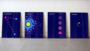
On-screen, the logo is designed to have a continuously changing form and colour, symbolising creative transformation in itself.
Talking about the idea behind the new logo, Jim Prior, Global CEO, Superunion, says in a press note, “Our ambition was to present WPP with the same energy and creativity that we offer to our clients right across the company. There’s a lot of pride and ambition in WPP that is now united under a strong and dynamic brand identity.”

Jane Geraghty, Global CEO of Landor, says, “WPP has always been transformative – bringing together the best people and ideas to meet the needs of our clients. We now have an evolved brand and expression of purpose that better reflects who we are as a company, our collective capabilities, and what we offer.”
According to WPP, the Superunion/Landor team worked alongside WPP’s central team on the new positioning.
Source: afaqs!
WPP wears new brand identity as part of global repositioning added by newsroom on
View all posts by newsroom →
You must be logged in to post a comment Login