Today, Pride in London – the UK’s largest Pride – is unveiling a new brand direction and visual identity designed to better reflect the organisation’s core values and put community, history and activism front and centre.
As it looks ahead to its 50th anniversary in 2022, Pride in London has created its new-look brand to be more inclusive, more memorable and more powerful – evoking the spirit of protest while also shining a light on those fighting for progress. This new brand identity integrates the organisation’s key values of visibility, unity and equality, and serves as a visual reminder that Pride in London is the city’s volunteer-powered LGBT+ force that unites voices, amplifies diversity and protects rights.
Key features of the new brand direction include:
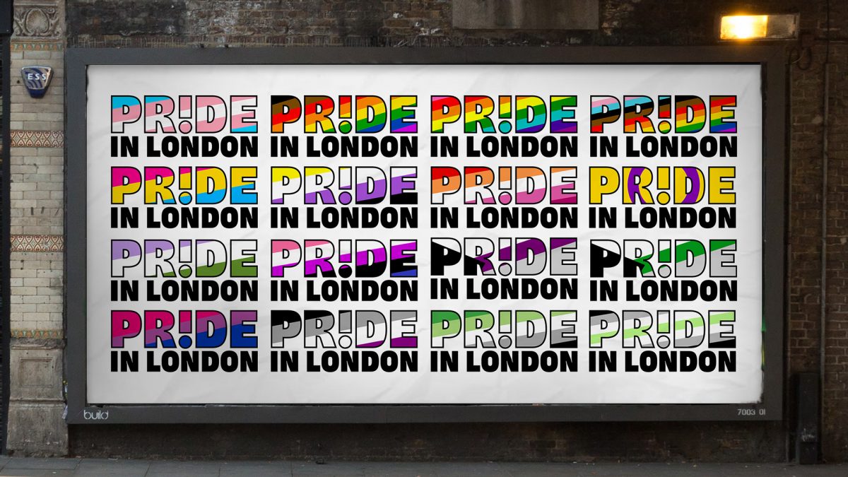
- ● The exclamation mark – rooted in decades of LGBT+ protests, “!” onplacards and posters throughout history is a clear symbol of queerdefiance, resilience & solidarity
- ● The window – Pride in London will use photography within the words, as aspotlight directly on the people it exists for and because of, with all images un-retouched in order to give a raw, honest representation of the capital’s LGBT+ communities
- ● Pride at its heart – the prominence of the word ‘Pride’ not only roots theorganisation in the global, historic movement, but is also a statement to show that LGBT+ people are proud to be different, together – not just in London, but united with the world

Pride in London will use photography in the new logo’s ‘window’ in order to ensure LGBT+ people are at the heart of the brand. As a hub and uniting force for so many people across many different LGBT+ spaces, this evolution in branding demonstrates Pride in London’s commitment to championing its communities.
As with many organisations, Pride in London has had to adapt and evolve over the past 12 months so that it can continue its vital work effecting change and advocating for LGBT+ people in the capital and beyond. 2020 prompted the organisation to consult its communities and its volunteers to determine who Pride in London is, whom it represents and what it stands for. The organisation recognises the significant role it can play in communities, and the new visual identity needed to reflect this.
Tom Stevens, Director of Marketing at Pride in London, said: “Our new logo and brand identity are more than just a facelift – we knew our brand had to reflect who we want to be, what we represent and who we stand for. This new brand direction will serve as a reminder that Pride in London is a platform for all LGBT+ voices and a force to drive positive change for all queer communities through visibility, unity and equality.
“Above all else, it’s vital that we as LGBT+ people remember our roots in activism and community, and that our people are always at the forefront of everything we do. At a time where there is still so much uncertainty, we sincerely hope the new branding can be brought to life physically at a Pride in London event sooner rather than later.”
The organisation’s new-look brand will be visible everywhere Pride in London is found, including on its website, social media channels and advertising campaigns, as well as being used by other LGBT+ community groups.
Alongside the brand relaunch, Pride in London is also asking LGBT+ communities to share their thoughts on what the organisation’s plans should look like for 2021 once the current restrictions begin to be relaxed. LGBT+ people and their allies can share what they wish to see from Pride in London this year via the short survey here.
Source: Pride In London
Pride in London unveils new brand direction with LGBT+ communities, queer history & activism at its heart added by newsroom on
View all posts by newsroom →
You must be logged in to post a comment Login