When Therapy Notebooks launched in 2020, it was one of the first brands of its kind – partnering with clinicians, researchers and therapists to translate evidence-based mental health tools into guided notebooks for your everyday — covering topics like anxiety, depression, sleep and more. Since then, it has sold more than 140,000 copies of The Anti-Anxiety Notebook alone, earning industry praise and widespread awareness. Continuing to rethink its vision for the future of mental health, its team partnered with creative studio High Tide to rebrand Therapy Notebooks with an eye towards championing even greater access, scientific rigor, positive impact and growth.
High Tide was tasked with rethinking the entire Therapy Notebooks brand – updating it to support greater brand differentiation as well as to foster trust, empathy and empowerment with even more people. This meant a complete overhaul of the brand’s approach to strategy, illustration, photography, identity, website, packaging and book design – all while maintaining the credibility and rigor that had made them an acclaimed clinically-driven mental health resource.
The team was also conscious of trends in the wellness space, wanting to take a more bold and deliberate position by embracing more technical, focused pathways to visual storytelling. “We wanted the brand to convey that if you’re looking for stories that help dimensionalize mental health experiences in nuanced ways, that Therapy Notebooks offers options grounded in science, psychology, research and clinical expertise,” says High Tide Founder and Creative Director Danny Miller.

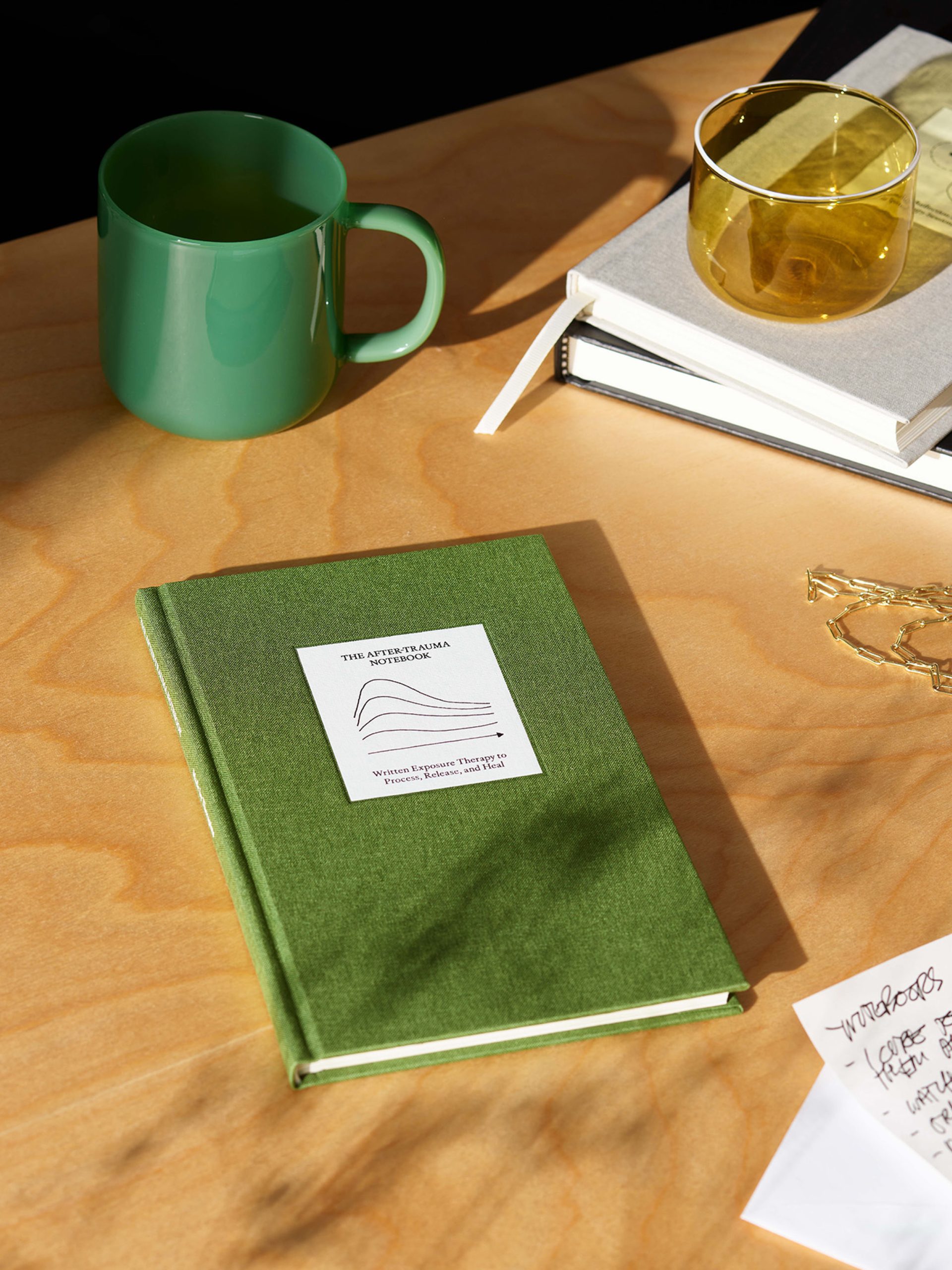
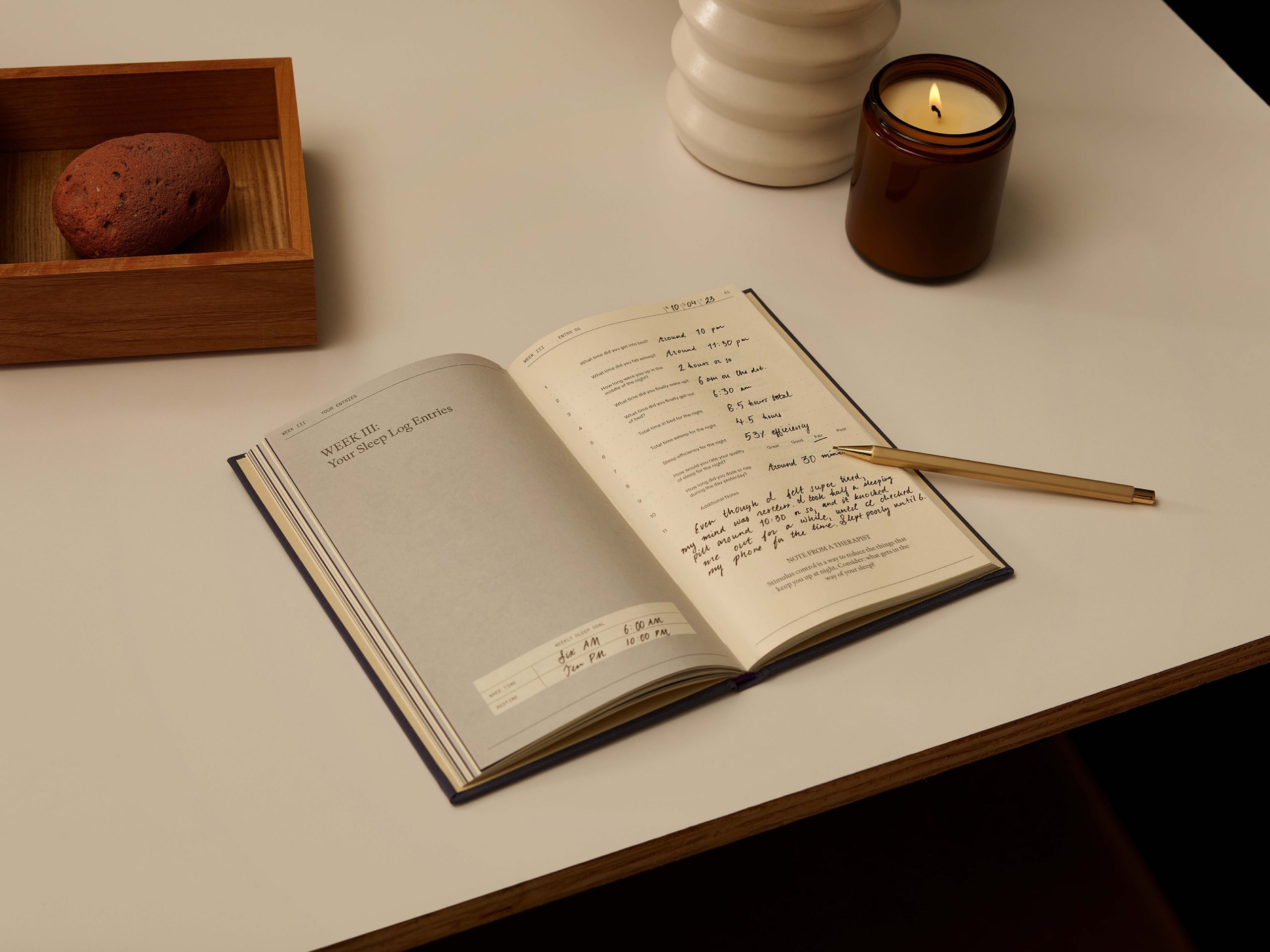
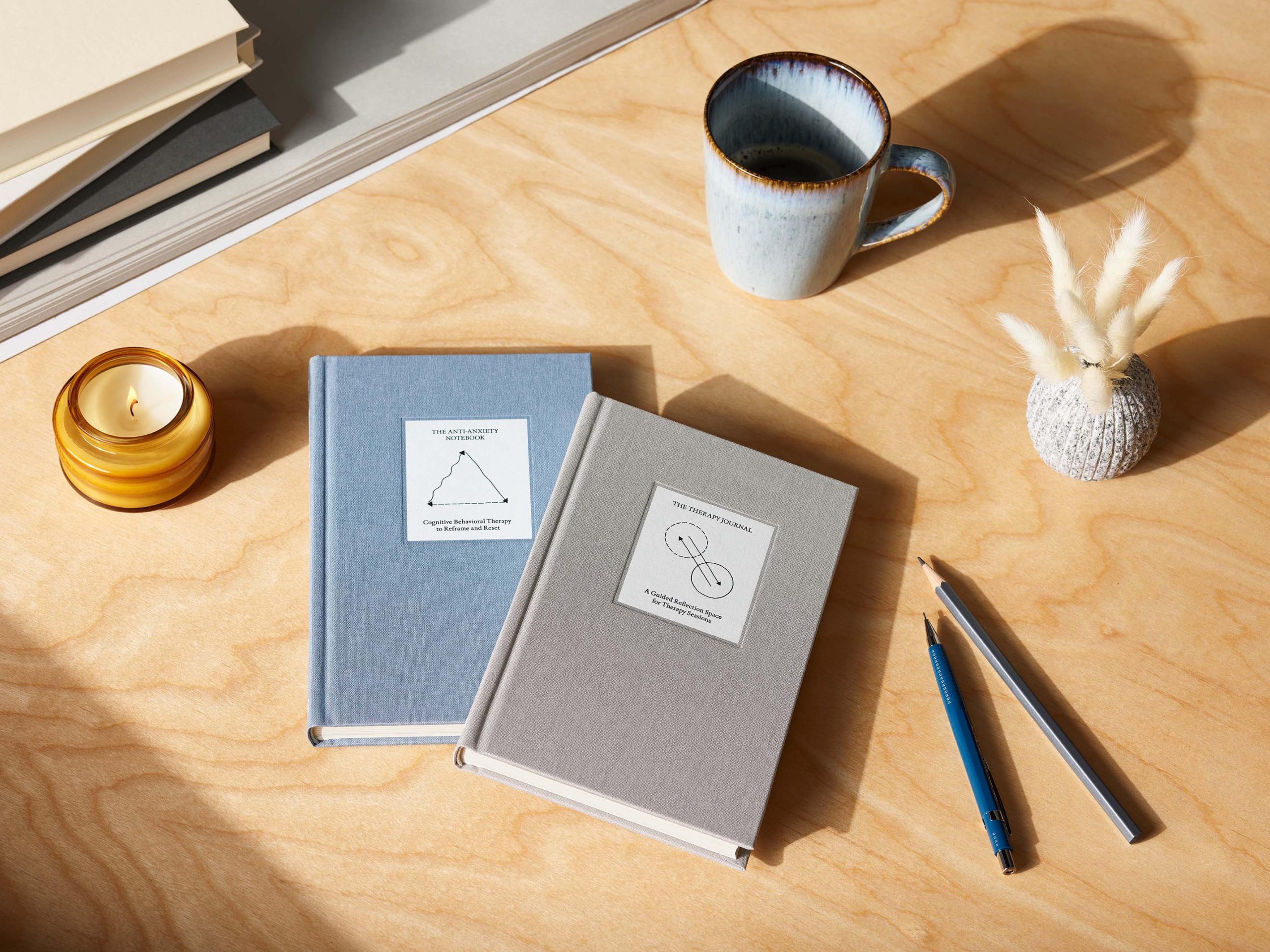
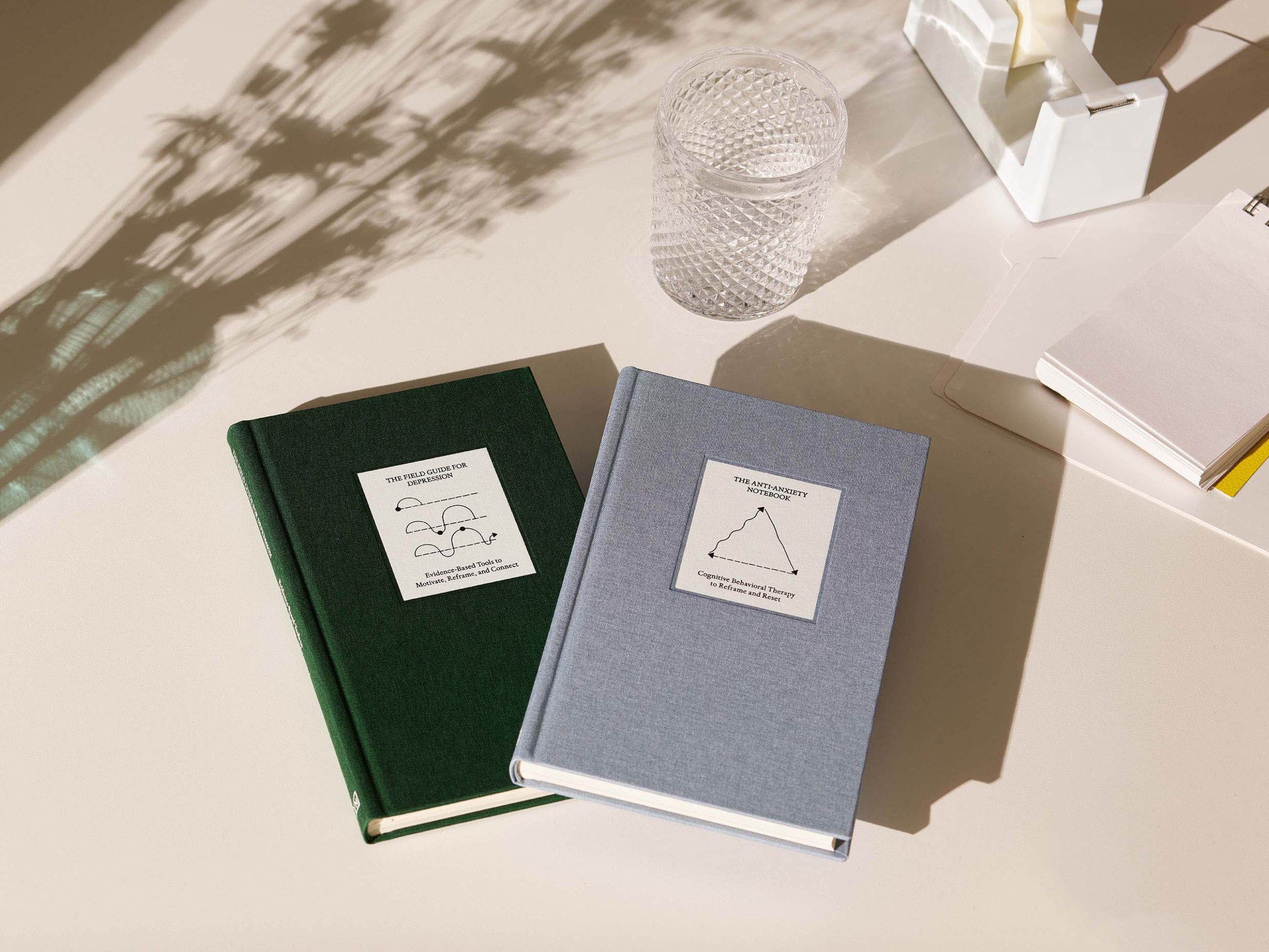
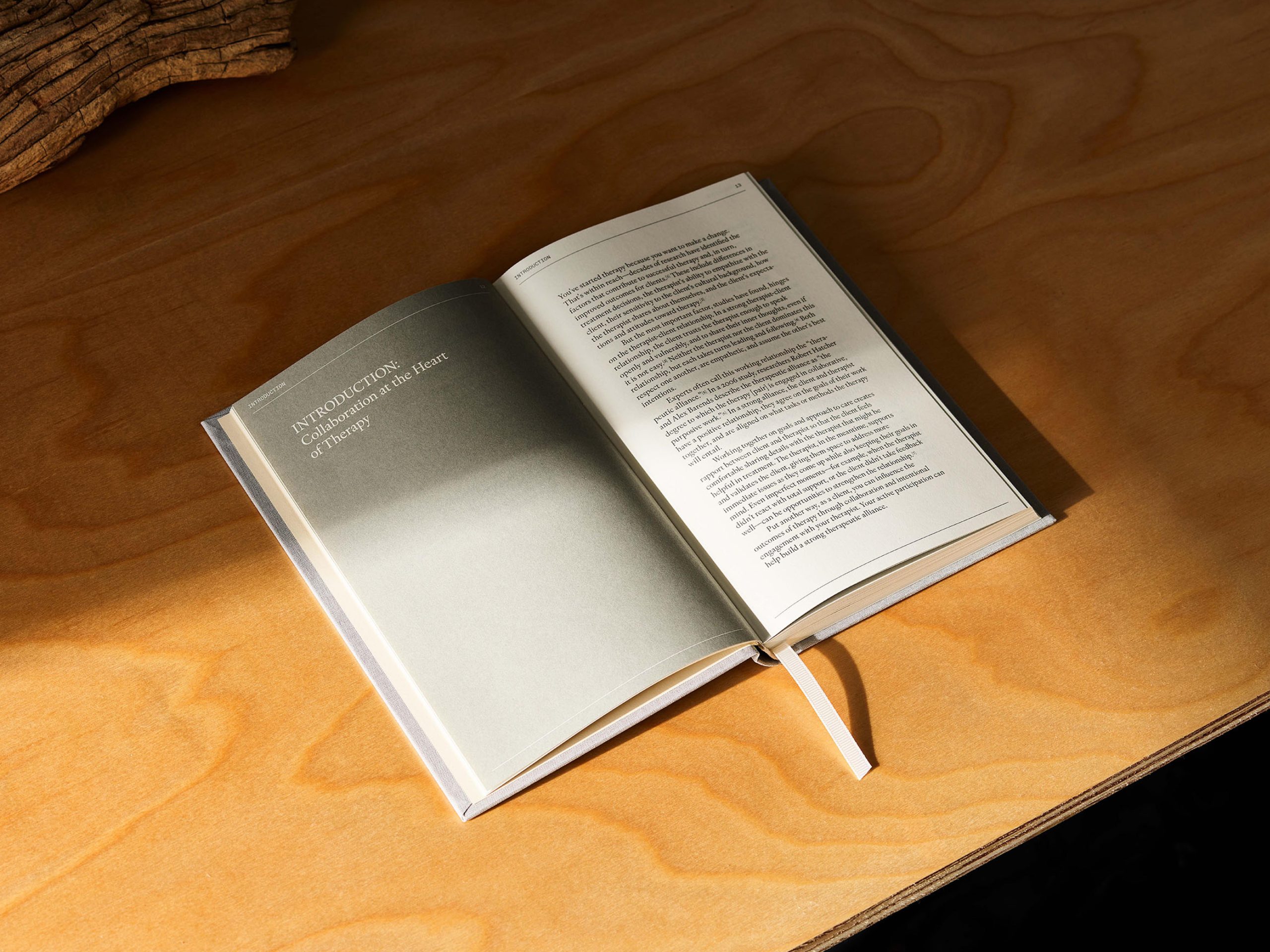
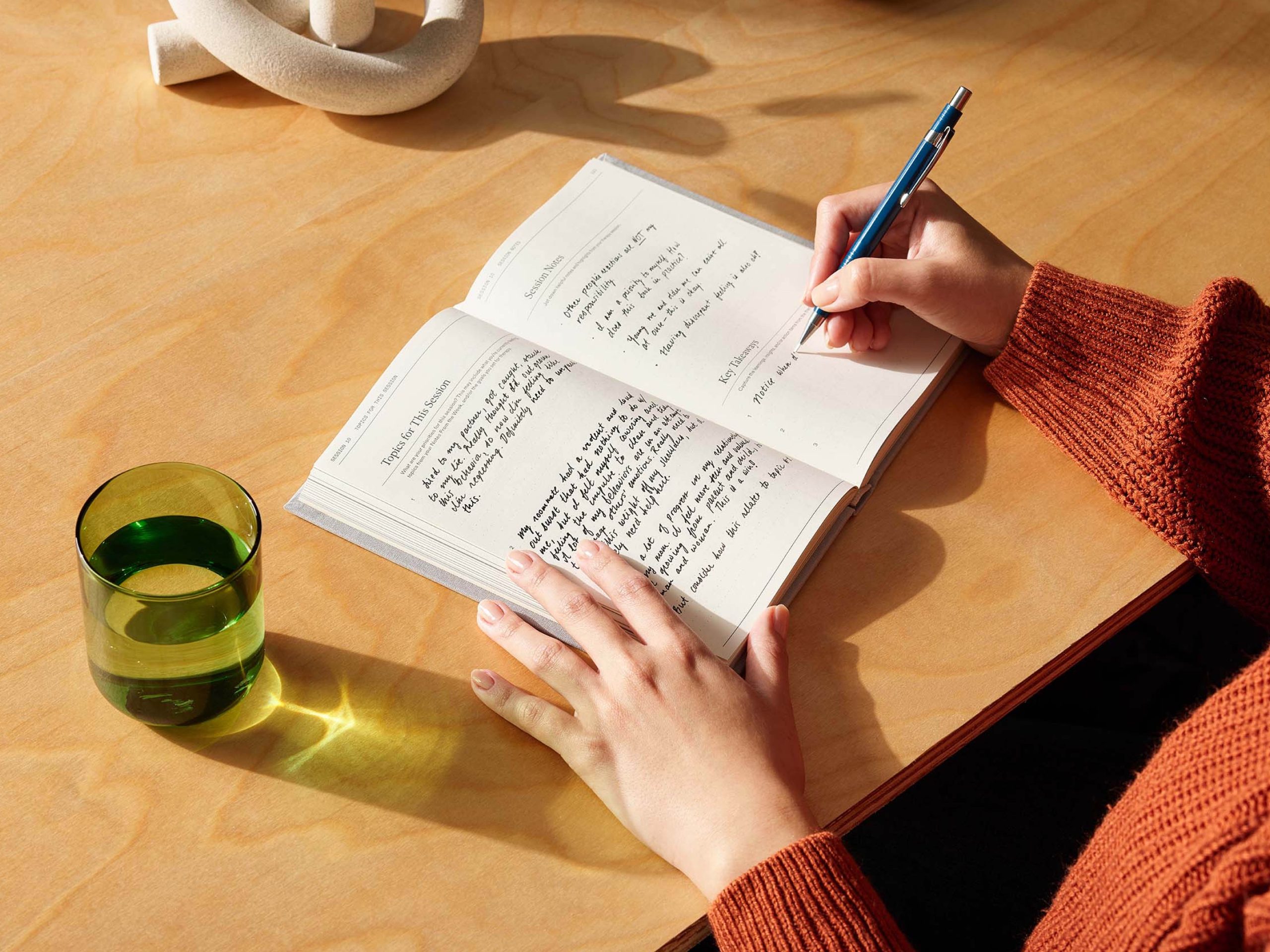
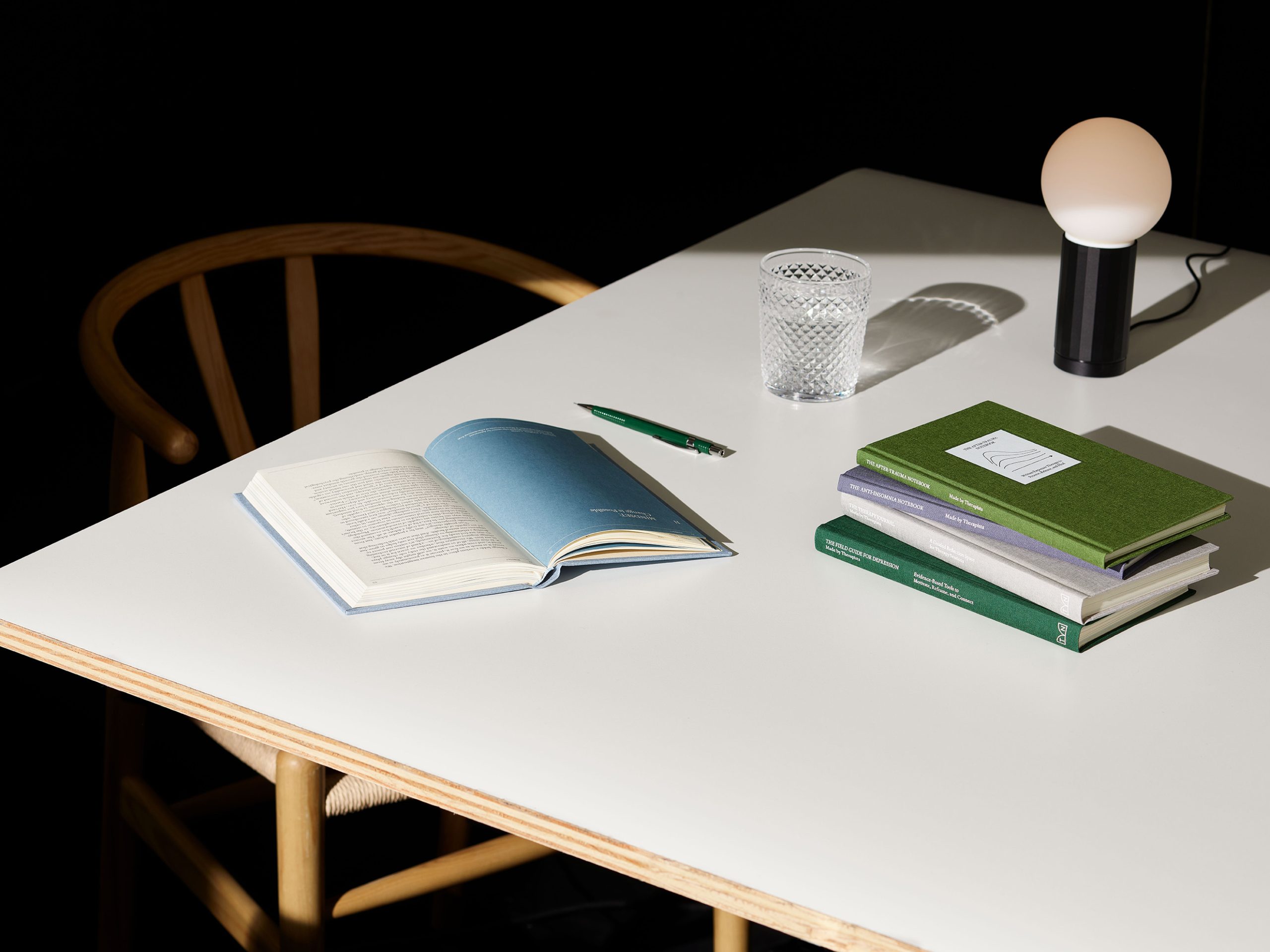
To do this, High Tide meticulously created a brand system that feels classic and literary yet modern, all while guiding users along their mental health and wellness journey. The wordmark blends traditional inscriptional letters with contemporary qualities, while the notebook icon represents the tools’ function as an open source for self-knowledge. Elsewhere, the identity uses a carefully chosen range of rich, evocative colors, human-centered photography and textured materials, working to create an intuitive way of navigating the linen hardcover books and overall brand. The books’ illustrative diagrams – based on clinical diagrams and scientific charts – have a warm, analogue, hand done quality and are conceptually tied to the subject matter of each book through visual metaphor.


Therapy Notebooks’ new brand identity offers a more powerful, expansive, humanistic vision for what a mental health brand can be in the age of modern storytelling.
“We feel strongly about the change that Therapy Notebooks represents within the current landscape of mental health resources,” says Miller. “With more brands focused on mental health today than ever before, we recognized Therapy Notebooks’ unique ability to turn awareness into action in a way many other services and resources are unable to. Therapy Notebooks is a genuine force of progress that can support millions of people in finding the healing and hope they are searching for. It has been a privilege to create a design system that can support that cause. “
Source: High Tide
High Tide Looks to the Future of Mental Health with Redesign of Therapy Notebooks added by newsroom on
View all posts by newsroom →
You must be logged in to post a comment Login