Much like its sporting counterpart The Olympics, Eurovision’s annual explosion of camp kitsch gifts us a new visual identity each time. With its typically shallow-yet-inclusive and mildly innuendo-laden message (2020’s slogan is “Open Up”), it continues to inspire both obsessive passion and derision in equal measure. Love it or loathe it, with its noble ambition of peacefully uniting nations through the arts, Eurovision still stands as the most watched non-sporting event on the planet.
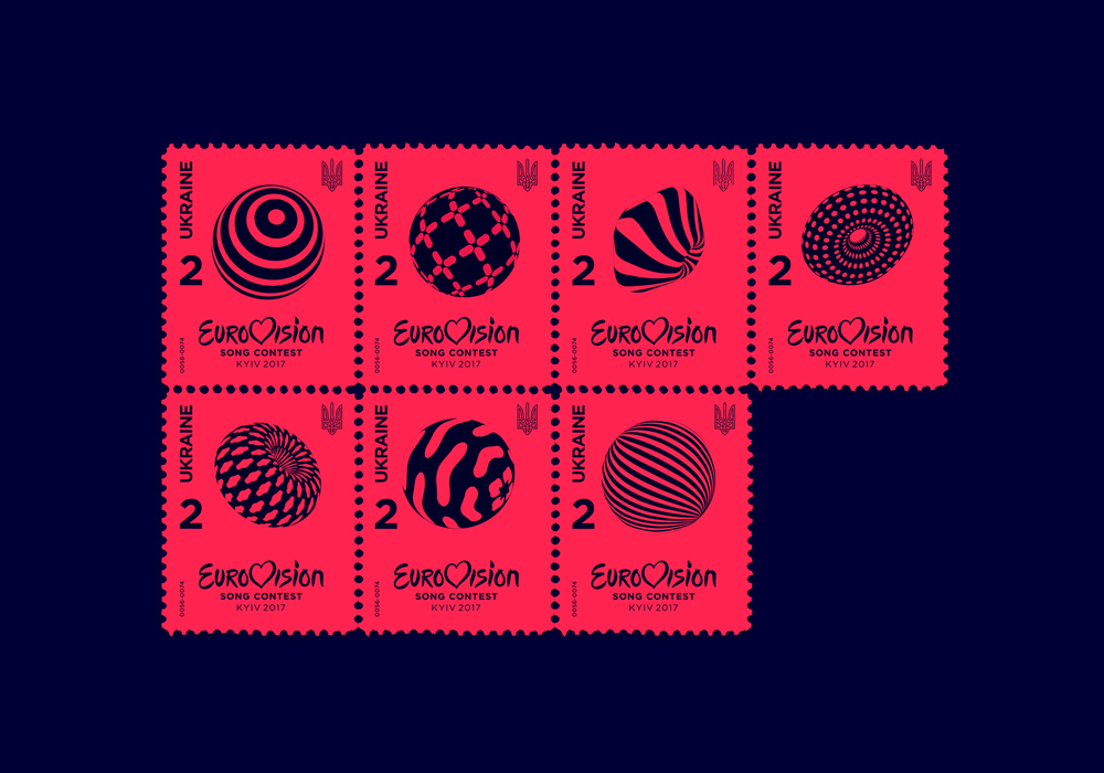
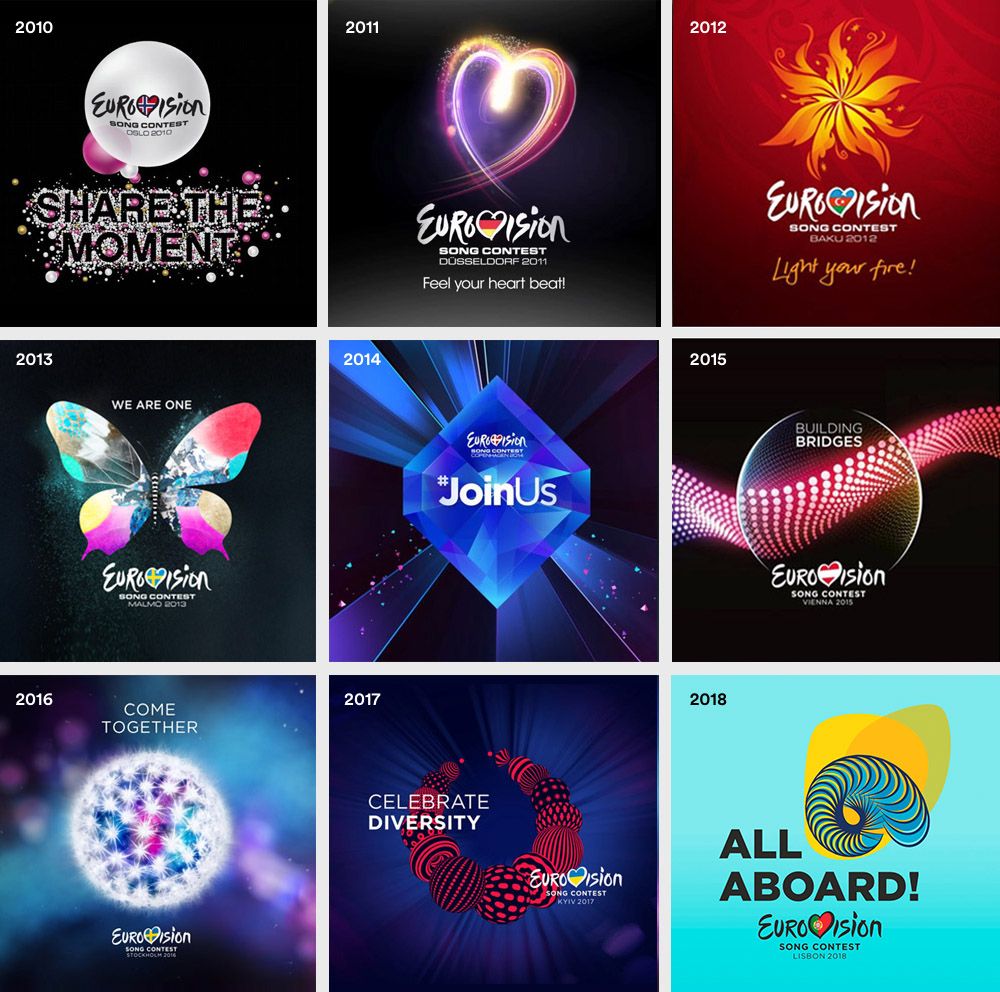
In the past decade, we’ve been blessed with identities of varying levels of success. Glittering butterflies, pulsating hearts, shooting stars and swirling dandelions are all staples of this overly earnest festival of love and peace. Examples in recent years have stepped up their game and there have been some genuinely beautiful graphic concepts that reflected the personality of the host country; notably 2017’s ‘Celebrate Diversity’ for Kiev (just look at that set of postage stamps – swoooon) and 2018’s ‘All Aboard’ for Lisbon.
Now comes the turn of the Netherlands, the place I call home, which will host 2020’s competition in Rotterdam. A country renowned for its distinctively no-nonsense approach and sharp graphic eye. No pressure.
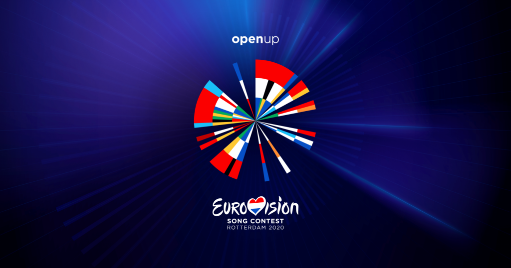
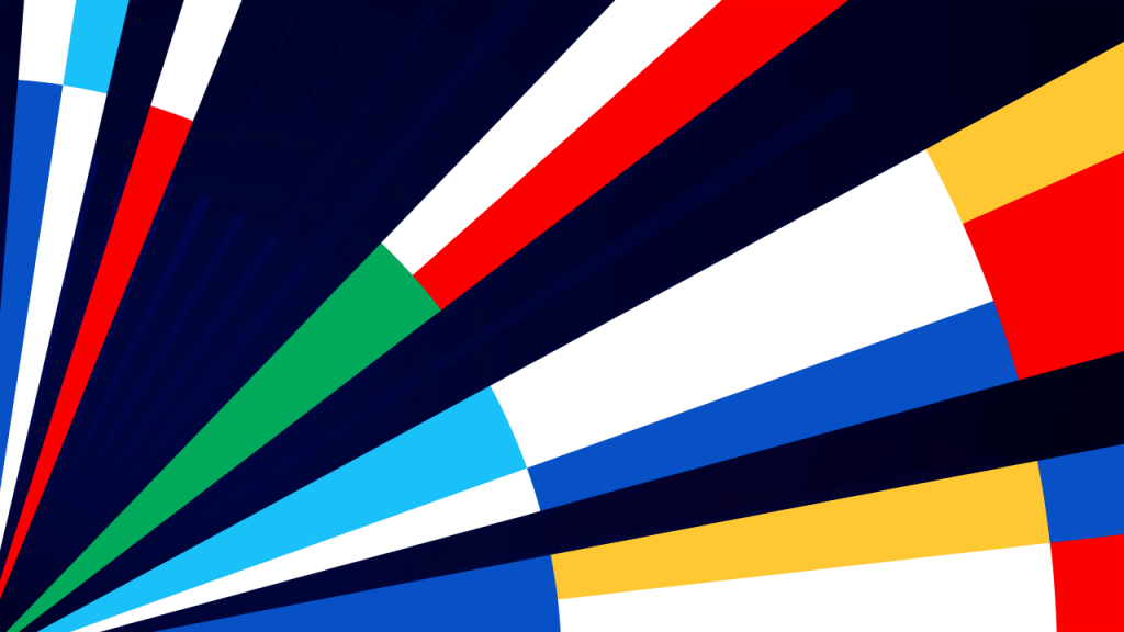
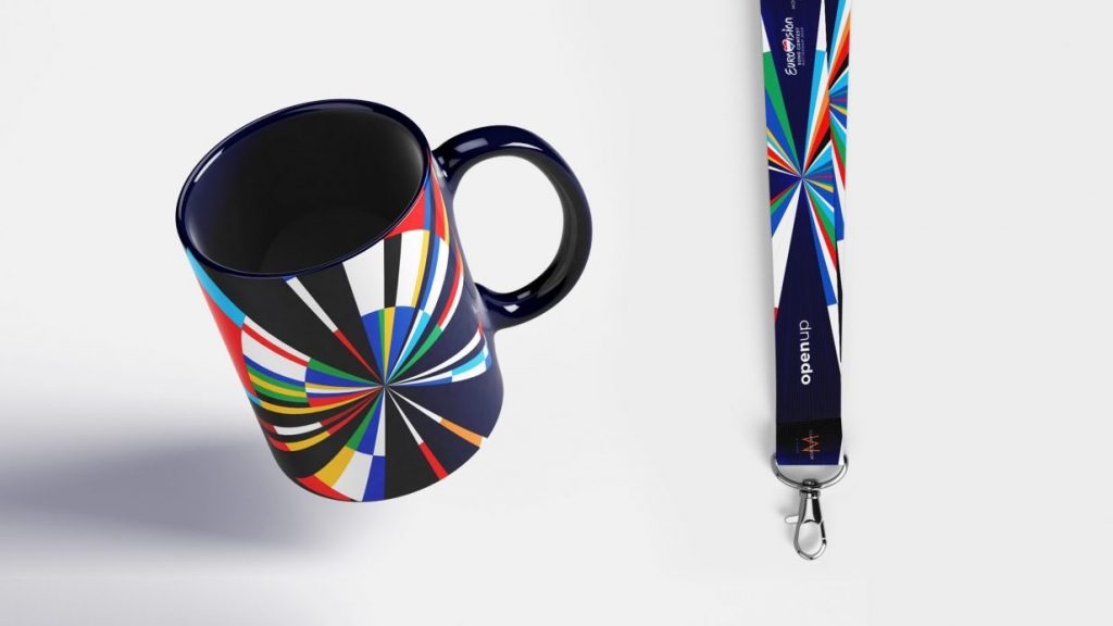
It was announced on Thursday that the task of making the identity had been awarded to ‘data visualization agency’ CLEVER°FRANKE. They’ve created a marque that smartly combines 65 years of competition – a radial graph spins the flags of all participating countries into a series of brightly coloured blocks – all contained within one big windmill of joy. With its Mondrian-esque feel, it’s indisputably Dutch. The vexillological colours and shapes clearly reference flags without being literal. And, more importantly, it’s incredibly suited to adapting across a multitude of touchpoints; from signage, to apparel, and within the on-screen infographics of the competition itself.
Best of all, it eschews typical expectations. Still fun and energetic, this one feels slightly more serious than its predecessors, possibly hinting at Eurovision’s desire to establish itself as being about ‘music first always’.
Less flattering comparisons have included a hubcap, a pizza and a dartboard, but for me the sequence of shapes could almost contain a hidden message or represent the grooves of a vinyl record. This is a design that has to speak to millions of people, across different nations and cultures, and I think there’s real strength in an identity like this that invokes curiosity and is open to interpretation, all the while remaining bold and distinctive.
However, it would be remiss to completely adorn the design with praise. One could accuse it of being a bit safe, still fitting within the framework of the standard Eurovision look and feel, and there must have been more radical proposals left on the cutting room floor. And what about going as far as challenging the Eurovision logo altogether? That handwritten wordmark with the heart at its centre has remained more or less unchanged since Istanbul 2004. With 2019’s ‘serious’ winner and rumours of a (slightly) more musically adept competition in 2020, could this have been an opportunity to breathe new life into the overall identity?

The reaction so far from fans online seems mostly positive, although there is a noticeable divide between those who appreciate it for its intelligent graphic aesthetic, and those who are left completely cold by its clinically dissected geometry. Either way, its distinctive Dutchness makes it worthy of douze points for me, and there’ll no doubt a handful of my Design Bridge colleagues heading to Rotterdam next May to see it in person.
By Benjamin Farrell, a Senior Designer at Design Bridge Amsterdam
The new Eurovision identity: does it score ‘Douze Points’? added by newsroom on
View all posts by newsroom →
You must be logged in to post a comment Login