FutureBrand, a global brand transformation company, has partnered with leading technology platform, Mobvista, to reimagine its brand identity following a period of sustained innovation and business growth.
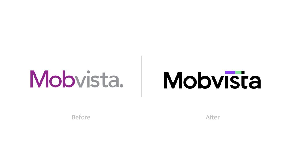
Mobvista began life in 2013 as a mobile advertising platform but has since grown to become one of the world’s leading technology platforms, helping customers utilise advanced technologies such as big data, artificial intelligence and cloud computing elastic cluster management. Rapid growth over the last few years created the need for Mobvista to realign its parent brand with newer sub-brands: Nativex, Mintegral and GameAnalytics. As a result, earlier this year FutureBrand was tasked with imagining a new, comprehensive identity and unified brand experience for Mobvista, refreshing the existing brand with a new vitality and infusing it with a more national, modern and leading personality.
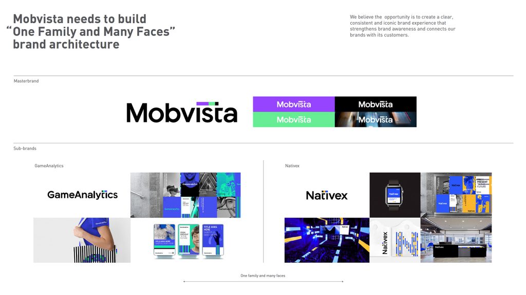
Sophie Cheng, General Manager, Greater China, from FutureBrand commented: “The big challenge for our team lay in creating a brand architecture and design for Mobvista which would be recognised across the larger group. We needed to define a clear, unified yet flexible brand architecture for Mobvista and it’s three new sub-brands: Nativex, Mintegral and GameAnalytics. The original assets of the master and sub-brands were inconsistent which reflected the different business structures. We needed to unite the three new sub-brands as part of one family to build one whole brand experience.”
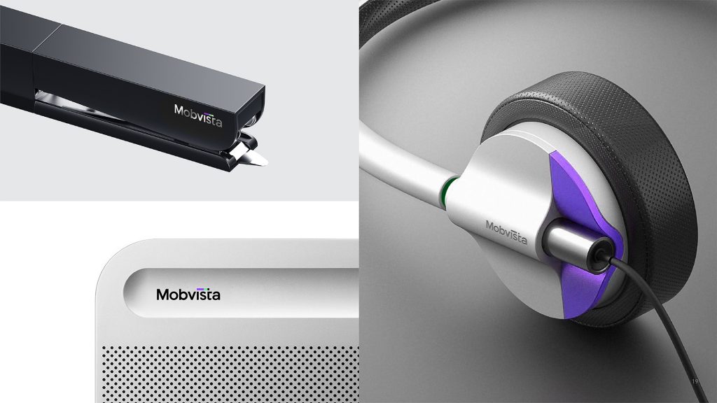
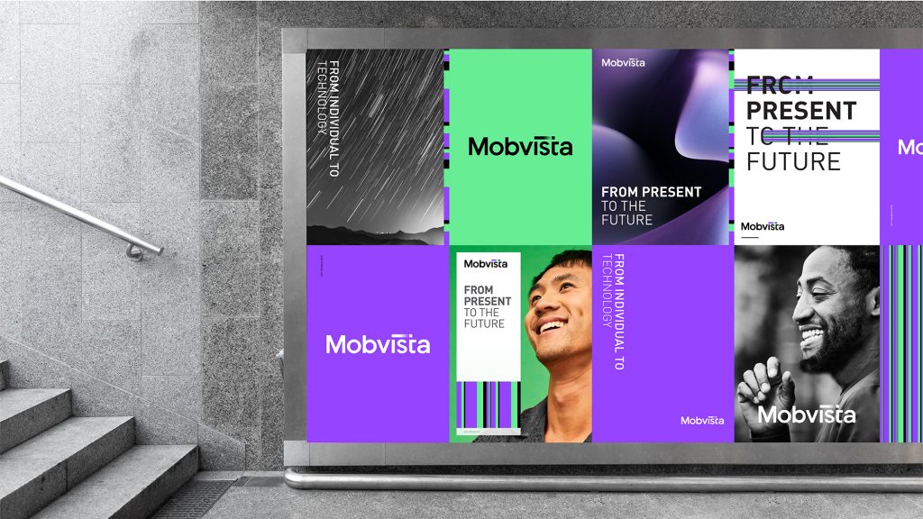
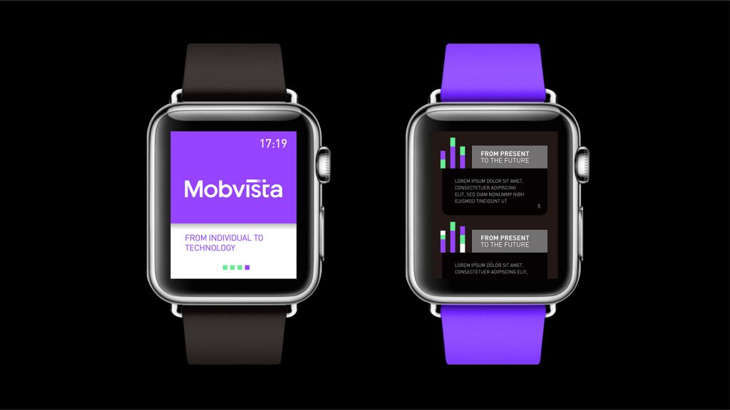
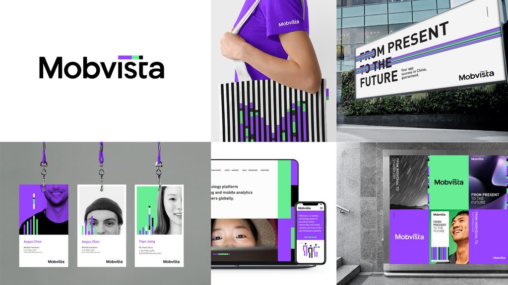
FutureBrand adopted the ‘one family, many faces approach’ to create a balance of visual endorsements between Mobvista and its subsidiaries. The resulting design is a unified and flexible visual identity for the family of brands, which retains the individualities of each sub-brand. The brand logo and visual system are modern, scientific and humanised to highlight Mobvista’s core competitiveness and personality.
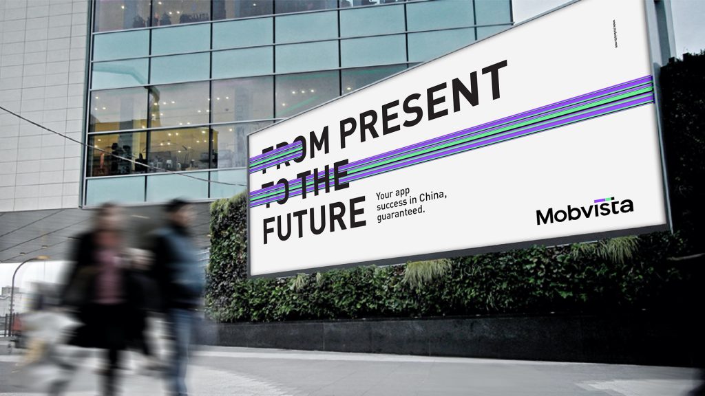
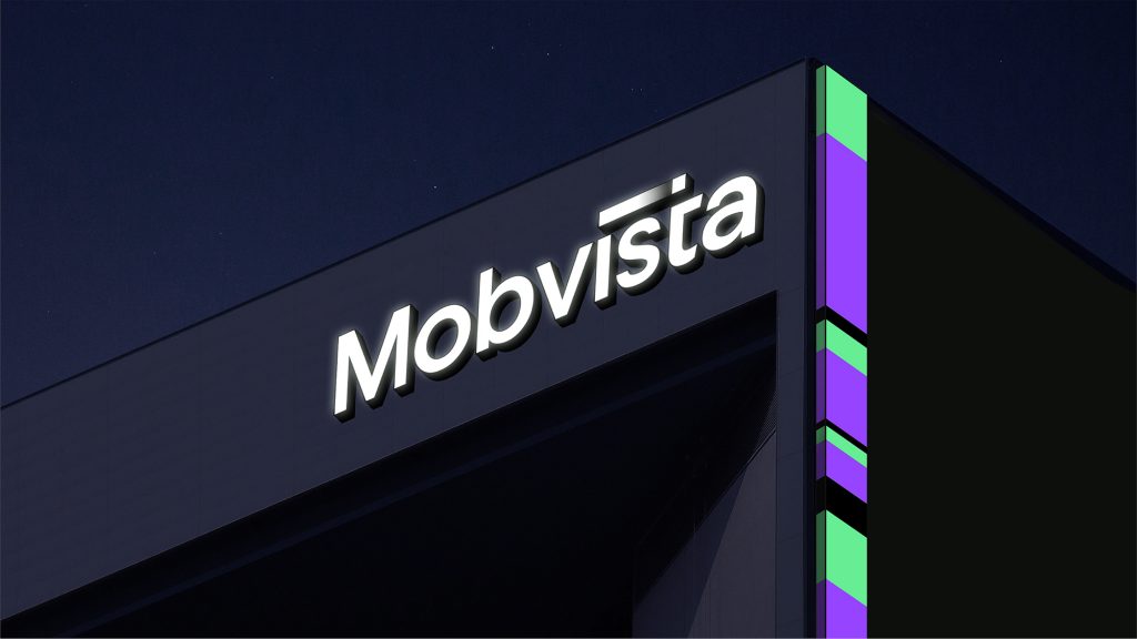
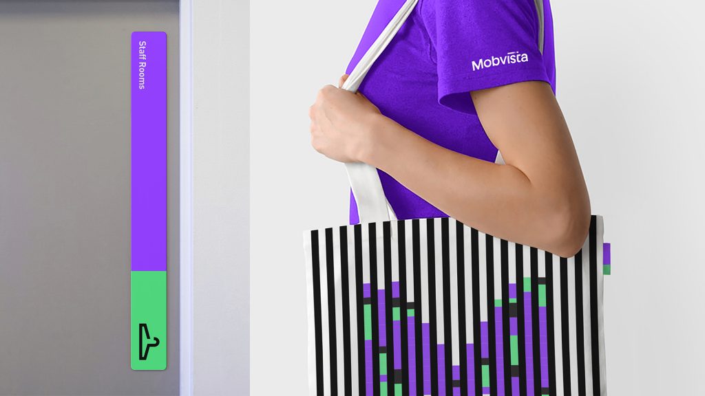
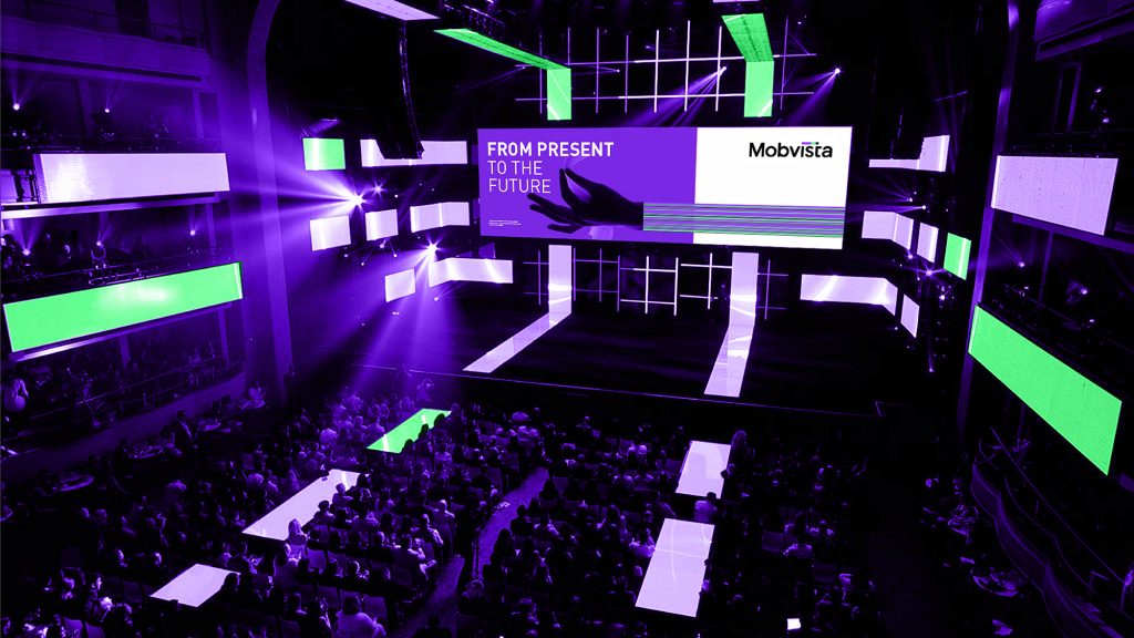
Mobvista wanted to highlight the customer-centric nature of its brand which is reflected in the suite of assets created by FutureBrand. The roving dot of the ‘i’ in the Mobvista logo, for instance, moves across the brand name to form the letter ‘t’, reflecting the ways in which company’s technology connects people from the West to the East. Such motifs are mirrored in the logos of the sub-brands, maintaining the overall vitality of the brand and unifying the group as a whole. FutureBrand also redesigned the colour scheme for Mobvista to revolve around bright purple and green. These colours reflect the vibrancy of the company and the teams but are also unusual for tech companies, setting Mobvista aside from its competitors.
Sam Yang, Creative Director, Greater China, from FutureBrand commented: “In order to unify Mobvista with its subsidiaries, we needed to strike a fine balance between telling the story of the customer-centric warm nature of the brand and the professionalism of the tech industry. Mobvista provides considered solutions for its customers and we wanted this caring nature to be reflected throughout the visual language. We redesigned its colour palette to include bright purples and the colour green to reflect its positivity and human-centricity.”
Cao Xiao Huan, Co-founder & CEO of Mobvista said of FutureBrand’s work: “With FutureBrand’s global vision, international team and rich industry experience, we were able to reorganise the company’s parent-subsidiary brand structure and redefine the brand strategy in line with the global market. In particular, the design of the visual identification system makes the brand matrix of the company glow with new vitality, presenting more international and technological features, and integrating humanistic care. This visual design is also in line with the company’s brand philosophy, a great interpretation of our relentless exploration of technology and customer care values.”
Source: FutureBrand


You must be logged in to post a comment Login