Heights, an innovative cognitive performance brand, launches with a brand strategy, name and identity created by Ragged Edge.
The direct-to-consumer subscription service, which is aimed at professionals, pairs a monthly supplement delivery with regular brain-training advice, blending nutrition, knowledge and exercise to enable people to realise enhanced cognitive function.
But while consumers are happy to invest time, money and effort to transform their bodies, there’s currently a lack of understanding about what it takes to get more from the most important organ in our body. So for Heights to succeed, the brand needed to persuade people to invest in their brains.
Ragged Edge’s approach shows how a straight-talking yet aspirational brand can be used to change perceptions and behaviours, balancing the need to educate and inspire.
Stretching our brains
“Health is the new status symbol. And nothing in our bodies is more complex or important than the brain,” says Dan Murray-Serter, Co-founder, Heights. “But right now many brands are making false promises, saying you can pop a pill and suddenly your brain will function more effectively. That’s just not true – looking after your brain is a long-term commitment. We started Heights to change the conversation around our brains, and heighten the cognitive potential in everyone.”
Heads Up
Following an in-depth analysis of the market, the audience and overarching cultural trends, Ragged Edge defined and created a new brand to get people thinking brain-first.
“The human brain remains ‘plastic’ even in adult life,” says Max Ottignon, Co-founder, Ragged Edge. “While quick fixes don’t work, with the right knowledge and nutrients, anyone can stretch their brain’s capacity for greatness. So we set out to inspire our audience with a brand that pushes you to stretch your brain, and yourself.”
Stretch yourself
The name sets the tone, inviting the audience to go beyond what they thought possible, while the tone of voice aims to challenge the reader to reconsider their preconceptions. Playful headlines and the occasional brainteaser ensure that things never get preachy, or overly worthy.
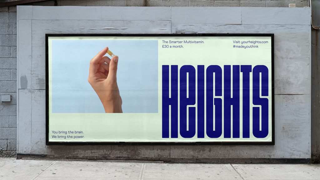
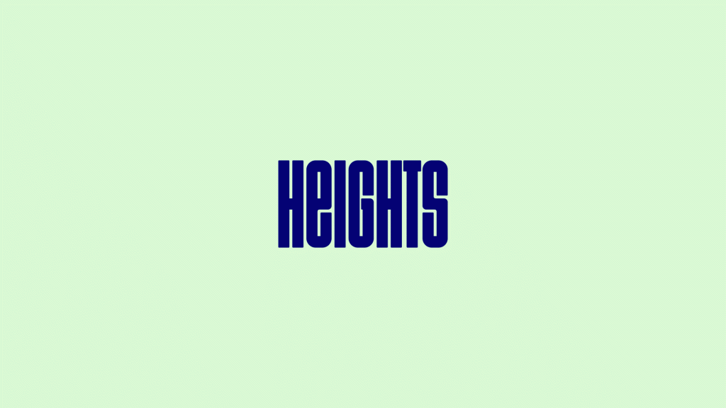
The centrepiece of the visual identity is a ‘stretchable’ logotype that can expand into a flexible pattern – a simple, scalable system, designed to be as adaptable as our brains.
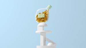
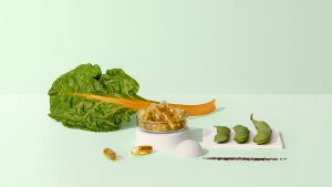
Beyond the logo, the visual system is calm and premium, in direct contrast with the rest of the category’s high-energy quick fixes. The colour palette borrows credibility from the healthcare category with blue and green hues, but the tonal variations are designed to evoke a lifestyle feel. And imagery, created in collaboration with photographer Kuba Wieczorek, combines a refined, high-end aesthetic with compositions that play on the idea of taking your brain to new heights.
With the strategy and identity complete, Ragged Edge helped Heights deliver the brand, working with a range of partners to ensure the experience was coherent at every stage of the journey.
Source: Ragged Edge
Ragged Edge gives smart supplement brand Heights a brain-stretching identity added by newsroom on
View all posts by newsroom →
You must be logged in to post a comment Login