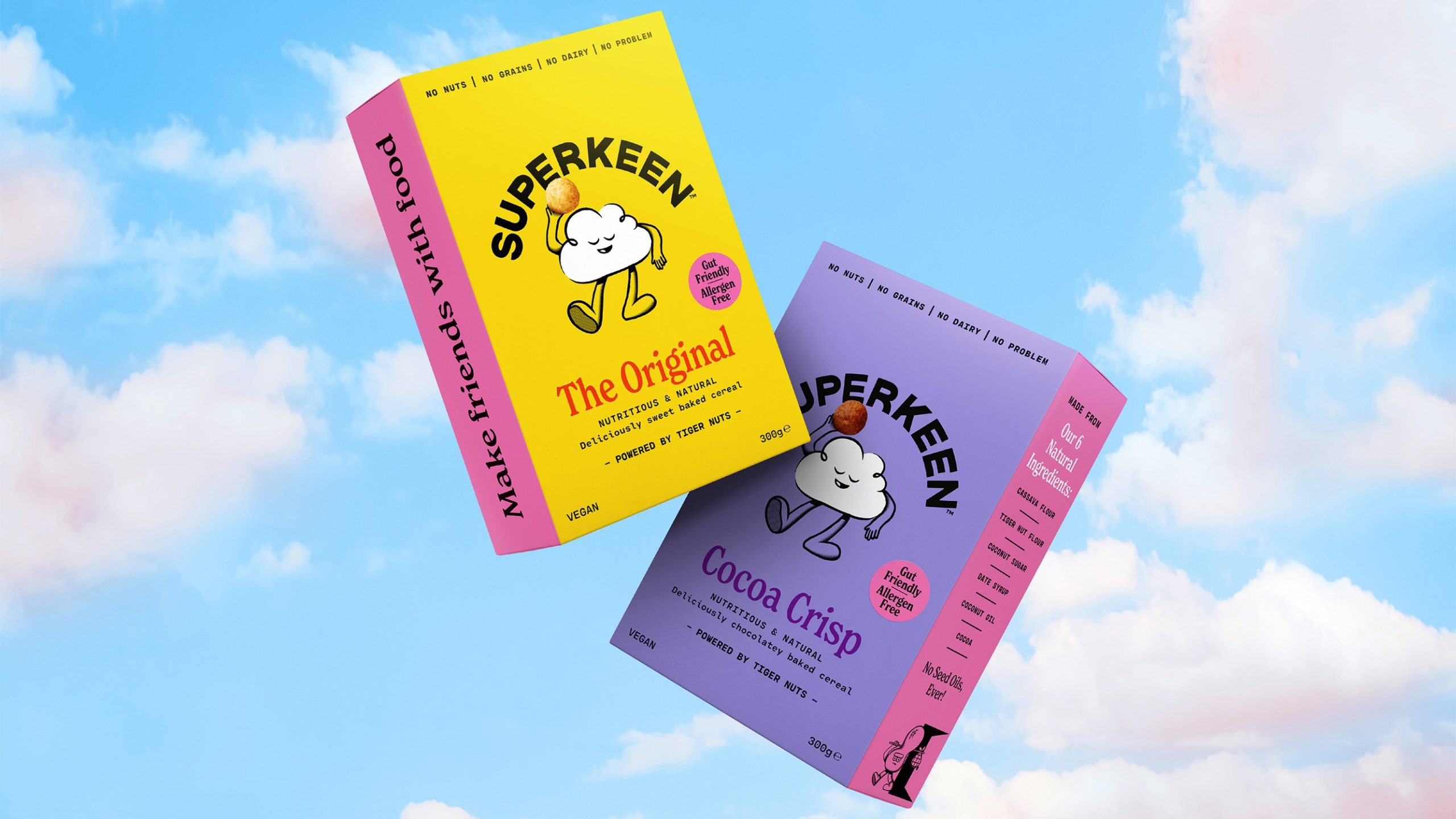
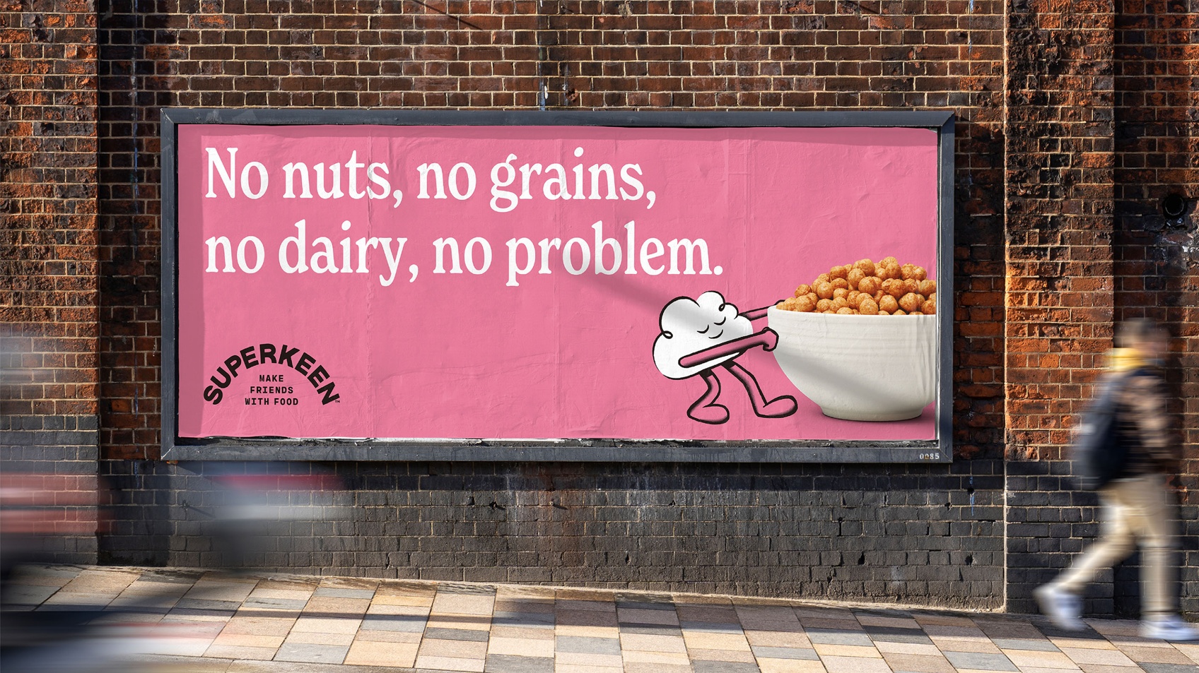
B&B studio has worked with founder Caragh Keane to create SUPERKEEN, a food and wellness brand designed to support an anti-inflammatory lifestyle. Inspired by Caragh’s own diagnosis of auto-immune disease lupus, and her experiences with the ‘Auto Immune Protocol’ (AIP) way of eating, SUPERKEEN is launching with a range of allergen-free cereals powered by tiger nuts.
Encompassing brand positioning, creative strategy, brand naming, and all brand design and packaging, the project is the latest brand creation to come out of B&B studio, an agency known for its highly successful launches in food, drink and wellness, including BEAR, Pip & Nut and Kit & Kin.
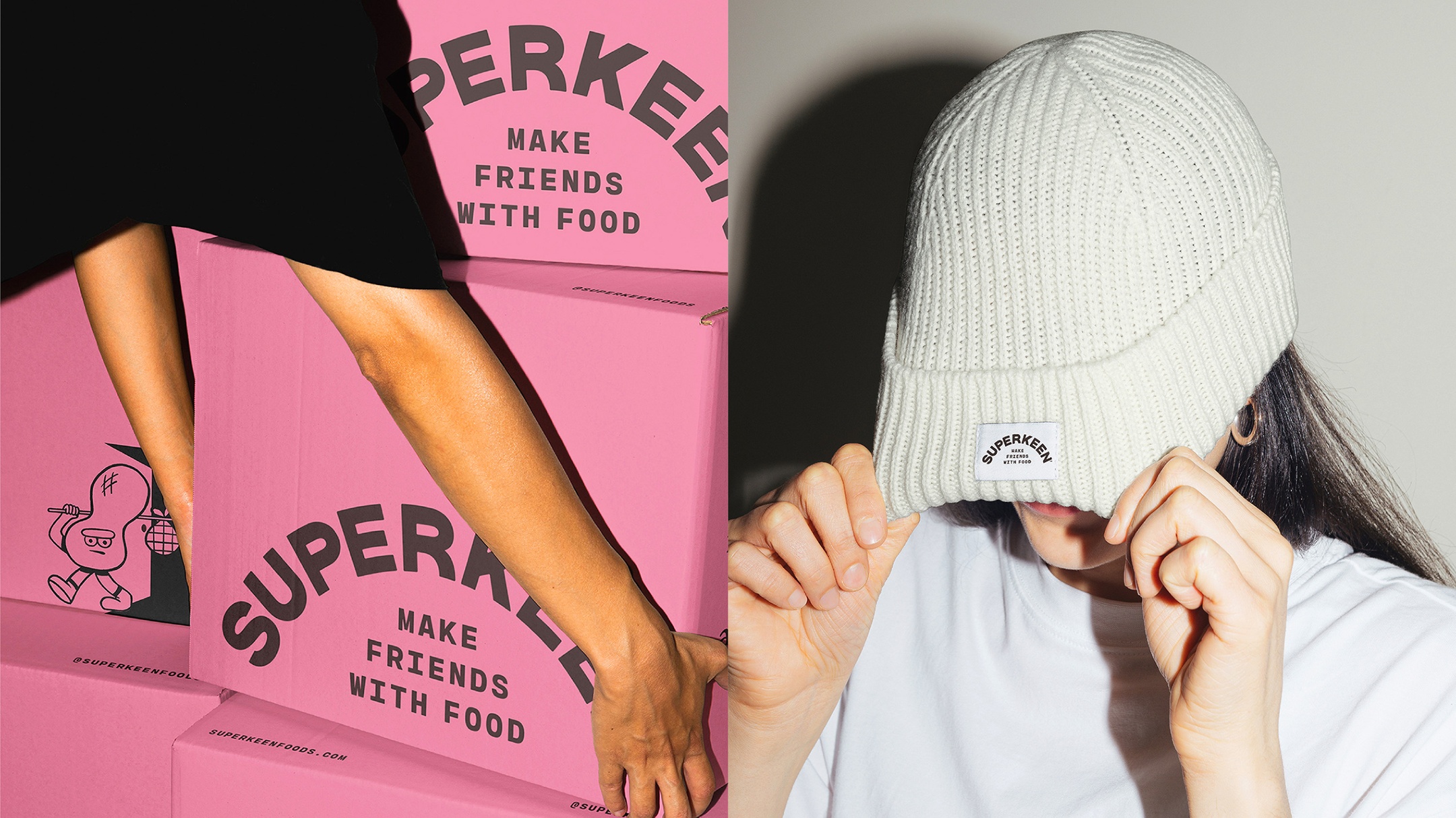
Make Friends With Food
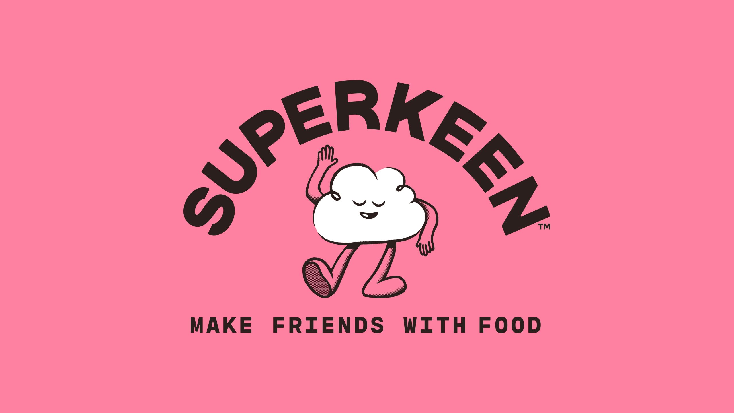
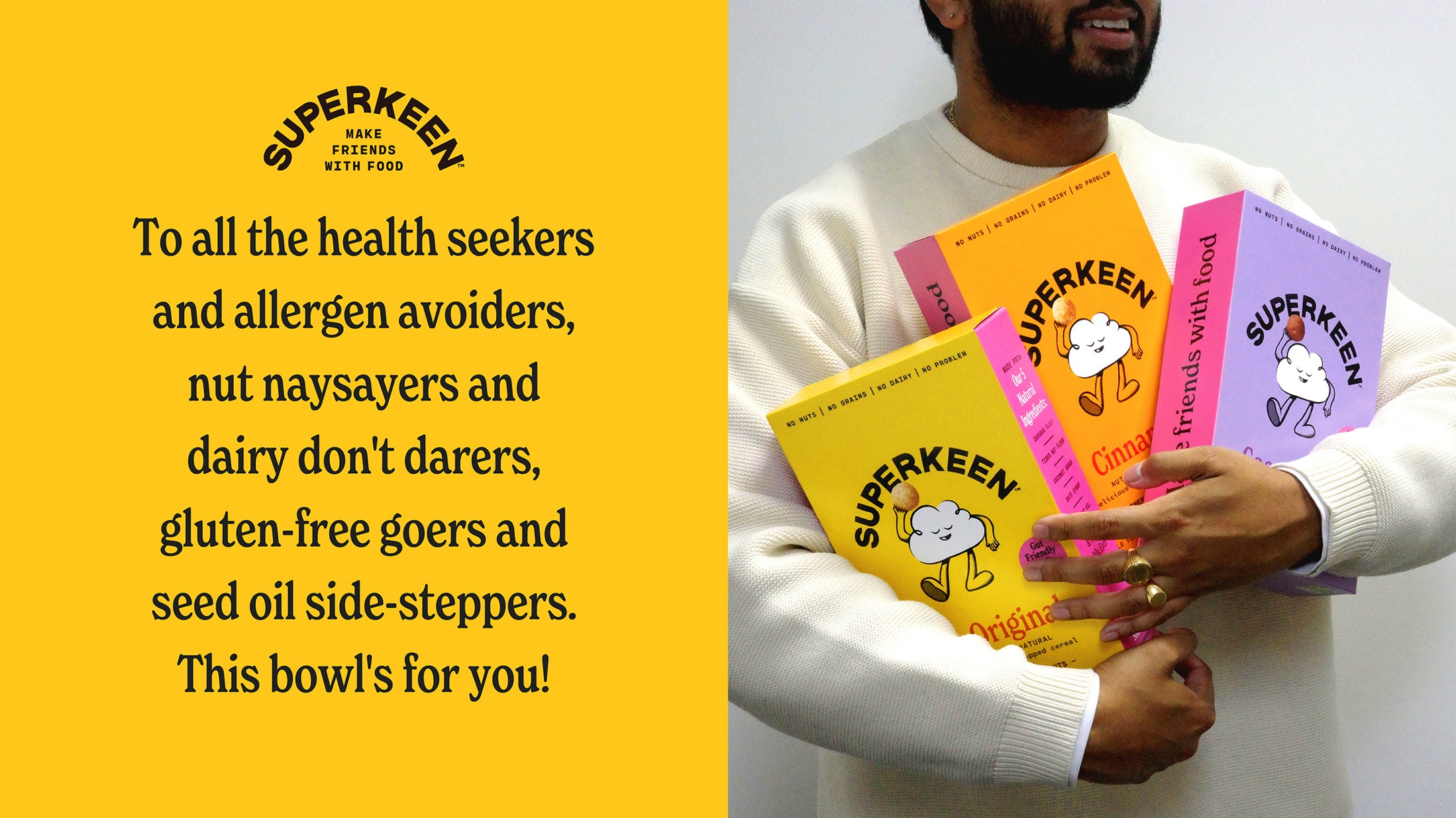
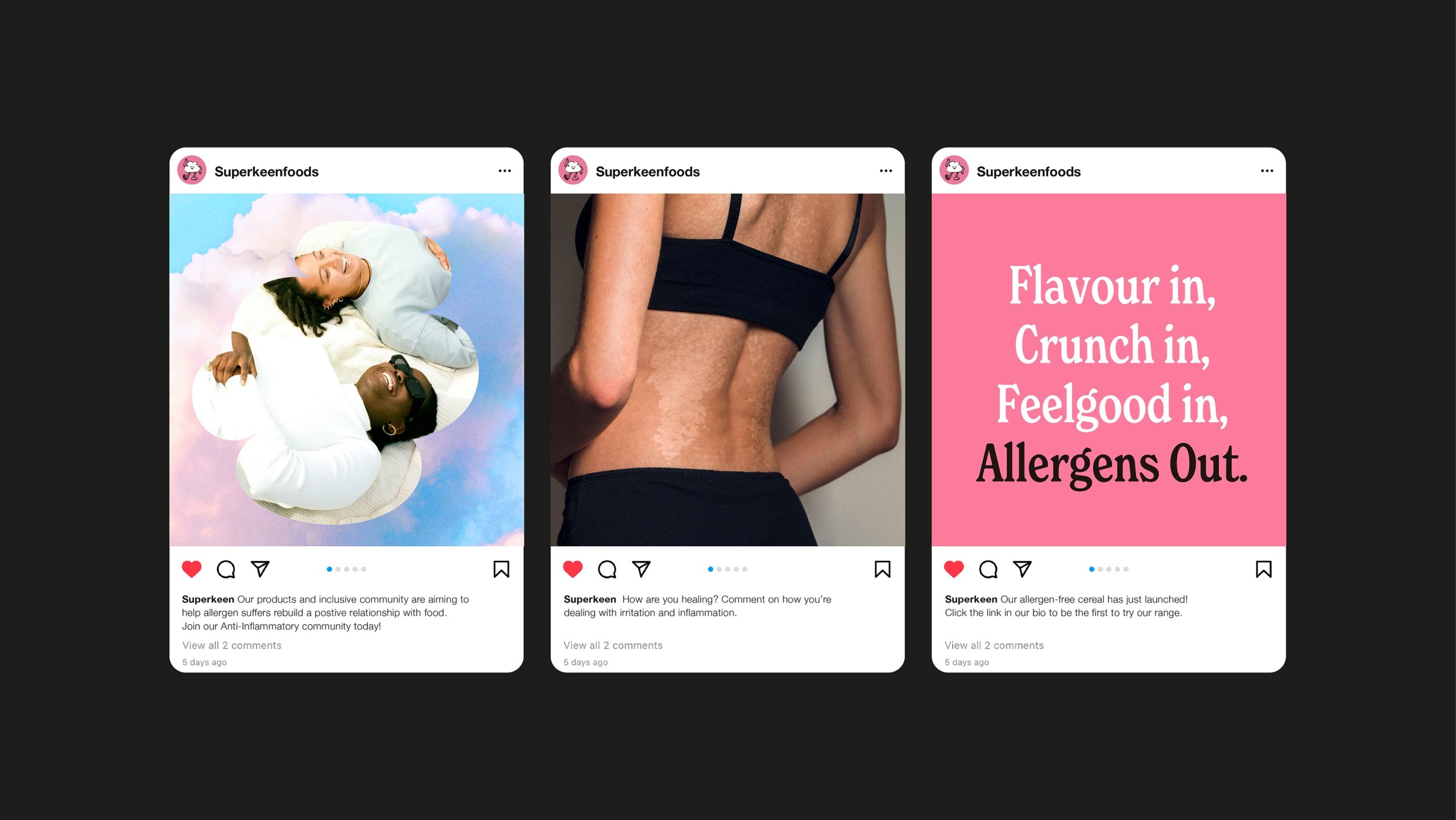
Understanding people’s emotional relationship with food was key to B&B’s approach, particularly how those with auto-immune issues or food allergies can often feel alienated from branded offers. Drawing on this, B&B built the brand positioning around the big idea of ‘Make Friends with Food’ and mapped out a direction for the brand inspired by community, inclusivity, and support. Importantly, the brand is targeted at all health seekers who are looking to avoid inflammatory foods – not just those with allergies. The name SUPERKEEN is a play on founder Caragh’s surname and captures the positivity and enthusiasm that both she and the brand represent.
What Does Anti-Inflammatory Feel Like?
The creative brief for design explored the feeling of being free from inflammation, an idea that led directly to the design of the brand’s mascot – Cloud Guy. Calm, floaty and laidback, Cloud Guy embodies the feeling of lightness that comes with bodily wellness and represents the anti-thesis of inflammation. Celebrated front and centre within the brand design, his chill vibes set the tone for the rest of the brand world. From graphic shapes to physical materials, the brand is characterised by rounded forms, curved edges and soft textures – all combining to exude an anti-inflammatory feel.
A bold brand colour – positive pink – roots the brand among a peer group of contemporary challengers and is accompanied by a palette of flavour-inspired shades. The arched wordmark adds craft and quality, subtly balanced by its characterful, all-caps, typography.

Characterful Inclusivity
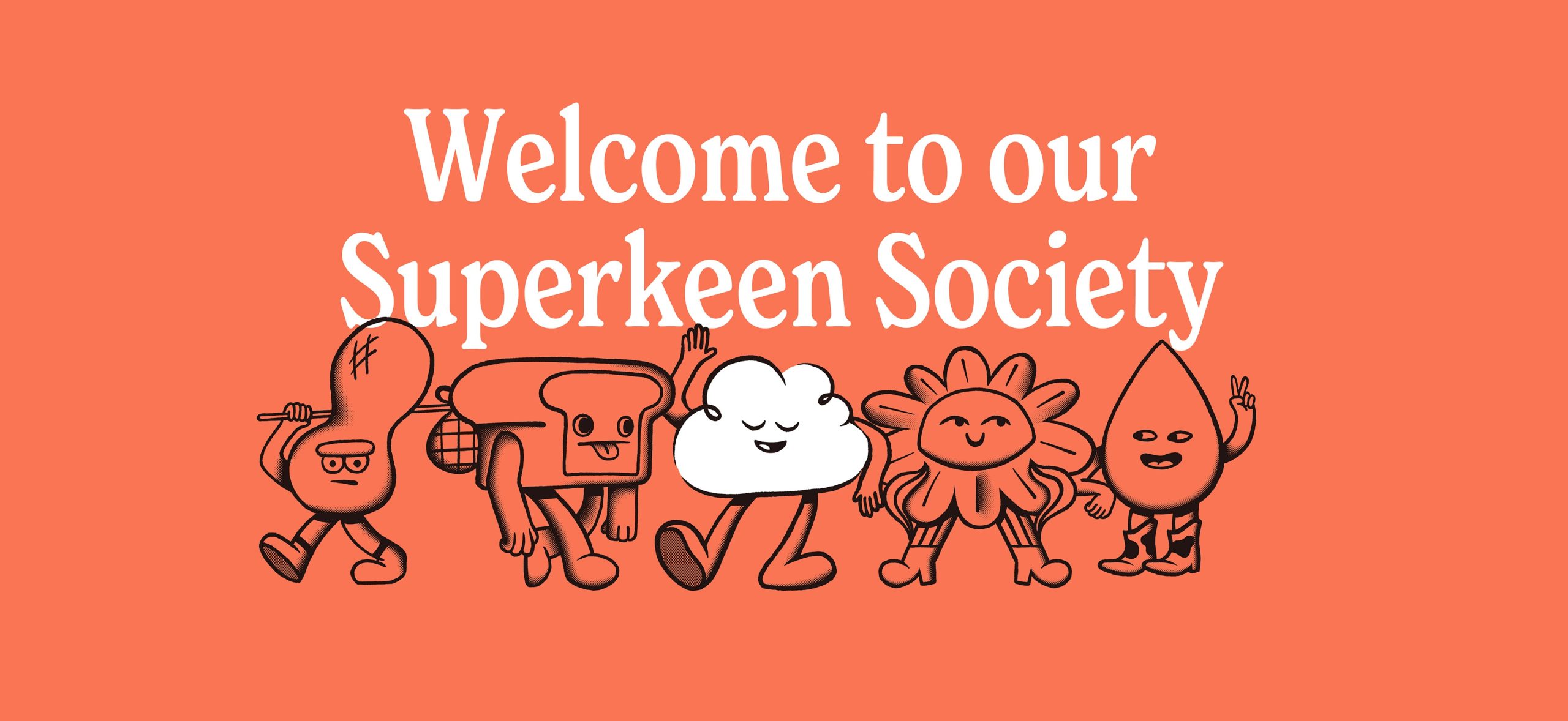
Created for a diverse audience of health seekers, allergen avoiders and AIP eaters, SUPERKEEN is designed to appeal to all ages, from kids to grown-ups. While Cloud Guy – and his accompanying crew of allergen-inspired characters – bring a child-friendly sense of fun to the brand, their simple style and witty characterisation connect equally powerfully with an adult audience.
Lisa Desforges, Head of Strategy at B&B studio, says: “It has been a pleasure to work with Caragh on the creation of SUPERKEEN. The ‘Make Friends with Food’ idea perfectly captures her positive approach to wellness and has set the tone for an irresistible brand. We can’t wait to see her succeed.”
Founder Caragh Keane comments: “SUPERKEEN is all about providing great tasting food for all kinds of people and offering a sense of solidarity and support for those with food-related allergies and illnesses. B&B has made sure that everyone will want to be a part of this highly desirable brand, whatever their health status.”
SUPERKEEN can be found online at www.superkeen.com
Source: B&B studio
B&B studio creates SUPERKEEN – a food and wellness brand for an anti-inflammatory lifestyle. added by newsroom on
View all posts by newsroom →
You must be logged in to post a comment Login