Big Lottery Fund (The Fund) has announced its rebrand to The National Lottery Community Fund.
23red was appointed last year to undertake a strategic review of how the People in the Lead strategic framework was being interpreted across the business, as well as develop a brand narrative for The Fund and review whether a rebrand would be beneficial.
23red went on to conduct workshops and in-depth interviews with staff from across the business, ultimately identifying different interpretations of ‘People in the Lead’, before settling on one consistent narrative to enable clear and consistent communication of who The Fund is, what they do and why they do it:
When people are in the lead, communities thrive.
People understand what’s needed in their communities better than anyone.
We listen, collaborate and fund so that good things happen.
That’s why we’re proud to award money raised by National Lottery players across the UK.
Alongside this, the agency explored alternative names for the organisation, testing them with staff and grant holders. ‘The National Lottery Community Fund’ was selected because it better articulates the organisation’s work but also clearly aligns it with The National Lottery, helping players to understand the difference they make when they buy a ticket.
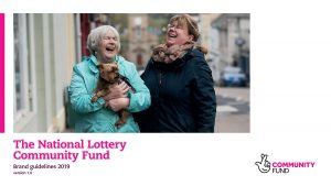
Introducing a new name led to the design of a new logo that still retains the signature magenta colour of the original, as well as comprehensive brand guidelines. This included updating the brands tone of voice and personality alongside looking at other design features such as typography, photography, icons, how the brand would look in print and on screen and ensuring full accessibility.
Emma Taylor, Business Director at 23red, said: “For the Big Lottery Fund, it was really important for people to understand where the money comes from, how it is used and why. At its very core The Fund is about collaborating with communities to make good things happen, but it has been doing this for over a decade already, so we simply wanted to bring that alive by evolving what was already there, rather than reinventing it.”
Jenny Olsen, Senior Head of Communications at The National Lottery Community Fund continued: “The Big Lottery Fund and its signature magenta logo has a lot of brand equity and impact, but if we asked people what we really do we’d have gotten a lot of different answers. What this rebrand does brilliantly is tell all our stakeholders – employees, grant holders and National Lottery players alike what we do, who we do it for and firmly positions us as part of The National Lottery family.”
Source: 23red
Big Lottery Fund Rebrands as The National Lottery Community Fund added by newsroom on
View all posts by newsroom →
You must be logged in to post a comment Login