 Border Biscuits, which generated more than £14.5 million in sales in its last financial year, has announced the launch of its new brand identity developed by brand consultants, Coley Porter Bell. The work – rolled out at the end of January 2016 – aims to modernise the brand to help build on its success in the ever more competitive biscuit aisle.
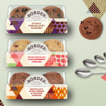
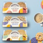
Utilising its established visual planning process, Coley Porter Bell developed the idea of ‘Family Biscuitiers’ to convey Border’s perfectionist qualities. The scope of work included creating 21 retail packs across 4 ranges, as well as rolling the design out across mini-packs for food service and a new gifting offer, which is due to launch later in the year.
 The aim of the rebrand is to move the range from product-led to brand-led. Previously the emphasis had been on the biscuits themselves and there were few ‘Border’ equities. However, with a brief to increase listings and distribution it was critical to build value into the Border brand by creating a master brand design system, which still allowed the product personalities to shine.
Lesley Ann Gray, Brand and Marketing Manager of Border Biscuits commented on the new design: “We’re a privately owned business and all of our staff share our vision of making exceptional biscuits that people love and we go to great lengths to do this. We really wanted to tell this story through our biscuit portfolio and feel the work Coley Porter Bell did encapsulates the company ethos. Our new packaging will appeal directly to our loyal customers, who’ve supported the brand for over 30 years as well as attracting new ones to the brand.â€
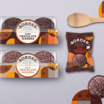
 The concept for the design was inspired by the precision and exacting standards applied to the baking of the biscuits. Each shape – a circle for Classic Recipes, an oat shape for Oat Crumbles, a triangle for Cookies – is divided into different hand-drawn illustrations and blocks of colour, each representing the ingredients and textures in the biscuit. They are executed in a perfectly imperfect way to convey the hand-crafted nature of the baking process.
Every aspect of the brand identity has been updated. Coley Porter Bell evolved the logo to feel more contemporary and crafted. The addition of the hand-scripted ‘Family Biscuitiers’ and ‘Since 1984’ helps provide provenance and a key point of difference versus the mainstream mass-produced biscuit manufacturers.
 Maintaining the fun and charming tone of voice – Coley Porter Bell focused the messaging on to the elements that communicate Border’s point of difference, for example the introduction of ‘Our Philosophy’ on the back of pack. They also made the sub-brands and product names clearer and more consistent in their execution to help shopper navigation.
The packaging reflects the craft, passion and rigour of the baking process of the team that is responsible for producing the product. This has been conveyed by the use of vibrant, natural colours which inject a greater sense of warmth and ‘foodie’ qualities.
Carolyn Sweet, Senior Designer, at Coley Porter Bell commented: “From very early on we were inspired by the Border team’s obsession and passion for the perfect biscuit. There is a great mix of precision and creativity throughout their process and this really led the concept and is reflected in the designs. The quality of the biscuits is second to none so we wanted to do them justice and give them packaging that is a thing of beauty and admiration.â€
Coley Porter Bell Help Border Biscuitiers Bake Better Biscuits added by newsroom on
View all posts by newsroom →
You must be logged in to post a comment Login