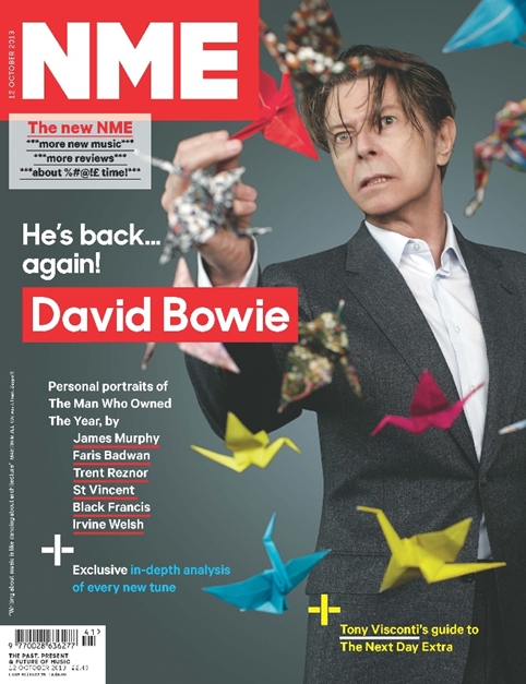
 NME has been redesigned with a new look and a new logo in a bid to assert ‘authority, credibility and depth of knowledge.’
The design has been led in-house by art director Mark Neil under new editor Mike Williams.
NME last redesigned in 2010 under art director Joe Frost and former editor Krissi Murison.
This latest redesign follows a steady decline in print readers over the last few years and a drop in circulation.
The new logo has been credited by NME as reasserting the magazine’s ‘power and credibility.’
Neil says he ‘looked back to go forward’, unarchiving the work of NME art director Barney Bubbles from the late 70s – ‘who created the initial NME mast stencil.’
Although the cover has been designed with a clean aesthetic, inside the magazine has ‘a cut-and-paste fanzine feel, like a digital scrap book.’
The main display font is Sharp Sans, a sans-serif font by Lucas Sharp, and a redrawn version of this has been used in the main identity.
 Inside, a sans-serif Calibre by Kris Sowersby and a serif font Tiempos Text have been used across copy.
Neil says the new design will allow the NME to forge ‘a better connection between fans and artists’.
The print magazine, which relaunches tomorrow, has a new matte cover stock and has been reorganised around new editorial content, such as a bigger Radar new music section, which links to a playlist driven section of the same name on NME.com, which is also going to be overhauled.
Its Review section has been redesigned to make space for more in depth reviews of records and gigs and a new From The Vault section makes use of NME’s 60 year archive.
A refreshed Guide section has been introduced to now include a Staying In section.
NME redesigns with new look and logo added by newsroom on
View all posts by newsroom →
You must be logged in to post a comment Login