Pearlfisher is celebrating saying “YES” to Pudding with a new strategy, packaging redesign and portfolio review for Hartley’s 10 Cal Jelly.

The nation’s iconic jam and jelly brand, Hartley’s introduced its 10 Cal Jelly Pot range 7 years ago, but it was time to modernise the brand’s expression. Pearlfisher was tasked with making it the definitive go-to for anyone wanting to maintain a balanced lifestyle whilst still saying yes to pudding, bringing joyful fruity moments into everybody’s every day and helping Hartley’s 10 Cal Jelly expand its future offer.
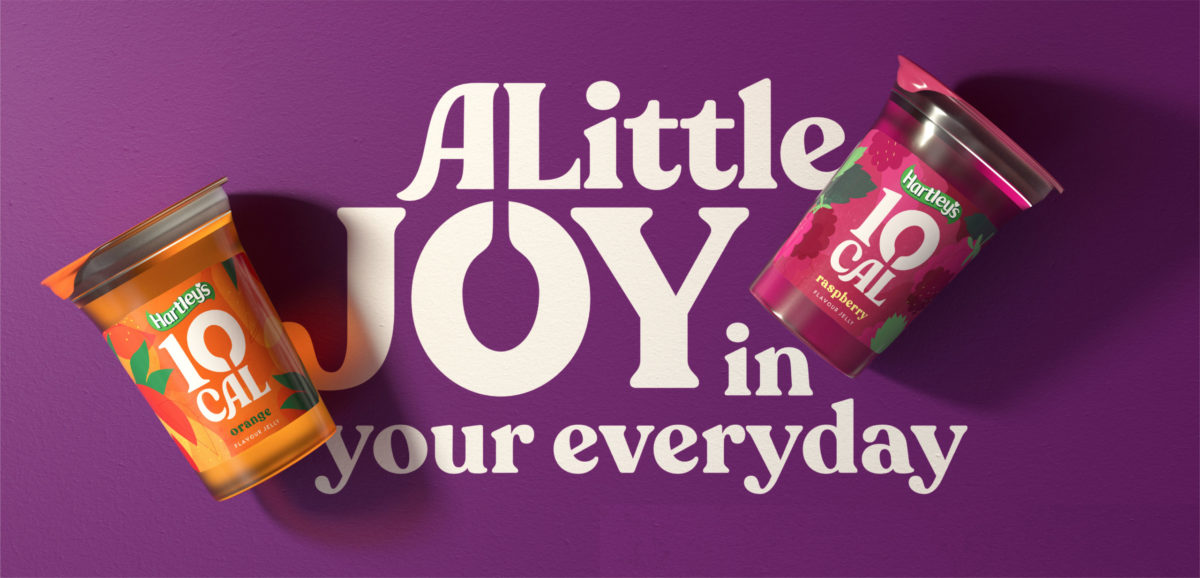
Pearlfisher Partner, Vision & Strategy, Yael Alaton, said, “Being ‘on a plan’, whether that be dieting, Diabetic or simply making healthier choices, is often perceived as restrictive and limiting, but in today’s world, keeping a healthy and well-balanced diet should be all about positivity and celebrating choice as part of a fulfilled lifestyle. We needed to appeal to a contemporary audience, packing the brand with taste and personality, to show how this pot of low-calorie jelly could be a bigger part of their lives and lifestyles. Ultimately, creating a brand that celebrates the opportunity to say YES to pudding for those who otherwise have to say no.
Design Director, Jess Phillips, talked through the design approach: “We arrived at a design essence of ‘little exhilarations’, basing our redesign of the packaging – for both the core range and across the portfolio – around the idea of a more liberated, inviting, joyful and positive expression.
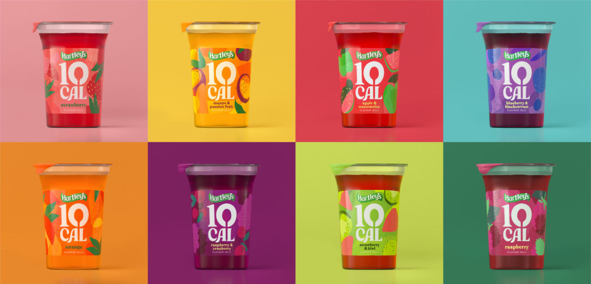
Jess continued, “We lifted the logo to lead with the Hartley’s master brand and enhance the readability of the Hartley’s 10 Cal Jelly name – adding more joy and personality with a bespoke, rounded and playful new logotype. Our new spoon icon, sitting at the heart of the identity in the 0 of the 10, dials up the idea that this is a product offering a generous and fruity spoonful of joy to look forward to.
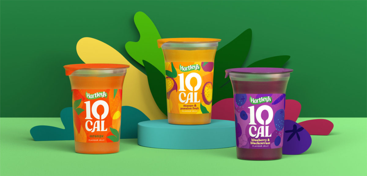
To differentiate Hartley’s core ranges, the colourful packaging design and imperfectly placed illustrations of the “Fruity Core” range now burst with taste, personality and a new sense of freedom. For the “Fruity Treats” range, we have used a similar style of illustration, to draw out the taste factor of the different choices, capturing an irreverent feel with, for example, an angel wing added to the illustration of a jam doughnut to signify its light and low-calorie offering.
Elizabeth Fox, Senior Brand Manager from Hartley’s, said, “Pearlfisher’s design has absolutely moved us into the territory of modern icon – it clearly shows the fruity element of our products, and offers so much more in terms of a new emotional connection, and how we can build a new place and space in our consumers’ lives. Hartley’s 10 Cal Jelly is all about saying ‘YES’ to pudding and having such dynamic visual assets and an integrated portfolio will drive the standout on shelf for consumers. We’re so excited about this next step for the brand and looking to build on the brilliant foundation of fantastic growth we’ve seen over the past 3 years”.

The new-look Hartley’s 10 Cal Jelly range will hit shelves in all major retailers nationwide in January.
Source: Pearlfisher & FAB News
Pearlfisher brings joy to jelly with new design for Hartley’s 10 Cal Jelly. added by newsroom on
View all posts by newsroom →
You must be logged in to post a comment Login