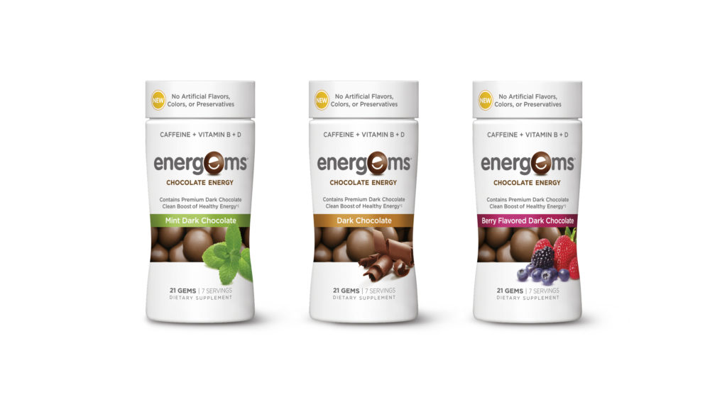
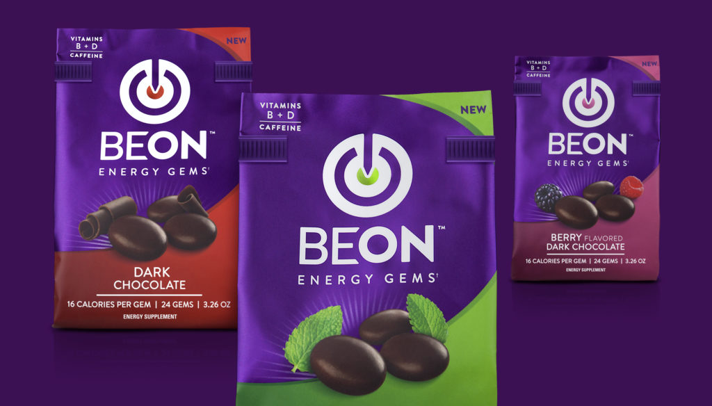
BeOn, the chocolate energy brand has recently undergone a full strategic rebrand with the help of global strategic brand design agency BrandOpus.  The rebrand encompasses a new name, new identity and new business model.
Previously called Energems, BeOn provides great tasting, bite-sized chocolate gems that can be eaten on the go and provide as much caffeine as the average cup of coffee.
In a fast-paced, convenience driven culture, time and energy comes at a premium for many and for years there has only been a few alternatives to coffee.  BeOn delivers a little lift to consumers so they can be ready to go, whatever the occasion.  This new format has opened up the energy category to a new market, looking for an alternative to the high sugar, jitter inducing energy drinks.
Our brand strategy and naming positions BeOn as a wellness lifestyle brand.  In order to drive relevant meaning, we introduced symbolism to the brand identity that represents the idea of self-optimization.  Expressing the idea of being on target, BeOn allows people to switch on the best version of themselves.  Backed by a powerful masterbrand look and feel, the design communicates a strong and confident personality whilst achieving effective stand out across all touchpoints.
 Whereas previously Energems was only available in drugstore and supermarkets aisles, BeOn now has a subscription based model in order to better meet the needs of its consumers.  The new model will deliver chocolate energy straight to your door.
Kimberly Dunphy, Creative Director at BrandOpus says, “BeOn needed to shift from its niche position in the supplements aisle to become relevant for the more mainstream ‘on the go’ consumer.  The rebrand is single-minded, bold and energetic which is exactly how you feel once you’ve tried BeOn.â€
Source: BrandOpus


You must be logged in to post a comment Login