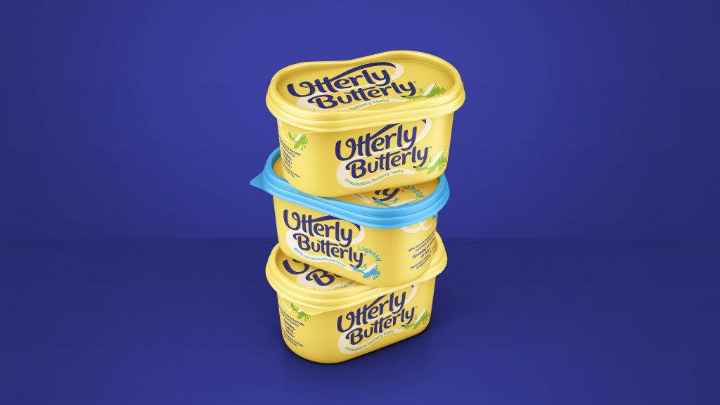
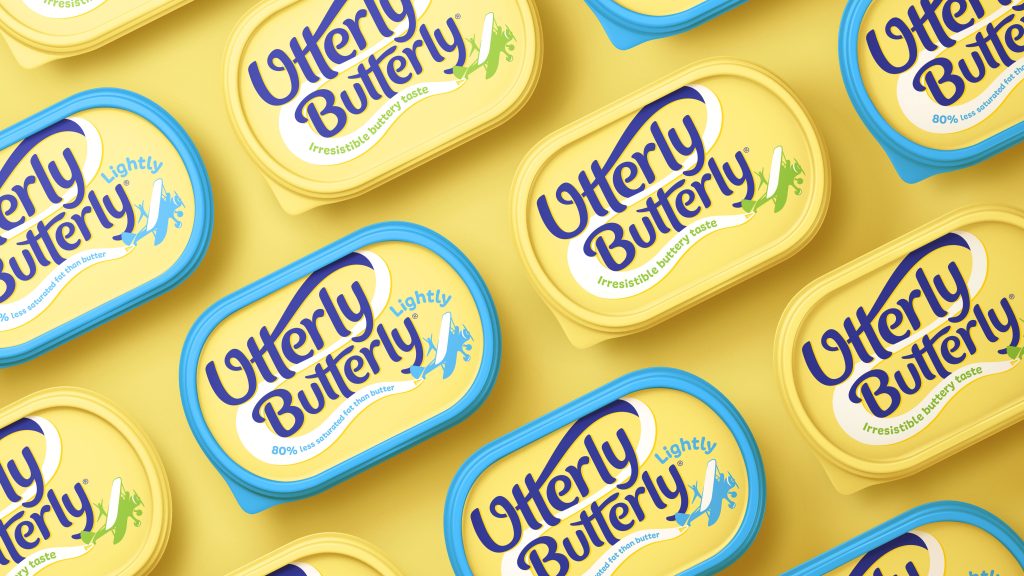
Saputo Dairy UK have teamed up with global brand-led creative agency,BrandOpus, to deliver a playful overhaul of its signature value spread brand Utterly Butterly. In a move to enhance its position within the sharp-elbowed dairy spread category, the brand refresh aims to better connect with consumers emotionally through a joy-fuelled identity and pack.
Renowned for its irresistibly buttery taste, famous wing-walkers, and humorous historical adverts, Utterly Butterly quickly became a favourite in UK households in the late nineties. BrandOpus was approached based on its strong heritage in the FMCG space. The agency has a reputation for supercharging well-loved brands – including McCain, Rustlers, Princes and Oscar Mayer – who are faced with increasingly competitive and cluttered marketplaces.
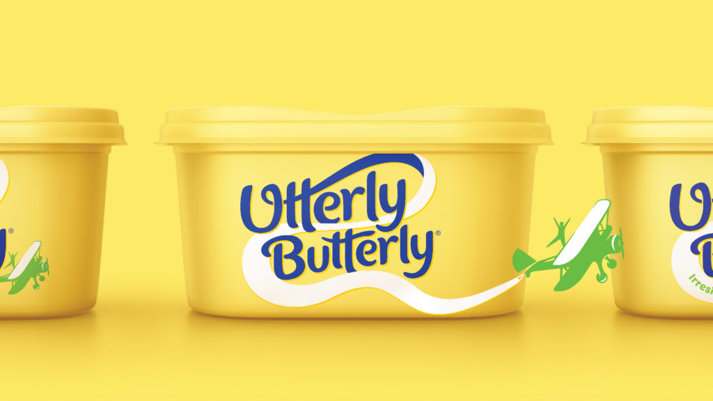
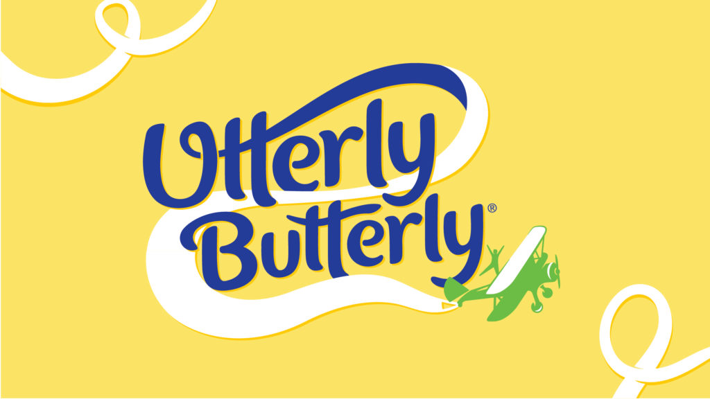
The BrandOpus team identified that the spread brand lacked an emotive meaning and needed to better differentiate itself against own-brand. The new work sets out to create a more distinctive and ownable identity by introducing a quirky symbol – a daredevil aerial acrobatic flexing on a plane. Leaning into Utterly Butterly’s playful nature, the new icon pays homage to the brand’s aerobatic heritage. Utterly Butterly were a key sponsor for the AeroSuperBatics Wingwalkers – the world’s only aerobatic formation wing walking team.
By uniting the spread brand with joyful entertainment and family spectacles, the symbol suggests associations of fun, escapism & light heartedness. Accompanying Utterly Butterly’s bold and bubbly word mark is an expressive flight path graphic, which links up to create the banner of the plane – another nod to the brand’s heritage. Its soft and inviting colour palette has been preserved and lightened to feel more in line with the modernised identity. A splash of fresh white has been introduced, whilst its original buttery accents have been removed.
Ellen Munro, creative director, BrandOpus, comments: “Our mission was to draw out the brand’s memorable quirks and deliciously unserious personality to reinvigorate the family favourite. The introduction of the aerobatics visual helped us to do both things at once; bringing more meaning into the brand and giving it a new distinctive symbol.”


Emilie Grundy, Marketing Controller, Utterly Butterly, comments: “Our brand look and personality had eroded over the past few years, so it was time to re-establish the meaning we bring to consumers lives, over and above functional benefits. We’ve always been an irreverently playful brand – one that doesn’t take itself too seriously, and that was something we really wanted to own on shelf. Not only does the refreshed identity seamlessly capture our personality, but it also evokes nostalgic memories of years gone by for many of our loyal shoppers who have loved the taste of our spread for decades.”
Source: BrandOpus

You must be logged in to post a comment Login