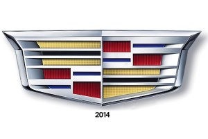
 The luxury car brand Cadillac has a new crest, updated for the 21st century.
The new logo has no wreath, and has been made more trapezoidal while retaining its colors, grid and center-line peak.
Each color represents a quality of the brand—red represents power and bold actions, blue stands for valor, with black and gold representing wisdom and riches.
Designed by General Motors’ 35-member global industrial design team, they started conceiving designers for the new emblem back in summer 2011, with creative designer Nathan Korkus making the brand more youthful while still retaining its history.
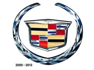 “In this iteration, you’ll see the crest matches our longer, lower and leaner mantra that we have on the current portfolio of vehicles. It mirrors the evolution we’re going through on our art and science philosophy,” stated Andrew Smith, the executive director of Global Cadillac design.
Anne-Marie LaVerge-Webb, General Motors’ brand identity studio design manager, stated that the new emblem also had to meet the pedestrian safety standards in Europe, as it could not stick out too much from a vehicle. Long-range radar technology should also be able to operate through the crest.
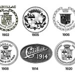
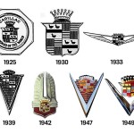
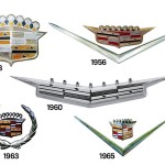
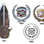
The emblem has undergone 38 iterations over nearly 112 years, and was originally the coat of arms for French explorer Antoine de la Mothe Cadillac, who founded Detroit in 1701.

You must be logged in to post a comment Login