Since 1956, Promax has been connecting entertainment marketing professionals across the globe. But as the industry has shifted from linear to digital in recent years, the company recognized an opportunity to expand its community of marketing executives beyond the confines of traditional TV. This year, Promax launched an updated brand identity and architecture to take it forward into the future of entertainment and better serve members.
loyalkaspar’s job was to create a fresh visual identity and a user-friendly superstructure that would promote clarity, community and inclusivity to future members while remaining flexible for Promax to use across sub-brands, annual opens and future projects.
Beat Baudenbacher, Principle and Chief Creative Officer at loyalkaspar said: “Our goal was to create a new brand that conveys a certain sense of authority while remaining approachable – one that reflects the supportive, playful community that Promax represents.”
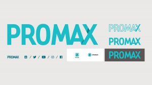
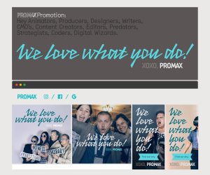
To achieve an open and confident identity, loyalkaspar created a slick yet personable masterbrand, including a new, modern logotype, a custom typeface, a range of patterns with a premium, singular blue color scheme, and a campaign line to highlight the human element of Promax.
“We wanted the masterbrand to be very graphic” said Baudenbacher. The challenge then, was to keep the brand’s personality warm and inviting, when ‘geometric designs can sometimes feel cold’.
From the start, the team had an obsession with simplicity to clearly convey what exactly Promax is. The new brand had to be inviting, modern and confident, while also conveying a sense of community.
Baudenbacher honed in on the fact that the first three letters of Promax contain curves, while the last three contain straight lines and angles. That led to the idea of combining the “A” and the “X” which developed into an entire brand architecture where the forward slash of the “X” becomes a functional activator, visually connecting Promax to its sub-brands and clearly conveying what the organization offers. The forward slash also is used to influence the organization’s overall voice, adding a fun, text-based design to the way Promax talks about itself. Using these connected, almost knit together patterns represents the idea of community and connection between the different members.
To contrast the compact Promax logotype, Baudenbacher wanted a typeface that felt a little loose, a little “less serious”. Because he couldn’t find one, the team at loyalkaspar designed their own. Proxy Mono is based on the geometry of the Promax logo, so there’s a visual connection, despite the purposeful contrast. It feels a little tech-y, a little vintage and a little not-trying-too-hard.
A light and airy blue was also chosen as a palette reducing the brand to one recognizable color that’s displayed in different shades. The neutrals were very important because Promax needs to be able to live with a lot of other brands – networks, partners and sponsors – that they can’t control. Together, those elements establish the Promax brand as fun, defined and community-focused.

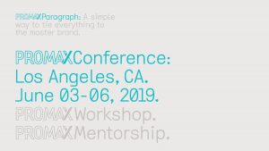
A key function of the new brand structure had to be its usability. It had to work for Promax’s small internal marketing team, loyalkaspar wanted to ensure that the visual identity was easily applicable in a range of contexts. Cue a massive “Aha!” moment for Baudenbacher: making the Promax logotype typable within Proxy Mono, so that the Promax team could “make the entire brand in Microsoft Word if they had to.”
A typable logo allows for teams to use brand signalling quickly and effectively in all communications – all they need is the right keyboard command and to adhere to what Baudencbacher calls “The Promax Paragraph” – a simple enough formatting rule to follow: ditch indents and align all text to the top left margin.
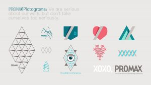
In the same vein, the dominant use of patterns rather than narrative scenes in the visual language helped the in-house marketing team cut-down on time spent cropping images for socials – fewer heads to chop off makes everyone happy!
Beyond maximizing ease, these additions contribute to the brand’s approachable feel, and its flexibility recognizes the human hand in the brand.
Promax’s branding needs to be flexible enough for internal use and new developments as the organisation continues to grow and expand into the future of entertainment, building new sub-brands, and partnering with a range of other companies for events and programs.
Baudenbacher said: “We wanted to create an informational structure that could sit on top of anything, and that informed the way we treated the logo and the layout of information. Underneath the new creative, the brand should be flexible.”
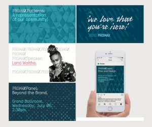
With a focus on customization and simple application across contexts, loyalkaspar succeeded in giving Promax room to grow while maintaining a strong, recognizable brand identity built to go the distance. Already the brand’s adaptability has been showcased through videos and conference packaging that loyalkaspar supplied for the Promax 2019 Open and Promax Games.
Informed by the new masterbrand, the videos take on a life of their own, with adjusted colour schemes and animated expansions on the already recognizable Promax colors and patterns. The videos convey the personality pillars the loyalkaspar team infused into the fresh brand: playfulness, collaboration, inventiveness, proving the breadth and depth of the redesign.
Source: loyalkaspar
loyalkaspar redesigns entertainment marketing association Promax brand for the future added by newsroom on
View all posts by newsroom →
You must be logged in to post a comment Login