Leading catastrophe investment manager, Nephila Capital, unveils its rebrand, complete with a new logo, website, and brand identity to help own their spot as market leader in non-correlated exposures in the insurance, reinsurance and climate markets.
Brand design agency, Coley Porter Bell, part of WPP, was brought in to help Nephila Capital more appropriately reflect both the firm’s essence, and the range of services it now provides. Nephila Capital also wanted to better memorialise and leverage its 22 years of culture and values evolving from a 26-person start-up to a fast-growing multinational company serviced by over 200 employees.
The new brand strategy was based on a series of interviews with Nephila Capital’s key stakeholders, including investors, brokers, counterparties, employees, and senior management. These interviews uncovered Nephila Capital’s brand strengths, and weaknesses; its values, culture, and public perception.

Coley Porter Bell’s proprietary Visual Planning approach was then used to translate these foundations into a new brand positioning and strategy which went on to inspire development of the identity.
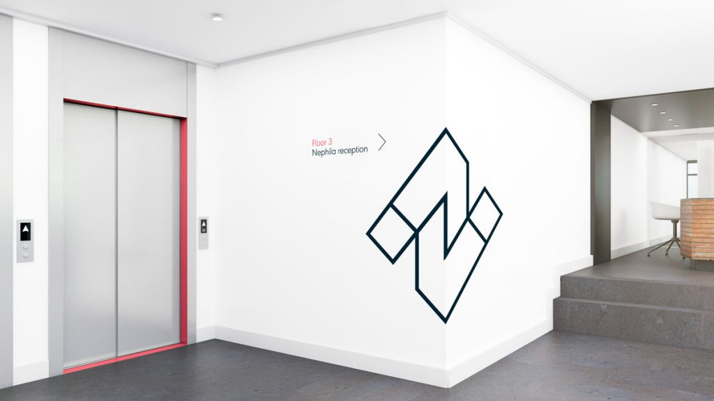
The logo containing Nephila’s first initial, ‘N’, was inspired by the Penrose Triangle as a way of demonstrating to the viewer that the company and the world in which it operates can always be viewed from different perspectives. The see-through lens device works seamlessly in conjunction with photography and imagery, while the use of a 90-degree rotated typeface reflects and interacts with imagery in a unique way.

The new sophisticated subdivision of colours reflects the various components of the business, including the master brand (cherry red), climate (bright jade), syndicate (electric blue), portfolio management (aqua) and reinsurance (orchid) that the business has expanded into since being founded in 2009. Each colour was chosen to help the brand emit a confident, calm, authoritative incisive approach to the world of capital markets and the premium feel sets the brand apart from more conservative competitors, inviting the viewer to look again.
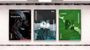
Coley Porter Bell also developed visualisations of some of the crises Nephila’s clients face, such as crashing waves, stormy skies and climate change. It was also vital that the brand’s namesake, the Nephila spider, featured in the new set of visual assets. The use of a spider web helps complement the sophisticated colour palette by showing the brand’s focused determination to create its own network and intuition to predict risk.
Helen Westropp, Managing Partner, Coley Porter Bell, said: “Nephila has evolved to the point where the brand didn’t match the firm’s broadening capabilities. Charting out a brand strategy and visual identity for the brilliant story behind Nephila was an exciting project to work on and will lay the groundwork for the business for many years ahead.”
Greg Hagood, co-CEO, Nephila Capital, said: “We are delighted to share our new brand identity with our clients. Our original logo and brand served us well for many years, but we needed to undertake this initiative because the firm has evolved significantly over the last ten years. While we have refreshed our look, we are still the same Nephila – eager and inspired – but visually and functionally closer to our identity and values as we look toward the future.”
Source: WPP
Nephila Capital’s new brand identity cements its market leader status added by newsroom on
View all posts by newsroom →
You must be logged in to post a comment Login