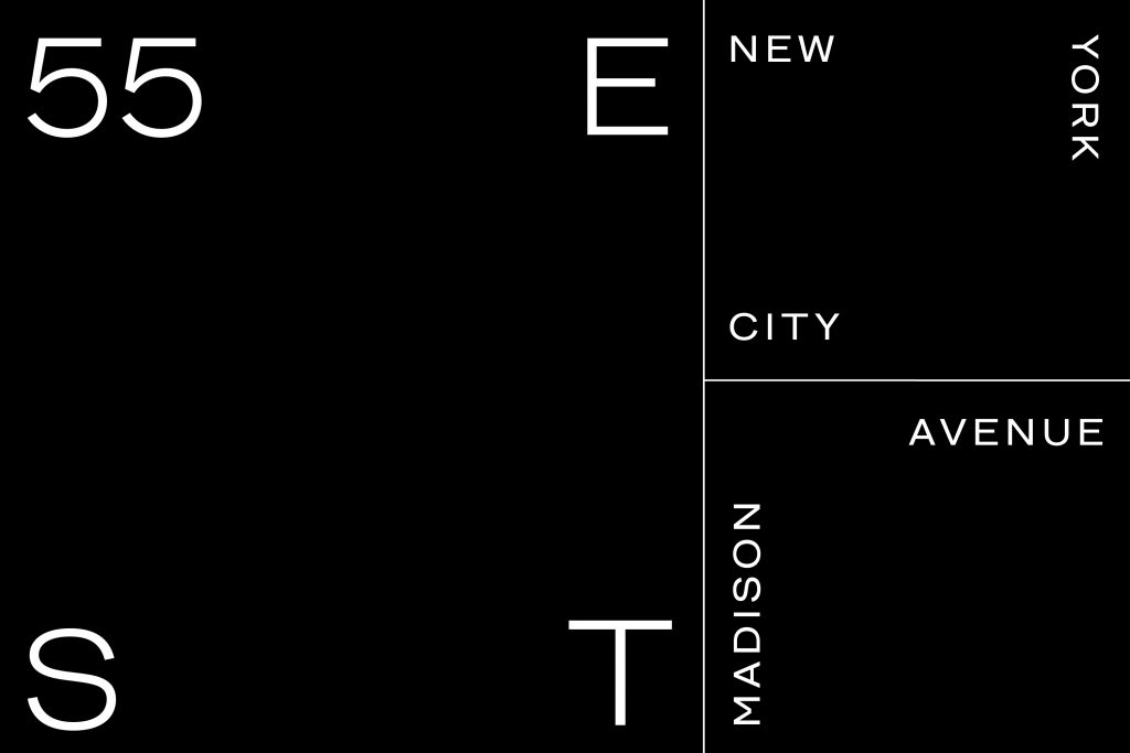
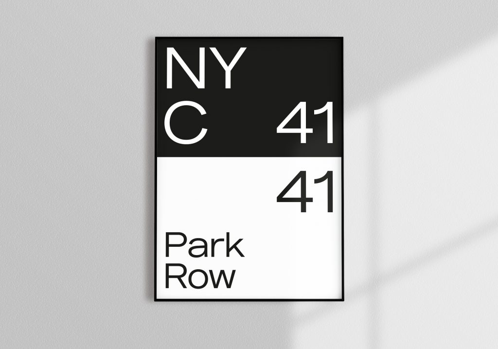
To do this, they studied the history of Wunderman and J. Walter Thompson’s respective origins, researching the past to define moments where each agency inspired growth as a brand. The designers looked at key design elements of the older timeframes (i.e.: building facades, advertisements, and fonts of the legacy agencies), using their inspiration to create one new typeface.
Key points about the process:
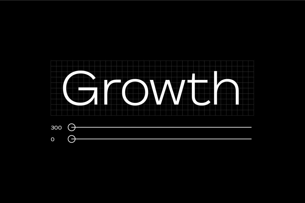
Variability, sound, motion, and data were key considerations during development, all around inspiring growth.
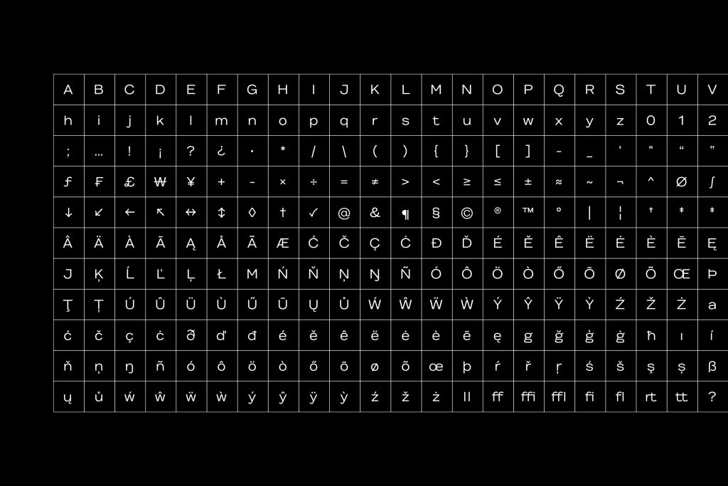
Geography and accessibility were also key factors. The designers made the font available in more than 150 languages across the globe and made similar character shapes easier to read for those with dyslexia.

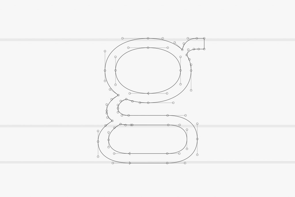
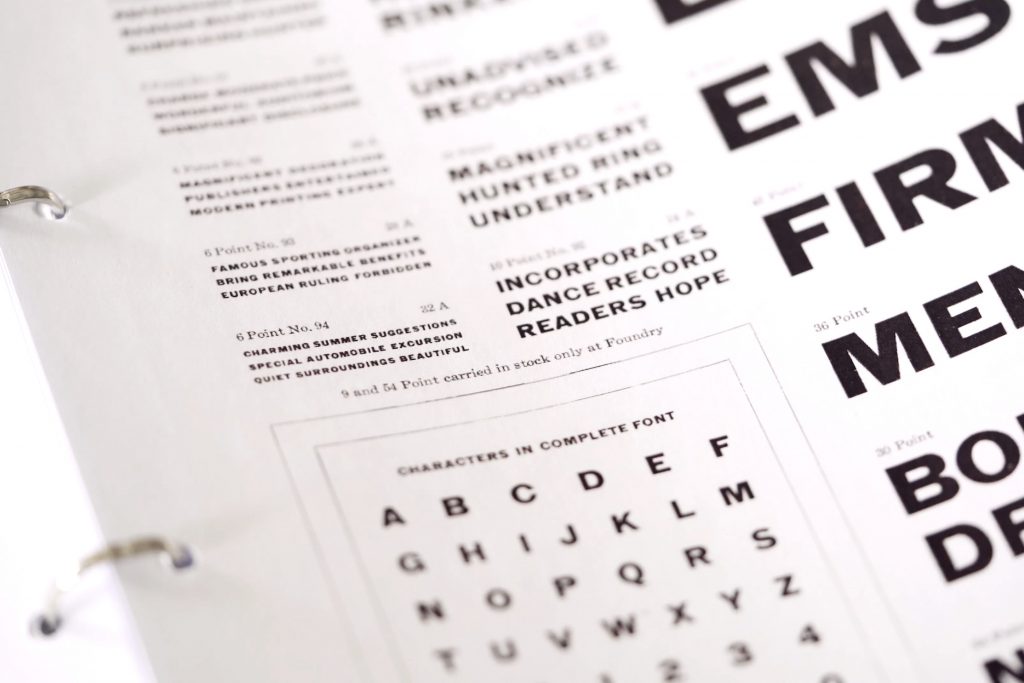
In four weeks, the designers worked through and refined every detail of the typeface, testing different sizes, weights and languages.
Essentially, great ideas can thrive and prosper at Wunderman Thompson and this was an idea two designers had while they were working on the brand refresh, this was not an assignment. They created this font together in their spare time, having become inspired by the agency’s origins.
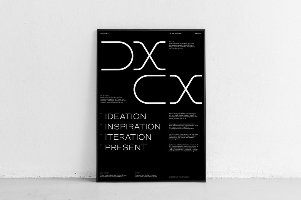
Wunderman Thompson is a place where everyone has a voice and can do great work. The new font represents creative bravery, one of Wunderman Thompson’s core behaviors.

Source: Wunderman Thompson
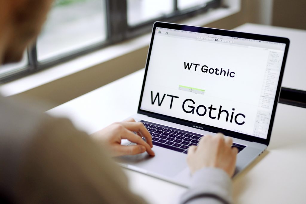
WT Gothic – New Font by Wunderman Thompson Creatives added by newsroom on
View all posts by newsroom →
You must be logged in to post a comment Login