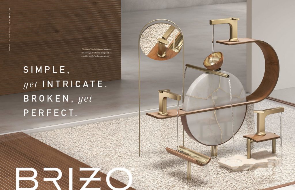
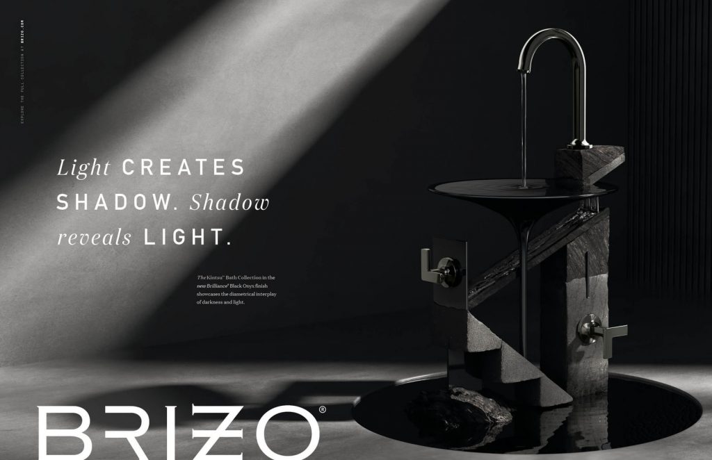
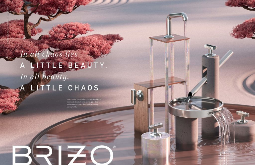
Inspired by wabi-sabi philosophy, the collection celebrates the perfectly imperfect. It embraces broken lines and natural irregularities—creating a delicate sense of equilibrium. To drive demand from Brizo’s high-end interior design audience, we needed them to see that craftsmanship and inspiration. So to tell the story of this exquisite balancing act, we created a literal one.
The campaign highlights the collection with gravity-defying sculptures, each balanced with striking precision. As one part of a sculpture pushes, another pulls. As one part gives, another takes. The sum effect is a breathtaking harmony that shows off the collection to its full advantage. Because it’s only when you bring together opposites that you find true equilibrium.


Social
![]() Brizo
Brizo


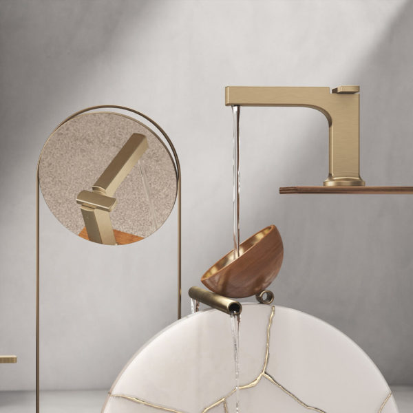
brizofaucetWhen broken symmetry creates uncommon beauty. // Find #CounterBalance in the Kintsu™ Bath Collection by Brizo.![]() Brizo
Brizo


brizofaucetPush and pull. Weight and counterweight. Action and reaction. // Find #CounterBalance in the Kintsu™ Bath Collection by Brizo.![]() Brizo
Brizo


brizofaucetThe details enhance the whole. And vice versa. // Find #CounterBalance in the Kintsu™ Bath Collection by Brizo.
The campaign will play out across OLV, print, digital and social channels. Y&L adapted the campaign for each social media platform: Instagram, Facebook and Twitter.
- Since Y&L helped create Brizo in 2006, the agency has carved out space for them as a forward-thinking brand that acts less like a faucet company and more like a fashion label.
- Each of three sculptural vignettes demonstrates striking equilibrium. In one, a faucet rests precariously on top of a curved surface, triggering a chain reaction as it turns on. In another, the interplay of light and shadow highlights Brizo’s new Black Onyx finish. And in the third, a shishi-odoshi fountain shows the give-and-take necessary to maintain balance.
- At times seeming to defy physics, these sculptures create breathtaking backdrops for the product. The copy speaks to the beauty of apparent contradictions and highlighting the heritage of Scandinavian and Japanese influences.
- Given that the majority of Brizo’s following is on Instagram, there was extra emphasis placed there by using a combination of row takeovers, Instagrids, carousels and single-image posts to tell the story of the collection. Organic stories and posts combined with paid stories and posts to reach a broader audience.
“The Kintsu collection brings together ideas that initially seem like contradictions. It finds perfection in natural imperfections and merges Japanese influences with Scandinavian ones. It’s a delicate balancing act. So our campaign is, too—literally. We wanted to capture the harmony that only exists when opposing forces push and pull on each other. Because that interplay of opposites is where you find beauty.” – Trevor Williams, Principal and Group Creative Director at Young & Laramore
“We’ve worked with Y&L for so long because they just get it. They understood exactly what we were going for with the Kintsu collection, and they nailed the spirit of it in this campaign. The work incorporates all of the design influences and heritage, but it does so in a new and fresh way. It’s exactly the fashion-forward thinking we’ve come to expect from Y&L.” – Mandy Ellington, Director of Brizo Brand Management
Source: Young & Laramore

You must be logged in to post a comment Login