The Herbtender is a new brand creation by B&B studio, encompassing brand positioning, creative strategy, naming, brand design and packaging. The brainchild of entrepreneurs Laura and Mark Neville (Upbeat Drinks), the brand harnesses the power of adaptogenic herbs – powerfully intelligent ingredients that support the body’s ability to manage stress by regulating physiological function and restoring metabolic balance.
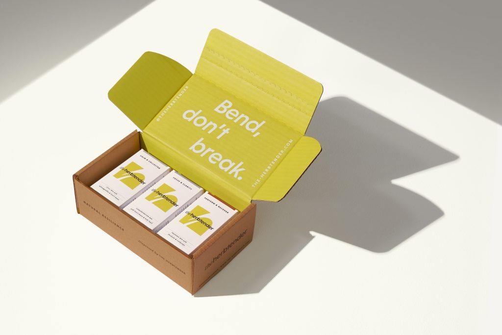
Bend, Don’t Break
B&B’s strategic approach led to the creation of a clear and ownable brand mantra – bend, don’t break – a reference to the ancient truth that the reed that bends in the wind is mightier than the oak that breaks in the storm. By positioning flexibility rather than force as the true measure of strength, the mantra captures the essence of adaptogens and how they work in the body, as well as their relevance to our stressful modern lives. The concept of flexibility is captured visually in the brand’s curvaceous and monogrammatic logo, as well as an illustration style – by Aron Leah – that focuses on free and flowing lines.
The bend don’t break mantra has given the brand a clear philosophy built around the concept of natural resilience. Rather than conform to the popular, but potentially indulgent, ‘self-care’ codes of social media that seek stress avoidance, The Herbtender encourages people to embrace life, empowering them to be resilient, self-reliant and come back stronger every day.
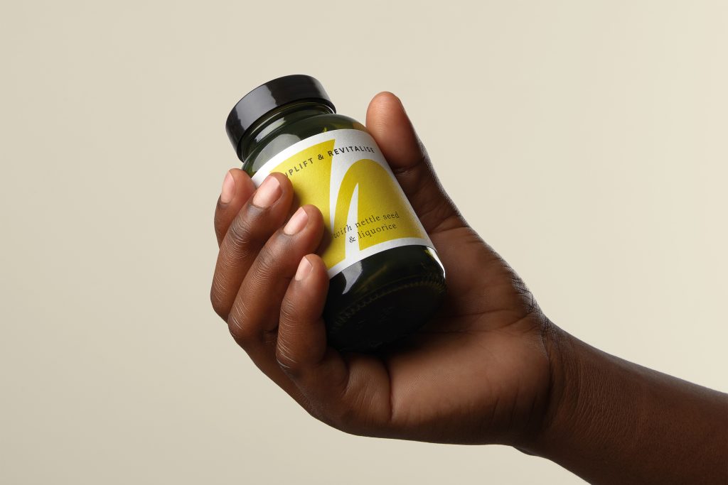
Timeless Plant Wisdom
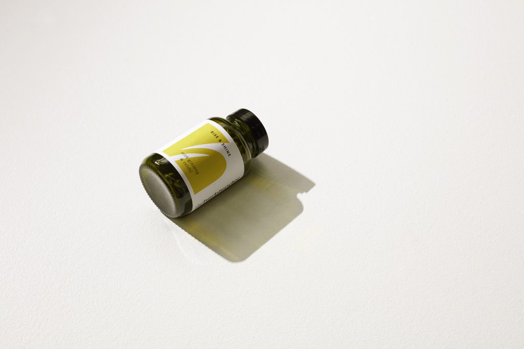
Emphasising the credibility of the brand’s herbal ingredients as well as the clean, plant-based and planet-positive status of each product was key to the brand creation. The Herbtender name was created by B&B to deliver a sense of care and efficacy to the brand and was inspired by the brand’s medical herbalist Schia Sinclair, who formulated the products. The ingredients themselves are captured in photography as beautifully sculptured arrangements, emphasising their naturalness and almost mystical power. In addition, B&B has selected an ownable ‘acid olive’ green as the brand colour, which is showcased in the logo, as well as a bespoke green glass jar for the supplements. Additional supplements are sold in compostable refill pouches in keeping with the brand’s planet-positive positioning. When it comes to lifestyle imagery, rather than directly reflect the target demographic’s urban lifestyle, it pictures them interacting with nature to communicate a harmonious relationship between people and product.
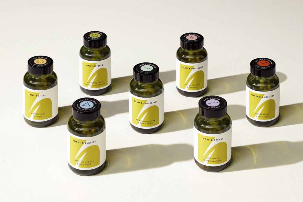
Adaptogenic Wellness
The Herbtender is launching direct-to-consumer with a set of seven supplements, targeting contemporary wellness needs across anxiety, sleep, immunity and physical performance. Each supplement is made from responsibly-sourced adaptogenic herbs that have been safely used for centuries, with each ingredient delivering a clear beneficial purpose. The supplements are clean, plant-based and free from fillers, colorants, preservatives and sweeteners.
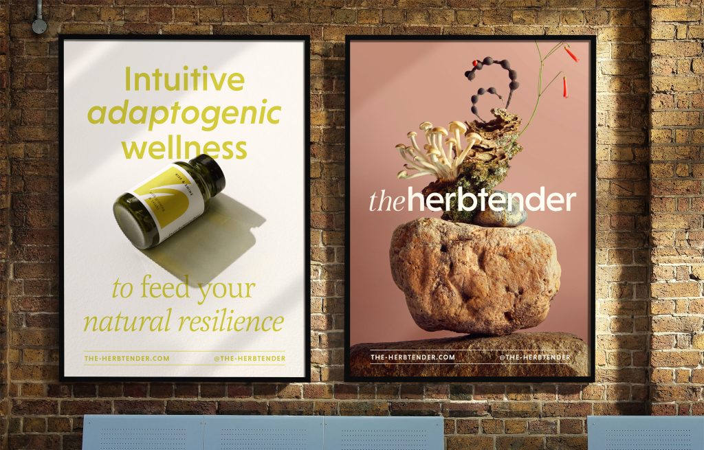
Shaun Bowen, Creative Partner at B&B studio, says: “While The Herbtender is certainly bringing ancient wisdom to modern lives, we were keen not to create too much of a traditional or esoteric look. We wanted to show that adaptogens have a timeless effectiveness, delivering the same benefits today as centuries ago, no matter how contemporary our problems might seem. Having the freedom to create every aspect of the brand – from identity to graphic language, photography to illustration – meant we could balance the look and feel for a world that feels cutting edge but natural, and desirable but credible.”
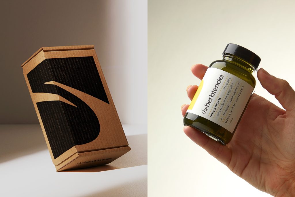
Founder Laura Neville says: “With The Herbtender brand creation, B&B has helped us bring something unique and exciting to the UK supplements market. Our passion for adaptogens and our mission to help people access their natural resilience is clearly evident across the brand’s design and communication. It perfectly captures our belief that acting in harmony with nature is the only remedy that really works.”
Source: B&B studio

You must be logged in to post a comment Login