This month Thornton & Ross Ltd, part of the STADA group, unveils a new look and feel for Flexitol, created by Brandon.

Flexitol is the brand leader in foot skincare and is growing in line with the category, but with a long-term vision ‘to provoke and inspire people to engage positively with the condition of their feet’, Flexitol wanted to bring its revised proposition of ‘health and wellbeing for feet’ to life on pack.
Brandon’s challenge was to make the brand relevant in consumers’ lives, with the aim of driving brand reappraisal across its entire range of products and not just its star Heel Balm product.
Strategy Director, Louise Kennedy, says:
“The category is very much functionally driven as people don’t generally think of their feet until there’s a problem to treat. Other brands benefit from their dry skin credentials, but Flexitol is rooted in efficacy and expertise, with on-pack product descriptors reinforcing this perception. As a result, people felt that Flexitol wasn’t for them –‘it’s for someone with a medical issue so why would I use it’.
“To understand the stretch opportunity for Flexitol to break free from this medical perception, we looked widely to see how science and efficacy are communicated across other categories, from deodorant to skin and hair, and also in more contemporary ways.”
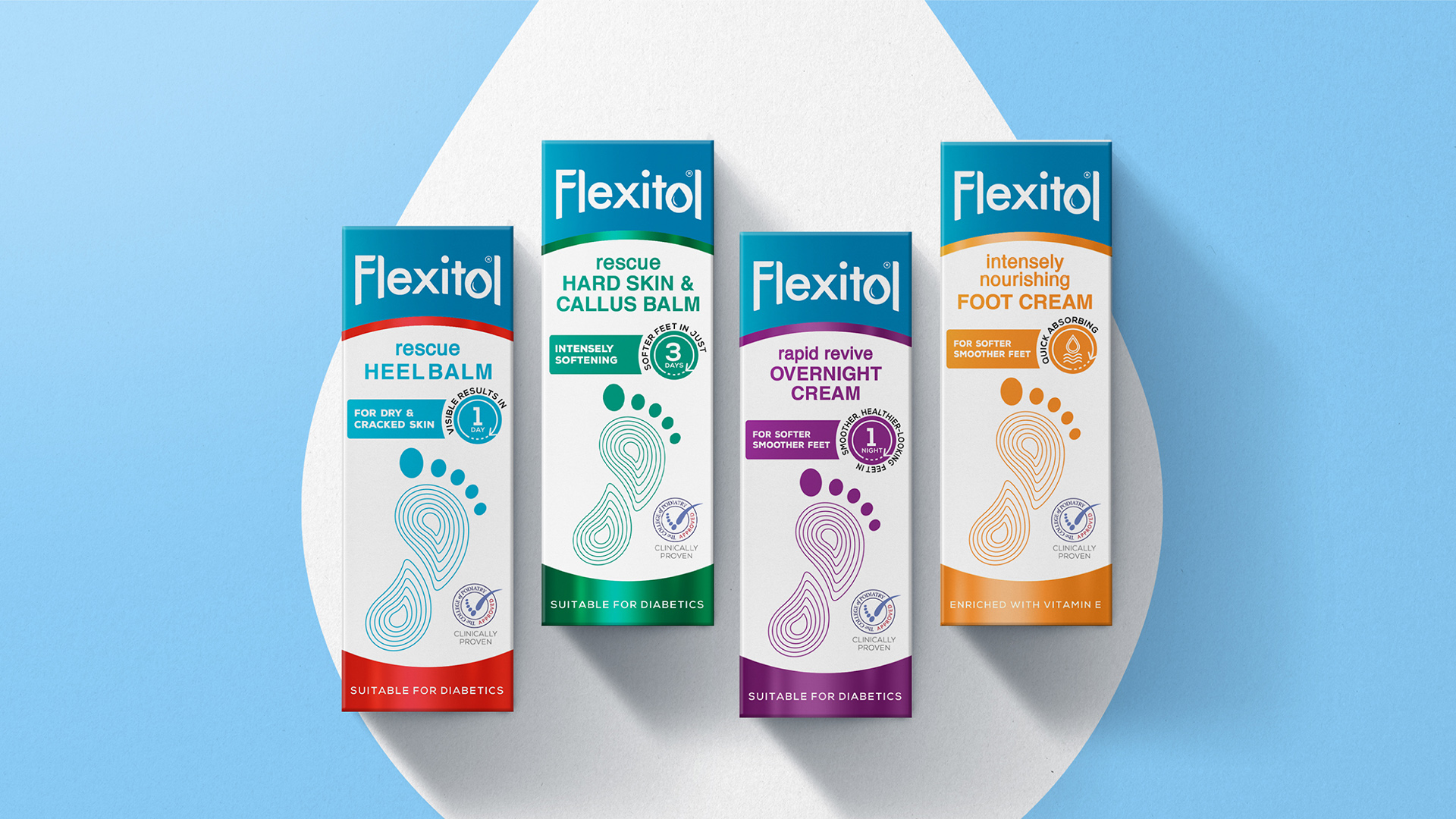
The agency created the brand territory of ‘the beauty of science’ to keep the brand’s roots in efficacy but move it into more of a wellbeing space – in line with its new proposition and its desire to encourage a more proactive footcare regime amongst consumers.
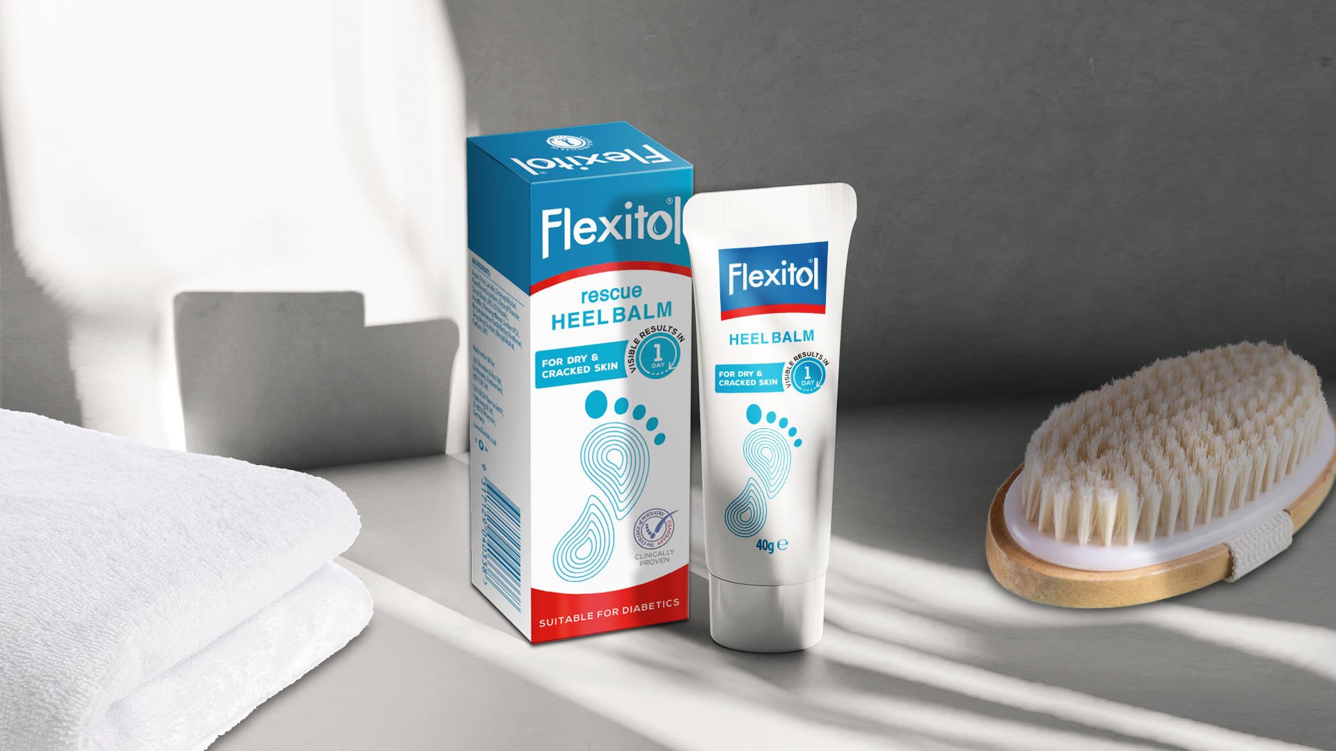
On pack, the foot image is retained, but switched to a line drawing of the sole of the foot, instantly showing the product’s intended use in a more contemporary and ‘cool science’ inspired way, rather than ‘clinical’ science. Foils have been used to premiumise the products’ appearance.

Louise Kennedy continues:
“The biggest change is within the brand architecture. Our research showed that the on-pack descriptors (such as ‘symptoms of foot anhidrosis’) were confusing and contributed to the perception that Flexitol was for problem feet.
“We therefore split the range based on the consumer benefit, using language such as rescue, restoring, rapid revive, etc. and new product descriptors in similarly clear and user-friendly language to highlight the range of products available and to help consumers identify the best product for them.”
Consumer research, carried out as part of the redesign process, has shown that the new packaging has improved standout on shelf and vastly improved appeal. The new design retains brand elements that existing customers find familiar, but it moves the brand on by positioning it as an essential part of proactive footcare, rather than a more reactive treatment.
Jo Marshall, Head of Insight & Innovation at Thornton & Ross, says:
“Brandon has injected warmth into the brand, moving us away from being a functionally-driven purchase to more of an emotional one. The packaging now clearly communicates the end benefit to the consumer and illustrates how all of our products can be relevant in a wider range of consumers’ lives, ultimately delivering us the brand reappraisal that we’re seeking.”
Source: Brandon
Brandon puts its best foot forward with new branding for Flexitol® added by newsroom on
View all posts by newsroom →
You must be logged in to post a comment Login