London-based branding agency Lantern has developed a striking new identity for design agency PR specialist Red Setter.
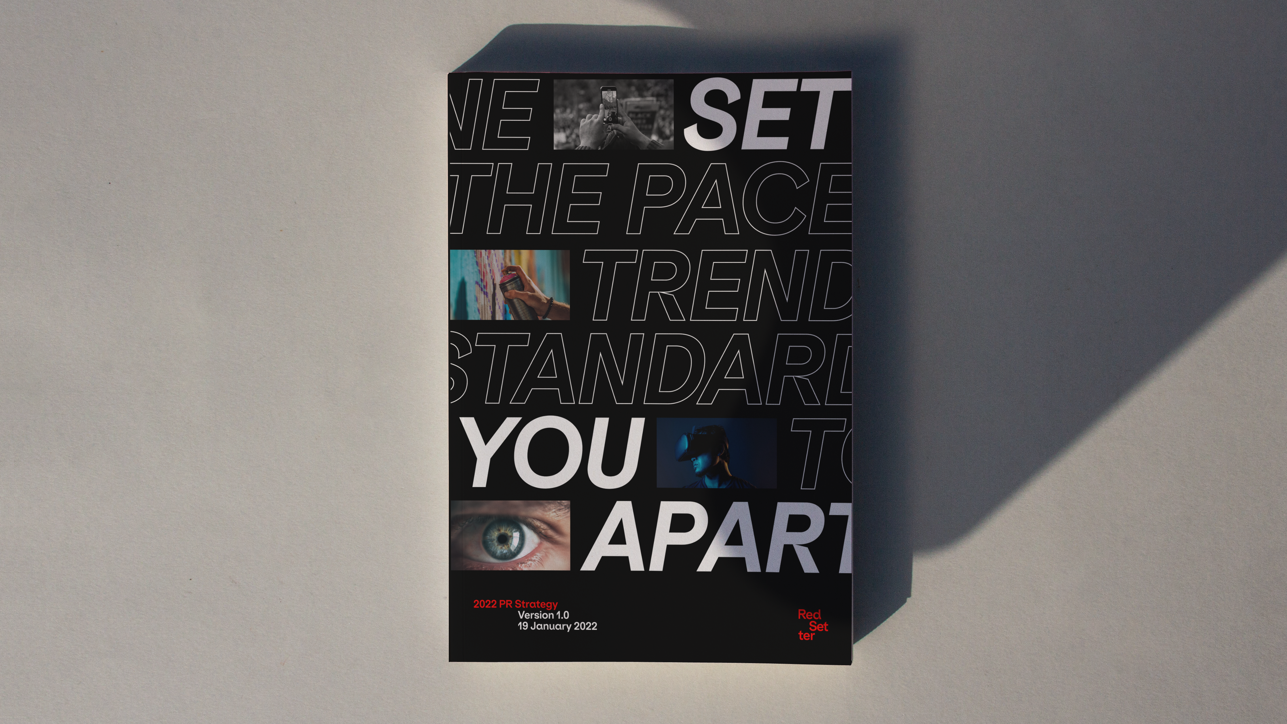
For more than ten years, PR agency Red Setter has been building the reputations of ambitious and pioneering design agencies the world over. The rebrand with a new logo, visual language and identity system are inspired by the rolling, scrolling, streaming pace of today’s news agenda.
Claire Blyth, founder and MD of Red Setter said: “We’ve built an expert team of journalists, media specialists and PR strategists who share an unrivalled understanding of the design industry and the media. It’s insider knowledge that sets us apart, so we can set our clients apart and achieve the recognition they deserve. This is what we wanted to communicate in our new brand and show how we keep our clients relevant in an ever-changing world.”
With 400,000 design agencies around the world, the number of in-house teams is rising fast, and the media landscape changing faster than ever, it’s a never been tougher to cut through the noise and stand out from the competition.
Designing for designers
“The brief from Red Setter was exciting, but also one of the most challenging, designing a brand for a design agency audience,” said Ryan Tym, founder of Lantern. “We developed a visual language that’s inspired by the pace of today’s news agenda, delivering a new logo and identity system that – just like Red Setter itself – never settles.
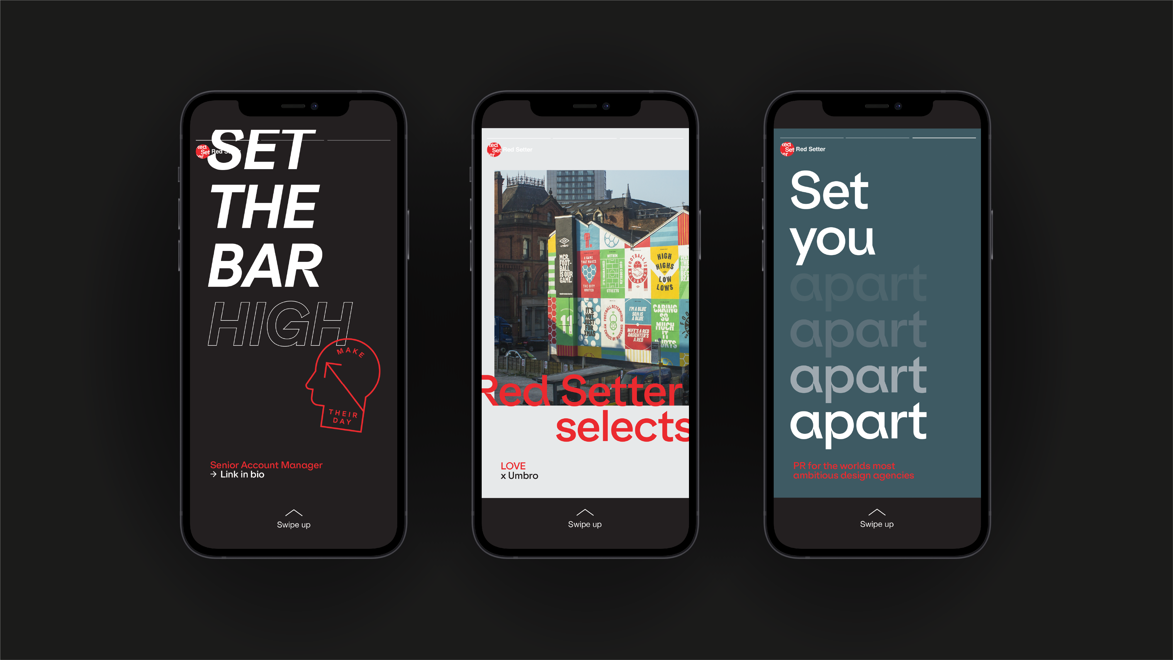
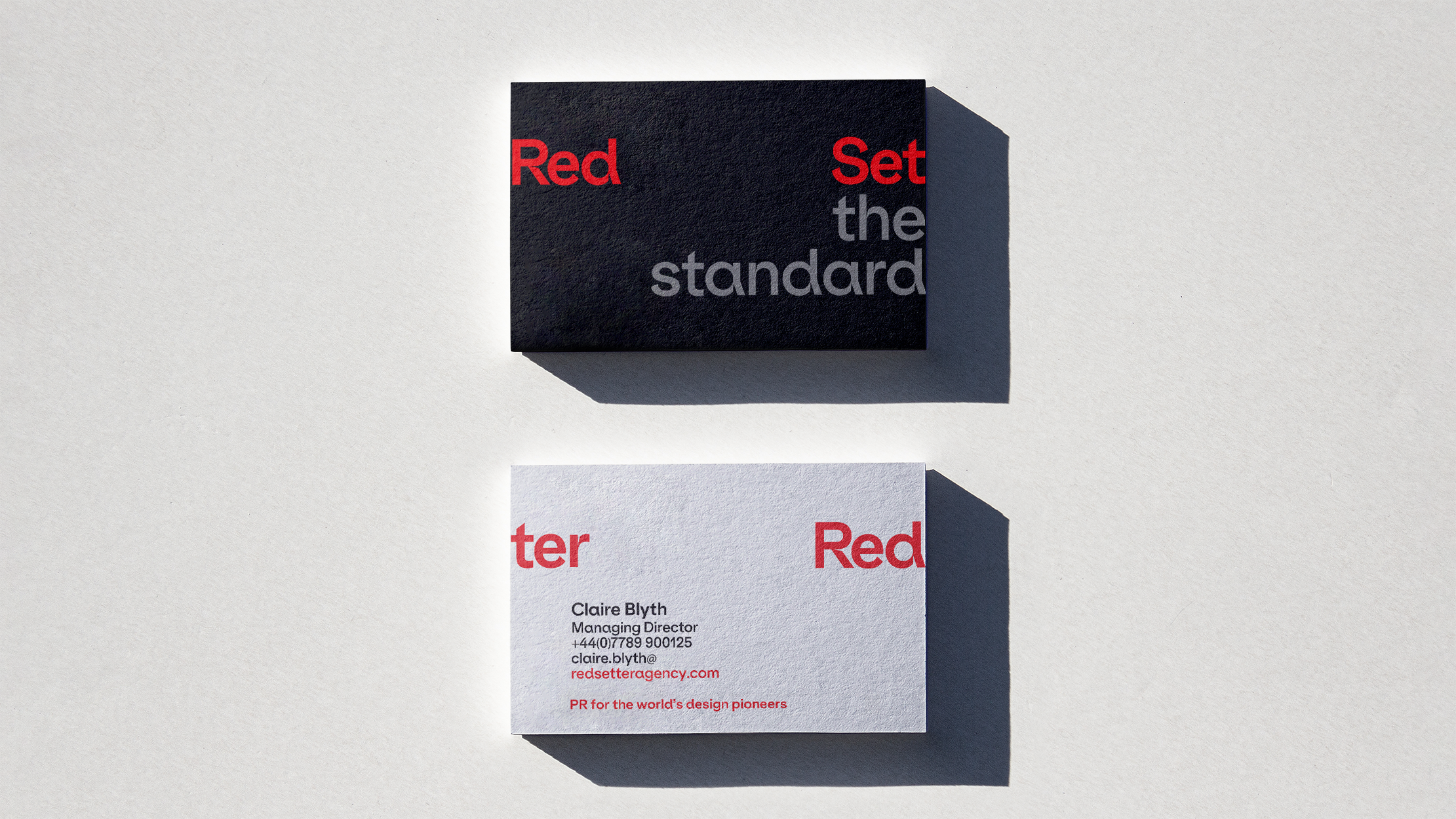
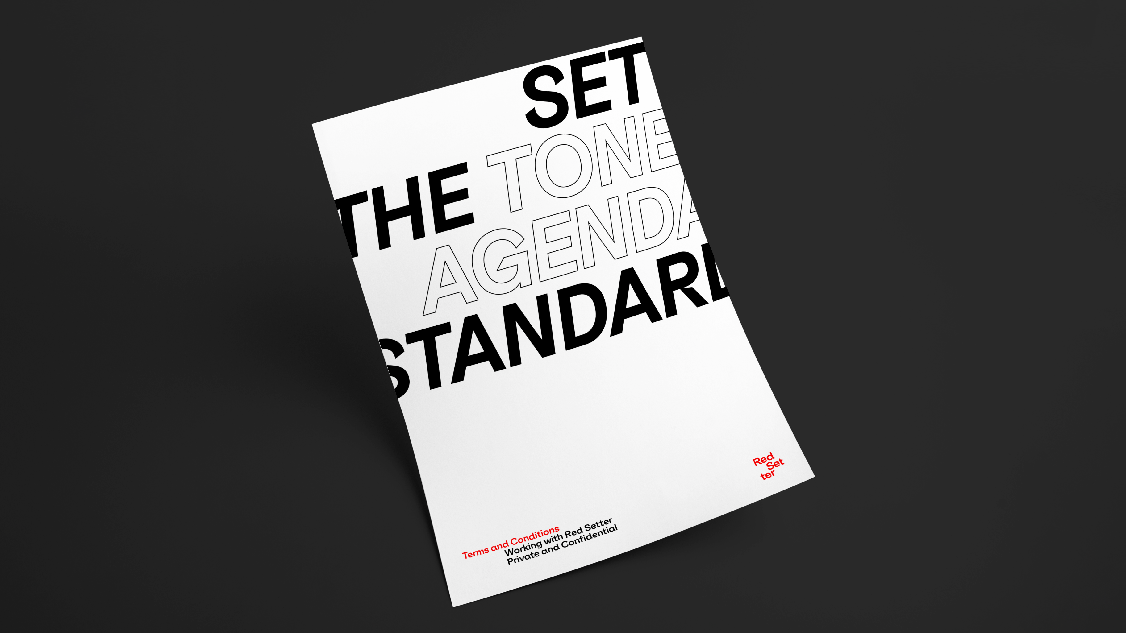
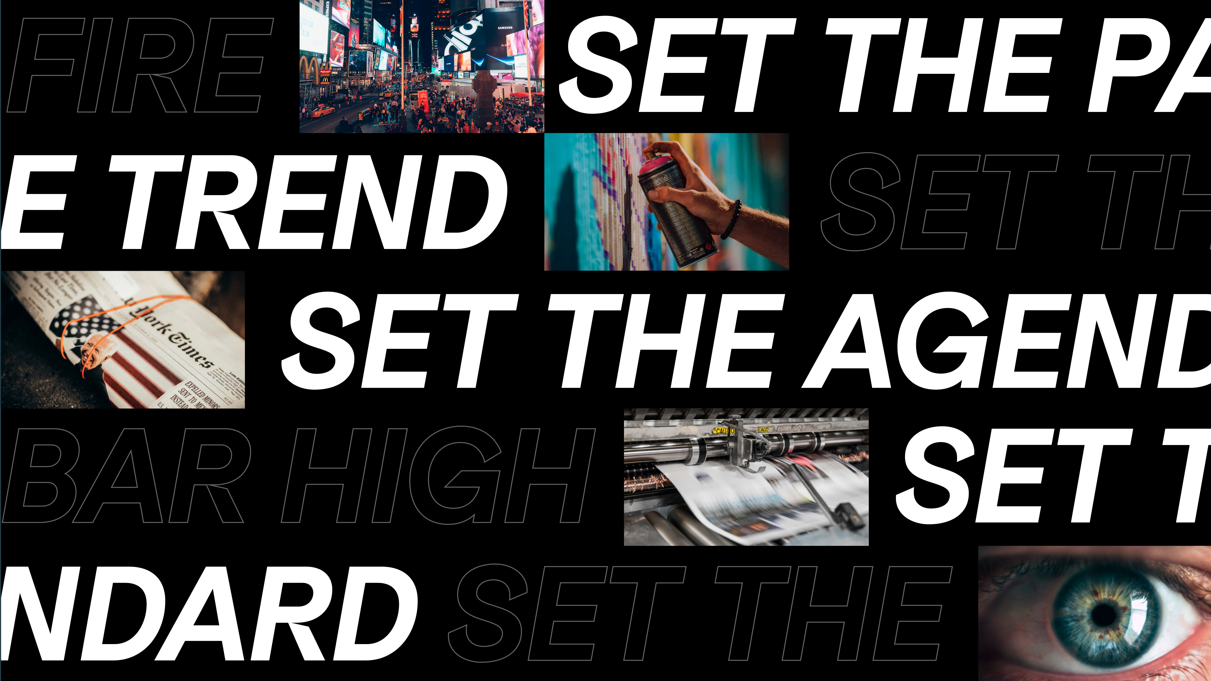
“When it came to the verbal side of the brand, we wanted to create an attitude for Red Setter that reflected the progressive nature of their business and the sector. The Red Setter name was a bit of a gift. With it, we could create a suite of messaging that plays on ‘Set’ and ‘Setter’. This is an agency and industry that sets the trend, the tone, the pace and the agenda. Their clients set the standard and Red Setter sets them apart,” added Tym,
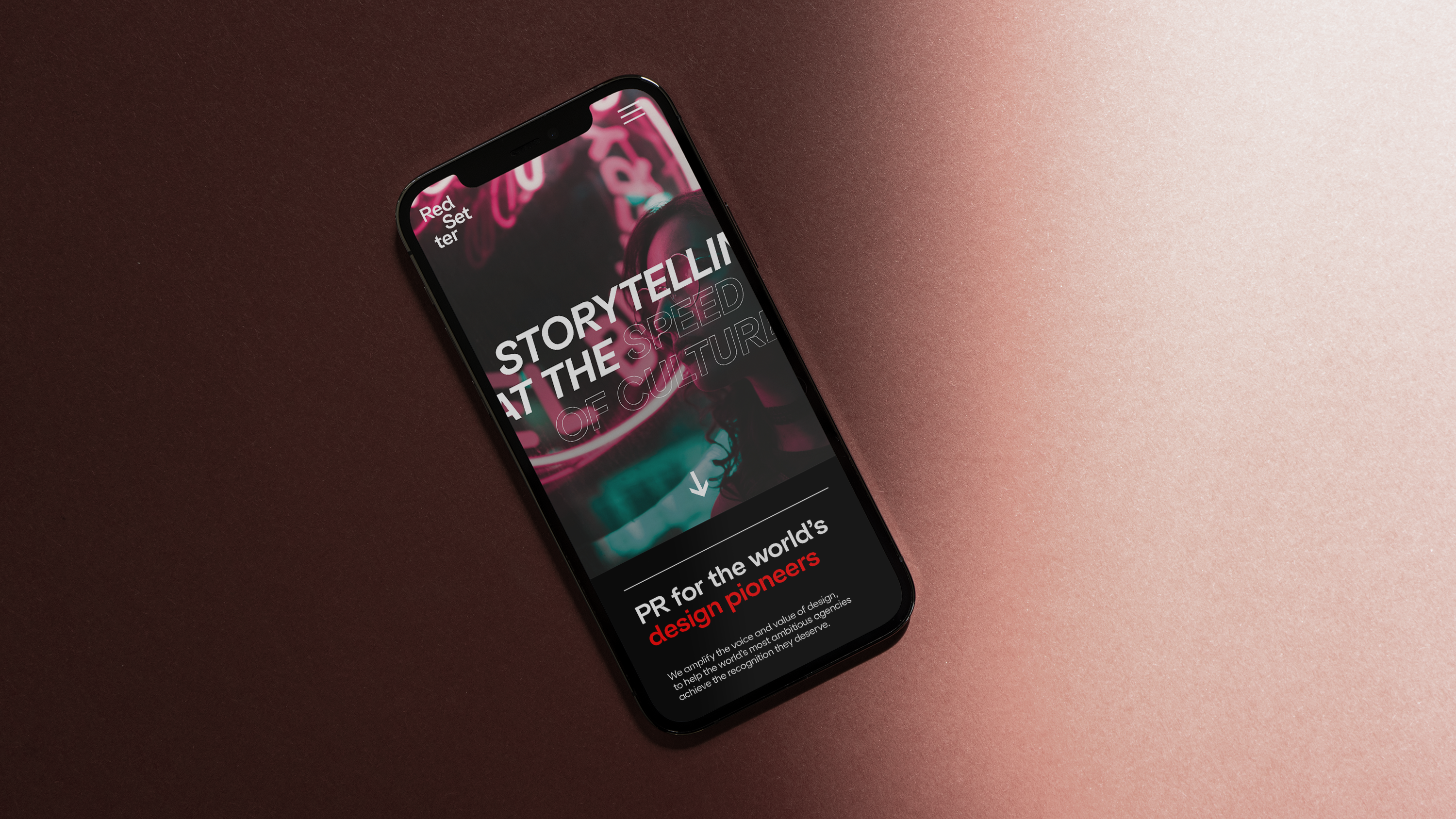
Amplifying the voice and value of design
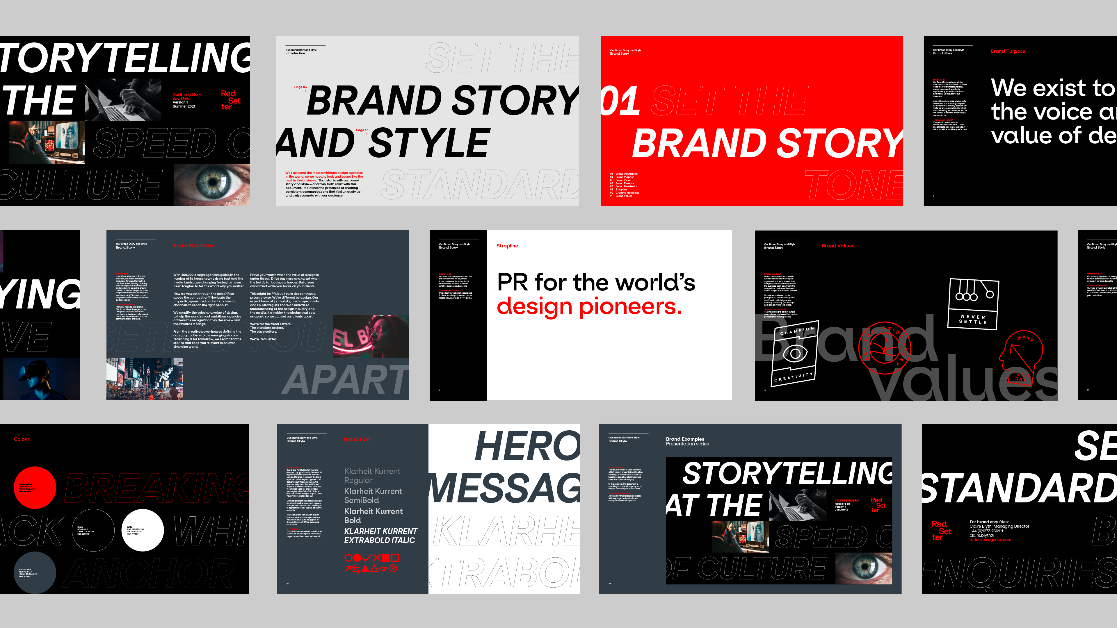
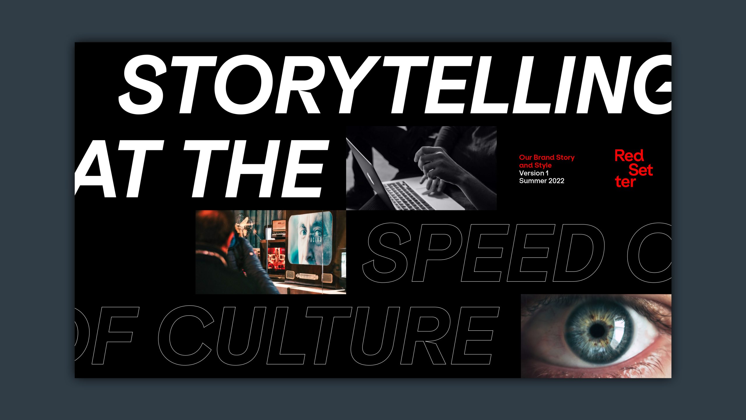
The updated visual and verbal language is designed to create the same level of standout for Red Setter as it achieves for its clients. A deconstructed logo reflects a world in constant flux, while a visual timeline delivers the centrepiece of the new graphic system, enabling Red Setter to hero creative headlines as well as showcase a stream of changing imagery – often bleeding off the canvas to reflect constant motion. The colour palette is predominantly black and white – reflecting the clarity and conviction with which Red Setter speaks. And the new verbal identity complements the visual system.
“Red Setter works to amplify the voice and value of design and our brand had to communicate this,” said Blyth. “It was amazing to go through the full branding experience with Lantern and for an agency to understand exactly what we needed. We love the new brand immediacy that connects what we do for our clients with the media world we’re living and working in.”
Source: Red Setter
Lantern Reveals New Identity For PR Agency Red Setter ‘Designing For Designers’ added by newsroom on
View all posts by newsroom →
You must be logged in to post a comment Login