For a rebrand of dating service Plenty of Fish (POF), Mrs&Mr baited their creativity hook and hauled in a boatload of designs guaranteed to become buzz bait.
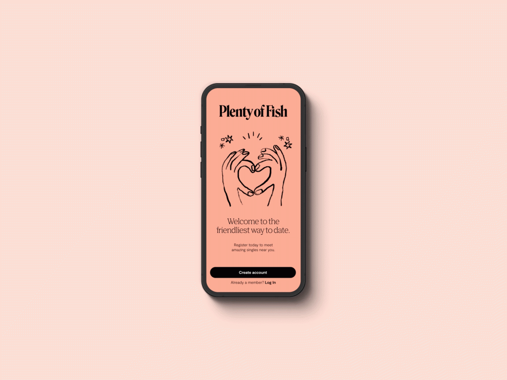
The new wordmark is a visual anchor for all the client’s brand and visual communications. With the color palette, typography and bespoke illustration style, everything was designed to be friendly, playful, open and optimistic, reflecting Plenty of Fish’s brand positioning and values.
The wordmark is based on a modern serif typeface with a hidden fish silhouette connecting the top serif of the “F” to the dot of the “i” to illustrate the brand’s dedication to creating friendly connections between its users. The salmon color creates distinction in the category and became an ownable color for Plenty of Fish that appeals to men and women equally.
The objective of the rebrand was to create a global positioning and a completely new visual identity that would differentiate the brand in a cluttered and competitive category. The challenge was to create an identity for people who don’t want to have to try so hard to find someone they click with, where users won’t feel pressured to create false versions of themselves to get a date.
“As a veteran brand of the online dating industry, we were looking for a way to modernize ourselves while expressing our unique welcoming and down-to-earth brand personality,” said Mitra Shad, director, brand marketing at Plenty of Fish. “Working with Mrs&Mr along with our internal designers, we were able to strike the perfect balance between a friendly, approachable brand design and an easy and fun-to-use app focused on letting singles get to know each other more naturally, like in real life. We couldn’t be happier with the results – Mrs&Mr has been an integral partner in our rebrand efforts.”
In speaking to users of dating apps, Mrs&Mr uncovered that online dating can feel pressured and unnatural. The agency’s rebrand is designed to present a friendlier experience, where people can get to know each other more easily—as they would in real life.

“Our ambition was to completely transform and modernize a 20-year-old dating app that had innovated its business and product experience, but whose brand was lagging behind,” said Kate Wadia, chief creative officer at Mrs&Mr. “Creating an inviting, uplifting and cohesive design system to express the product’s uniquely welcoming and friendly experience, was the highlight of this rebrand.”
The new visual identity system was applied to the UX of the product itself, in addition to all marketing and communication touch points including OOH, Instagram, digital advertising, emails, clothing and swag. Mrs&Mr also created messaging constructs across key channels, including animation.
The agency was given the project earlier this year. Plenty of Fish is owned by Match Group.
CREDITS
Client: Plenty of Fish
Director of Marketing: Mitra Shad
CEO: Malgosia Greene
Agency: Mrs&Mr
Chief Creative Officer: Kate Wadia
Chief Strategy Officer: Daniel Wadia
Art Director: David Zoppi
Designers: Arian Franz, Austin Welch, Holden Kao
Source: Mrs&Mr


You must be logged in to post a comment Login