Pearlfisher has created the name, brand design and strategy for new-to-market Australian vodka brand, Grainshaker.

Australian-based drinks producer, Top Shelf International and Pearlfisher have worked together to create the latest innovation launching from their growing portfolio of beverage brands. Aiming to disrupt a market dominated by aesthetically cold and impersonal elitist brands, Grainshaker is introducing a new style of vodka both in taste and design that appeals to bartenders and consumers alike.

“Grainshaker is leading a significant category shift with a fresh, bold and uniquely Australian perspective to shake up the norms”, said Kristoffer Fink Parup, Pearlfisher Head of Strategy.
He continued, “Grainshaker is all about the grain – this focus inspired the brand name, along with its ambition to shake up the spirits category with a new and great tasting vodka. Its texture, complexity and taste are more evocative of the land than other spirits. During our immersion with the Top Shelf International team in Australia, we discovered the specialness and unique taste of Australian grain and its different varieties. Our big idea was to build a brand that visually expresses Grainshaker’s challenger-like spirit and its authentic flavours, inspiring a new appreciation for vodka and its many uses for crafting the perfect serve of something special.”

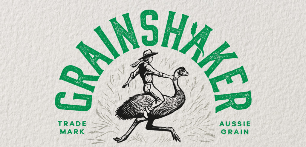
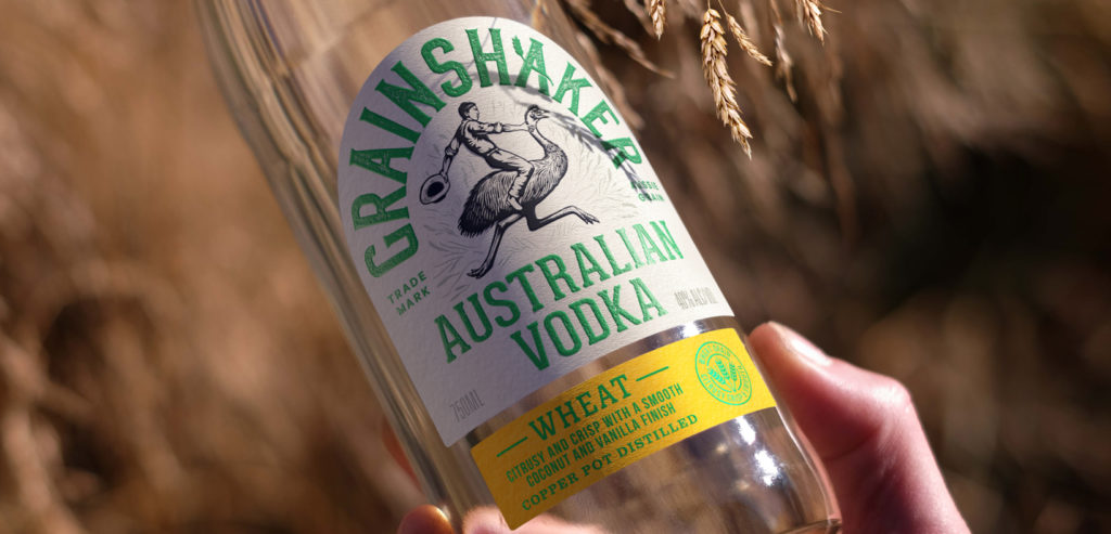
Talking about how this translated into the brand design, Sam Lachlan, Pearlfisher Design Director, said, “Grainshaker’s identity is a celebration of this country’s glorious grains. The illustrative icon of a farmer riding an emu – Australia’s indigenous and most-famed national bird – adds an element of characterful storytelling, visually reinforcing the brand’s trailblazing and disruptive attitude and the can-do spirit of the Australian farmers harvesting their grain.”
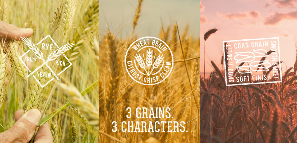
He added, “The bottle design has a simple, no-frills structure, while the texture of the brand identity is inspired by the hand-made distilling process of Grainshaker vodka. We injected warmth into the brand design, including a modern twist on Australia’s national colours by using a vibrant hit of green set against an off-white backdrop. Additional colours such as pink and yellow aid navigation across the range and signify the brand’s different variants: Rye, Wheat and Corn, while a playful flick of wheat through the ‘A’ adds a sense of charm and brings to the fore Grainshaker’s key ingredient.”
Matt Slade, Head of Marketing & Brands at Top Shelf International, said, “We have focused on developing the flavour and character of Grainshaker by challenging the norms and working with the uniqueness of Australian grain. Pearlfisher’s new identity brings to life our roots and is a modern expression of who and what we are. It also gives us the freedom to physically and creatively explore new territories and continue to build a diverse spirits portfolio.”

Credits
Group Creative Director & Founding Partner, Jonathan Ford, Pearlfisher Group Chairman & Founding Partner,
Mike Branson, Pearlfisher Head of Strategy,
Kristoffer Fink Parup, Pearlfisher Design Director,
Sam Lachlan, Pearlfisher Client Director,
Nadine Orton, Pearlfisher Copywriter,
Jamie Thorp, Pearlfisher Designer,
Melissa Taylor, Pearlfisher Client Manager,
Jack Sheehan, Pearlfisher Head of Realisation,
Jen Newell, Pearlfisher Creative Artworker, Alex Da Silva, Pearlfisher
Source: Pearlfisher & FAB News

You must be logged in to post a comment Login