Independent design agency Sunhouse has crafted a radiant new identity for Qnola, elevating the brand’s premium offering as it expands its range and reach into the mainstream.
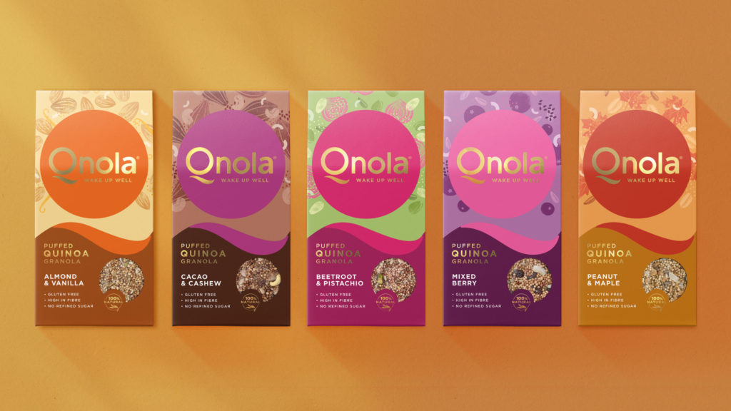
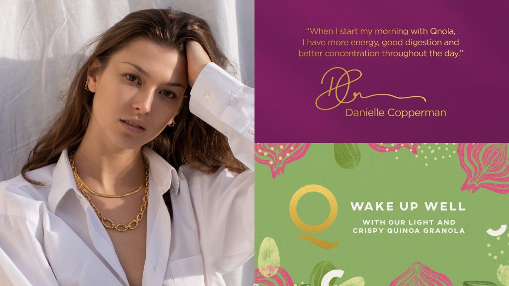
Founded by model and wellness writer, Danielle Copperman, Qnola provides mindful health seekers with nutritionally enhanced, quinoa-based granolas to help them always #wakeupwell. Beyond breakfast, Qnola is a lifestyle brand that encompasses wellness, nutrition and positivity – all the essential elements that lift the spirit and govern a life well lived.
“Qnola challenges the standards and complexity of the breakfast category with a product that is as nourishing as it is delicious,” comments Copperman. “It’s ultimate goal, however, is to help people feel good so they can enjoy their lives to the fullest.”
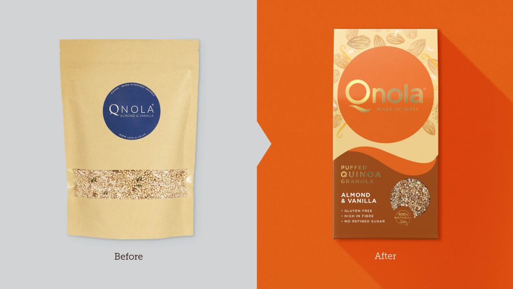
Sunhouse was tasked with helping Qnola define a manifesto that fully embodied the brand’s #wakeupwell promise. The challenge was then to bring it to life with a new identity and packaging design that expanded its appeal to a more mainstream audience.
Wake Up Well, Shine in Life
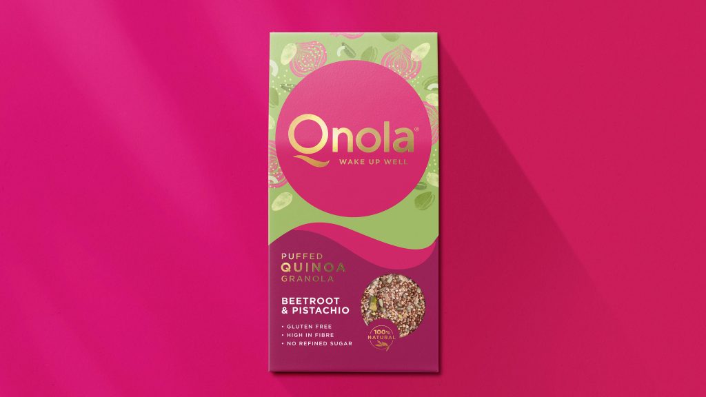
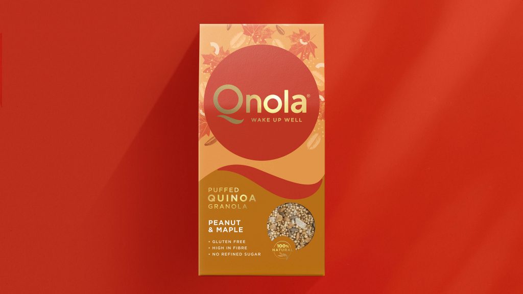
Taking the ‘Q’ of the new wordmark, Sunhouse have created both a sunrise and a vivid brand icon that channels the idea of a spirited yet calm morning, rich in possibilities. The new wordmark, resplendent in gold foil, is confident and empowering as it reflects the brand’s premiumness and #wakeupwell messaging. Illustrations of pure, untampered ingredients surround the logo in a joyful, lively scattering whilst an eclipsing window showcases the product within.
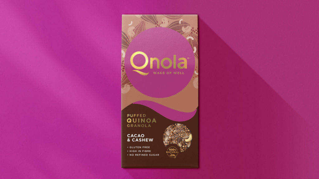
“The identity communicates Qnola’s proposition in a way that is authentic and uplifting,” comments Tom Maurice, founder and owner of Sunhouse. “The overall effect should be motivating whilst still maintaining a conscientious composure that is inherent to the brand.”
“It was also important for the design to be stylish. It should feel at home in the chic wellness cafes of Los Angeles as well as on shelf in Sainsbury’s here in the UK,” said Maurice. “We delivered this by keeping it simple but not being overly simplistic. With clear communication of benefits and an expression that is bold, optimistic and attainable, we’ve created a beautiful pack that will be noticed, easily remembered and easily shopped.”
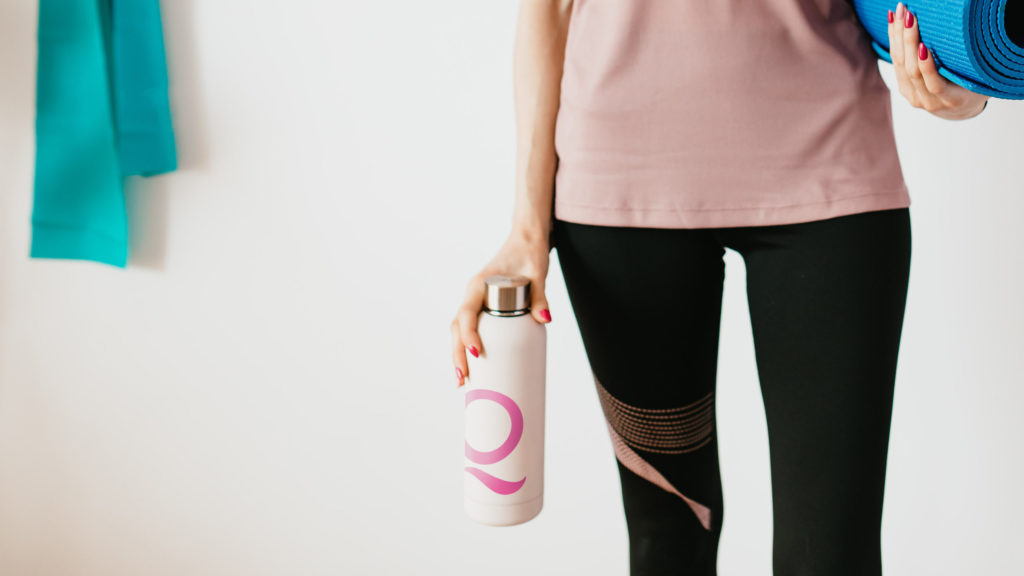
“Sunhouse’s work has transformed and brought new life to the brand,” comments Cooperman. “The designs are much more vibrant than before, to inspire a more joyful and energised way of life, through our all-natural products, for consumers loyal and new. It’s unique and incredibly striking on shelf, and I have high hopes that it’ll play an instrumental part in our success as we move forward with exciting new products in brave new markets.”
Source: Sunhouse


You must be logged in to post a comment Login