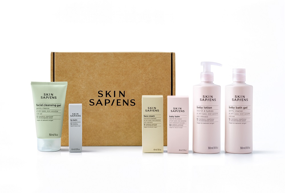
SKIN SAPIENS today launches its first range of six skincare products featuring identity and eco-packaging design by Lewis Moberly.
This launch not only marks a fresh direction for the skincare market, it also shows how design can powerfully point to a product’s sustainable and desirable credentials.
A new approach to skincare

The SKIN SAPIENS range is designed to clean, care and protect skin of all ages and skin types, even sensitive. There are three products for babies: a lotion, bath gel and balm. And three for adults: a facial cleansing gel, face cream and a vegan lip balm.
It is the fruition of a project that began 18 months ago in a kitchen in Madrid. “When baby Alex was born, we realised we couldn’t bring ourselves to put something we didn’t understand on his sensitive skin,” says James Jardella, CEO & Founder.
“Having worked for some of the biggest cosmetics companies out there, we knew that the world is full of products that aren’t always what they seem. This didn’t sit well with us. So, we locked ourselves away and thought hard about a different approach. We wanted to create something natural that’s good for skin, good for the planet, and free from secrets. We put everything into leaving everything unnecessary out.”
The result was a home-made balm, created from rich plant oils and waxes, nothing else. And so SKIN SAPIENS was born.
Design – the next ingredient
Jardella knew the product was good – he’d tried it on himself, his baby, and his friends. But he also knew that to launch it to a wider audience he would need a distinctive identity and design to stand out and resonate with consumers in this increasingly crowded space.
He turned to Lewis Moberly as a design consultancy with an award-winning track record of delivering commercially effective, future-proofed designs to entrepreneurs and multi-nationals.
“We were very impressed with the commitment, passion and determination of James,” says Mary Lewis, Creative Director at Lewis Moberly. “We shared it and wanted to be part of it.”
From naming to identity and packaging
The partnership began with reviewing the choice of name and then developing the identity. “SKIN SAPIENS conveys inherent wisdom and distinction,” says Lewis.
The identity, which economically drives the brand is, like the product, edited, pared down, and pure in form. For the logo, the observation of the SAPIENS ‘I’ sitting symmetrically and relating to the ‘I’ in skin works as a built-in navigator, pointing you to the product. A design observation which is both distinctive and helpful.

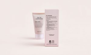
Packaging designs are equally distinctive in their simplicity. Complex, back of pack product information is replaced with straightforward information showcased on the front of pack. The tone is friendly and transparent. The colour palette is inspired by mineral shades found in nature, but is also pale enough to allow the bottles to be recycled. In fact, the bottles are entirely made from recycled British drinks bottles, so the loop is closed.
The future
SKIN SAPIENS is available to order direct from www.skinsapiens.com, and the team is in conversation with major retailers, with more products already in the pipeline.
Jardella concludes: “Creating a new skincare brand from recycled materials has been full of challenges, and along the way we’ve had to sacrifice things like ‘the perfect colour’ in favour of something more sustainable, but throughout it all we’ve been brilliantly led by the team at Lewis Moberly. The result is a visual identity for SKIN SAPIENS which is original, authentic to our purpose, and which we can’t wait to share with the world.”
Source: Lewis Moberly

You must be logged in to post a comment Login