If you could visualise your thoughts, what would they look like? There’s a good chance you think of them as fluïd and colourful but what if they turned out to be rock solid and in black and white? Belgian news magazine Knack developed a tool that through a series of questions and exercises visualises the way your mind works.
We live in polarising times, and life often demands us to search for hard certainties. It’s black, or it’s white, with nothing in between.
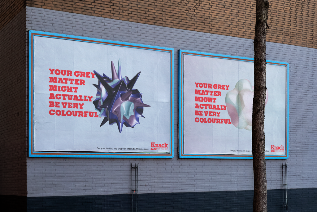
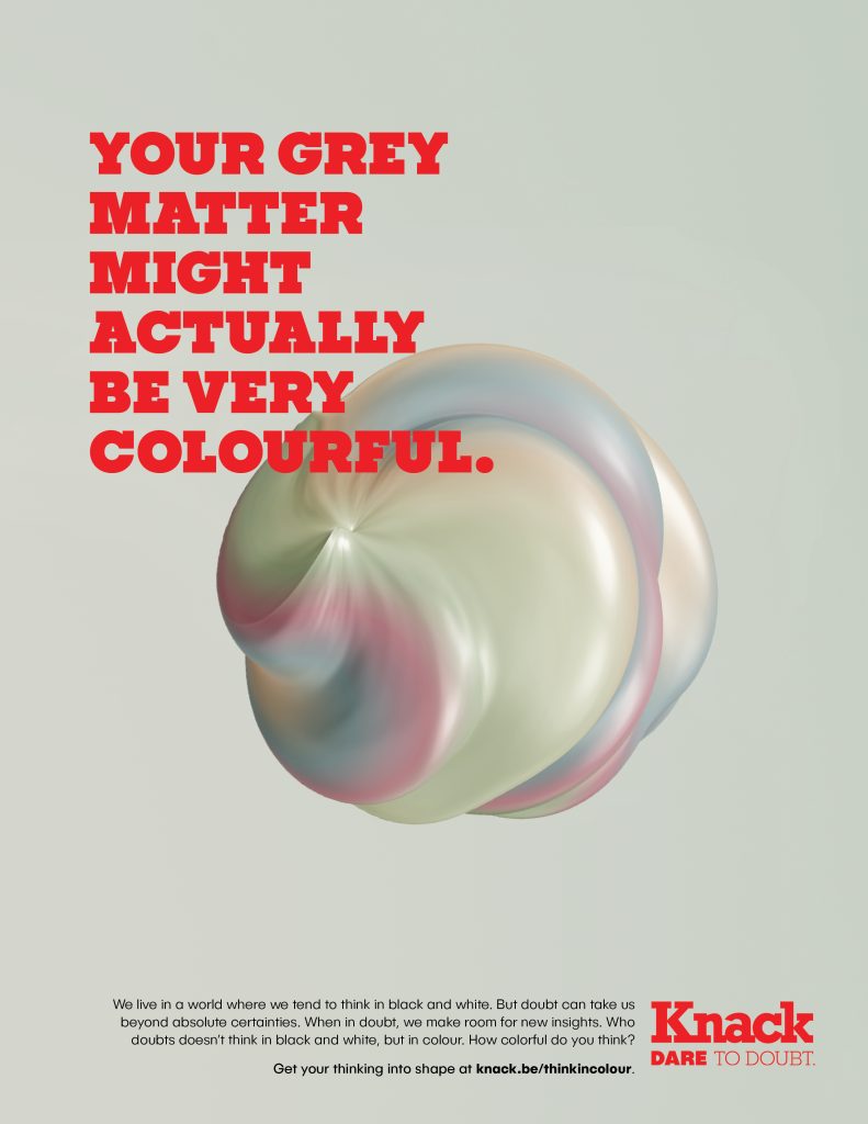
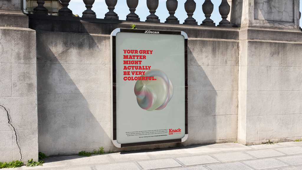
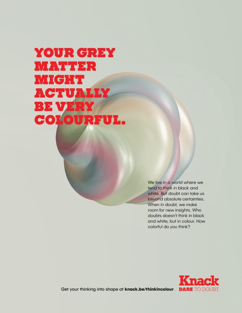
But not according to weekly current affairs and opinion magazine ‘Knack’. Today they launch ‘Think in Colour’, a new multi-channel campaign created by independent creative agency Mutant to highlight that very fact in a new multi-channel campaign featuring TV, press, radio, OOH and digital executions.
With an ethos of ‘Dare to Doubt’, Knack urges its readers to explore the nuances of opinion, the variety of beliefs, and turn a black and white way of thinking into a colourful train of thought.
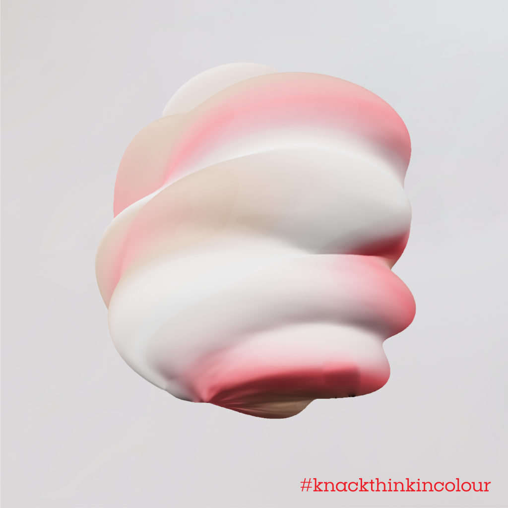
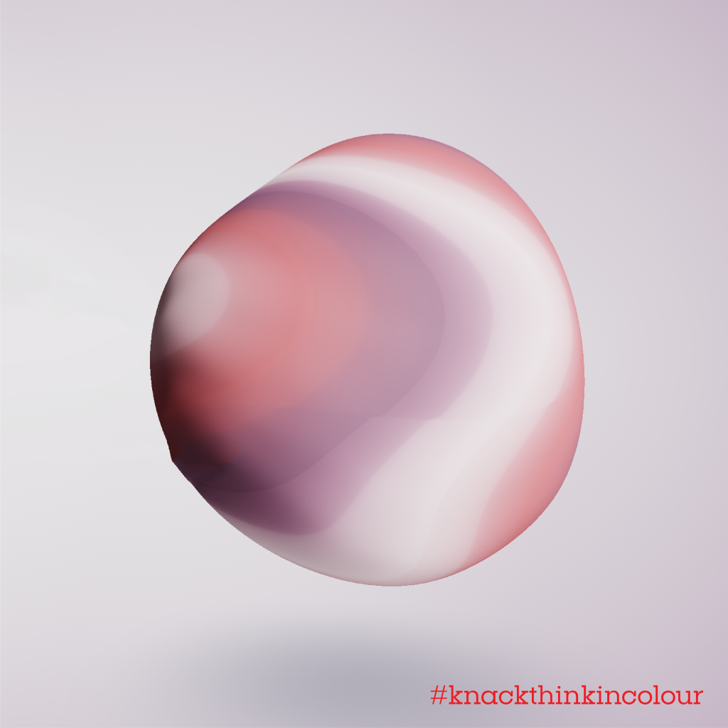
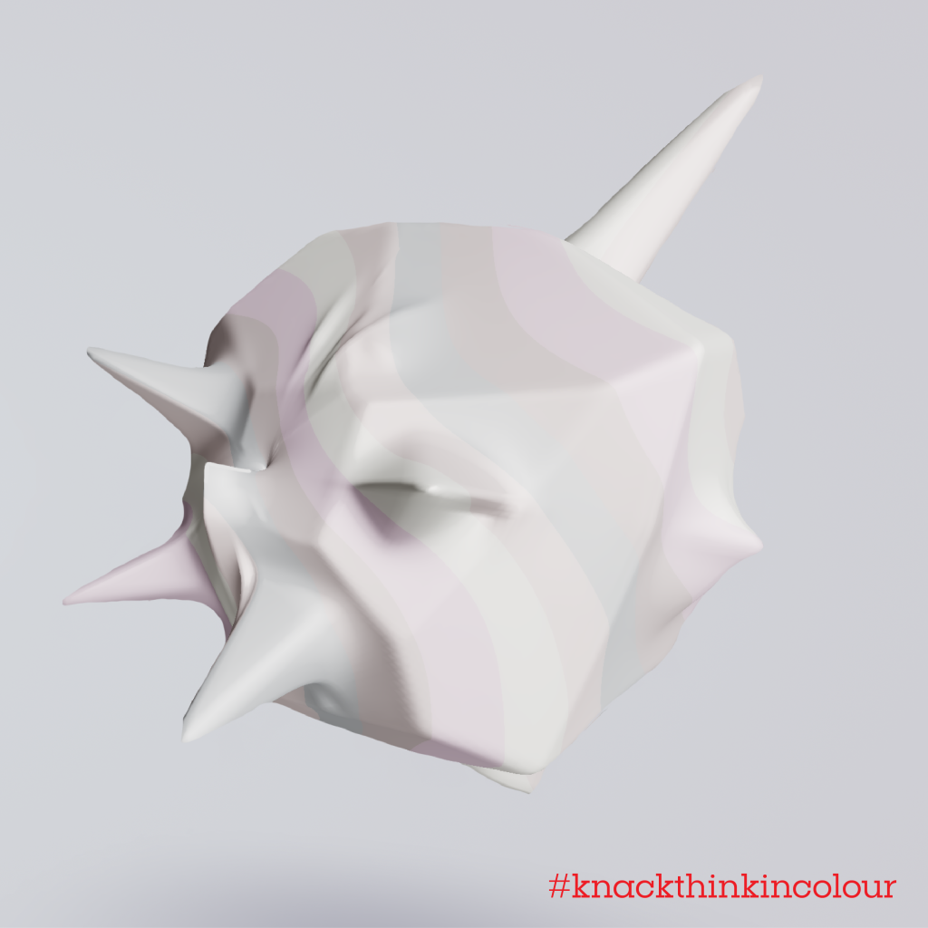
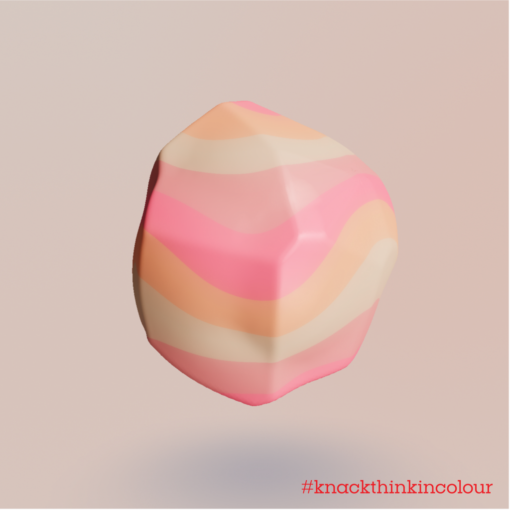
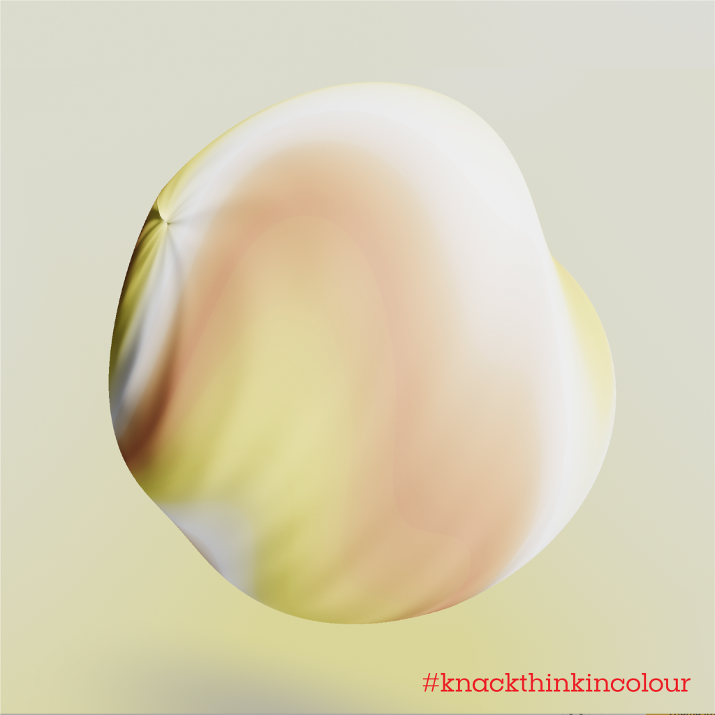
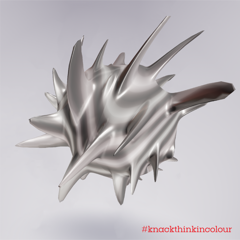
‘Think in Colour’ is an online questionnaire that examines how black and white a person’s thinking is. It visualises their thinking on the basis of how a selection of 15 questions are answered. Each person can discover their own unique shape by sharing their opinion on several topics. After each question their shape changes slightly, ending with their own personal ‘sculpture’ which is a downloadable JPG from the results page right at the end of the questionnaire. The questions were developed in collaboration with phycologists at the renowned University of Brussels (VUB) which specialises in human sciences, measuring different parameters such as empathy, open-mindedness, flexibility and intellectual curiosity. These are based on different psychological tests, such as the BFI-2 and FIT-60 tests.
Wondering what your mind looks like? Do the test here: thinkincolour.eu
Bert Bultinck, Editor-in-Chief of Knack said: “Our brand platform, Dare to Doubt, is a literal challenge to our readers to question their own way of thinking. If we’re serious about, that we must invest in tools that make that feasible. The past couple of covid-stricken years have shown the importance of comprehensible, clear visualisation and that’s why we think Think in Colour is so relevant right now.”
Odin Saillé, Founder and Executive Creative Director of Mutant added:
“We’re dealing with people’s thoughts here so we spent a lot of time conversing with the people at the VUB to guarantee a relevant, well-thought-out tool and not a gimmick. Because in times where people through their opinions around like the easter bunny, it’s super necessary to get a better understanding of your own thinking.”
The tool won’t just disappear after this campaign. It will become a weekly column in which the tool will be used to interview people. The outcome will be featured in the magazine and on its digital channels.
Credits
Agency: Mutant
Brand: Knack
Client: Nele Baeyens, Bert Bultinck, Anne Nijst, Jeroen Van
Raemdonck, Anne-Sophie Bailly, Camille Paly
Creative Director: Odin Saillé
Strategic Director: Odin Saillé
Creation: Roxane Schneider
Creation: Pieter Claeys
Creatives: Jonathan d’Oultremont, Matthew Lootens, Benjamin
Van Synghel, Olivier Maquenne, Olaf Meuleman
Design Director: Frank Schouwaerts
Client Director: Innie Tran, Soraya Hellara
Client Manager: Loes Daemen
Tool development: Nocomputer, Studio Hyperdrive
Animation: Whojo
Sound: Raygun
Vrije Universiteit Brussel: Gina Rossi
Source: Mutant








You must be logged in to post a comment Login