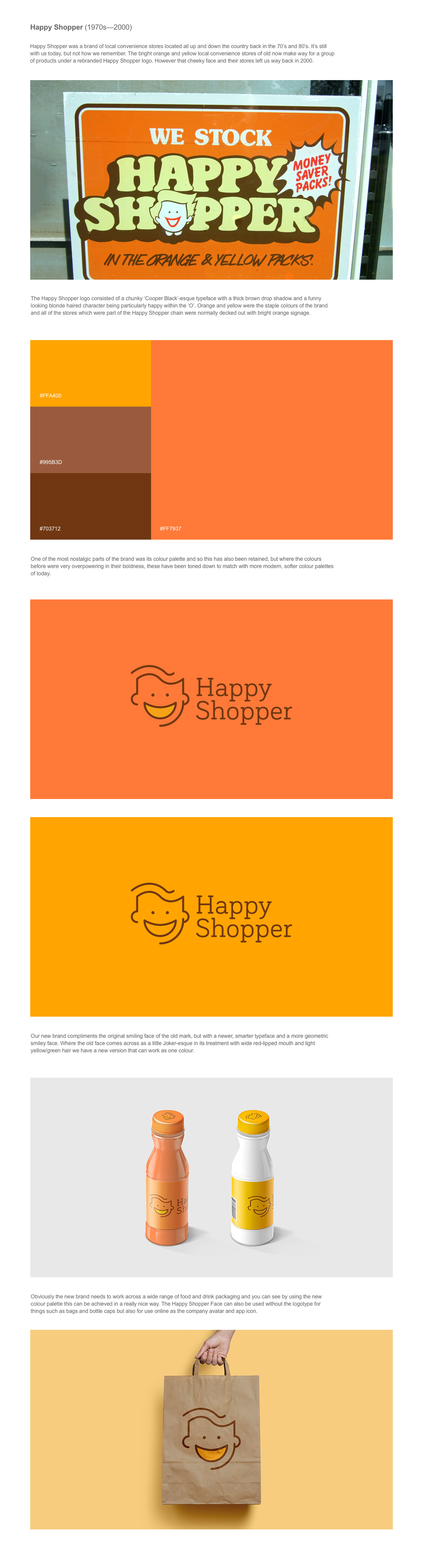
 Branding is more than an emblem, colour or typeface, it is a representation of a business, what it stands for and the way in which a customer perceives a company.
Even for some of the most iconic British brands, a logo refresh every so often is important. Your branding must evolve as your company progresses to keep it modern, interesting and, of course, recognisable to consumers.
Although still including the iconic lion, the recent Premier League logo redesign divided opinion with some thinking it was too much of a change from its predecessor. This is something we’ve seen frequently in the last few years with examples such as Google, Spotify and iTunes revamps.
Social media opens the door to public opinion, which should be welcomed, especially when it’s to do with a brand they feel so connected to. Logos, colour choices and typefaces are very subjective, but whether it’s well received or not, rebrands certainly do get people talking.
It’s very hard to gain 100% positive feedback with a rebrand, but it’s a better choice than falling behind and shying away from modernising your brand.
To celebrate domestic greatness of the past, Banana Moon recreated five now-defunct companies’ logos, to put hypothetical rebrands to the test.
Rover, Ocean Software Ltd., Rumbelows, Happy Shopper and British Steel were our top choices – the well-known and loved British brands all ceased trading within the last 20 years or less and it felt like time to bring them out of the shadows.
A number of things were taken into account when creating each of the five company makeovers. We focused on the styles of existing successful rebrands to catapult truly out-of-date logos and design elements into the 21st century, whether it meant redeveloping them from the ground up, or returning the companies to their roots.
Article By Alex Grace, Marketing Director, Banana Moon.
Branding: The importance of company image added by newsroom on
View all posts by newsroom →
You must be logged in to post a comment Login