Britain’s walking charity, the Ramblers, reveals a vibrant new identity system in a move to guide more individuals towards the pleasures of walking. The complete refresh was led by global branding agency BrandOpus, which used the opportunity to drive a more meaningful and positive narrative for the organisation. The overhaul launches today across a new website and key communication platforms.
With an 86-year-old history, the Ramblers’ mission has always been to expand and protect the places people love to walk and to promote walking for pleasure. Today, this mission includes not only removing physical and legal barriers to walking but also tackling social barriers – such as green equality – as well. The new identity comes at a pivotal time for the organisation. Since the nation is increasingly looking towards the outdoors to get fit and boost wellbeing, BrandOpus hopes the clearer narrative of the rebrand will stimulate new memberships and fortify current ones.
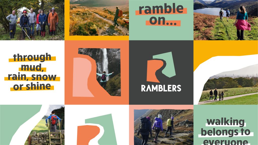
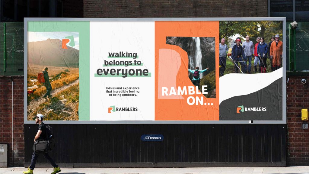
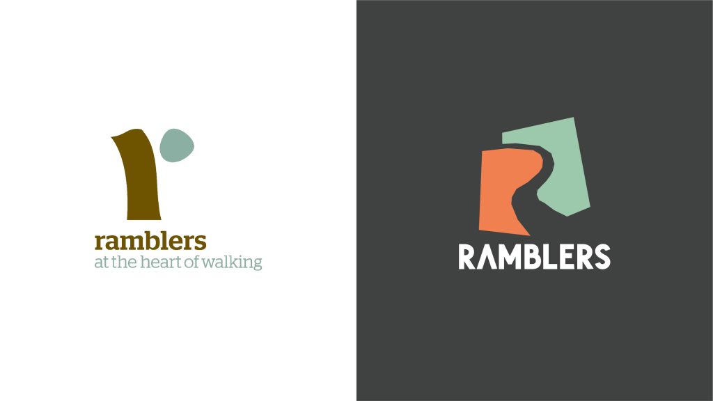
Rooted in the idea of ‘opening the way’, the fresh identity comprises a papercut that crafts an open ‘R’ path, symbolising that anyone can create their own way through the landscape. A refreshed colour palette of upbeat earthy tones and a bold, rounded typeface, appeals to walkers by emulating the outdoors and bringing the open and active characteristics of the Ramblers to life.
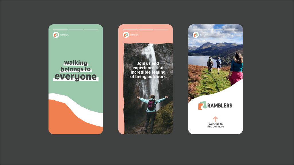
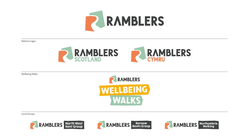
BrandOpus was challenged to reframe the Ramblers brand to appeal to wider recreational walkers, whilst still maintaining existing loyal memberships. With hundreds of local groups, the brand also needed to sit under one clear and compelling visual expression that could flex across all touchpoints from digital to comms. Not only has the Ramblers look and feel across the groups’ and nations’ logos been unified, the ‘Walking for Health’ initiative has been rebranded to ‘Wellbeing Walks’ to feel part of the Ramblers family.
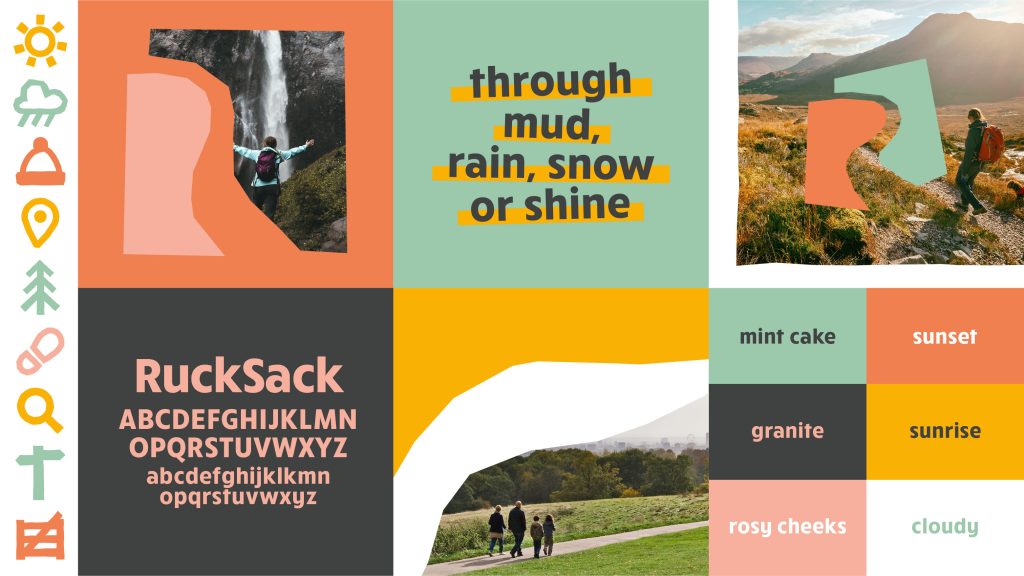
Design details of the wider brand world include:
● Inspired by the new brand symbol, the papercut iconography alludes to the different path shapes that celebrate ‘opening the way’, creating an ownable treatment.
● A contemporary colour palette draws inspiration from walking outdoors to instill a sense of warmth, with names of: ‘Sunset’, ‘Granite’, ‘Mint Cake’, ‘Rosy Cheeks’, ‘Sunrise’ and ‘Cloudy’.
● The bold typeface ‘RuckSack’ brings the open and active characteristics of the Ramblers to life through clean rounded shapes.
● A natural and open photography style aims to highlight the Ramblers experience, striving to show all walks of life amongst walkers and across all terrains.
Carol Flint, Head of Brand, the Ramblers, comments “BrandOpus has transformed the Ramblers brand, setting us up to move from being perceived by many as a lifestyle club for walkers, to presenting ourselves as an inclusive vibrant community unified by an important cause. Not only did the agency unite our charity under a single brand framework, but they also brought a level of vibrancy to how we showcase the pleasures of walking and we’re delighted to share it with the world”.
Ellen Munro, Creative Director, BrandOpus, adds “We set out to open up the Ramblers to a wider audience by bringing an open path into the identity. The refreshingly bold identity system not only champions all the wonderful campaigning work that the Ramblers does, but also provides a welcoming and open way for others to join. The papercut style extends to the layouts, typographic treatment and iconography, and when set in the naturally vibrant colour palette, creates an open and energetic Ramblers.”
Source: BrandOpus



You must be logged in to post a comment Login