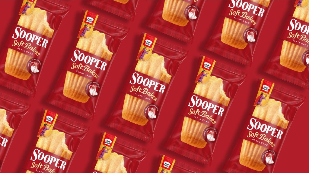
Brand and design consultancy, StormBrands has continued its partnership with international baked goods company, EBM with the launch of a single-serve soft baked cake within the Sooper range. The new product launch comes off the back of the successful redesign of the Sooper core biscuit range which StormBrands delivered last year.
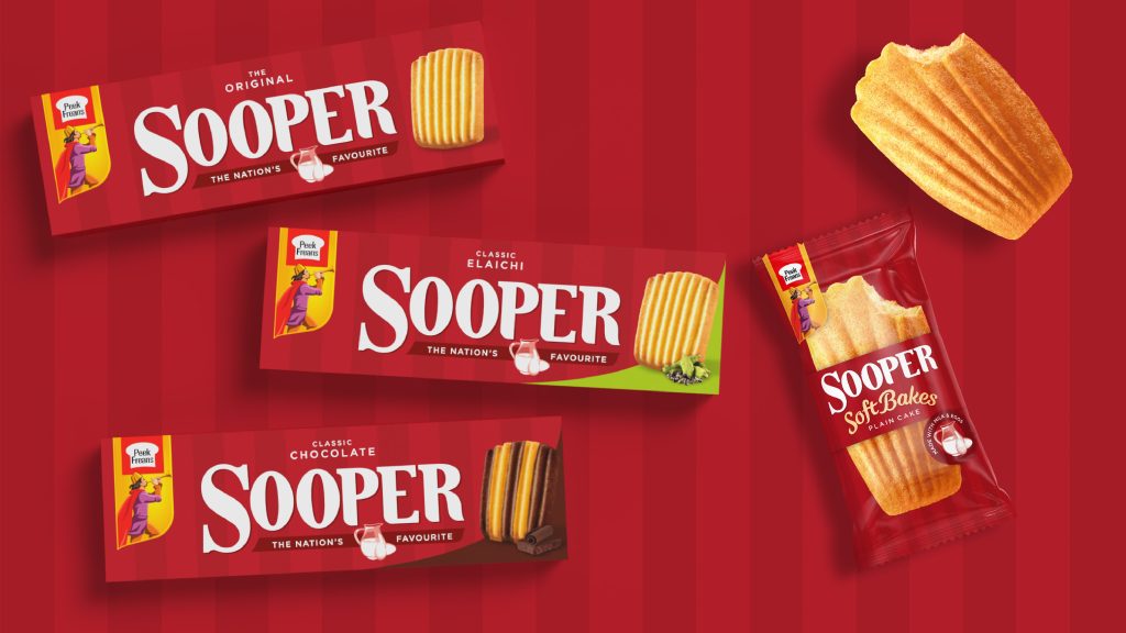
EBM, a market leader in the biscuit category has sought to significantly shake up the packaged cake market under its Peek Freans brand in Pakistan. Originally launched in 1996, Sooper is Pakistan’s number one selling biscuit brand and is a well-loved cupboard staple in the country. Consumers have a deep affection for the biscuit brand which is usually enjoyed with a cup of tea.
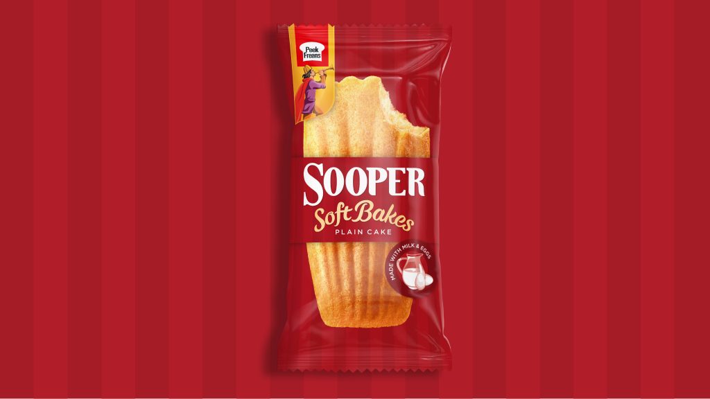
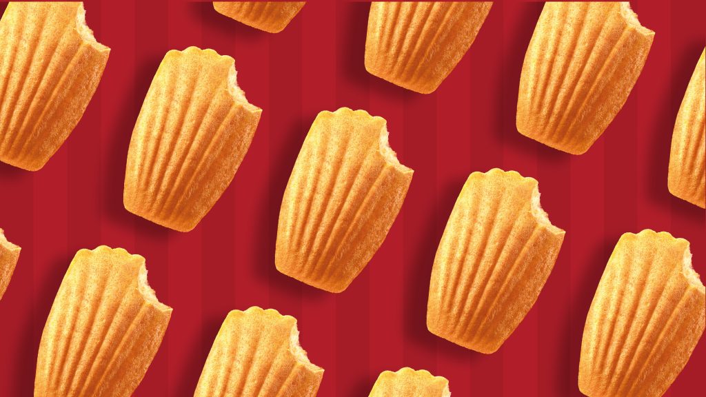
After a strategic review of the Sooper portfolio StormBrands worked closely with the brand team at EBM to identify key white spaces for development to further nurture the range. The resulting new ‘Soft Bakes’ product offers an on-the-go, sweet treat experience and continues to deliver nutritional reassurance through its real milk and egg ingredients. It also features the 7 iconic ridges that appear on the original biscuit. Storm have strategically employed both fixed and flexible assets to successfully develop the brand extension from the master-brand whilst building a design system that is robust enough to allow for future range development.
Zoe Phillipson, Creative Director at StormBrands commented:
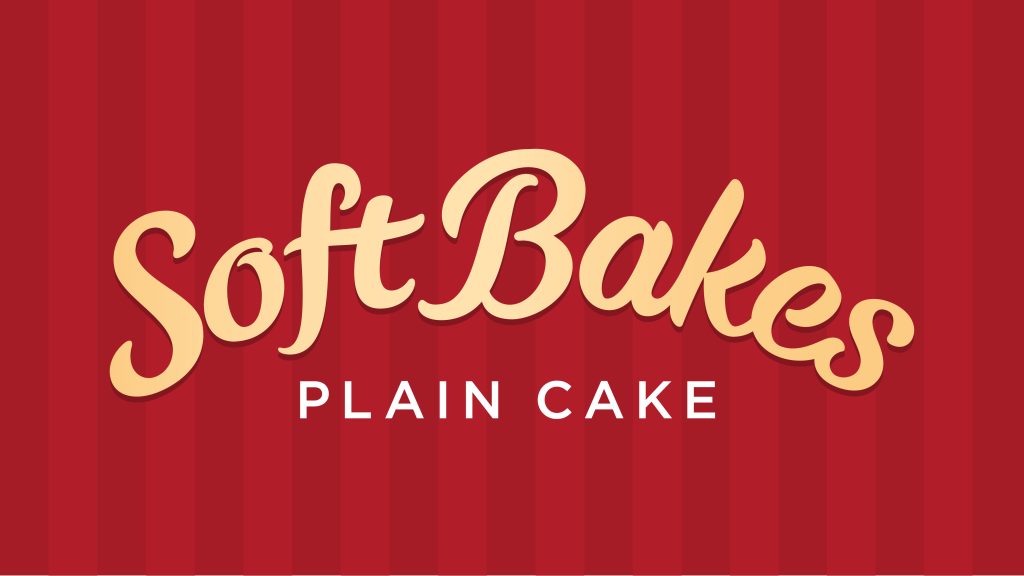
“We wanted to harness the equity of the recently re-designed Sooper Masterbrand and find flex where ‘Soft Bakes’’ melt-in the mouth personality could shine through. Typography was the obvious answer. We created an ownable and easily legible, soft, pillowy, hand-crafted script that echoes the curve of the cake and cues velvety, buttery, gorgeousness. The resulting pack design teases the single delicious cake inside with an endorsement of the brand’s trusted ingredient credentials.”
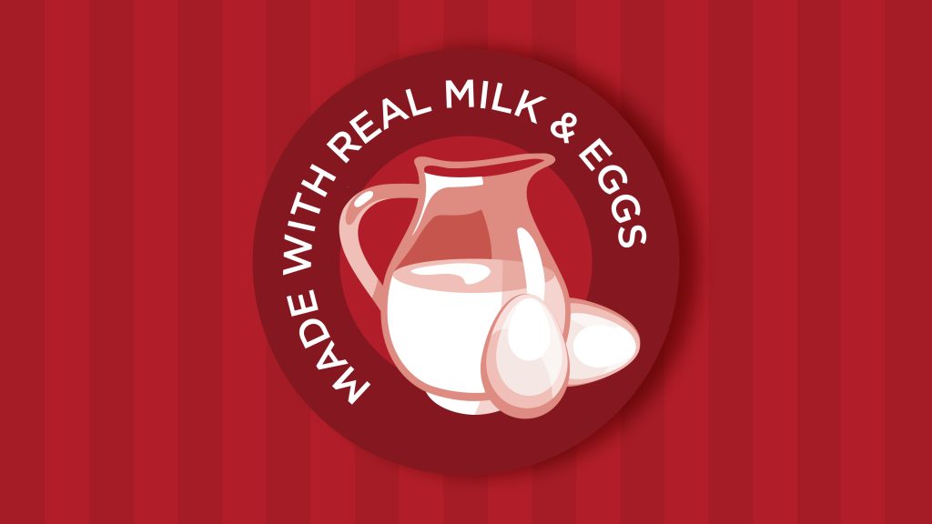
Shahzain Munir, Executive Director at EBM added:“Sooper continues to grow as the ‘Nation’s Favourite’ biscuit brand in Pakistan. For the launch of our brand extension into cakes we were keen to leverage our distinct master-brand design assets such as the bold Sooper brand red, the prominent brand stripes and the trusted milk and egg symbol. StormBrands’ contemporary design appeals to a new generation of Sooper consumers but also succeeds in retaining our highly recognisable and well-loved brand iconography. The response from consumers in market has been phenomenal.”
Source: StormBrands

You must be logged in to post a comment Login