BritBox, the leading streaming service for British television in North America, Australia and the Nordics, has unveiled a refined new brand identity designed in partnership with creative company Sibling Rivalry.
Building on BritBox’s existing equity and profitable position in the market, Sibling Rivalry’s brief was to evolve, rather than reinvent, the brand for today’s viewer. The team audited years of organic growth and informal brand use, then codified a coherent system spanning visual identity, motion, tone of voice, and sonic branding, anchored in the idea of a British speciality streamer bringing a curated eye and fresh perspective to an increasingly crowded streaming landscape.
“This refreshed identity strengthens the clarity and confidence of the BritBox brand,” says Abby Elkin, VP, Brand and Creative, BritBox. “Sibling Rivalry understood our brief to evolve the brand and bring it to life through a flexible, modular system that expands our creative toolkit and elevates premium perception. What stands out most are the ways the new identity captures our perspective and highlights the wit, charm, and nuance that define British storytelling. It sharpens our voice and creates much-needed cohesion for our audiences across the consumer journey.”
Designing with restraint
The visual identity refresh is the next step in the brand’s overall evolution, starting with the “See It Differently” campaign, launched in spring 2025. The campaign works hard to push against British stereotypes, showcasing the surprising breadth of British genres and elevating “British” from a place to a perspective.
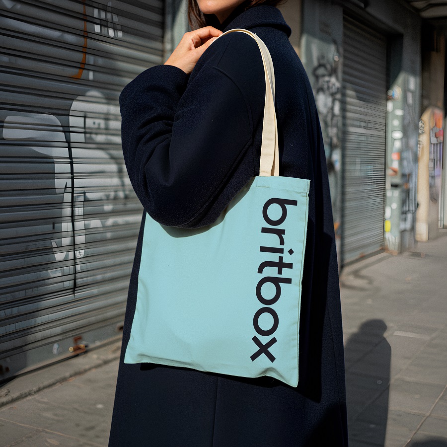
Building on this foundation, Sibling Rivalry leaned into the craft, curation, and brevity of wit that defines British storytelling. The work deliberately avoids clichéd British tropes, shifting away from the stereotypical Union Jack red-and-blue duotone logo towards a simplified, single-color mark, and an expanded toolkit of fonts and color palette. The result is a brand that feels modern, curated, and cohesive, yet remains subtly evolved to existing fans.
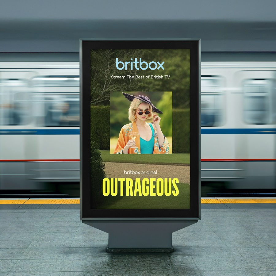
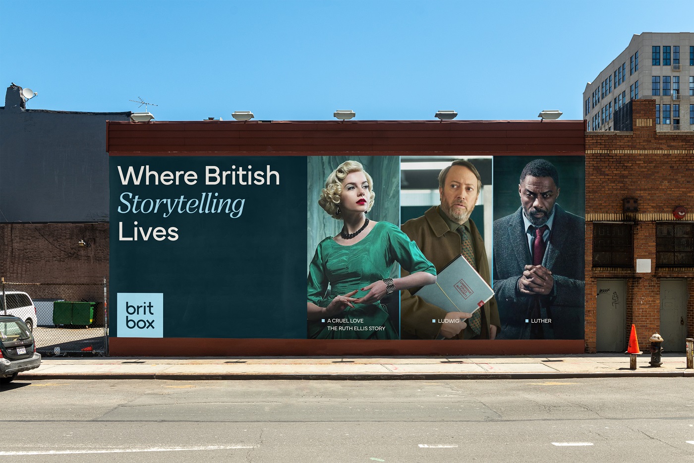
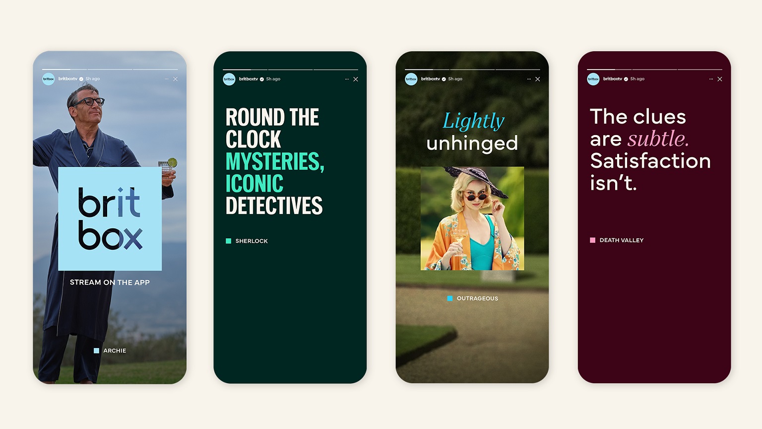
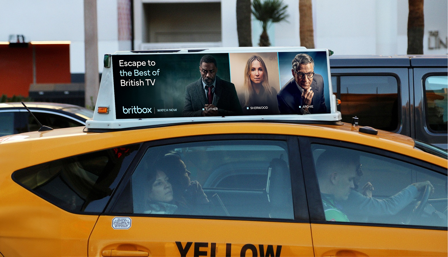
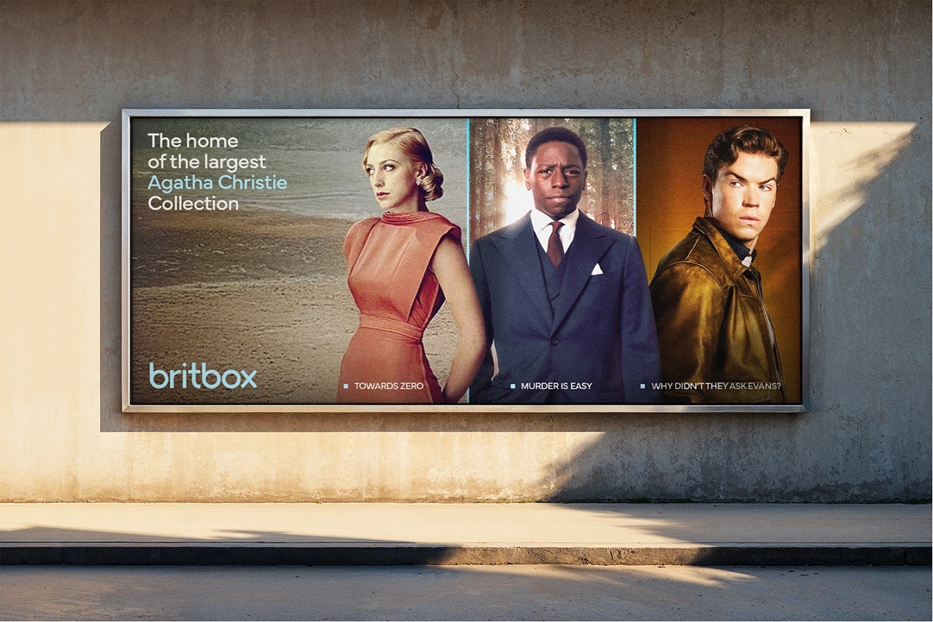
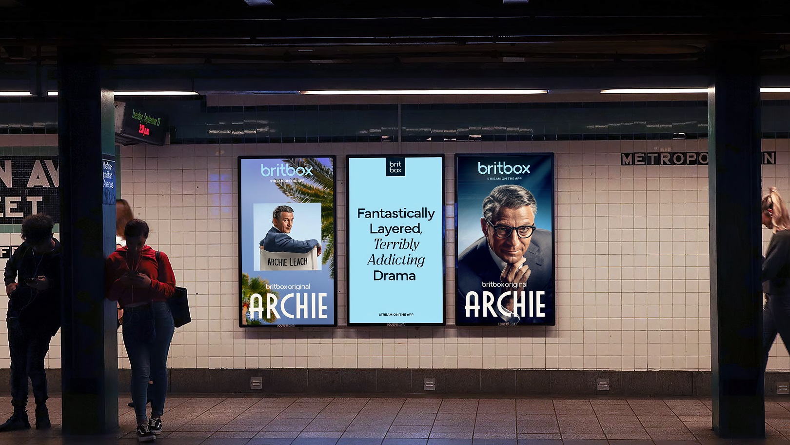
Built for flexibility, the visual system centers on the ‘box’ as a framing device. Serving as more than a logo container, the box is a quiet curator that runs through the brand. It frames characters, moments, and key UI elements, creating visual worlds around individual shows, while giving marketing and promotions a consistent BritBox signature – even when the logo isn’t present.
The brand has a new set of visual layouts, called “macro moments,” which reflect the way that British storytelling uniquely marries character and place. The layouts feature the box icon as a portal into British characters, married with a macro texture that anchors the story in its setting.
A cohesive visual, motion, and sonic toolkit
The new brand is anchored by a distinctive sonic mnemonic that extends the idea of a fresh perspective into sound. Working with composer Joel Pickard, Sibling Rivalry defined a short, memorable sequence that feels warm and confidently British without pastiche.
Lightly melodic, the mnemonic is designed to leave viewers with a feel-good sensation that matches BritBox’s refined positioning, as well as the shows themselves. It sits within a broader sonic toolkit, with variations for idents, promo endboards and product moments, so the brand sounds as consistent as it looks.
The hero mnemonic was developed hand-in-hand with motion principles, so the box device and character framing sync tightly with audio for a cohesive experience – with the box device moving along the wordmark before coming to rest above the “i”. The result is a guiding visual and audio expression that captures the smart, inviting, and humbly refined essence of BritBox. Sibling Rivalry has delivered a full motion toolkit, guiding BritBox to use motion assets consistently across the platform – including endpages for streaming content and promos.
“BritBox was already successful, profitable and well loved, but its brand lived more in instinct than in a cohesive system,” says Bo Bishop, strategy director at Sibling Rivalry. “Our job was to distill everything down to a single, memorable idea and bring that to life in a way that feels confident, contemporary, and distinctly BritBox.”
The new BritBox identity will roll out across product and communications as the service continues to expand its footprint in streaming.
Source: Sibling Rivalry
BritBox Launches Refreshed Brand Logo and New Motion and Sonic Branding Designed By Sibling Rivalry added by newsroom on
View all posts by newsroom →
You must be logged in to post a comment Login