A global brand refresh of skincare brand Simple has launched, elevating its Active Skin Barrier Care range to create a clearer distinction from its core range. Designed by international branding and design consultancy Lonsdale, the new identity reaffirms the Unilever brand’s expertise in uncomplicated, effective, and affordable skincare. The new range is rolling out in the UK now and will follow globally.
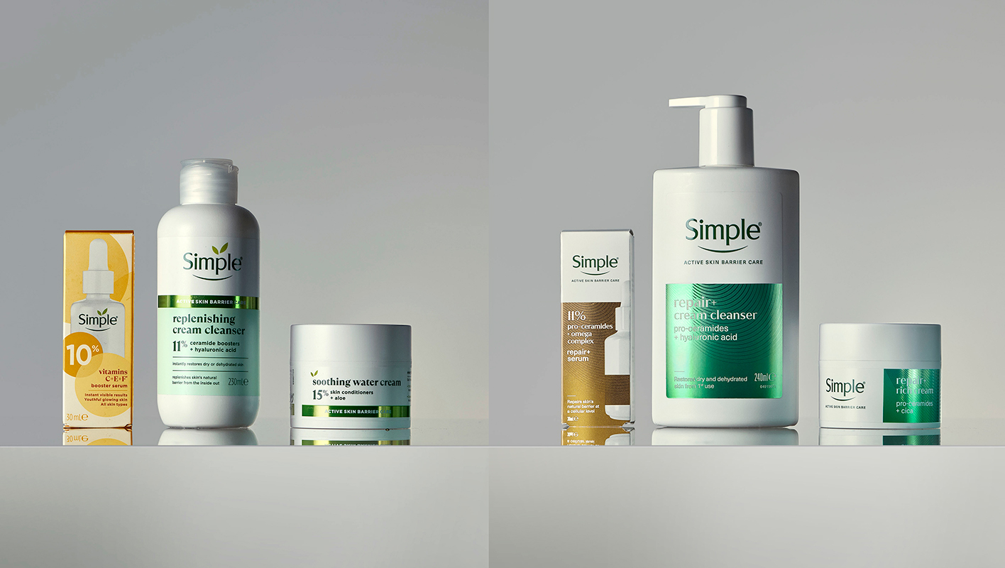
For generations, Simple has been a trusted choice for straightforward, sensitive-skin-friendly care. The Active Skin Barrier range was developed to address a broader set of skin concerns using powerful ingredients that provide cellular level damage repair and prevention. However, the range’s aesthetic lacked strong derma credibility and a clear differentiated proposition. It leaned too closely to the core range’s friendly, approachable look, rather than signalling advanced performance.
With Gen Alpha growing in spending power and showing a sophisticated interest in skincare, Simple needed to assert efficacy and transparency by communicating the science behind its formulas, without losing its heritage of authenticity and warmth. Ingredient-led storytelling, refined hierarchy, and purposeful restraint now convey effectiveness, confidence, and care.
Design approach
Simple’s long standing wordmark was refined by removing the leaves above the logotype, bringing sharper focus to the trusted name: Simple.
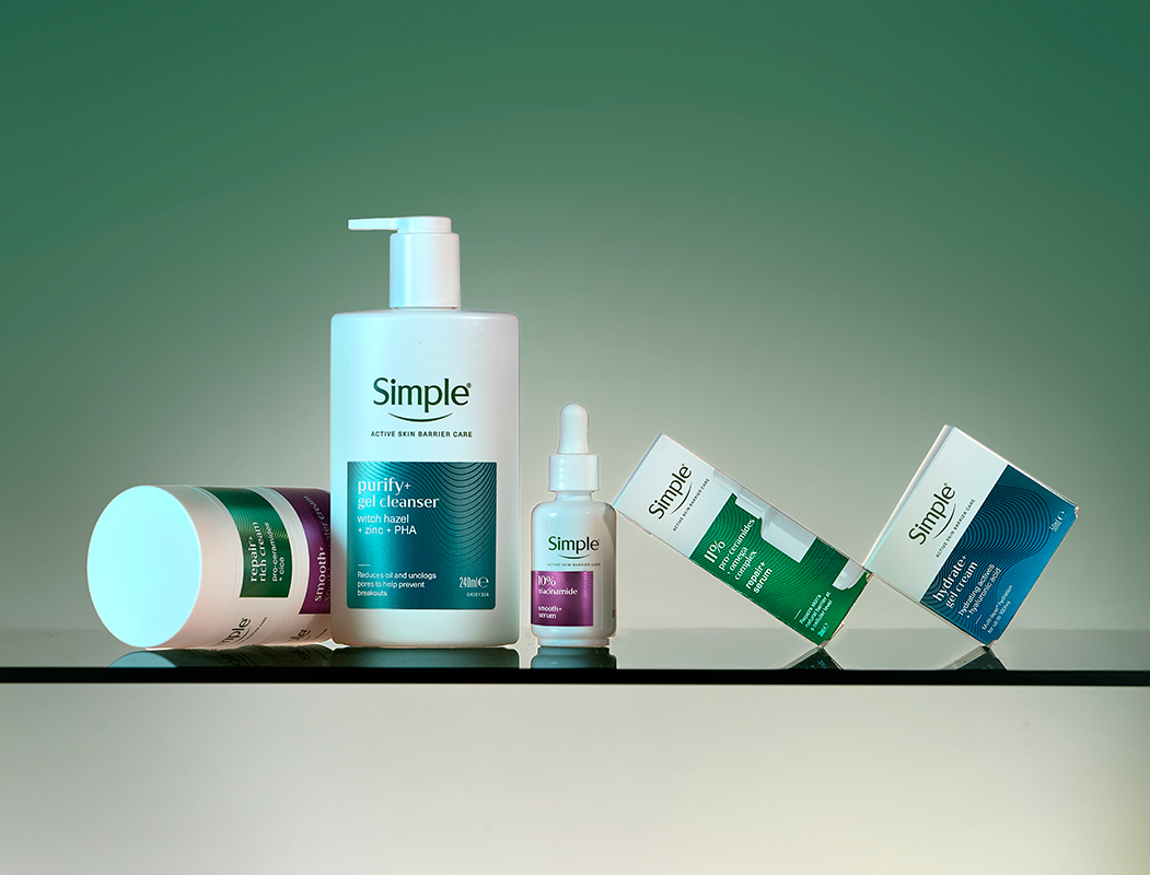
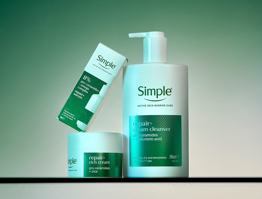
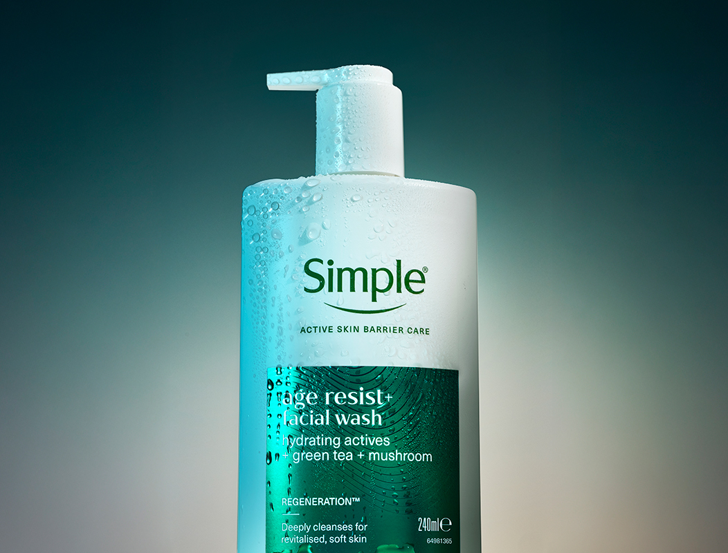
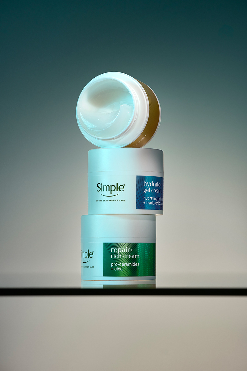
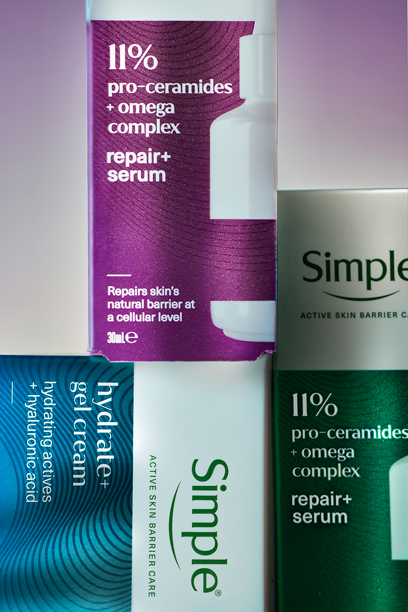
The Active Skin Barrier Care redesign highlights active ingredients and benefits, reducing clutter and improving clarity in its architecture. Precise layouts guide and educate consumers while maintaining Simple’s accessible tone. The evolved colour palette pairs Simple’s signature green and white with new gradating metallic tones, creating an easy navigation system across six benefit-led sub-ranges.
A subtle new pattern, inspired by the contours of the skin, reflects the brand’s belief in working in harmony with skin’s evolving nature. Existing printing techniques were used in more ambitious ways, layering transparent, opaque, and raised inks to add depth, tactility, and visual richness -enhancing the in-hand experience. Metallic effects express technology, precision, and performance, bringing desirability to a category where both efficacy and displayability are deeply valued.
The new look and feel transforms the iconic Simple design for a modern era—retaining its identity while elevating its expertise across every touchpoint, from packaging and web to point of sale. The result is an enhanced brand experience that makes Simple feel more intuitive, human, and confident, bridging science and sensitivity in a way that is both educational and emotionally engaging.
Michelle Mak, Creative Director at Lonsdale, said: “Skincare brands have proliferated drastically in the last several years, with new product innovations, complicated routines and endless steps becoming the norm. Simple has always been the OG brand that is the expert of essentials. Being simple isn’t boring or basic—it’s actually confident. This refresh lets Simple bring a more expert, premium feel while staying true to what people love: clear benefits, no clutter on the pack, and no clutter on your bathroom counter.”
Source: Lonsdale
Simple launches new look, redefining its premium skincare range added by newsroom on
View all posts by newsroom →
You must be logged in to post a comment Login