Design Bridge & K-Y from Design Bridge on Vimeo.
Design Bridge New York are excited to reveal their latest work for the original lubricant, K-Y: a brand and packaging redesign that proudly puts female comfort and enjoyment first, empowering women to pursue and own their sexual pleasure.
With most lubricant brands aimed at male consumers, K-Y was originally created in New York back in 1904, specifically for women. Fast-forward to 2019 and Reckitt Benckiser engaged Design Bridge to reinvent the K-Y brand and help achieve the brand’s new mission to “empower women to have better sex, always.”
Jess Marie, Design Director from Design Bridge New York, explained, “Women everywhere still struggle to have their voices heard, and the bedroom is no exception. KY has been making women physically more comfortable for decades, so we were really excited to help women feel more emotionally comfortable and confident in fulfilling their desires.”
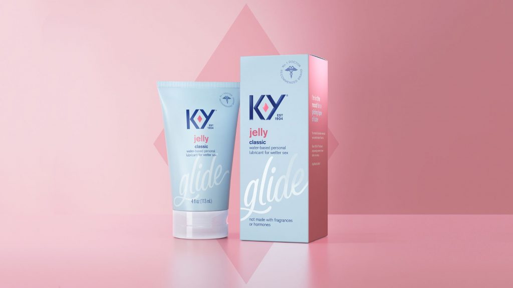
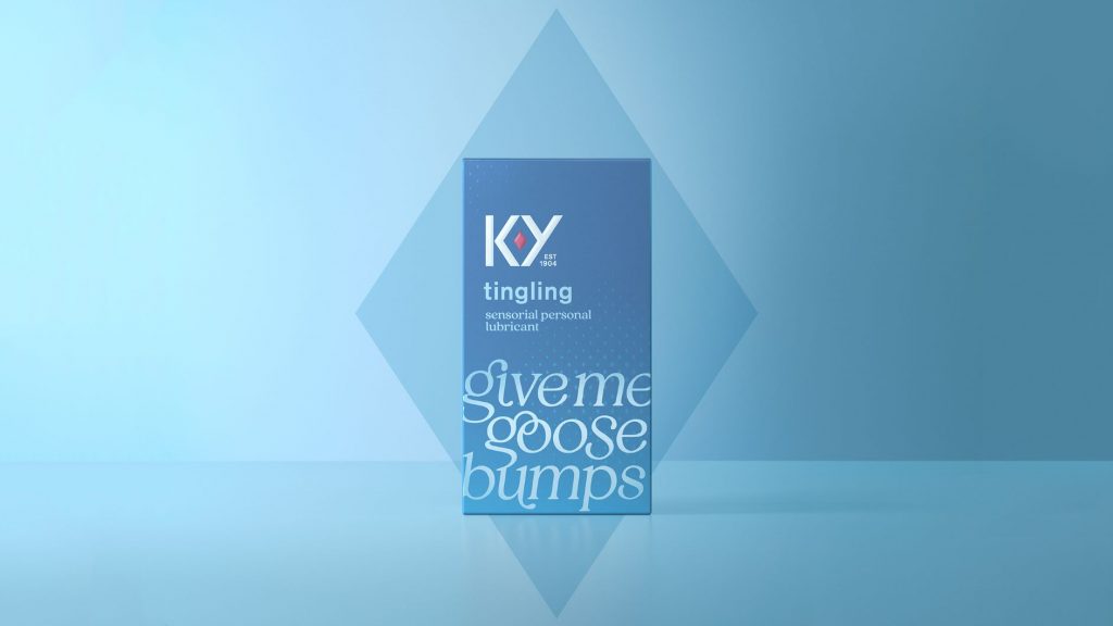
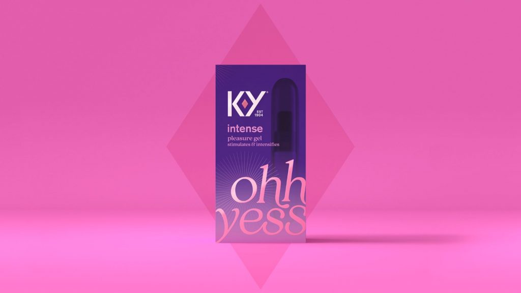
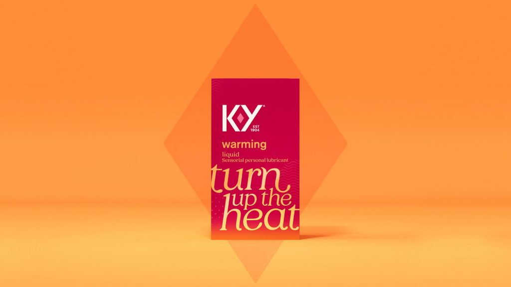
A strong symbol of female sexual power was placed right at the heart of the new brand identity – the ruby. Framed perfectly by the newly crafted K & Y, the ruby is a celebration of the vulva and a symbol of uncompromising passion and enjoyment. This new, unapologetic distinctive asset transforms across touchpoints to talk to the different forms of sexual pleasure that the brand wants to encourage.
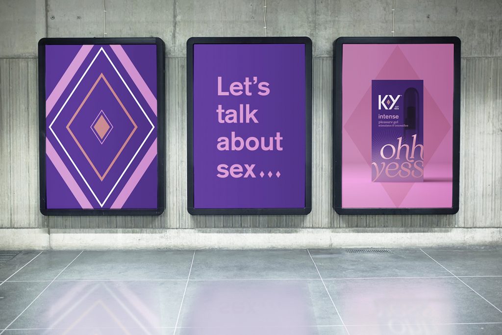
Claire Parker, Executive Creative Director at Design Bridge New York, explained, “We’ve unleashed a distinctive brand asset that was always there, it just never had any strength or purpose. By making it intentional, we’ve loaded it with meaning and brought a sensuality and confidence to the brand that was lacking before. An enormous step for a brand that was previously at best asexual, at worst clinical.”
The Design Bridge team came up with the simple yet powerful creative idea of “Let’s talk about sex”, and were inspired by the brand’s curious and sensual, yet uncompromising and expert new personality. With the vulva now so clearly celebrated at the heart of the brand, the surrounding brand world and assets were developed to further normalize female pleasure and build confidence between the sheets.
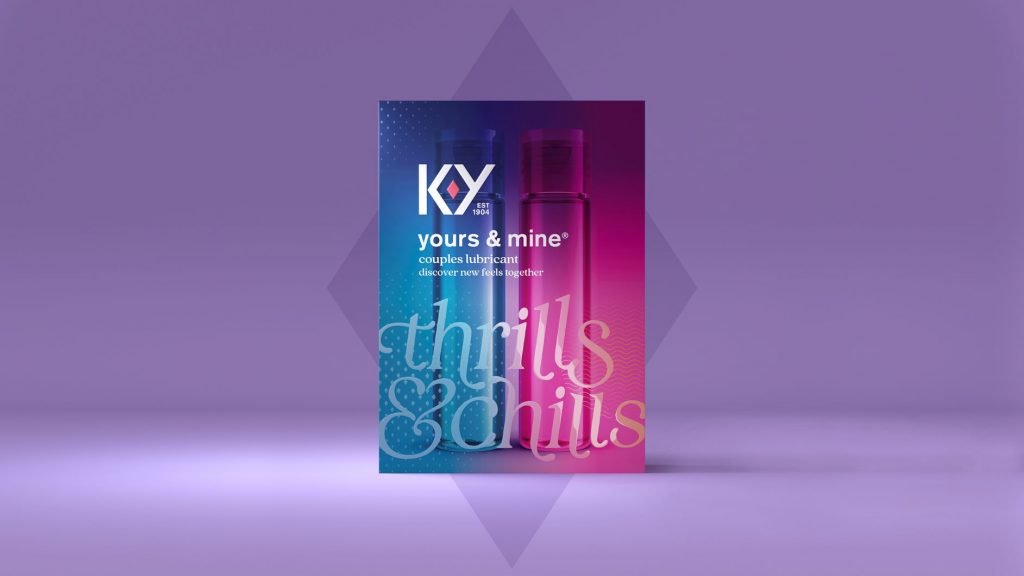
On pack, bespoke typography and iconography bring this creative idea and personality to life through playful, conversational messaging about each product, which in turn helps women to find the right product for them. The color palette has also been refined to improve navigation of the range, and the deep ruby red – a colour that universally represents love and passion – is now used consistently across the brand.
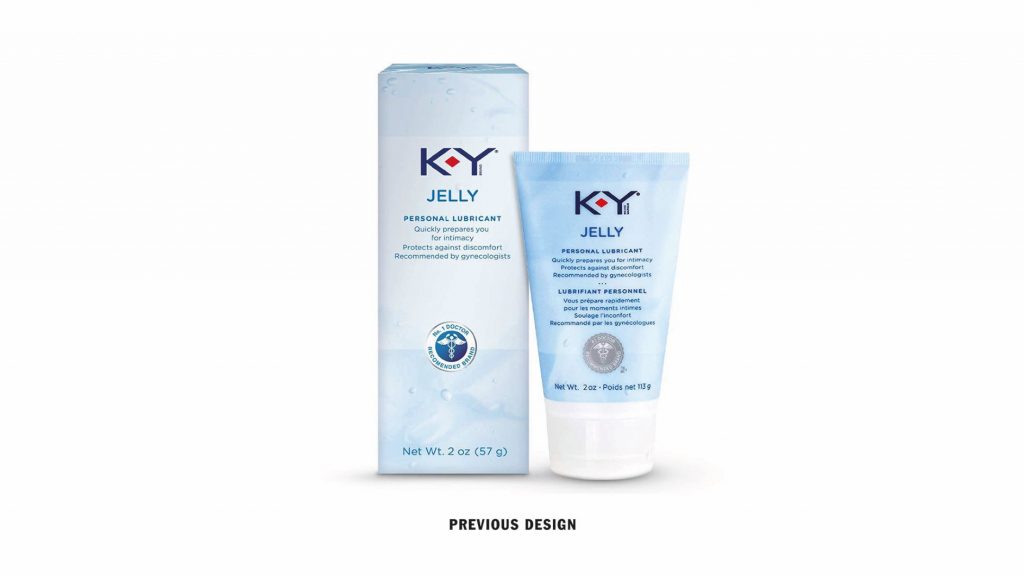
Jess Marie, Design Director from Design Bridge New York, continued, “Through the new brand, packaging and tone of voice, we’ve turned a medical-looking lubricant – that was often associated with female problems – into a trusted lifestyle brand that women are proud to purchase.”
The new identity and packaging will initially launch in the US, and Design Bridge New York will continue working on initiatives with the global K-Y team.
Bruno Funari, Senior Brand Manager from K-Y commented, “We felt there was an important need to both talk about, and celebrate, female sexuality in a market that predominantly targets men. We are very proud and passionate about what we stand for, and Design Bridge’s work has helped us communicate and solidify our position of empowering women to have the best sex, always.”
Source: Design Bridge NY

You must be logged in to post a comment Login