 Strategy and design consultancy Brand Remedy has created a new global brand for law firm Stephenson Harwood, after winning the work in a selection process overseen by the firm’s senior management team which involved more than ten agencies.
The rebrand, which supports Stephenson Harwood’s growth ambitions, is the result of the largest client and partner engagement programme undertaken in the firm’s 130 year history. Brand Remedy collaborated with strategic management consultancy Gulland Padfield.
Drawing on contributions from the partners, staff and key clients, the result is an authentic, client-centric brand which places Stephenson Harwood in a strong position to withstand current and future changes in the international legal market. As part of the new brand, the revised visual identity includes a new logo, an optimised website and a suite of tailored marketing collateral for key practice areas and sectors. Brand Remedy also consulted with the firm to clarify its brand values and design a communications campaign to introduce the new brand across the firm’s global offices in Asia, the Middle East and Europe and its 800 people.
Time for a change
The rebrand is the first significant change to the firm’s proposition and visual identity since 1998, and is a marked change from its previous branding.
Sharon White, CEO of Stephenson Harwood, explains: “The pace of change in our market means we have an ideal opportunity to articulate what we stand for and how we work with our clients. We’ve evolved hugely as a firm, broadening what we do into new geographic regions and legal services. It’s important that our new proposition and values are a confident projection of the firm.”
Anthony White, Director of Business Development and Marketing at Stephenson Harwood, adds: “As this was the first branding project the firm has undertaken in many years, it was vital for us to choose advisers who demonstrated expert knowledge of the global legal market, the creative flair to refresh our brand and the ability to engage credibly with our partners and clients. We selected Brand Remedy, supported by Gulland Padfield, because their proposal combined all of these elements and championed the idea of involving our clients and people to shape and validate our new brand positioning.”
Bright and brilliant
The market analysis, which included a rigorous process to involve the firm’s clients and staff in the creation of the new proposition, resulted in a clear, modern articulation of the Stephenson Harwood brand. James Edsberg, senior partner at Gulland Padfield, explains: “The foundation of the firm’s messaging was rooted in detailed insights from the firm’s clients who highlighted the calibre of the firm’s lawyers, their striking ability to build and nurture long-standing relationships and the straight-talking way they advise their clients.”
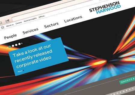
It was these insights that led Brand Remedy to create the new visual identity for the firm, which centres around bright lights and images reflecting movement and energy. Brand Remedy also art directed new photography of all staff to ensure portraits were consistent in style, and echoed the new branding’s modern and professional look and feel.
Richard Silbermann, Managing and Creative Director at Brand Remedy says: “Insight lies at the core of every project we undertake for our clients and it was crucial for this project that we took our strategic and creative lead from the market analysis. The new proposition is a true reflection of the commitment shown by Stephenson Harwood’s senior management team, which gave the project its full support and encouraged partner involvement throughout the process.”
Brand Remedy creates new brand for Stephenson Harwood added by newsroom on
View all posts by newsroom →
You must be logged in to post a comment Login