BrandOpus, the global branding agency, celebrates its move to employee-ownership through an identity redesign that champions the creativity of its team.
BrandOpus shifted to an Employee-Owned Trust model earlier this year, which recognises the importance and power of people within the business. Rooted in the idea of ‘uncommon sense’, the rebrand celebrates the agency’s distinct approach to creativity. The new brand world comprises three distinct dimensions:
- The Cracked Egg symbol: acting as a visual metaphor for creativity and ‘uncommon sense’, the new logo consciously symbolises hatching new ideas, and is inspired, in part, by Filippo Brunelleschi – the Renaissance architect who famously used ingenuity, creativity and an egg (!) to overcome his contemporaries’ bid to design the “undesignable” Duomo in Florence.
- A new colour palette: Drawing inspiration from the story within the new symbol, this distinctive ‘terracotta’ colour injects modernity. Paired with a black and white colour palette, it drives recognition across all brand touchpoints.
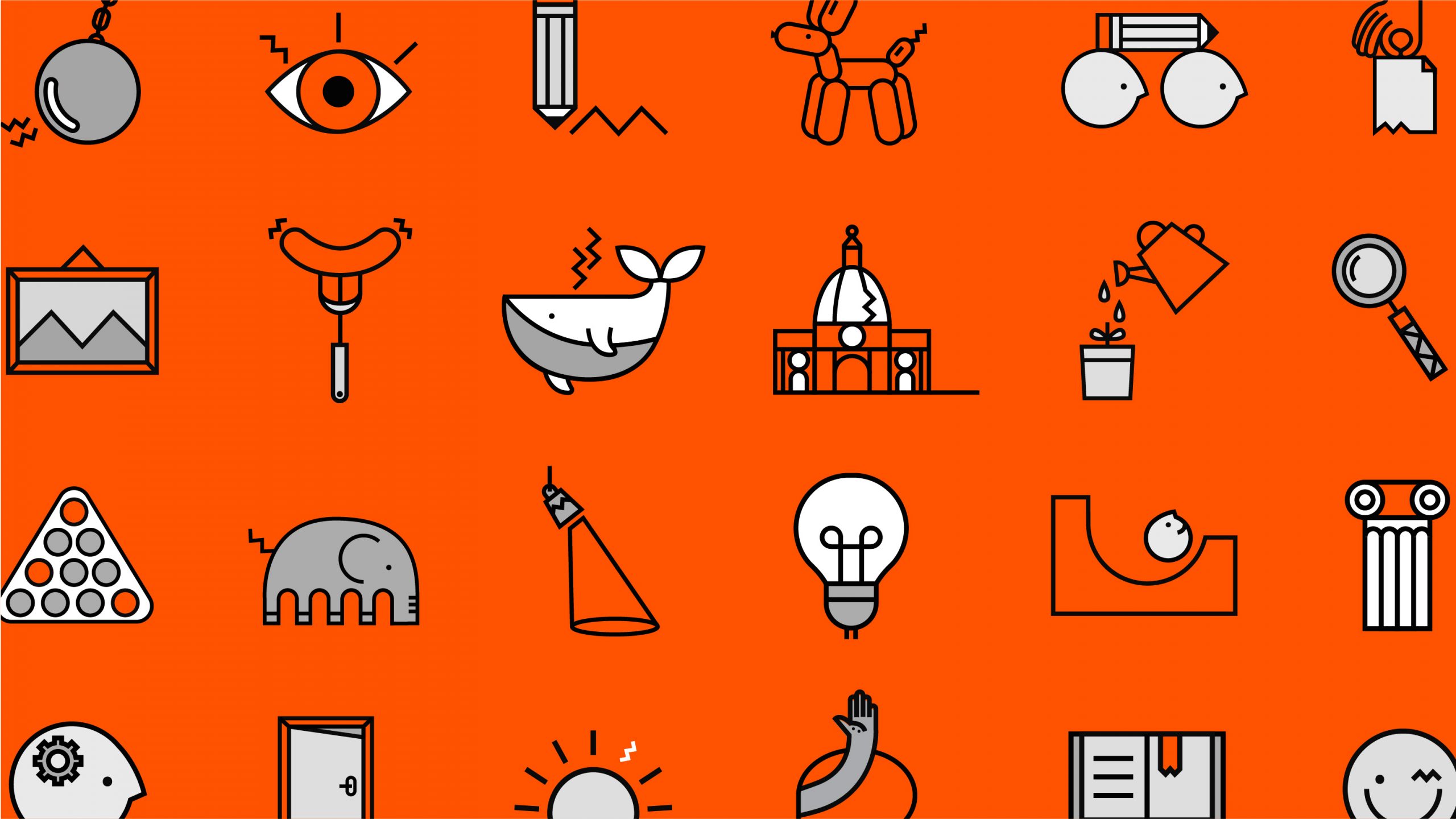
- A new suite of distinctive assets: Establishing a disruptive and ownable visual language that includes an expansive illustration style, developed with Martyna Makes, along with a bold and impactful serif typeface to deliver a distinctive tone of voice across all activations and communications.
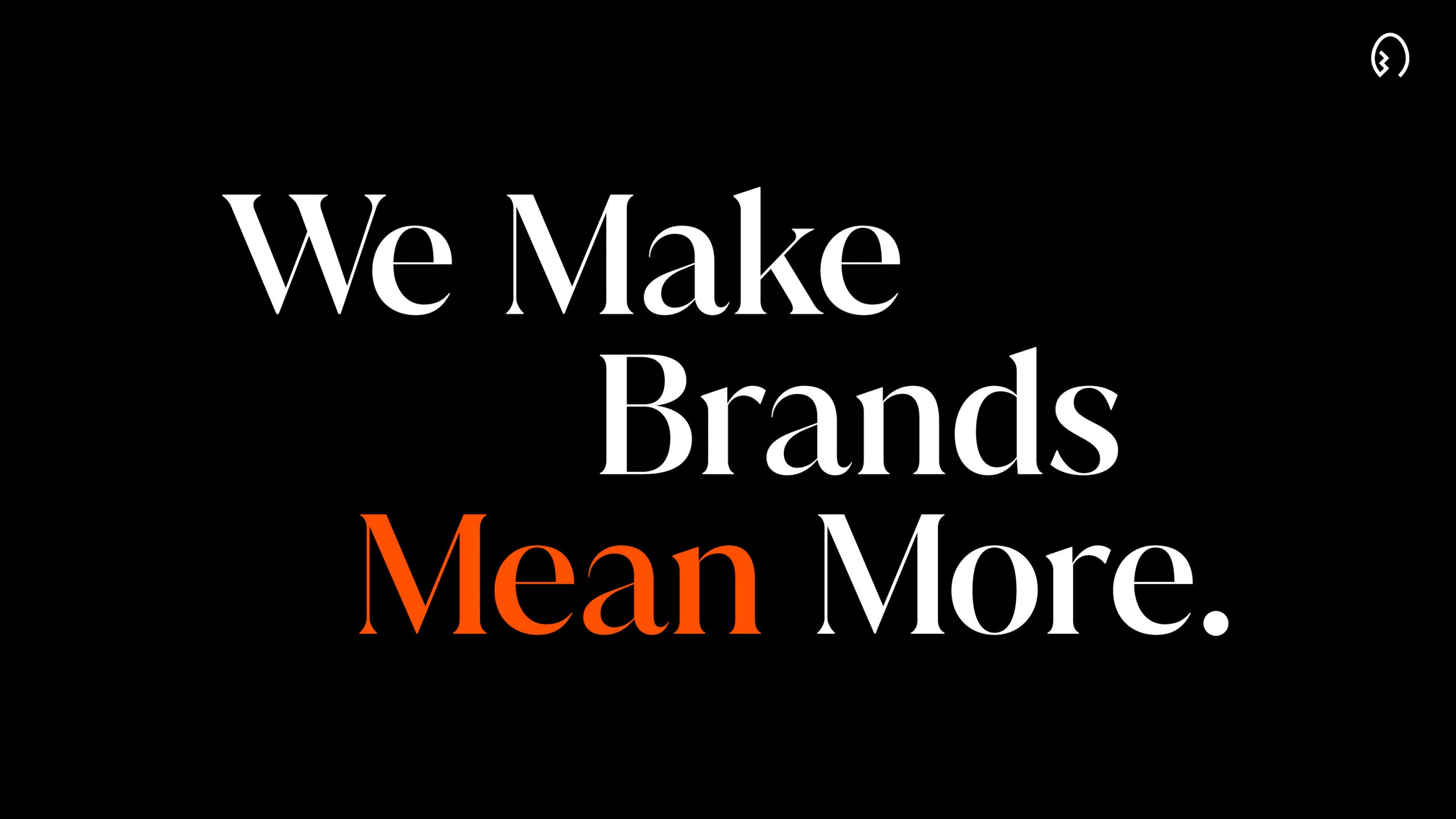
Speaking about the brand overhaul, Nir Wegrzyn, CEO and founding partner, BrandOpus commented: “We exist to change the way people feel about brands and wanted to change the way people feel about ours. Moving to an employee-owned company marks a significant shift in our business and we wanted to ensure our brand reflects the magic and creativity that our people bring.”
“To change feelings, you have to change meaning and we believe the most intrinsic way to do that is through associations. The new identity commemorates our distinctive approach to ideas through the Cracked Egg – a metaphor that is full of meaning both hidden and obvious. Alongside a fresh typeface, illustrative style and colour palette, the new design reflects the agency for today and tomorrow, and we’re excited to share it with the world.”


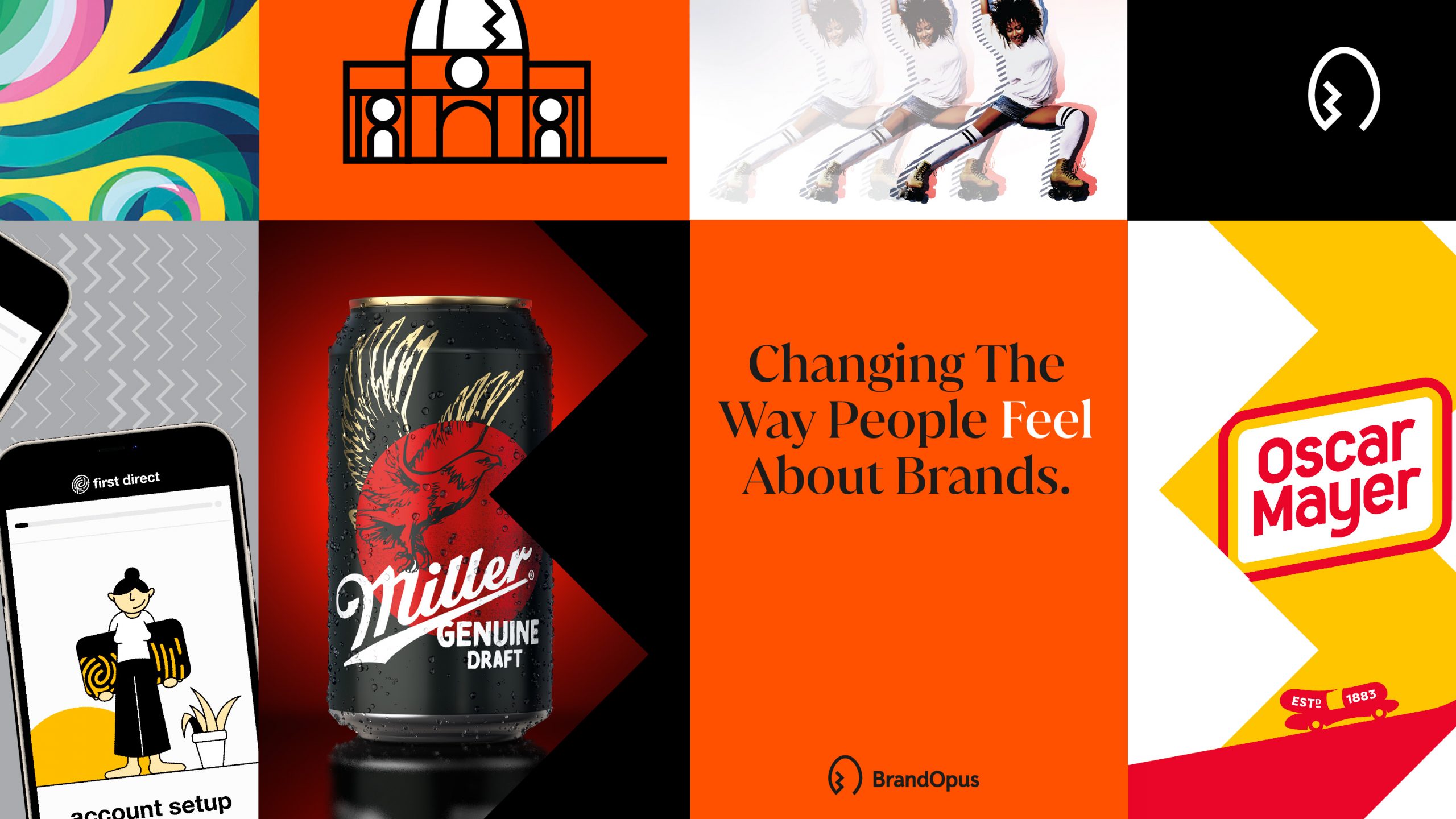
The identity system has been rolled out across the agency’s new website, social channels, and wider brand world.
Source: BrandOpus
BrandOpus Heroes Its People And Unique Brand Of Creativity With Identity Overhaul added by newsroom on
View all posts by newsroom →
You must be logged in to post a comment Login