Chicago-based strategy and design agency VSA Partners helped the data center provider strengthen its brand focus on data center density, scalability and certainty of execution.
VSA Partners, a strategy and creative agency, recently announced the launch of new brand identity work for client EdgeCore Digital Infrastructure. The work was created to better reflect EdgeCore’s updated business strategy and plans to develop gigawatt sized data center regions to support customers’ AI/ML workloads.
At the heart of the rebrand is EdgeCore’s new tagline, “Designed for Density,” which aptly describes its focus on developing 300+ MW data center campuses capable of providing high-density power to the world’s largest cloud and internet companies. The new brand messaging better communicates the company’s alignment with customer priorities, such as scalability and operational efficiency, as well as the commitments EdgeCore has made to sustainability, safety and local communities.

“This new brand all comes down to communicating certainty,” said Anne-Marie Rosser, Chief Executive Officer at VSA Partners. “An EdgeCore client could find space elsewhere. But it’s the certainty that EdgeCore can deliver the density they promise—on time and within budget—that enables them to serve and retain the biggest names in tech. EdgeCore is one of the most concentrated groups of experts ever assembled to tackle this challenge. The new identity matches EdgeCore’s bold vision, and is a statement that EdgeCore has the right people, relationships and knowledge their clients require.”
With an established reputation for excellence in brand development and identity work, VSA was tasked with redesigning the EdgeCore logo, as well as specifying an entirely new design system for the company.
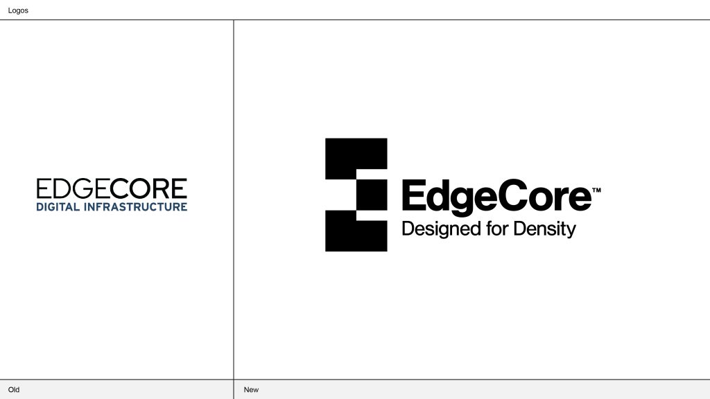
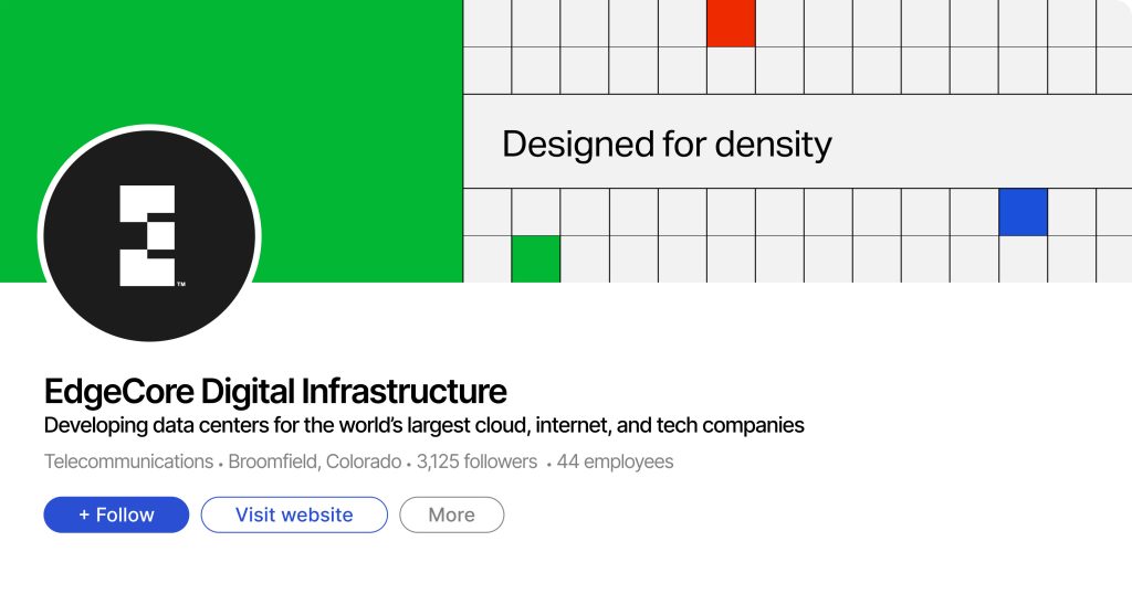
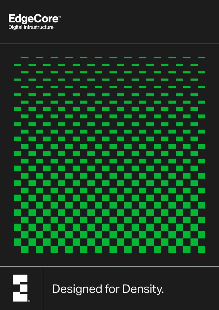
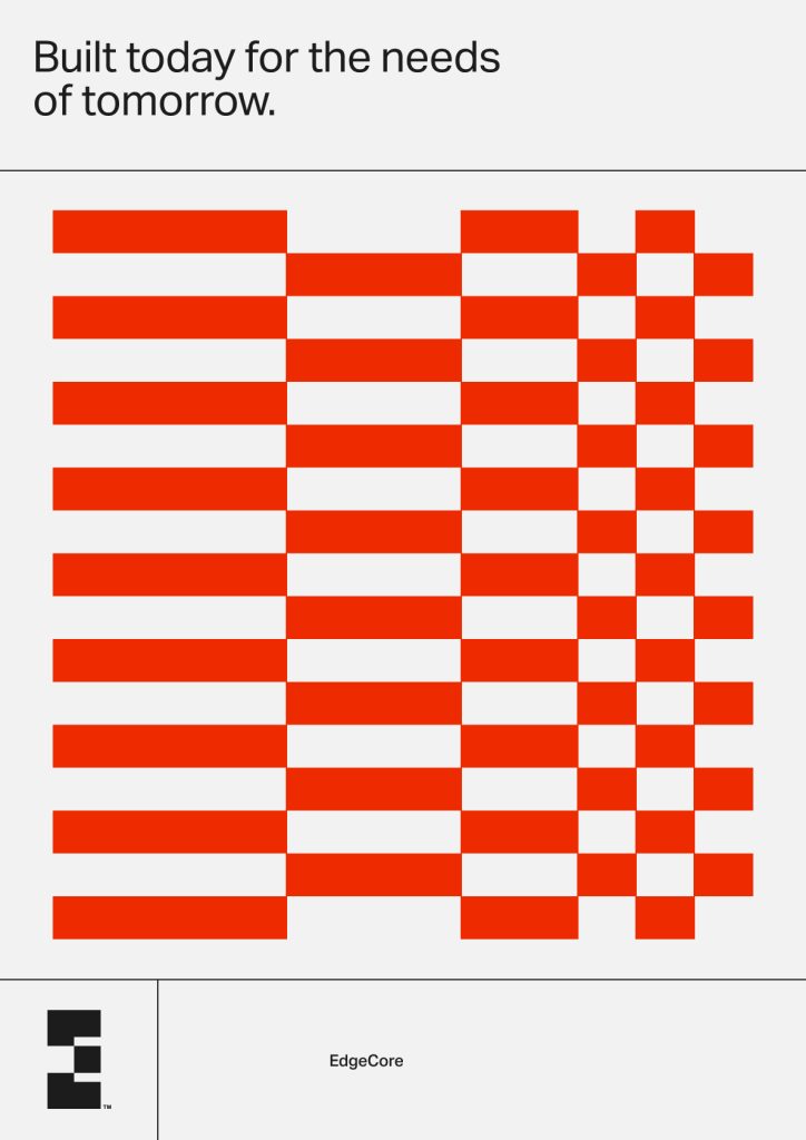
The resulting work plays into the physicality of the business, capturing both the essence of what EdgeCore does and how it conducts its business. The grid design in the logo is inspired by the data blocks that form the foundation of information storage systems, and the color palette takes its cue from the RGB monitor, establishing red, green and blue as the core colors. The logo is also imbued with meaning—the monogram illustrates the data storage space EdgeCore provides its customers, with the square representing its clients’ data. All together, the new identity creates a sense of familiarity for EdgeCore’s tech-based audience, communicating confidence and approachability through a recognizable and inviting design language.
“We’re excited to launch this rebrand for EdgeCore,” said Rosser. “It’s the perfect complement to their growth story and positions them well for even further expansion in the years to come.”
Source: VSA Partners



You must be logged in to post a comment Login