Veriff have seen near exponential growth making them the latest unicorn to rise from Estonia’s thriving tech scene. Their growth has been, so far, down to one thing: excellent technology that solves the very real — and very expensive — problem of identity fraud online. But this growth was being hampered by their image, and their consumer touchpoints were lagging behind their progressive world-class product. It was time for a freshly minted brand.
The Veriff team, lead by a visionary 27-year-old CEO, Kaarel Kotkas, have a mission much more interesting and more powerful than identity verification software. It just needed to be captured, defined, and communicated to bring their purpose driven mindset to the fore.
Their ultimate goal is to bring down the cost of digital ID verification so that it can be used beyond fintech applications, to the internet communities where it is also much needed. Kids gaming, dating apps and wider social media platforms could all benefit from being able to ensure people are who they say they are. Reducing the possibility for groomers, predators or trolls to freely populate these platforms.
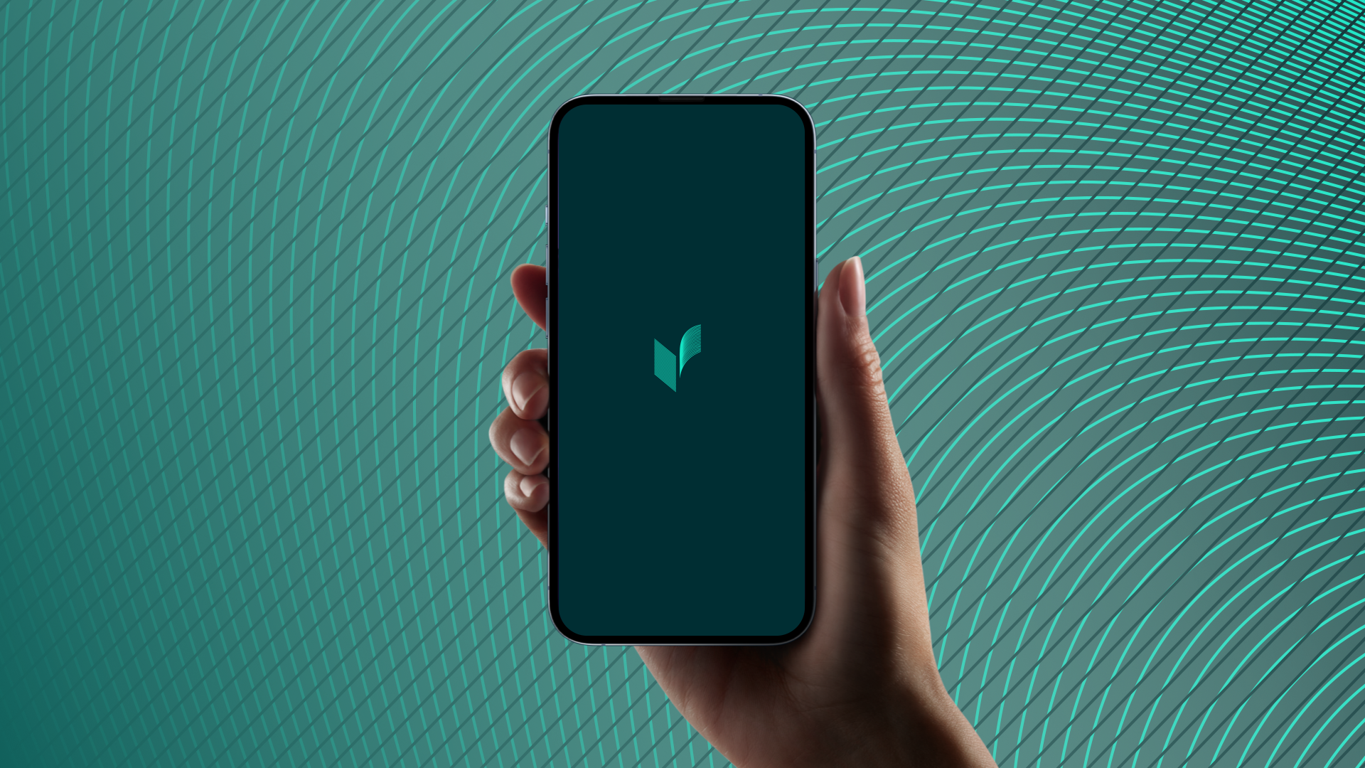

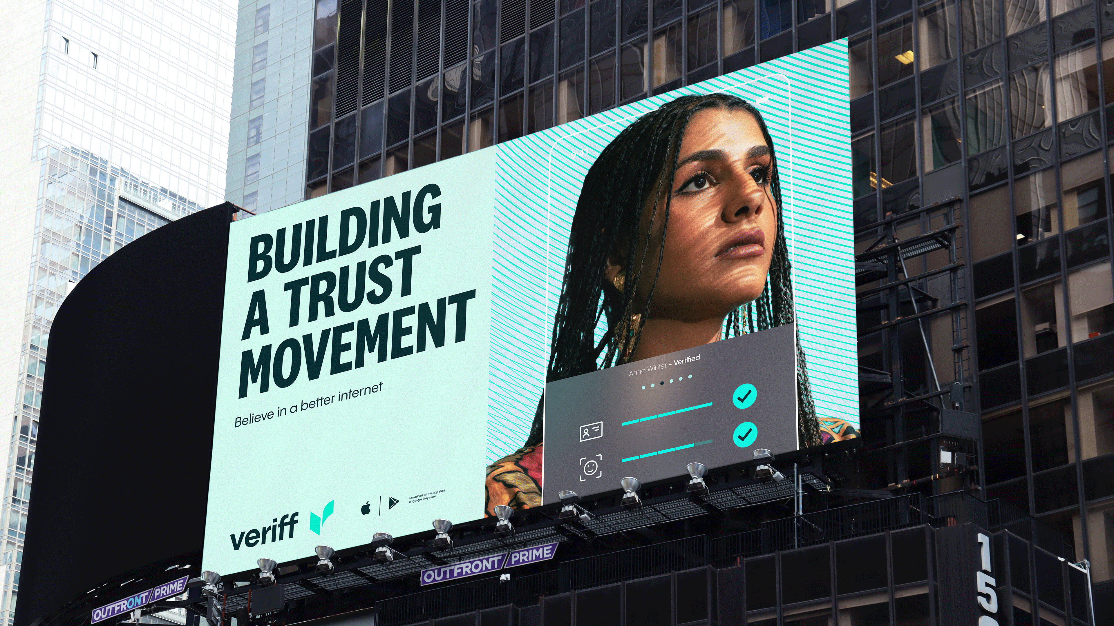
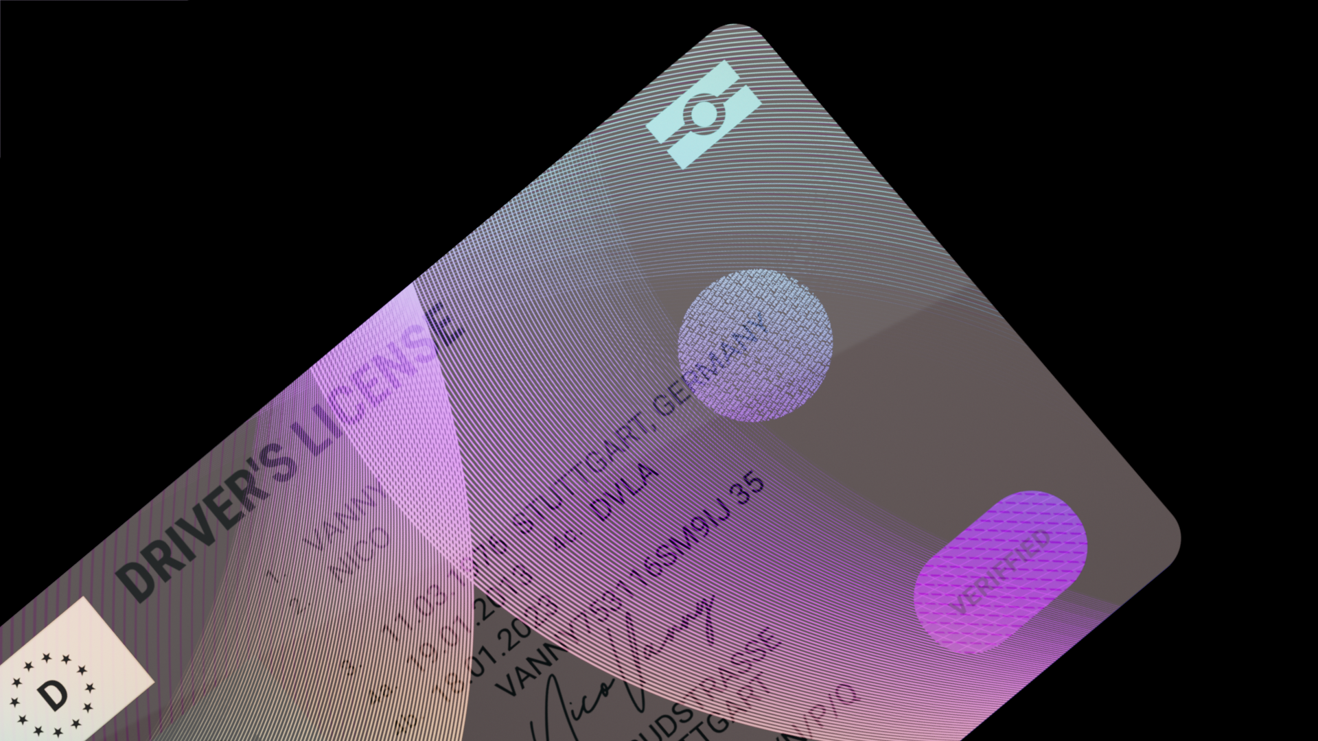
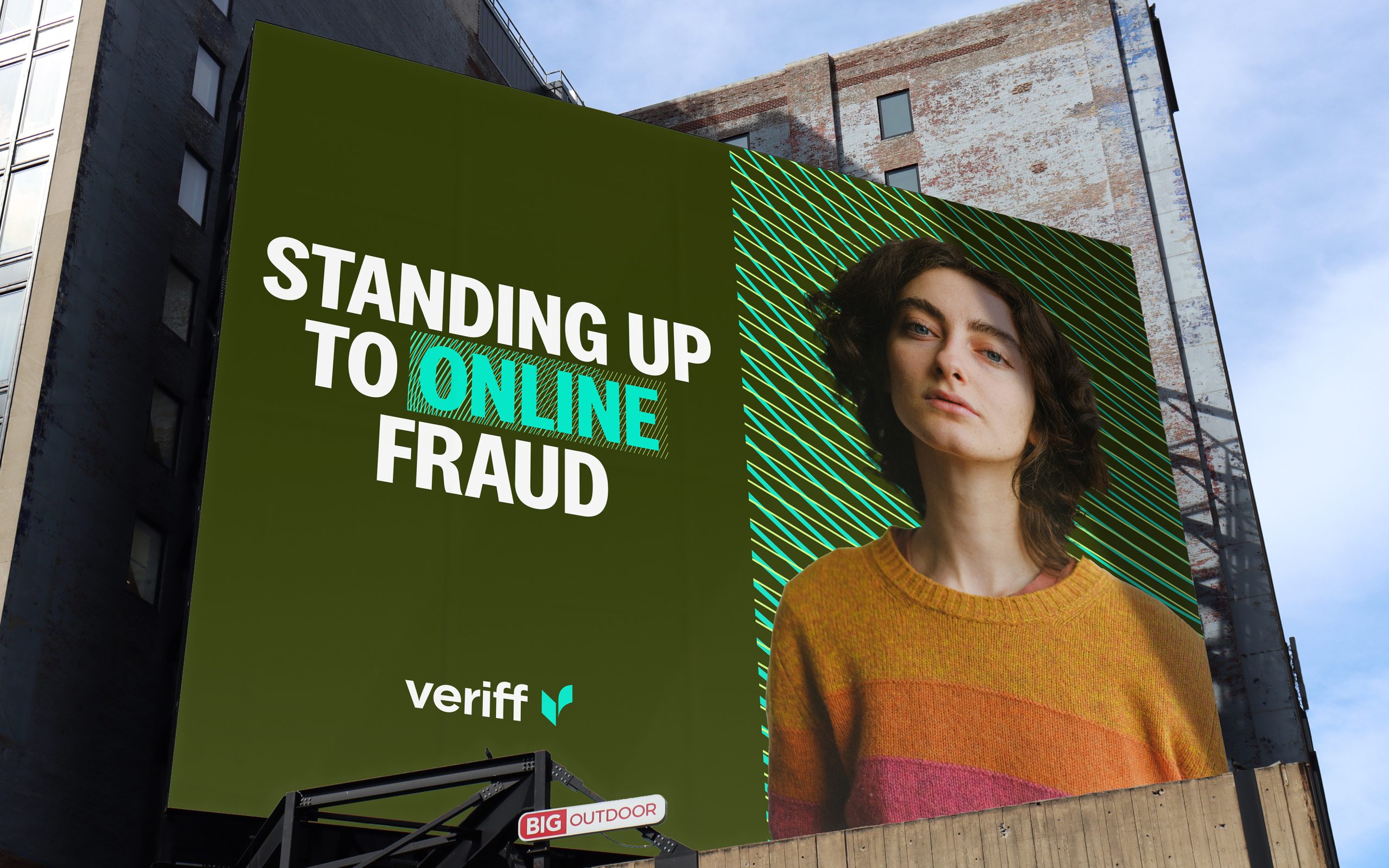
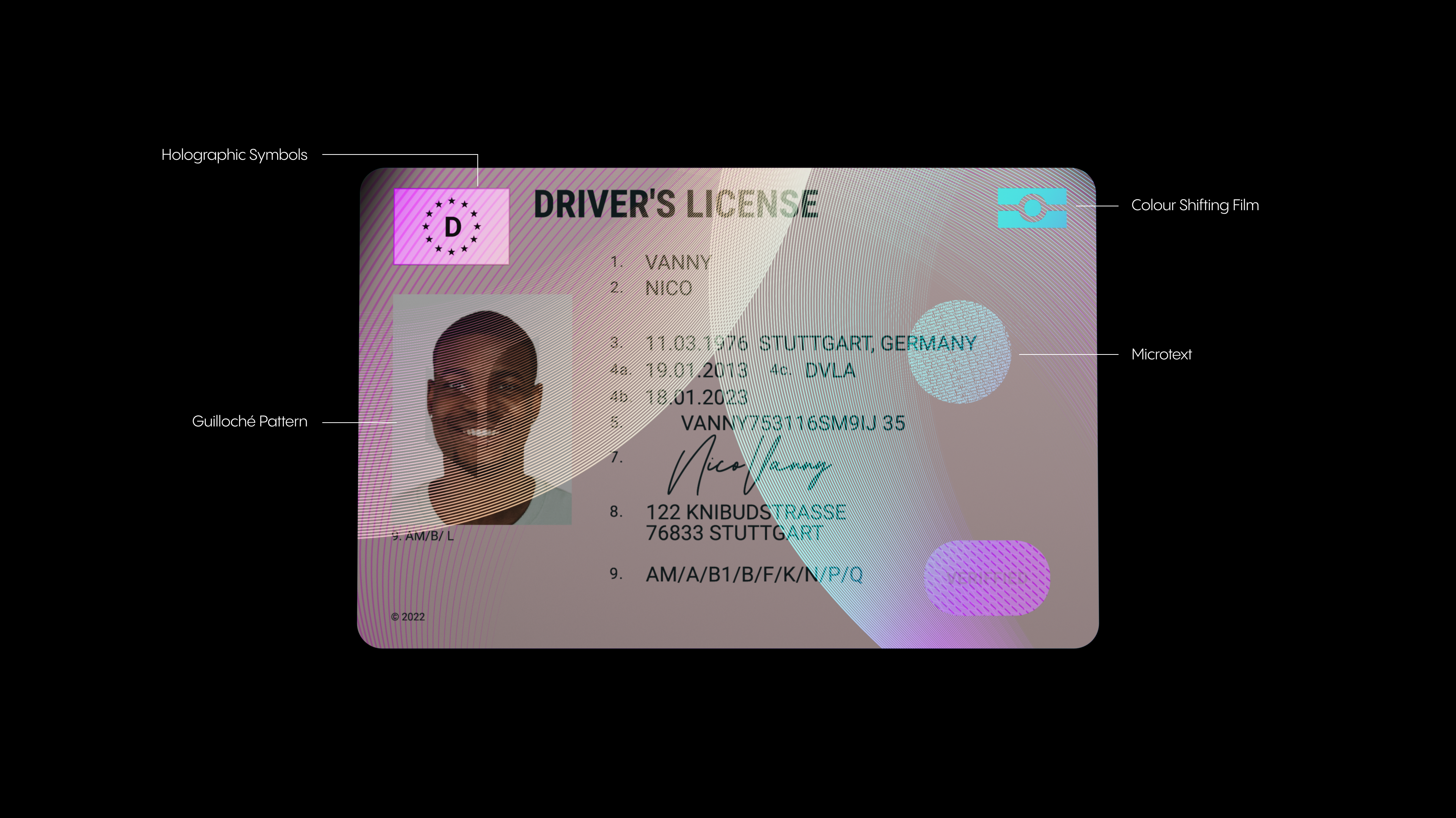


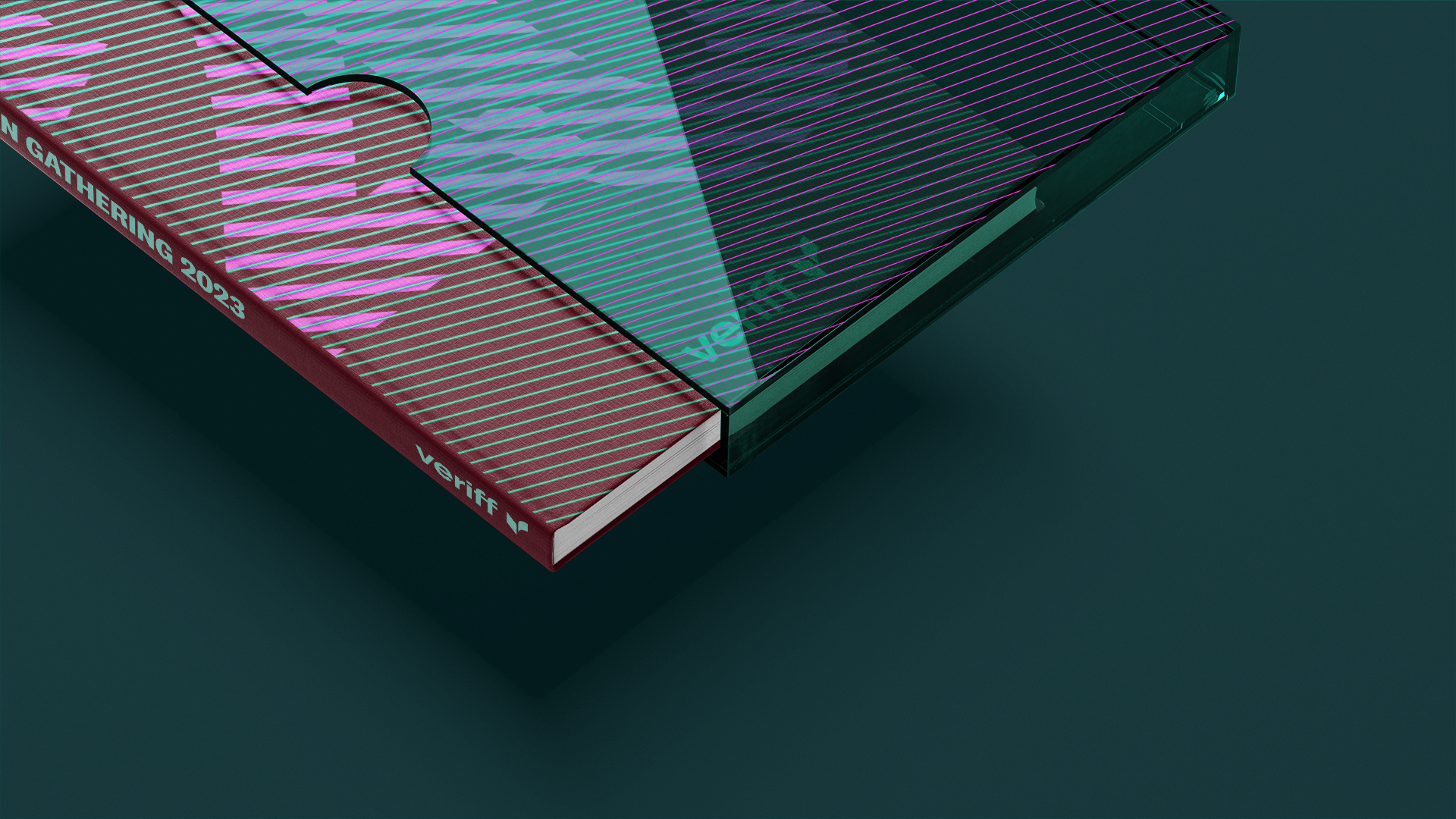
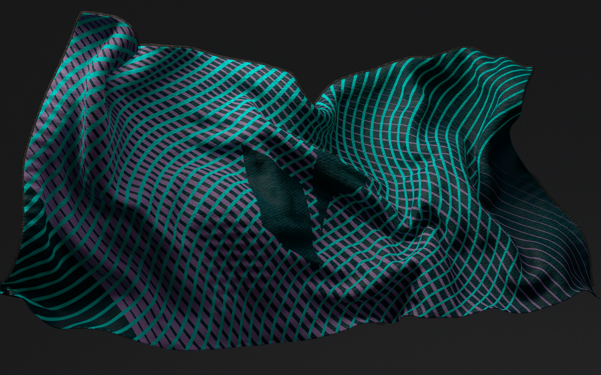
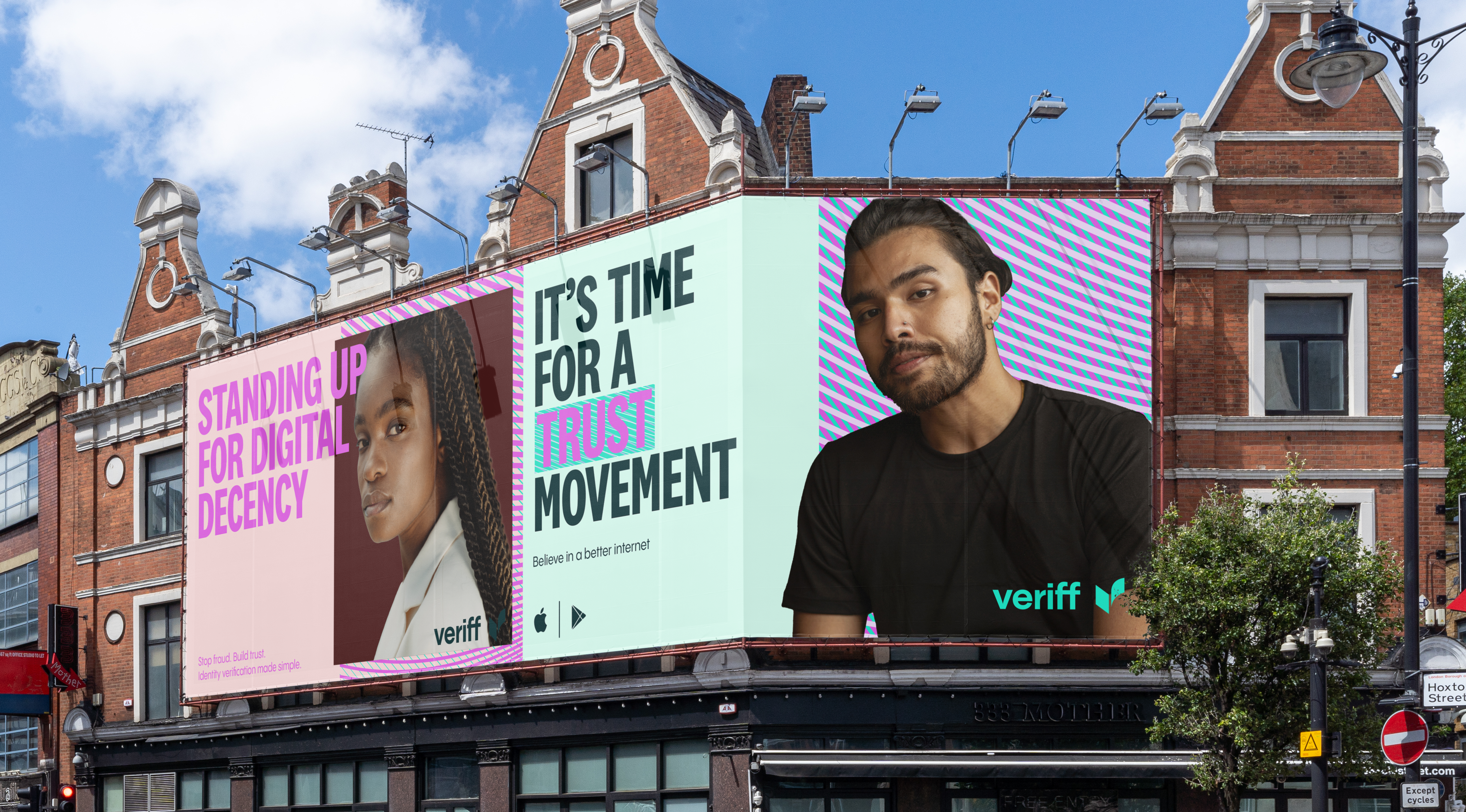

It was this mission combined with their leading technology that inspired the brand idea of ‘Identity 3.0’; a new layer of identity that — like the holograms on an ID card — provides an almost invisible certification online. Using this as our base, the design system we developed included warped and weaving textures taken from guilloché security patterns; and a dramatic colour palette inspired by iridescent holograms and colour shift film which are hidden on ID cards to combat fraud. The palette was purposefully full of strong contrast (dark and light, green and red), in order to convey the battle between malicious anonymity and genuine validation online.
The icon we designed was both a verified ‘tick’ as well as a V; while confident typography helped carry messages of strength and support.
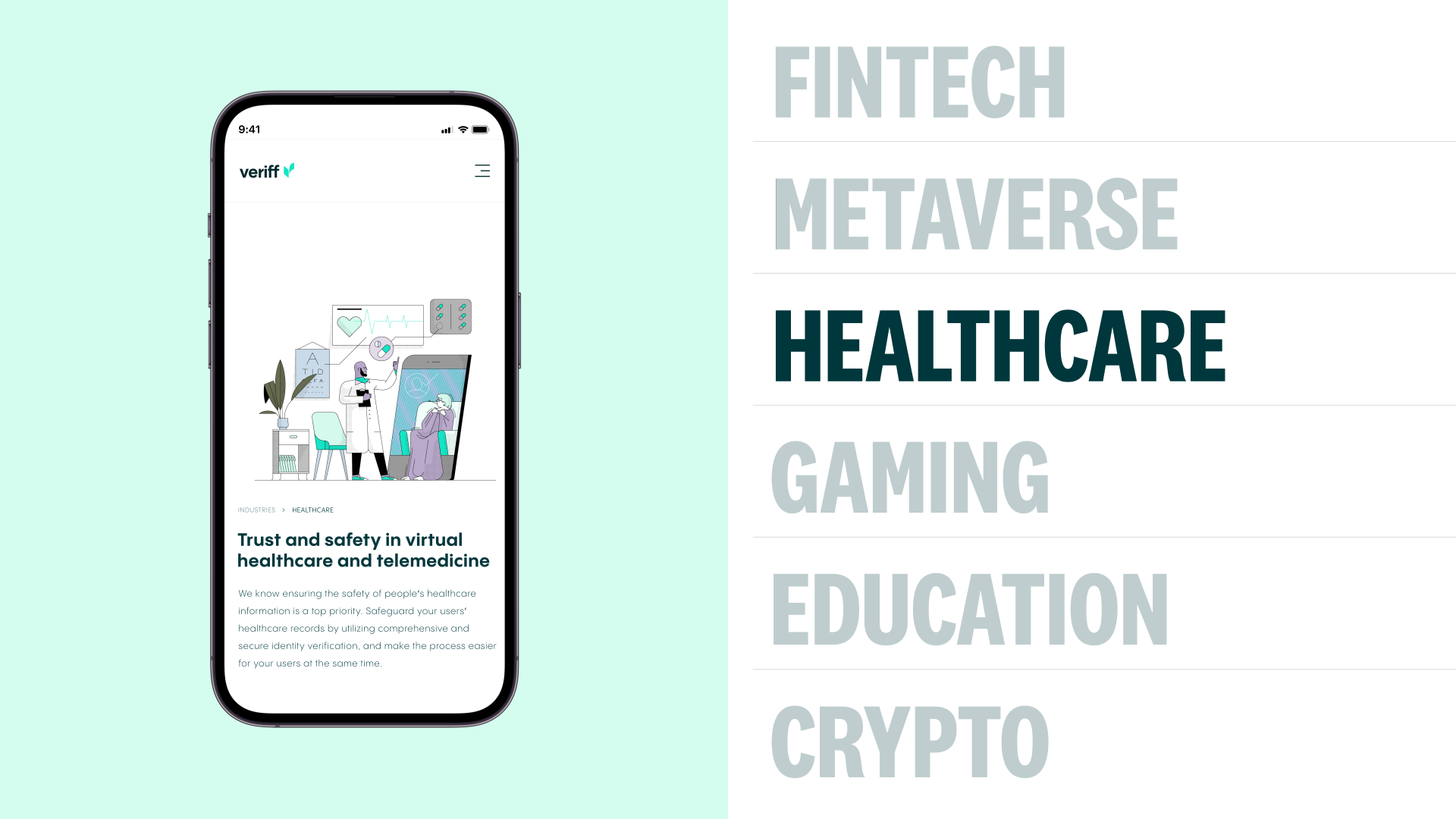
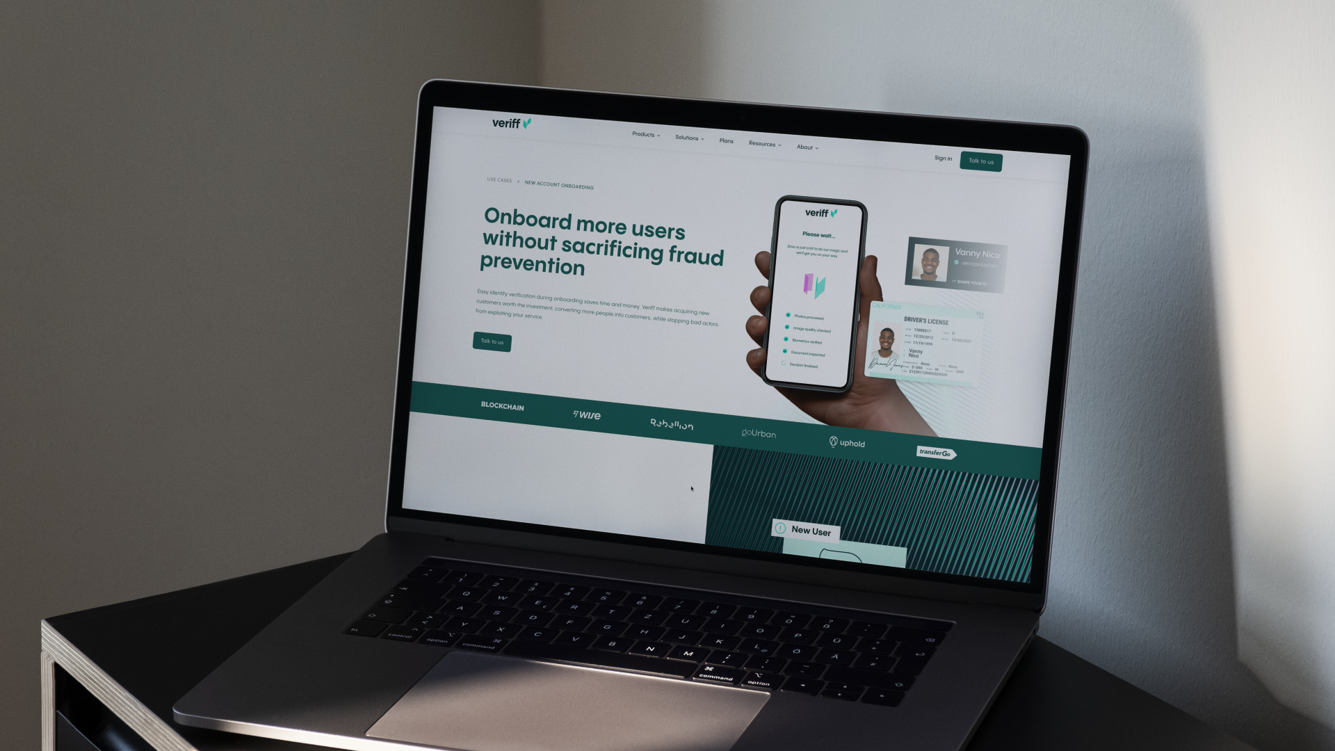
Alongside the brand strategy and identity for Veriff, we also designed the entire 40 module website — and built it ourselves too. As their their most important sales channel, the website had particularly complex components for product section guides and document coverage maps.
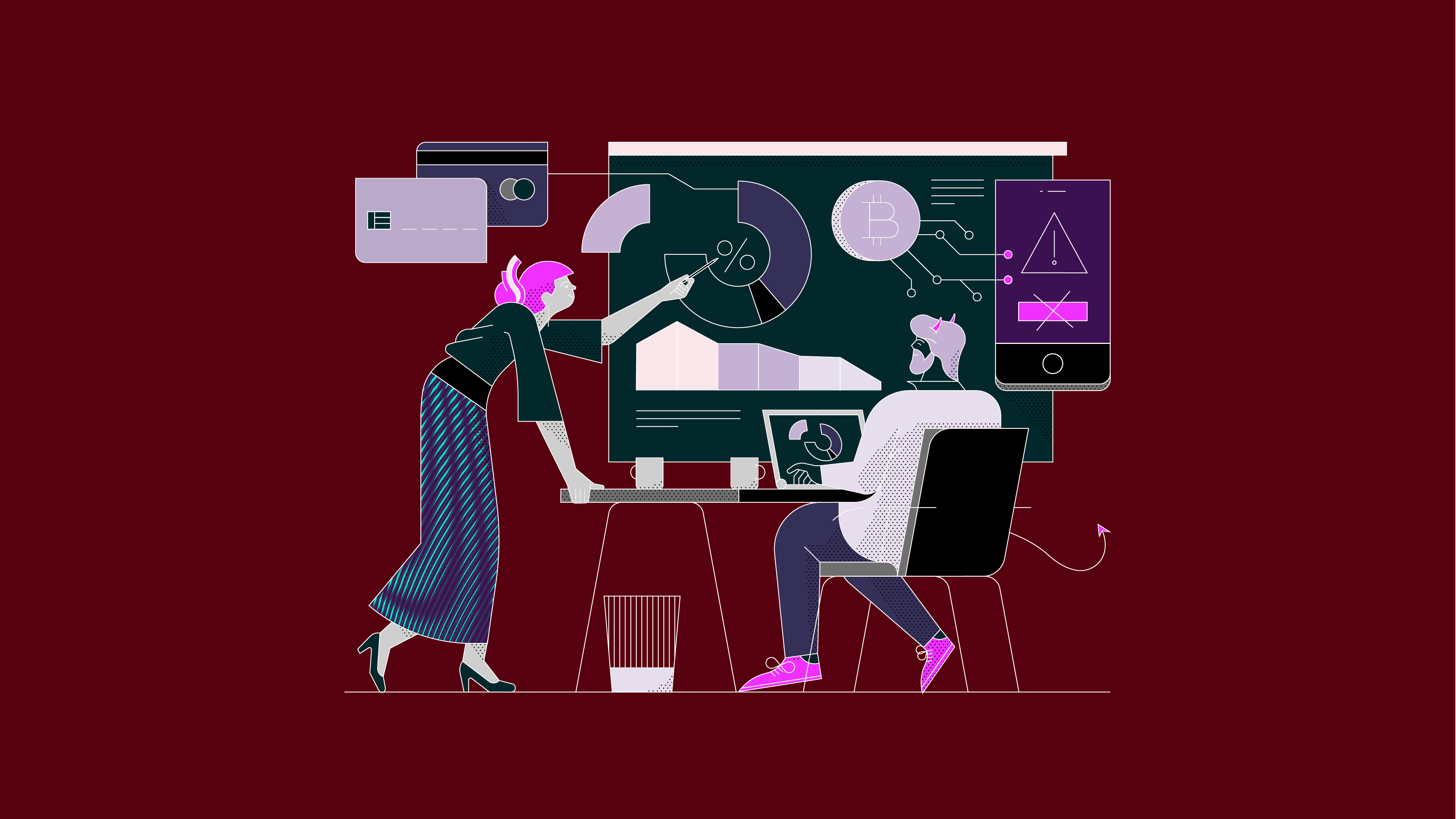
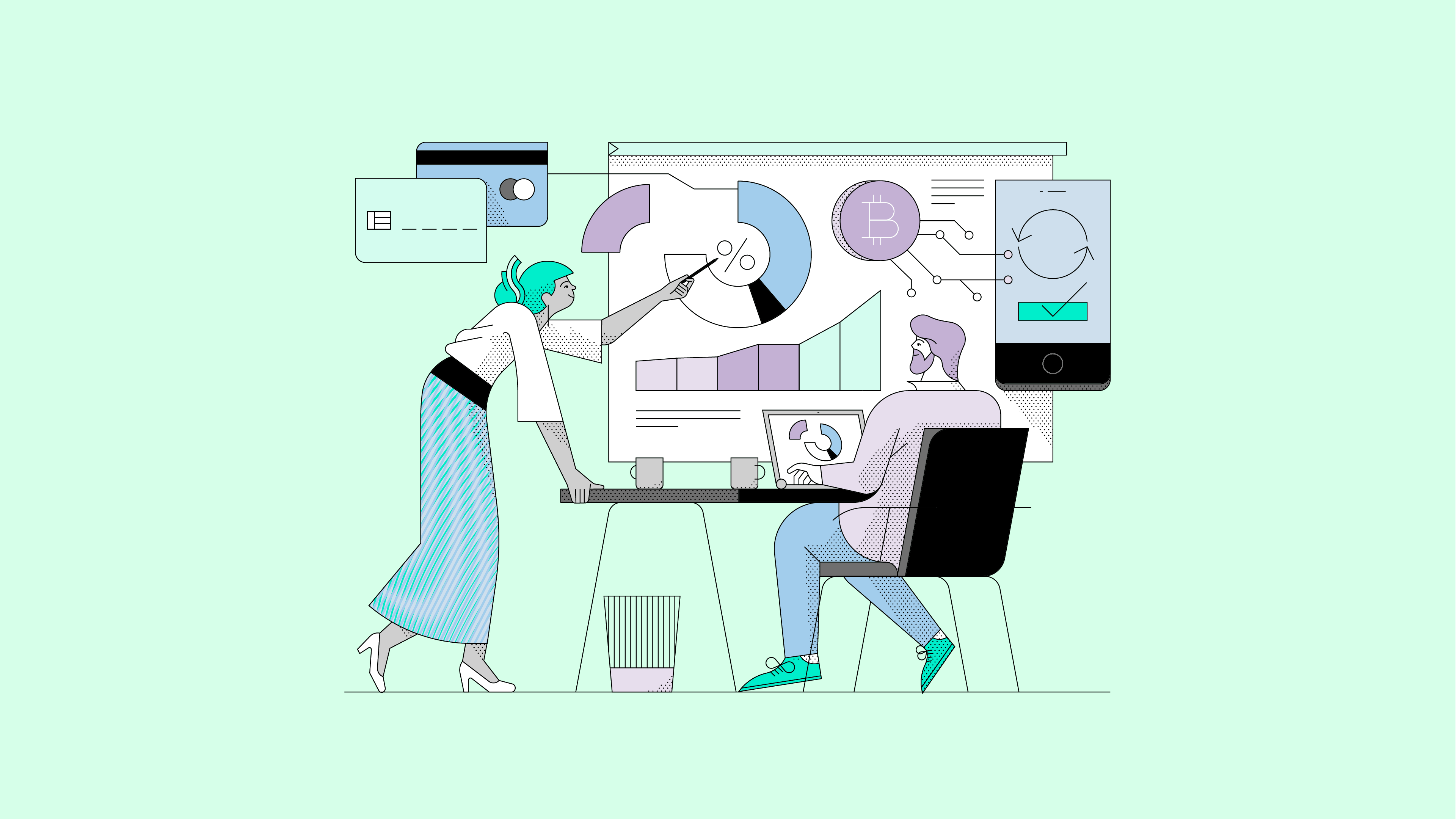
It needed to be both highly functional while conveying some key concepts developed in the branding work: trust, transparency and verification. These are all built into the digital design system using the colour shift patterns, holographic revealing devices and an illustration system using paper-puncture patterns inspired by passport markings. These devices, among many others, are used as functional elements, bounding areas and storytelling assets in order to bring brand into every experience of the site.

Source: How&How
How&How partner with Estonian unicorn, Veriff, to develop a new strategic position, brand identity and website. added by newsroom on
View all posts by newsroom →
You must be logged in to post a comment Login