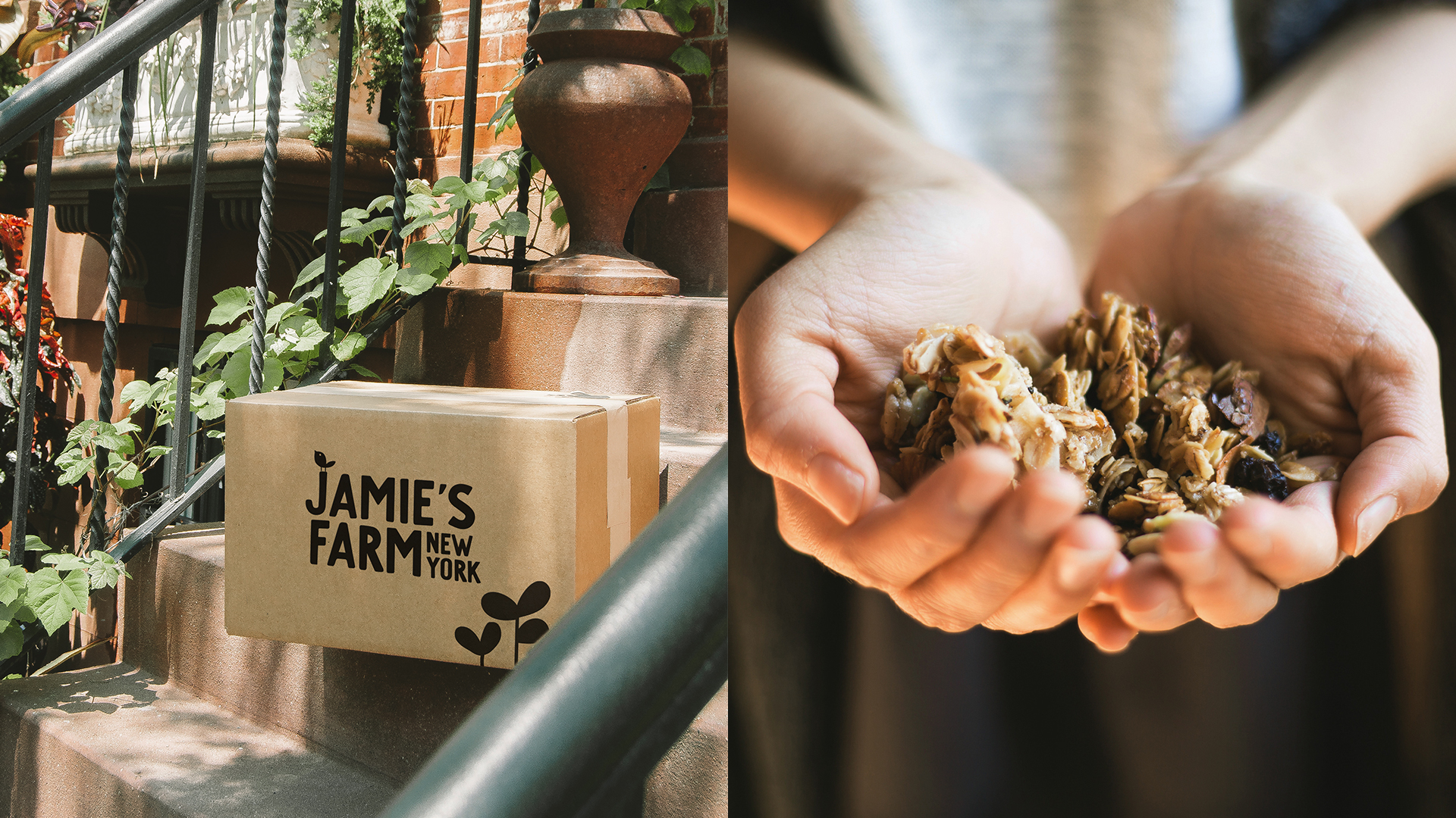
In partnership with Jamie Kim, Pearlfisher has rebranded her award-winning gourmet granola brand and renamed from Bumble & Butter to Jamie’s Farm New York, evolving the brand for its next chapter of growth.
Jamie’s Farm New York, Founder Jamie Kim, is on a mission to revive the idea of ordinary granola by using organic, high-quality ingredients and inventive flavours from local farms and artisans to create the most delicious offering.
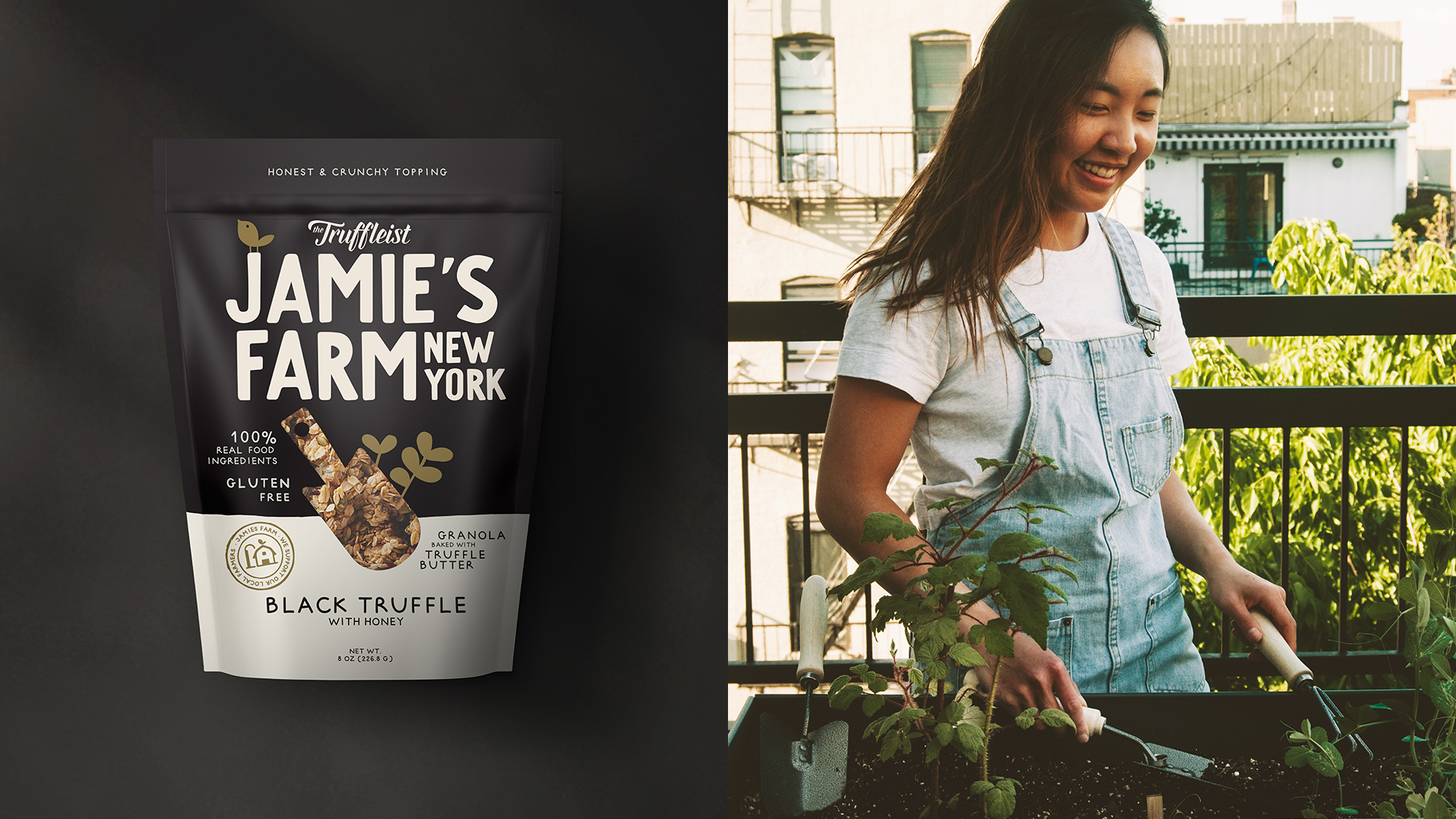
David Ramskov Hansen, Managing Director at Pearlfisher, commented, we wanted to redefine the idea of what a farm, and farming, can mean in today’s society. Representing a place that grows and nourishes a community and curating fine ingredients as embraced by Jamie’s unique upstate New York collaborations with suppliers and local sources. As a new breed of urban farmer, Jamie is playing a pivotal role in not just the granola category, but how she can help producers bring their products to larger markets. As seen with the latest launch of the Black Truffle with Honey granola. This new co-lab see’s Jamie and Jimmy Kunz, Founder of ‘The Truffleist’, combine their expertise in both their product and designs, underlining the larger opportunity that Jamie is starting to open up in her category and the brand world.”
Jesper von Wieding, Strategic Creative Director, talking through the new name, identity and design details, “The personal name speaks to Jamie’s expertise and commitment. Our opportunity with the rebrand and new name was to expand the horizons for Jamie’s brand and redefine the way we eat granola, by creating a considered and thoughtful visual expression which can enhance our eating experience.”
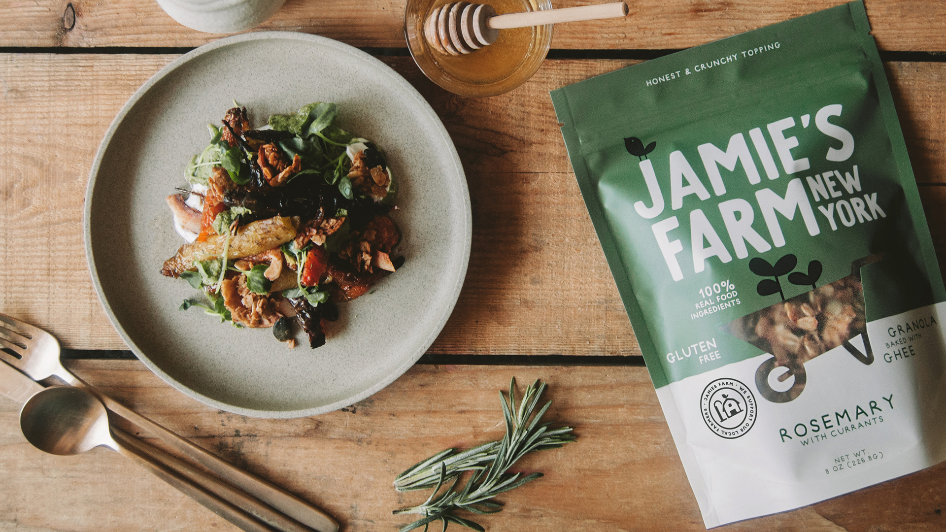
Jesper continued, “The unique nature of Jamie’s offer and method inspired us to create a bespoke typeface that speaks to the idea of craft and is boldly readable and firmly links her brand’s New York provenance. The bird asset represents the fact that birds spread the seeds that form the basis of the product and birds also connect nature and the city as they journey between the two. A symbolic, cut- out window, features sprouting plants but with a different design, reminiscent of well-known gardening tools, for each flavour variant – a watering can for Aged Cheddar and a wheelbarrow for Rosemary with Currants – to showcase the product and reinforce the idea of the personal care and attention that is given to the ingredients and manufacture.”
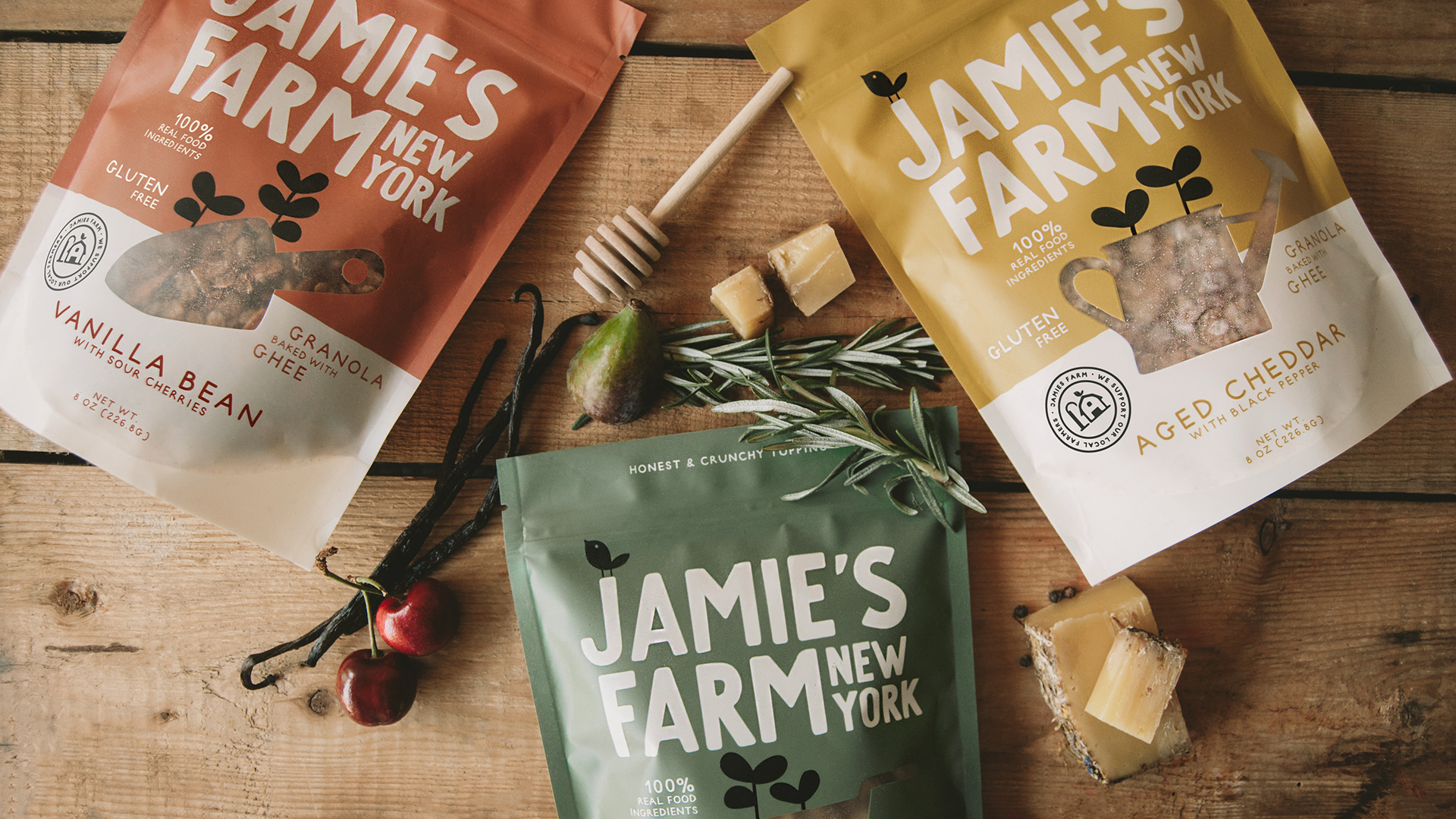
Designer, Louise Mikkelsen, added, “The brand colours reflect the uniquely inventive flavours, but in earthy and natural hues, with each pack now featuring Jamie’s signature and a new seal that proudly declares, ‘Jamie’s Farm, we support our local farmers’. A new iconography system, for back of pack, is intended to show people how to use the product across a spectrum of foods and occasions to tie into the unique flavours.”
Jamie’s Farm Founder, Jamie Kim, said, “The idea of partnership, community, collaboration and storytelling has been integral to my brand from the very start, and working in this way with Pearlfisher has seen them recognize the thought and intention I try to incorporate and this now shines through in everything from my name to the bird asset and iconography that tells the complete story of my brand and how we can enrich our communities, bring people together and create a more meaningful way to work, live and eat if we look after our natural resources and each other.”
Source: Pearlfisher & FAB News
Pearlfisher’s redesign brings a unique offer to the table for gourmet granola brand, Jamie’s Farm New York added by newsroom on
View all posts by newsroom →
You must be logged in to post a comment Login