The National Institute of Medical Herbalists the UK’s largest, and oldest regulator of herbal practitioners promotes the benefits, the efficacy and the safe use of herbal medicine.
With an increasing number of people choosing a more holistic approach to their health and well-being, the institute needed to stand out as the go-to ‘Natural Authority’ for all-things herbal medicine. It was important that new identity reflected the gravitas of a governing body, attract new herbalists and clients, without alienating its existing members.
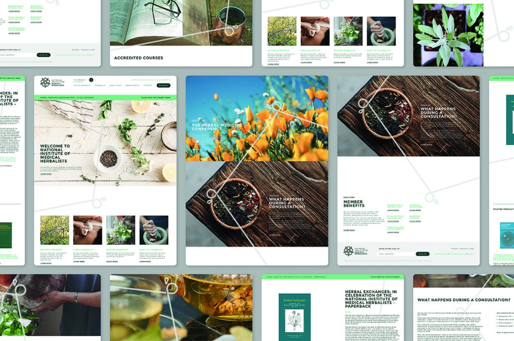
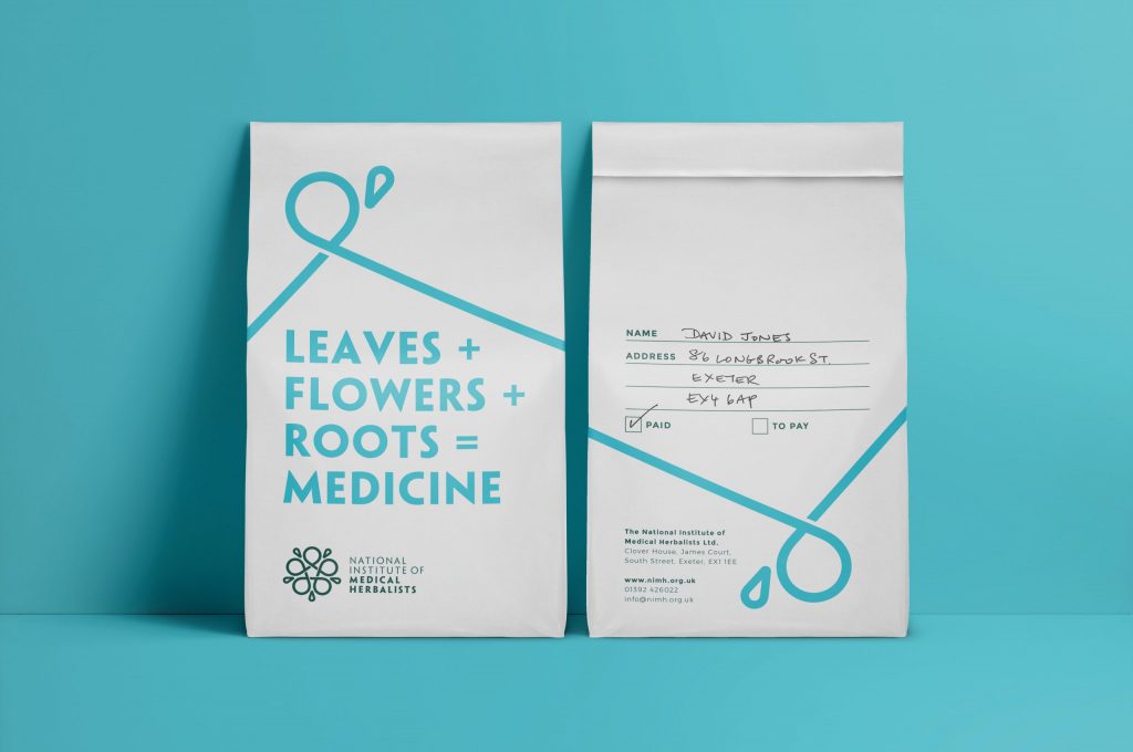
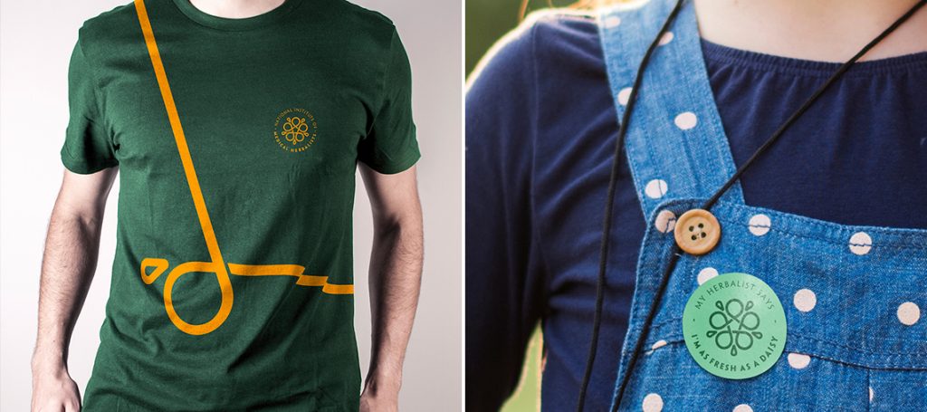
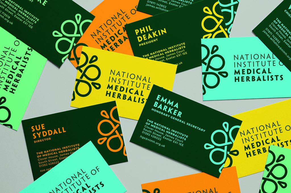
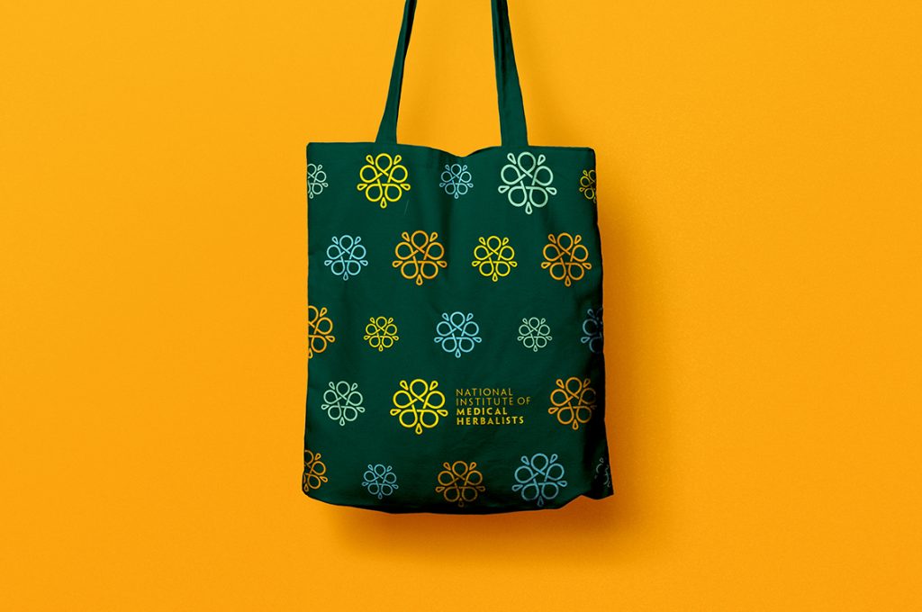
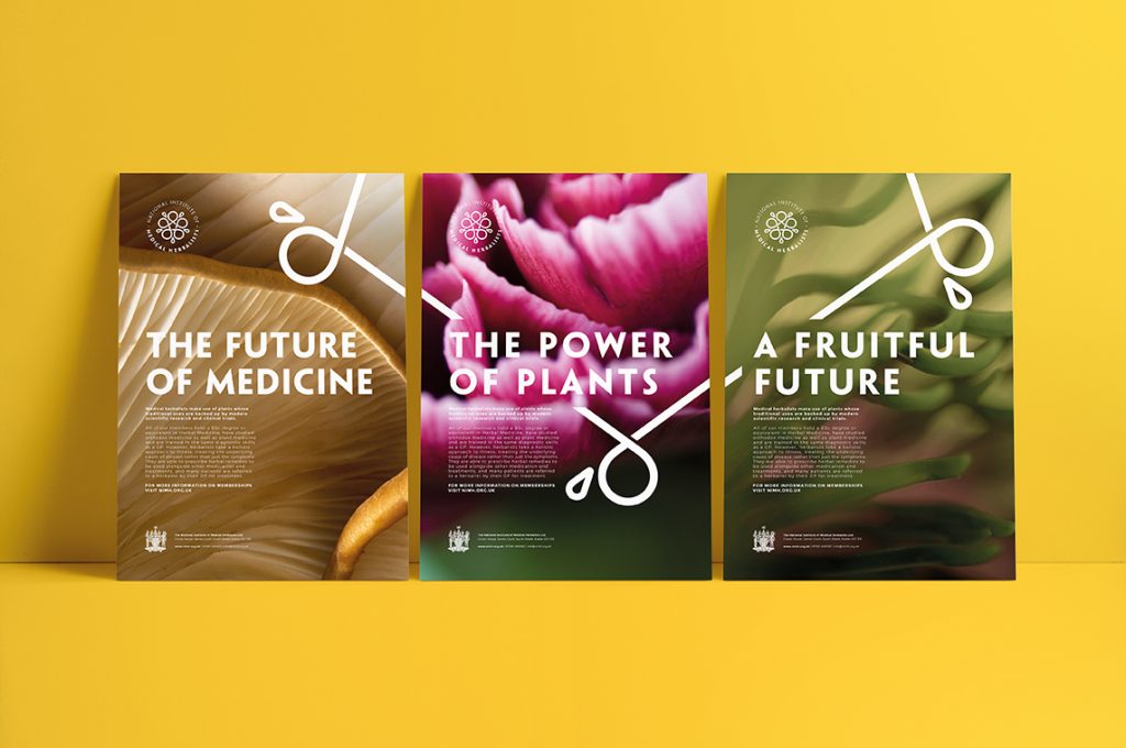
Taking inspiration from the Institute’s extensive resources – documents, old books, botanical illustrations and the story of its 100-year-old crest, a contemporary, authoritative trademark emerged that embodied our brand essence ‘The Power of Nature’ – a continuous, infinite flower motif that underpins the core brand and runs through all visual identity elements.
This 5 petaled flower is an element taken from the shield in the Institute’s historic crest and represents the whole-body holistic process that herbalists take when treating their patients. We intentionally stretched the line-work of the mark to create a flexible branding system across marketing applications and brand materials reflecting the connectivity of herbalism as a practice and the different aspects of the institute.
The flower motif extends through the full suite of collateral, office space and merchandise items. A fresh, new website design balances modernity with a natural authority.
Source: Buddy Creative
The National Institute of Medical Herbalists Branding by Buddy Creative added by newsroom on
View all posts by newsroom →
You must be logged in to post a comment Login