The world of travel has changed. Today’s travellers are looking for something different. Experience-driven, digitally savvy, and seeking authenticity over extravagance, they’re looking for meaning, immersive personal experiences and journeys they won’t forget.
Kuoni, once an iconic travel brand, had become pigeonholed as luxury Indian Ocean honeymoons, limiting its broader appeal and relevance. Perceived as niche and expensive, it struggled to define its value, alienating broader audiences.
“This wasn’t just a visual rebranding exercise; it was about revitalising a once market leading brand that had lost its way and giving us a strong foundation to grow from”, says Caroline Child, Kuoni’s Marketing Director.
The ‘Wow’ behind the ‘Why’
“Our goal was to shift Kuoni from a brand people aspire to book with to one they actively do!” said Sarah Westwood, Founder and Strategy Director at ODA Branding. “This meant making it more accessible, meaningful, and relevant to today’s travellers. We repositioned Kuoni as the brand making ‘wow’ holidays accessible to more people, by starting with the why rather than the where.”

By tapping into the deeper motivations behind travel, Kuoni crafts more personalised and meaningful experiences. To embed this philosophy internally, ODA introduced a powerful internal rallying cry: “Go wow or go home” and worked with all teams within the business to deliver it, from product to service. This mantra ensures that every touchpoint, from the first interaction to the final farewell, is designed to create unforgettable moments for every traveller.
A distinctive world of wows
ODA worked on the visual and verbal identity for the brand. “The category is a sea of sameness, literally – a sea of blue and a “word salad” of abstract superlatives, so we had to find what made Kuoni distinctive. The new vision called for a complete overhaul of the brand’s visual identity.” Grant Willis, ODA’s Creative Director.
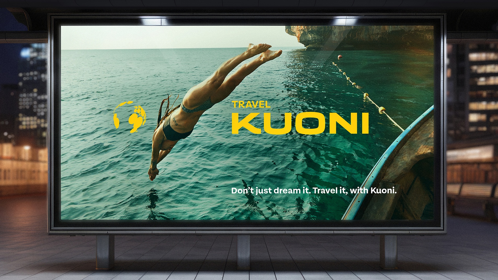
A key part of the transformation was bringing back the iconic Kuoni globe, a symbol of the brand’s global reach and passion for extraordinary travel. “People were walking past Kuoni stores without even realising they were a travel brand. That had to change and bringing back the globe was key to that,” says Willis.
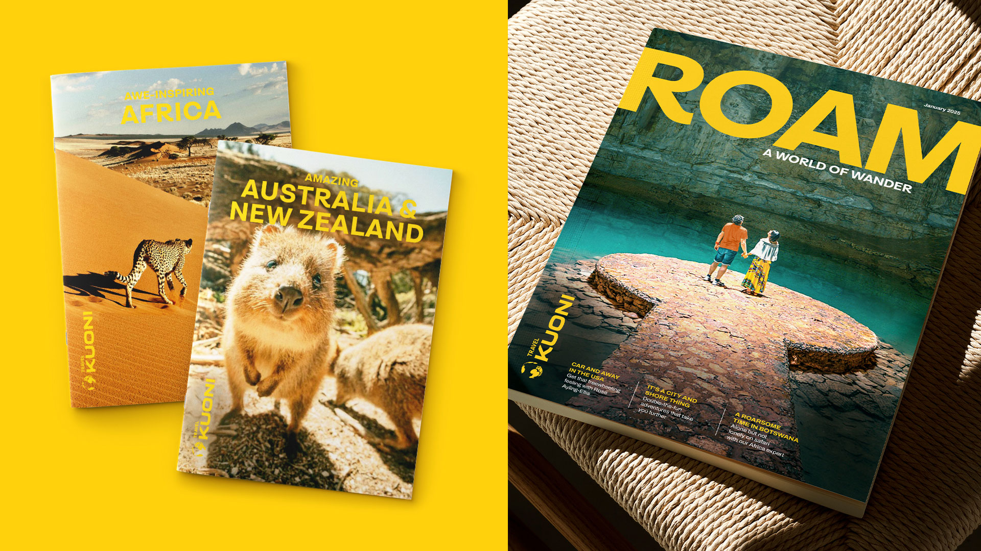
The new globe isn’t just a logo; it tells a story. “Kuoni was once an iconic name in travel, and the globe was a big part of that. It had disappeared in a previous rebrand, but we knew bringing it back in a fresh, distinctive way would reconnect people with the brand. The reimagined the globe is made up of a series of ‘wow moments’ around the world” says Willis.
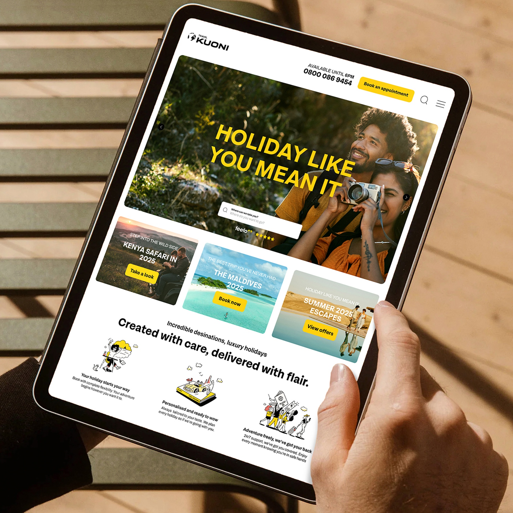
Alongside the redesign came the idea of Travel Kuoni, not just a travel provider, but a whole way of seeing the world. It speaks to today’s travellers, who don’t just want a holiday; they want something unforgettable. Kuoni is now positioned as a mindset, not just a mode of travel.

Wow yellow
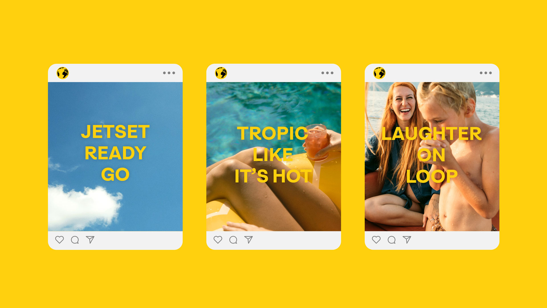
ODA introduced Wow Yellow, a bold, distinctive colour in the category designed to make the brand instantly recognisable as well as feel more playful, accessible, and energetic. This wasn’t just a palette shift; it was a statement.
Beyond the visuals, Kuoni’s voice evolved too. Gone was the overly formal, distant tone. Instead, the brand now speaks with clarity, warmth, and a sense of adventure, inviting travellers in, making them feel welcome, and proving that extraordinary travel isn’t just for the few.
The refreshed brand is already making waves.
“It’s only a few weeks in, but early signs are all positive. From our high street stores having people walk in who had never even noticed us before, to increased engagement metrics with our social channels and onsite behaviour,” noted Child.

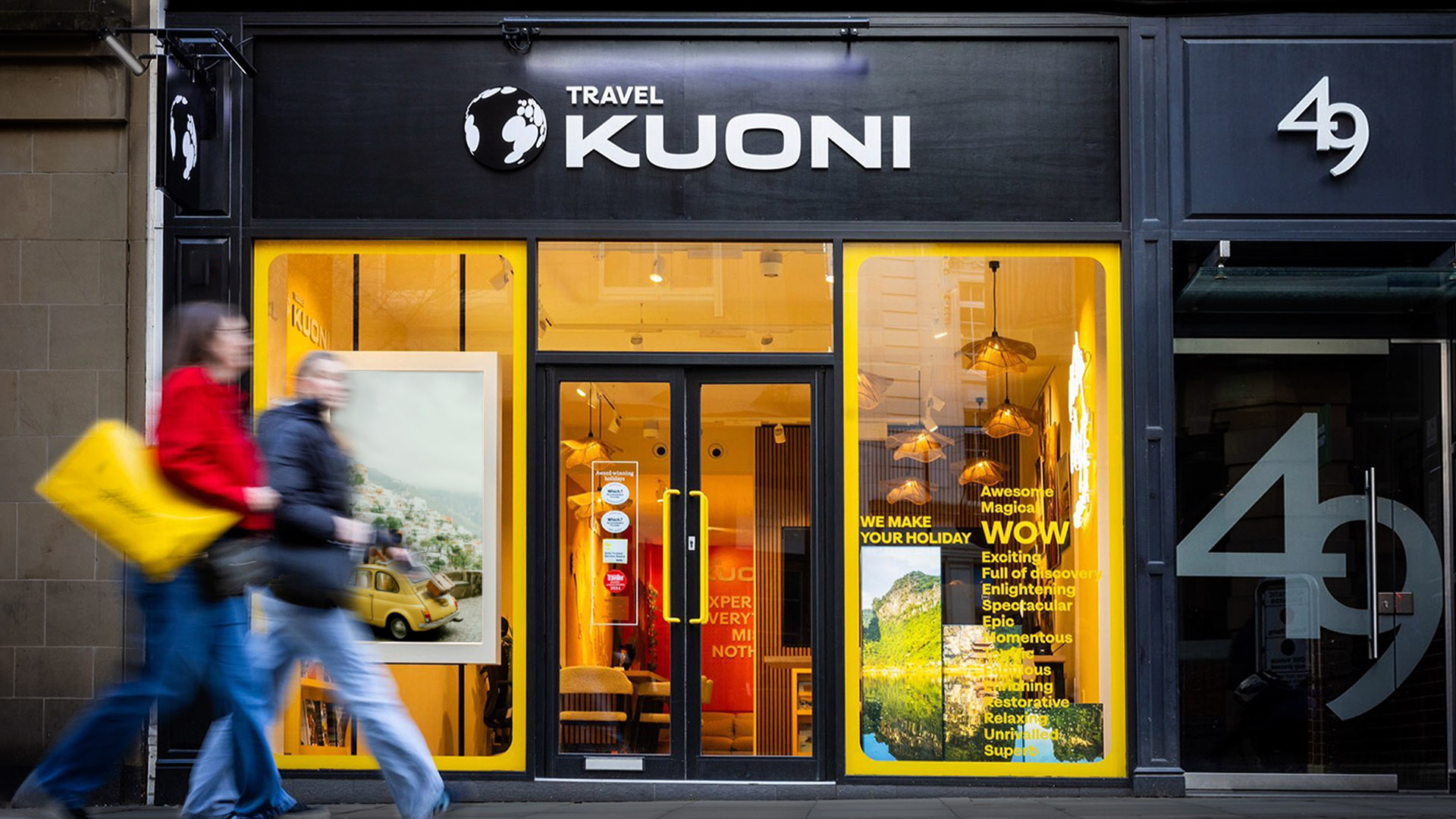
ODA worked closely with Kuoni‘s internal design team to ensure a seamless implementation of the new brand identity. The collaboration resulted in tools and templates that were both beautiful and functional, allowing the team to hit the ground running. The comprehensive guidelines ensured consistency across all touchpoints, from online platforms to the 27 high street stores and John Lewis locations.
And it’s not just customers who are feeling the shift, Kuoni’s teams are, too. “There’s a real sense of pride and confidence is high, and a large part of that is down to ODA’s collaborative approach and quality of work,” says Child. “I have never worked with a brand partner who felt so much part of the team from the very start, and that are as strong in the thinking as they are in the doing. Not only am I fortunate enough to now have a fabulous new brand identity to play with, but it’s one that actually works in real life – not just in the Guidelines document!”
Source: ODA Branding
ODA rebrand puts Kuoni back on the map added by newsroom on
View all posts by newsroom →
You must be logged in to post a comment Login