
Dog rehoming and rescue charity, Dogs Trust, has today launched a refreshed brand identity. As the UK’s only national charity dedicated solely to the welfare of dogs, the refresh aims to grow its community, representing and uniting all dog lovers.
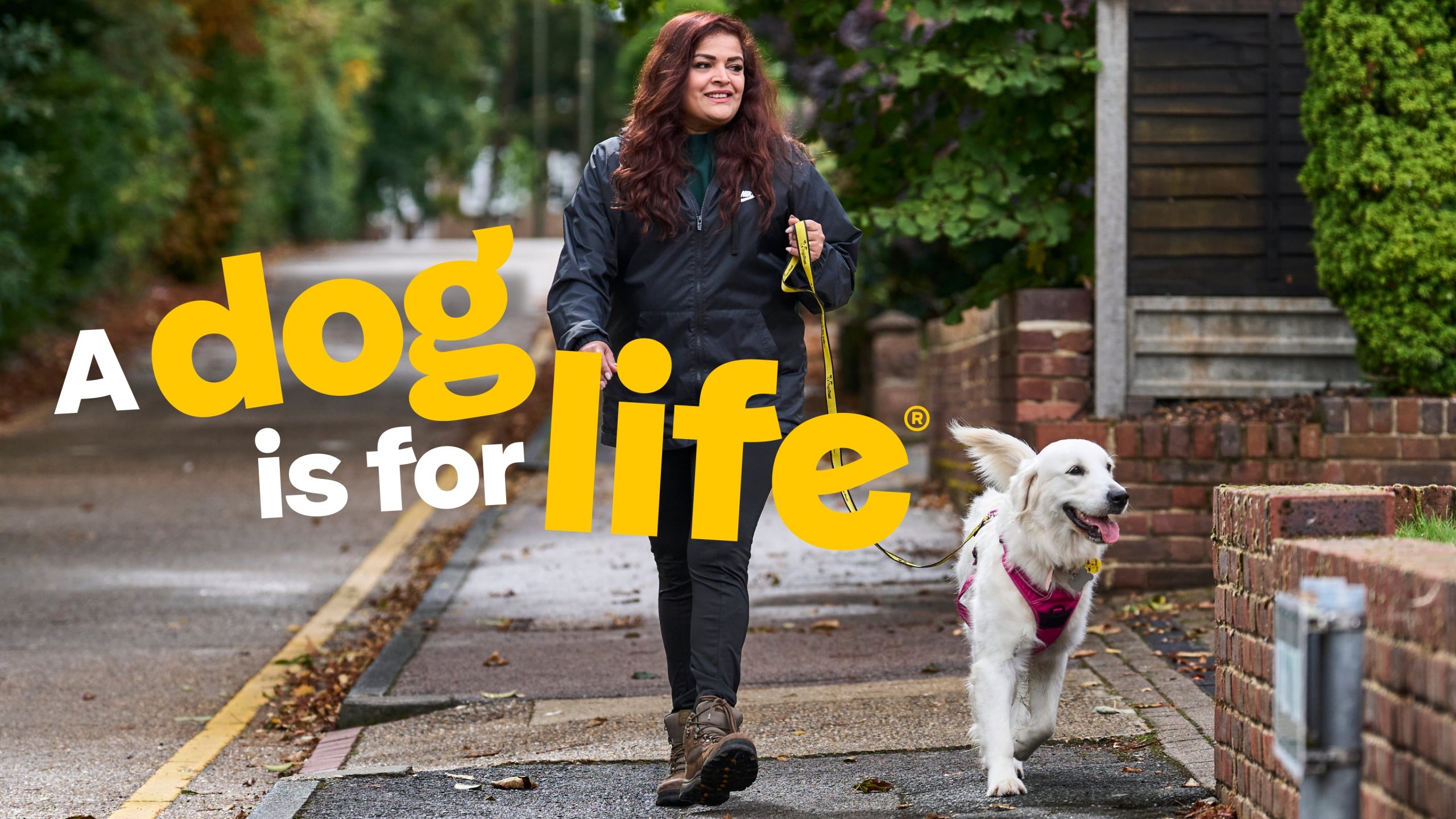
Designed in partnership with London-based creative brand agency The Clearing, the update builds on a 2020 rebrand by The Clearing to create a more expressive identity system that better aligns with Dogs Trust’s evolving organisational, communications and brand strategies.
Design elements
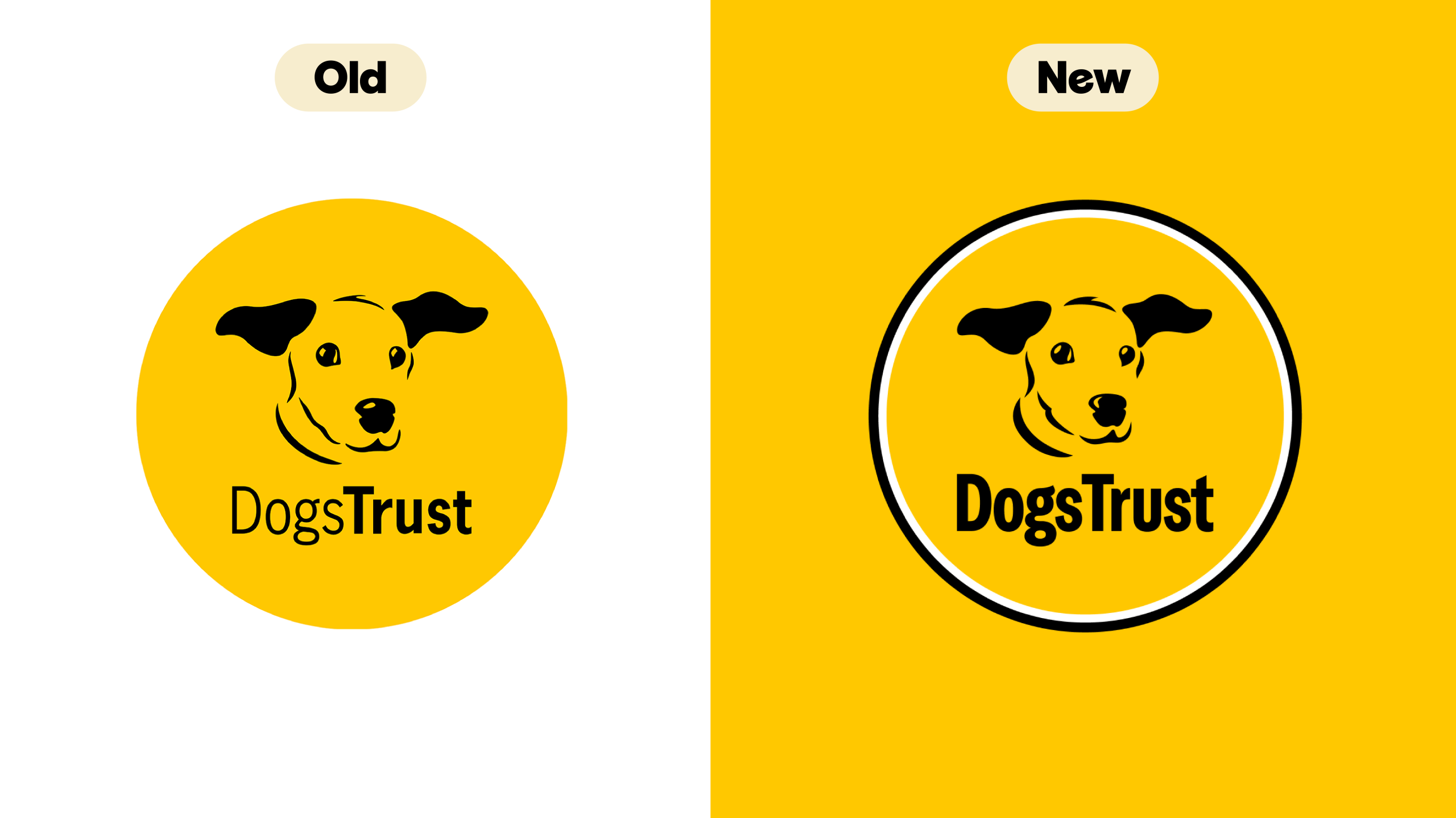
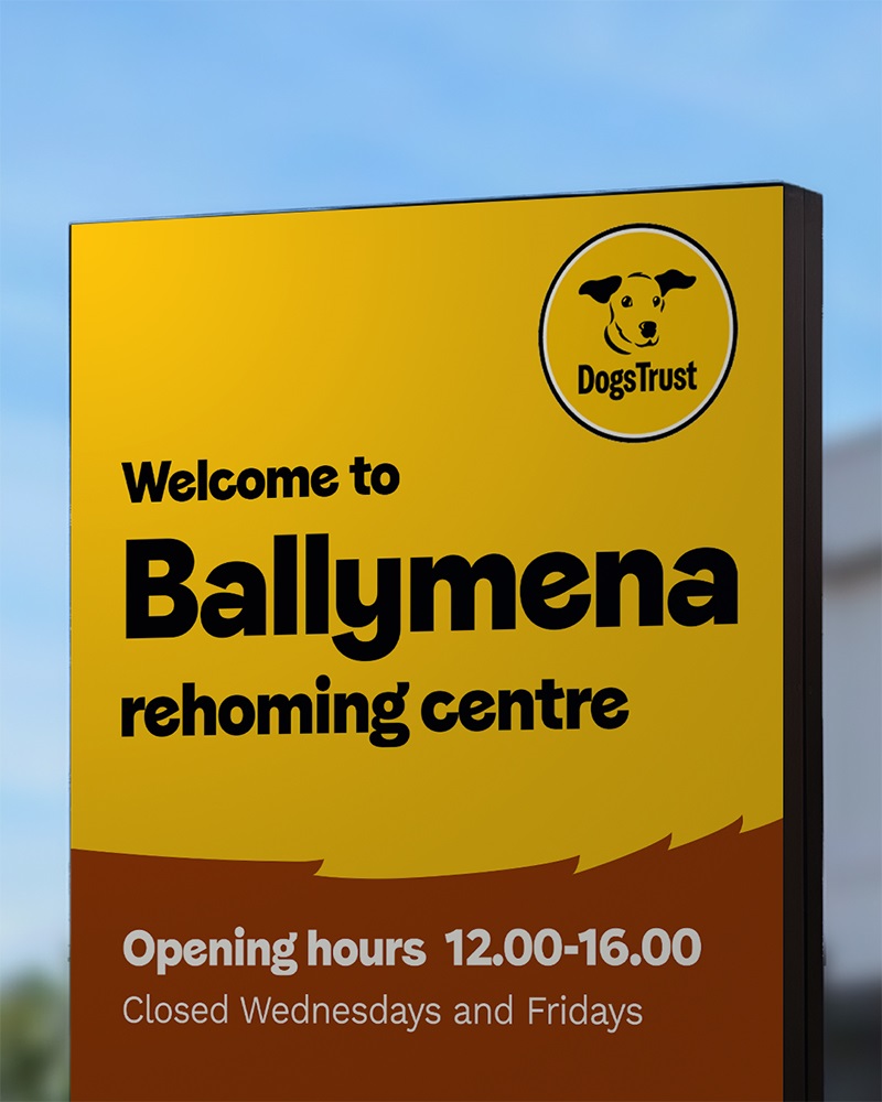
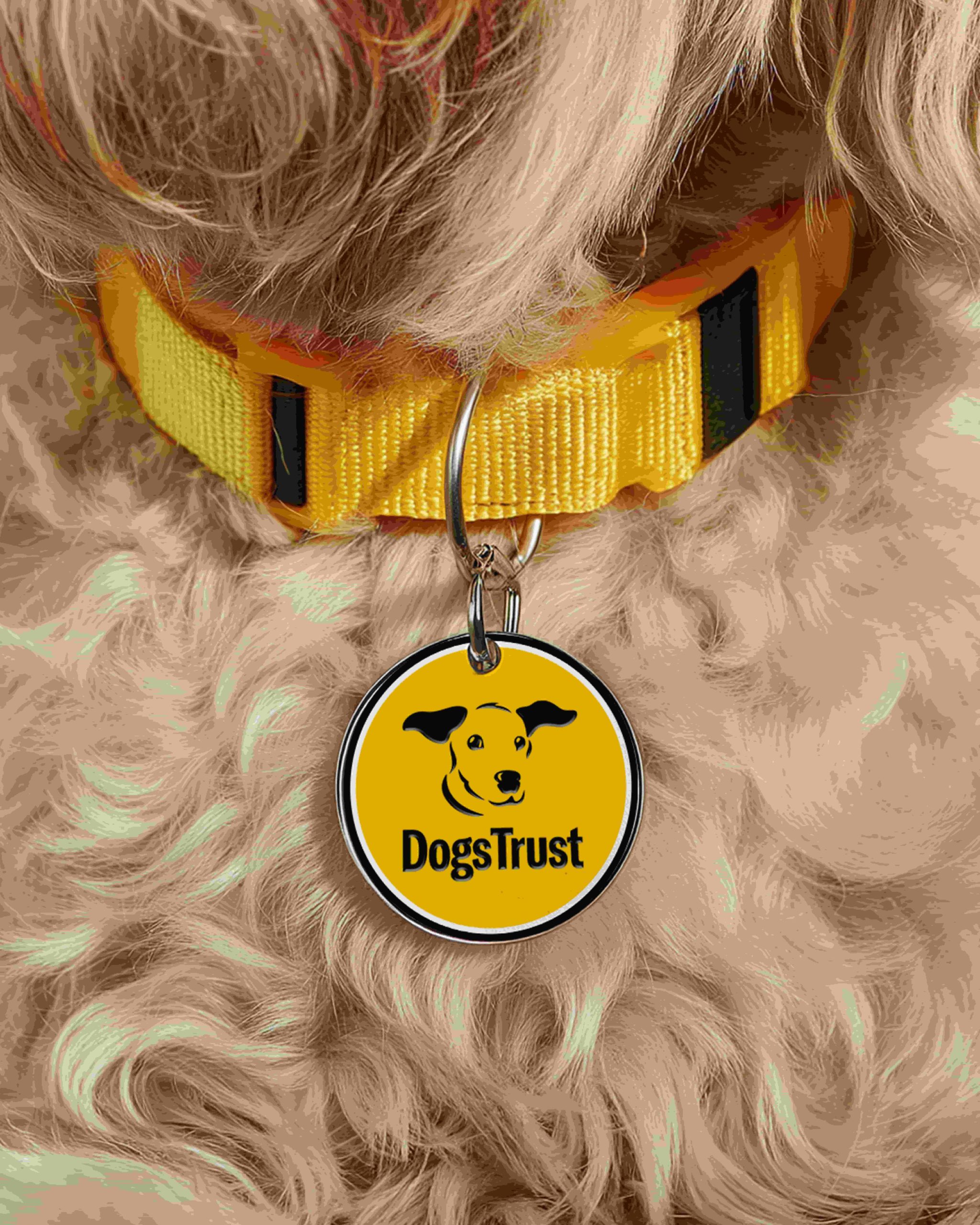
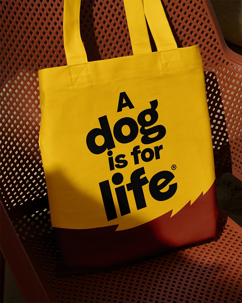
The whole identity system has been evolved to create a bigger, bolder brand expression for the charity so it can work harder across all channels, particularly digital platforms. This starts with the Dogs Trust wordmark which has been subtly refined, placing greater emphasis on both words, while the existing circular logo has been enhanced with a stronger sense of movement.
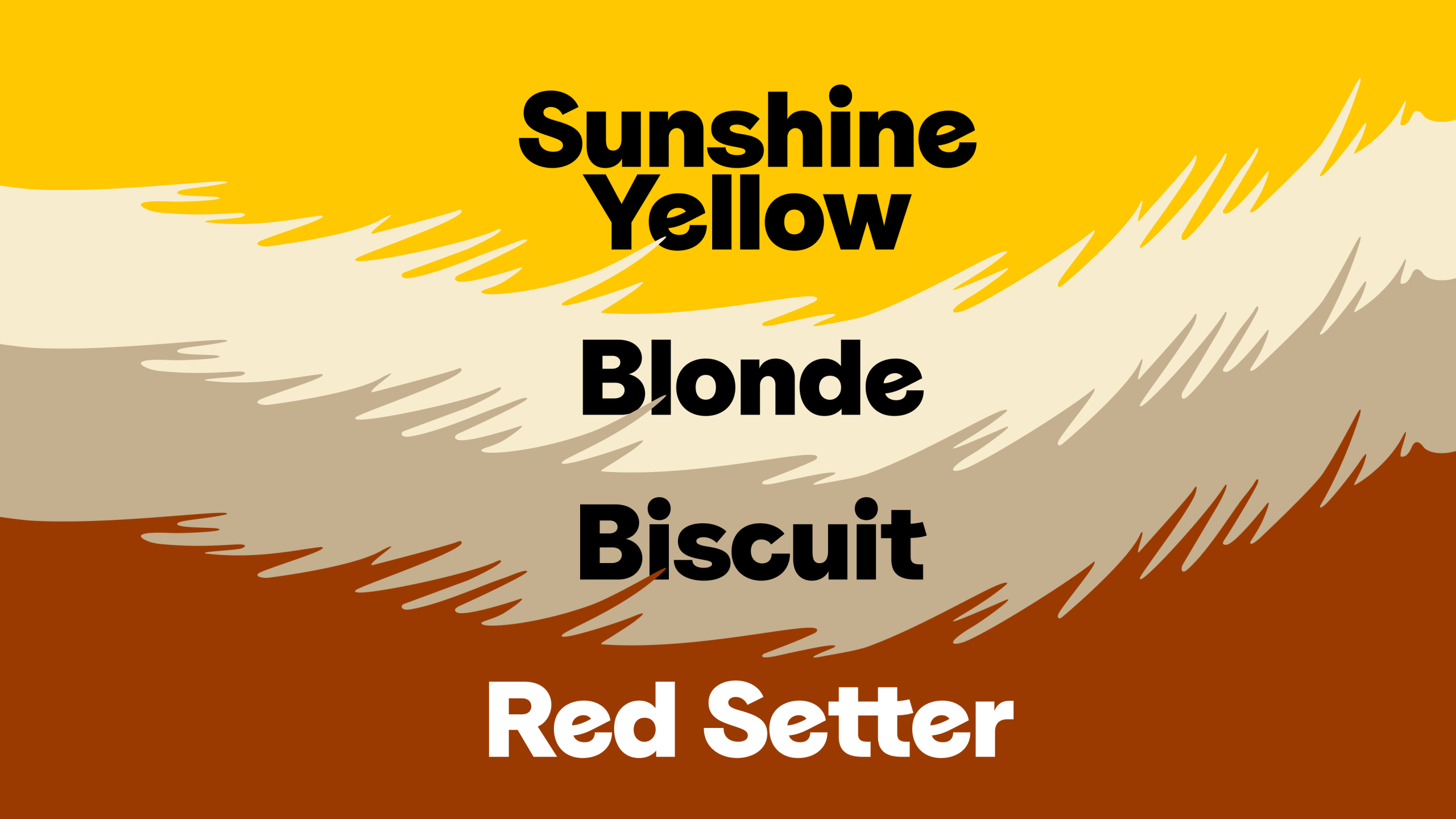
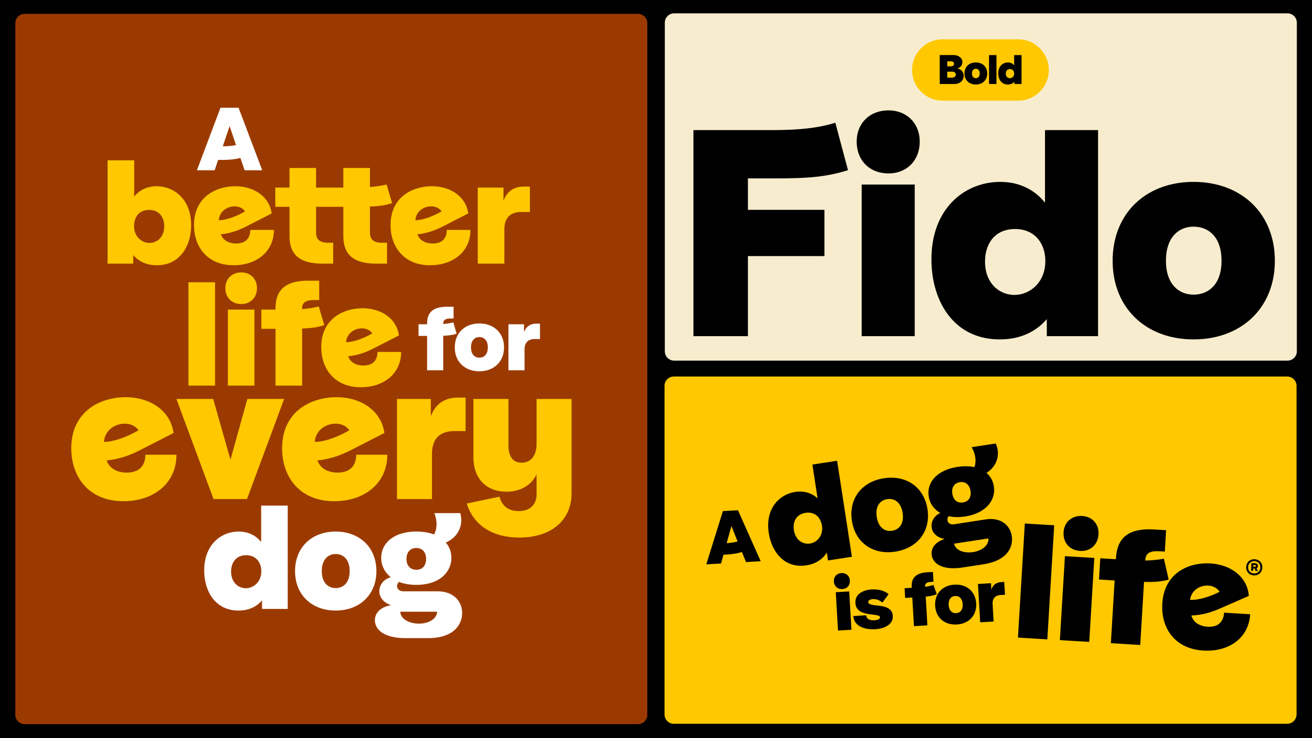
A refreshed colour palette includes newly introduced warm tones inspired by the world of dogs – Red Setter, Biscuit and Blonde. Typography remains rooted in the charity’s custom typeface, Fido, and is supported by Work Sans as a secondary font. Fido will continue to be used boldly and expressively across communications.
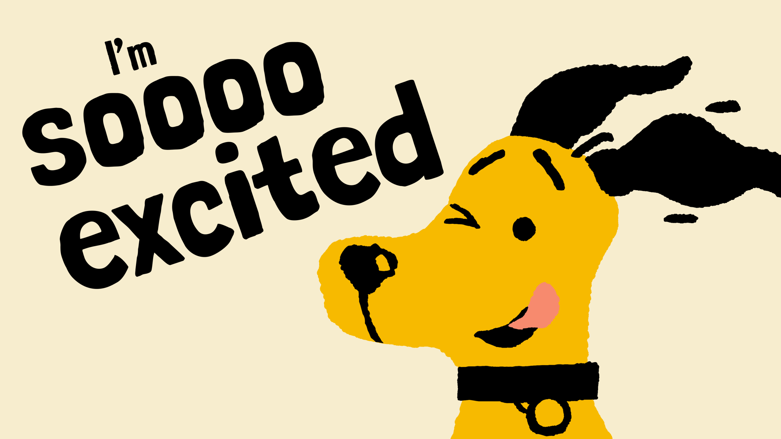
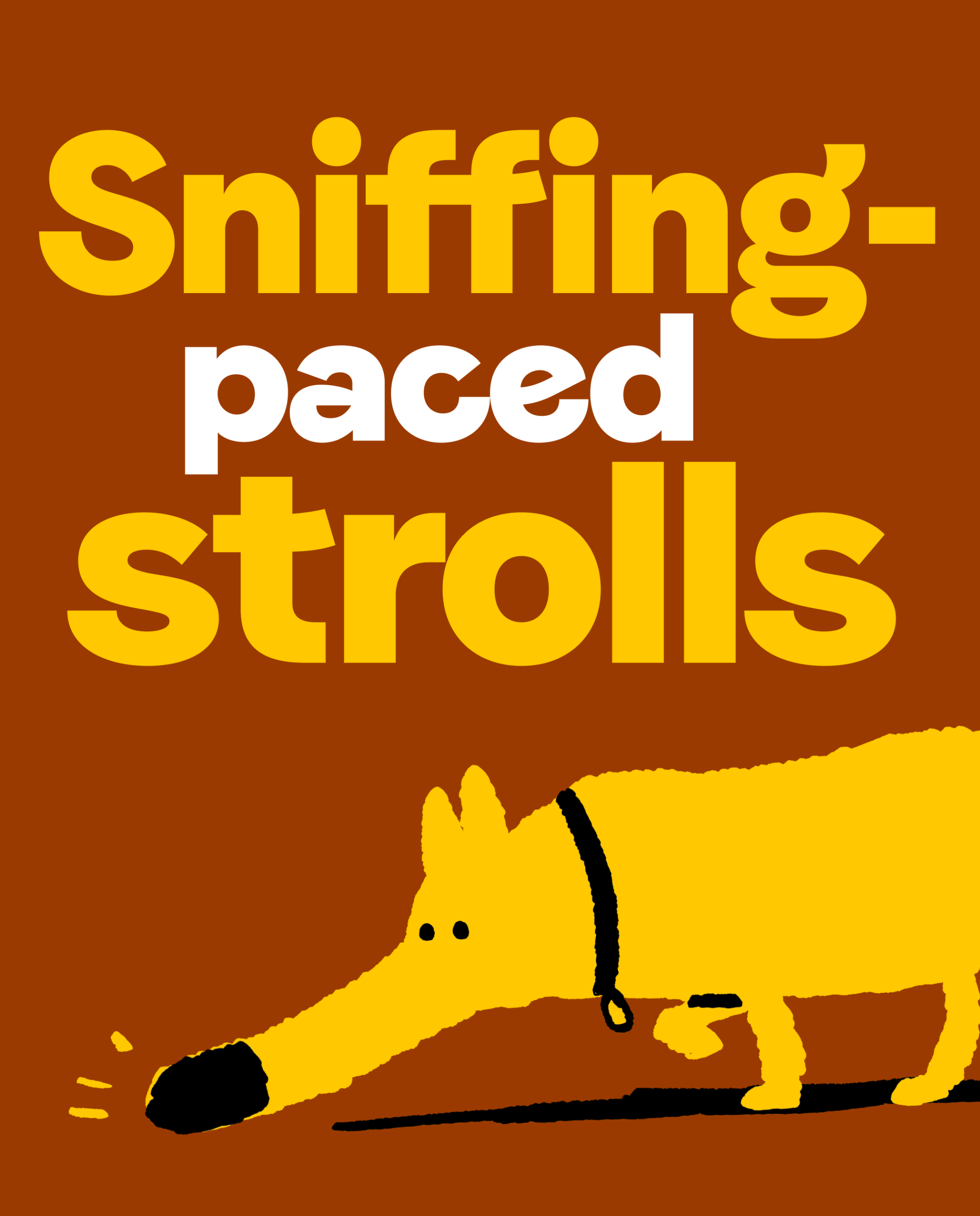
The charity’s mascot Homer has been freed from the logo and given a personality and role in the brand. He is joined by a wider cast of characters created by illustrator, Mr Griff. A broader illustration suite, created by Cathy Hogan, has been developed featuring more people and dogs in training-led scenarios that supports the charity’s rehoming and prevention work.
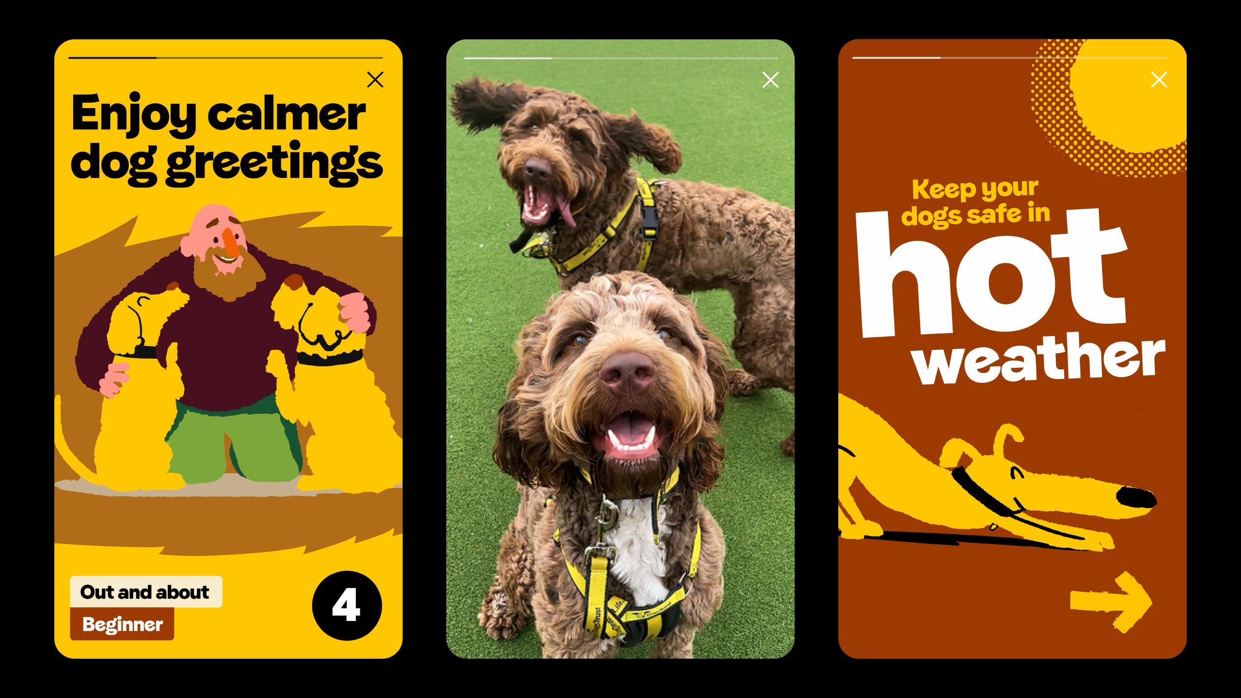


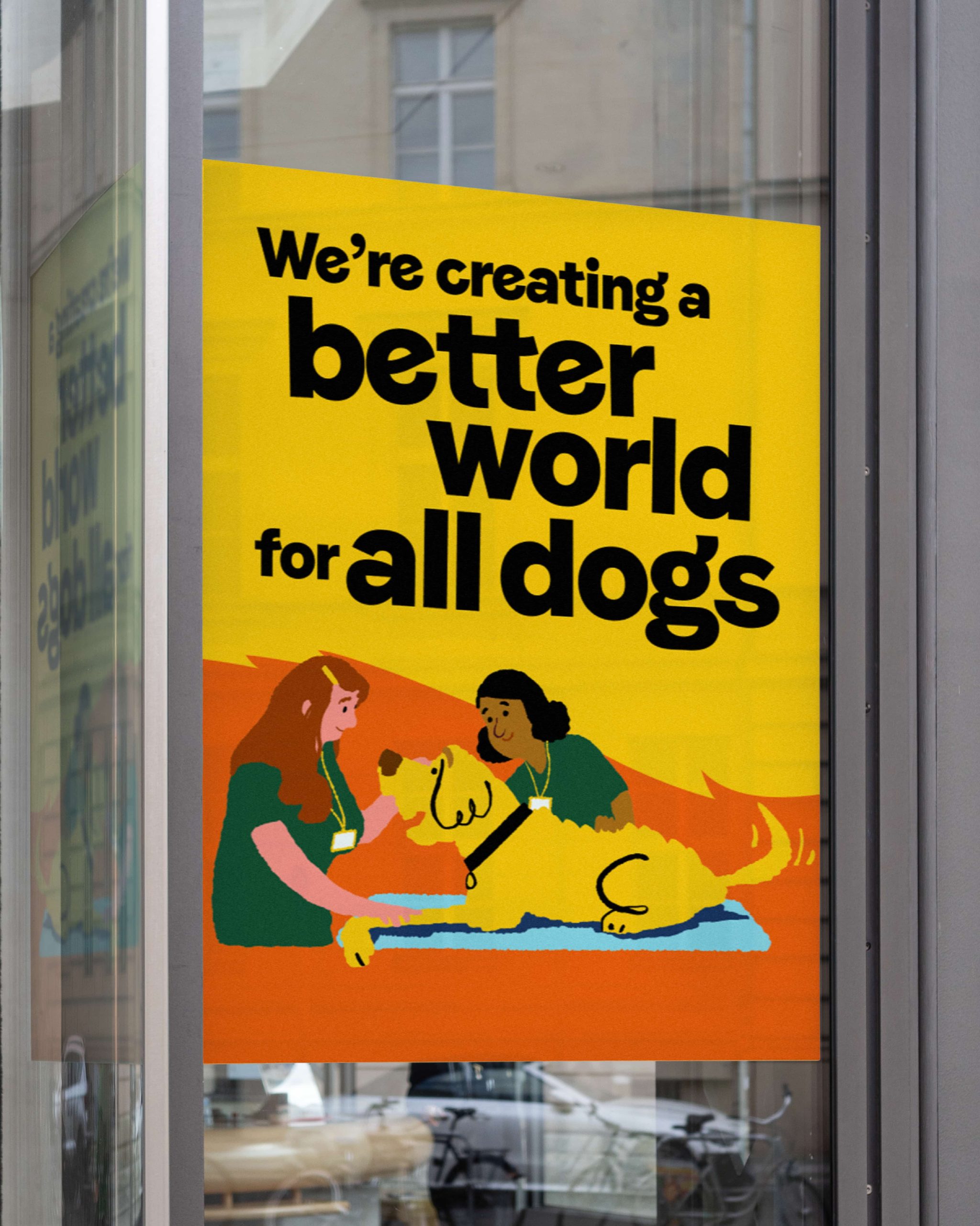
Brand photography has been reimagined through a “dog’s eye view” approach; more organic, honest imagery that captures the everyday bond between dogs and people.
Jayne Whitton, Chief Marketing and Communications Officer at Dogs Trust, said: “Whether through rehoming or prevention or our wider international work, our mission is to improve the lives of dogs everywhere. Working with The Clearing to refresh the brand gave us the tools to tell that story more clearly and more powerfully. Dogs Trust now has a warmer, more emotional identity that reflects the joy, playfulness and personality of the world of dogs.”
Martin Willitts, Design Director at The Clearing, said: “As a company of dog lovers, our longstanding relationship with Dogs Trust has always been important to us.The brief to help them become bigger and bolder has allowed us to add more movement, warmth and personality to the brand which will help them build a larger community of dog lovers.
He continues, “Dogs Trust was already a well-established charity in the UK. By introducing more movement, warmth and personality, the brand can help Dogs Trust build a bigger community and inspire more donations to fund the charity’s vital work.”
Source: The Clearing

Dogs Trust launches brand refresh to unite all dog lovers added by newsroom on
View all posts by newsroom →
You must be logged in to post a comment Login