If you’d like a glimpse inside the minds of our designers in creative play mode, look no further than our latest work for Amoranza.
Amoranza came to us bearing a very nice little bottle of red and asked us to bring character to their Spanish Tempranillo brand and create stand out among the other reds on display in the wine rack.
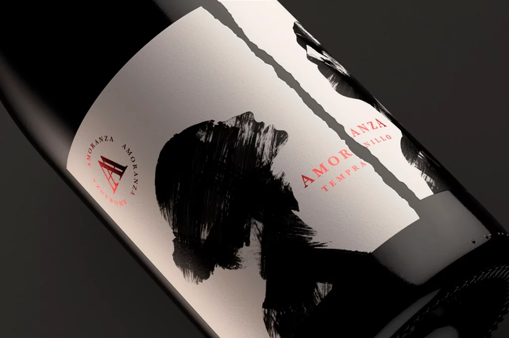
At the time it shared a label with its white and rosé counterparts that neither reflected its name nor temperament. So we dug a little deeper only to find that Amoranza meant love affair. And from here the creative play truly began. We explored the heat and emotional expressiveness of the Latin lifestyle and worked on ways to bring that frank and sexy sense of freedom to the fore. We wanted a design that reflected the tempestuous nature of star-crossed lovers while hinting at the complexity of sweet damson, soft plum and red berries, coming together with leather and tobacco.
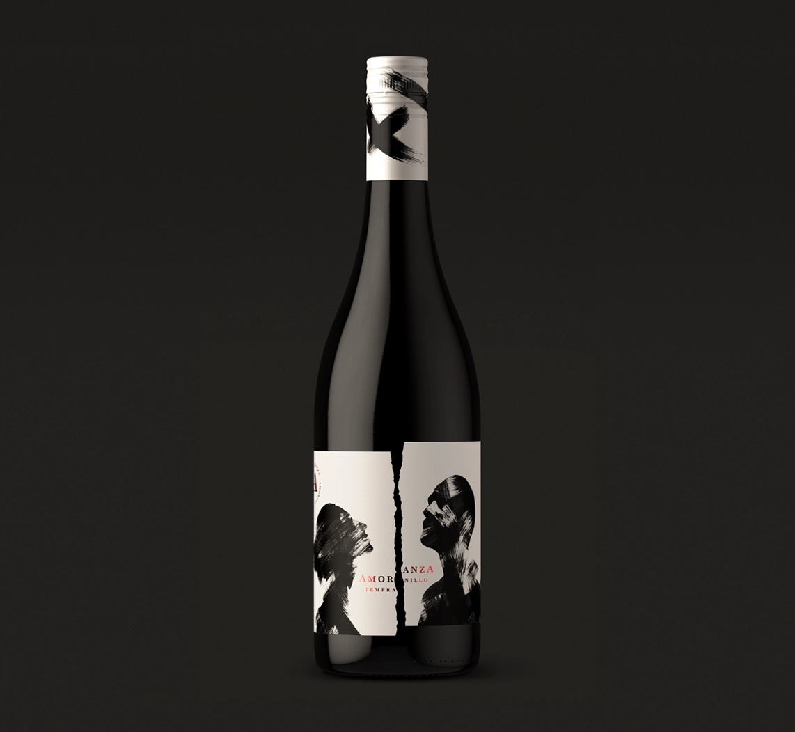
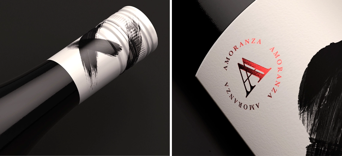
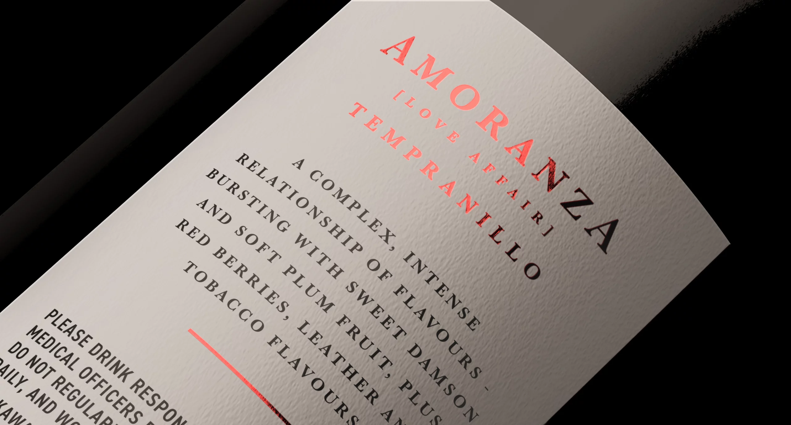
The idea that we’ve brought into the label design is a sleek and contemporary monochrome rendition of passion and provocation. With loose painterly brushstrokes depicting the intense connection between the couple while the torn and off kilter label reflects the powerfully explosive entanglement of the affair. Who knew that our imaginations could run so wild on just one bottle of wine?! Graphic marks splashed onto the neck and cap finish off this seductive idea while the tasting notes on the back tell the intense tale of a clash of flavour personalities brought momentarily into harmony by this grape-fuelled love affair.
Source: Buddy Creative
A Lesson in Seduction – Buddy creates new packaging for Amoranza added by newsroom on
View all posts by newsroom →
You must be logged in to post a comment Login