Working with ultra-successful beer brand, Cobra, BrandOpus were tasked with building upon their achievements, by widening their appeal to a broader audience, celebrating its versatility.
Cobra beer was first created to provide Britain with a premium lager that had a smoothness perfect for drinking with Indian foods. Since its creation in 1989, the brand has been phenomenally successful in achieving its original vision, with Cobra being enjoyed by beer lovers all over the globe. They wanted to build on this foundation by widening the appeal of the brand to a broader audience and a wider spectrum of foods, solidifying its place within the premium end of the mainstream market.
It was critical not to lose the existing Indian heritage or the brand’s memory structure, but instead to reframe Cobra in a way that reduced the barriers preventing consumer consumption at other occasions, alongside other cuisines. BrandOpus therefore needed to shift the narrative and visual language, to make Cobra relevant and credible beyond solely being associated with Indian food.
This was achieved through incorporating into the brand the idea of juxtaposition and contrast, a perfectly fitting narrative given Cobra beer is a juxtaposition in itself – a bold smooth yet less fizzy beer.
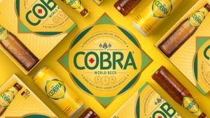
The brand identity consists of two distinctly juxtaposed shapes, a square and a circle. These two shapes exist in a state of perfect balance and harmony, with the two being combined in a relationship, known as squaring the circle. Despite being two entirely different shapes, mathematically the areas are exactly the same, following the idea of contrasting elements that go perfectly together.
This concept underpins the strategy of a smooth and complex beer brewed to be enjoyed by all. The identity is supported with the many medals awarded to Cobra, and overall portrays Cobra as a ‘world beer’ that goes delightfully with a variety of cuisine types.
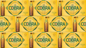
In the wider visual identity, the updated Cobra glass bottle incorporates distinctive embossing, depicting the depth of the brand story. This is also reflected in the new font design for on-premise restaurants and pubs, which reaffirms the smoothness of the product through the structural form and smooth pour feature.
Nir Wegrzyn, Global CEO at BrandOpus says, “Cobra is an already immensely successful brand within the world of curry houses. To extend beyond this and engage with a wider consumer base, the new strategic position had to drive reappraisal of Cobra as a premium world beer, to be enjoyed on all occasions.”
Paul Taylor, Chief Creative Officer at BrandOpus says, “Through modifying the visual language of the Brand, and introducing the relationship of juxtaposition as well as harmony, we created a strong visual identity that transcends beyond their standout new glass bottle, celebrating their story and championing their rich heritage.”
Lord Karan Bilimoria, Founder and Chairman at Cobra Beer says, “This is the first full rebrand of Cobra Beer, after 15 years, during which time Cobra Beer has grown at an enormous pace, becoming a joint venture with Molson Coors, one of the largest brewers in the world ten years ago. Cobra Beer is now stocked in thousands of supermarkets and off-licences around the world, as well as pubs and restaurants of all kinds, including Indian, Chinese, Vietnamese, Thai, Turkish and Lebanese restaurants.”
Source: BrandOpus
BrandOpus Helps Redefine Cobra as the World Beer for All Occasions added by newsroom on
View all posts by newsroom →
You must be logged in to post a comment Login