Anning’s Cider is a modern fruit cider from the Jurassic Coast named after the pioneering paleontologist and fossil hunter Mary Anning of Lyme Regis.
Fruit Ciders are currently enjoying a surge in popularity that looks set to go from strength to strength due in part to their wide appeal: from those looking for gluten free beer replacements, or drinkers searching out low alcohol options to those seeking more interesting taste profiles.
Anning’s is competing in a busy arena full of big names and even bigger budgets. So it needs to stand out and be heard above the billboard campaigns of its counterparts. Boasting solid West Country provenance, yet offering a lighter alternative to the traditional West Country styles, it has created a more sophisticated offering than its sweeter European cousins.
We were tasked with reflecting that difference through an identity refresh that brought the flavour credentials to the fore while retaining its authenticity and roots.
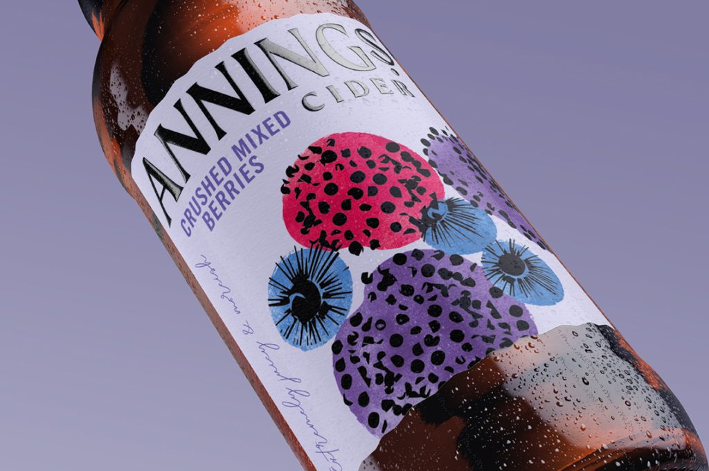
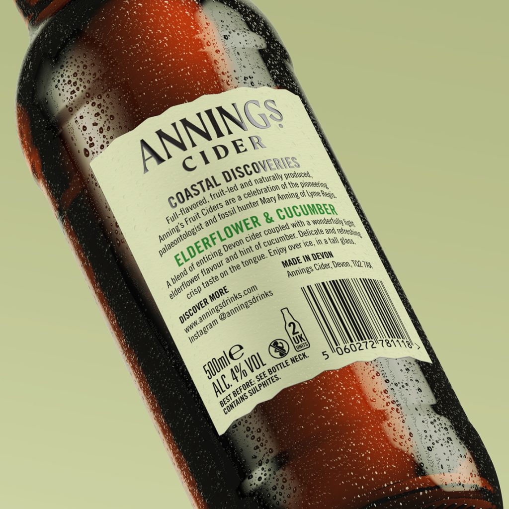
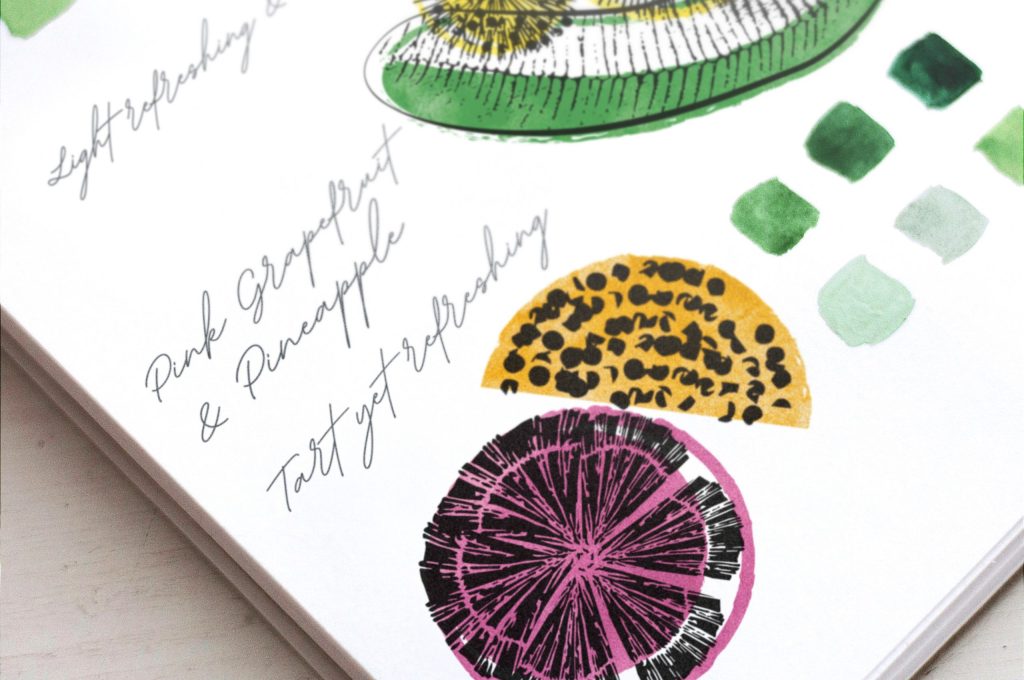
We began our exploration by returning to the cider’s Lyme Regis provenance and the lifework of its celebrated namesake. Now labels hint at archival documentation with beautifully deckled edges, unique illustrations and explanatory notes that echo the hand-drawn and hand-written identification process.
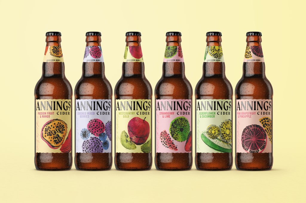
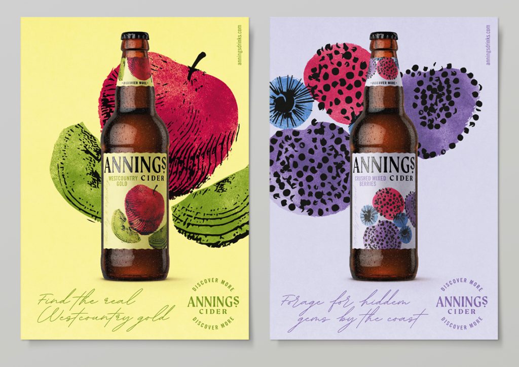
Taking the original fossil drawings so diligently catalogued by Anning as our starting point, we chose fruit illustrations that had a sketched feel and gave them a contemporary twist through graphic effects and colour combinations.
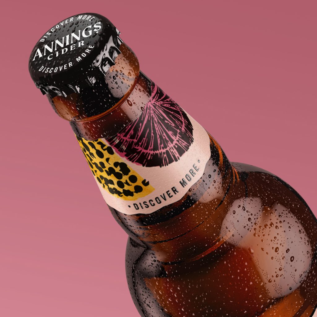
Bringing the idea of ‘Discover More’ to the heart of the brand, the result is a line up that exudes flavour saturation, vibrant individuality and intense desirability – each label designed to stand out on its own, but the effect as a whole range is as overwhelmingly tasty on the eye as it is on the palate.
Source: BUDDY

You must be logged in to post a comment Login