Deep Kentucky Roots Inspired Brand’s Naming, Personality, Visual ID, Logo & Package Design
Cornett, the independent, female-owned, full-service advertising agency, has developed a comprehensive branding platform for Holler Cannabis Co., one of the first of just 10 cannabis businesses licensed by the state of Kentucky.
The branding identity digs deep into Kentucky’s roots. That begins with the brand name, Holler: In Kentucky, a “holler” is a narrow valley where tightknit communities often take shape along a life-giving creek. The people in the hollers stay connected—to each other, to the land, to tradition. They lean on friends and family for strength. They stick to their guns no matter the consequences.
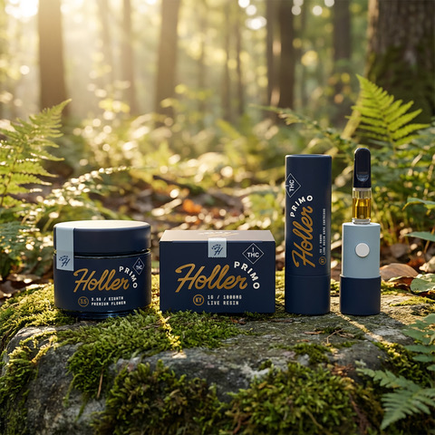
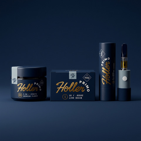
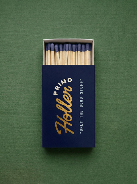
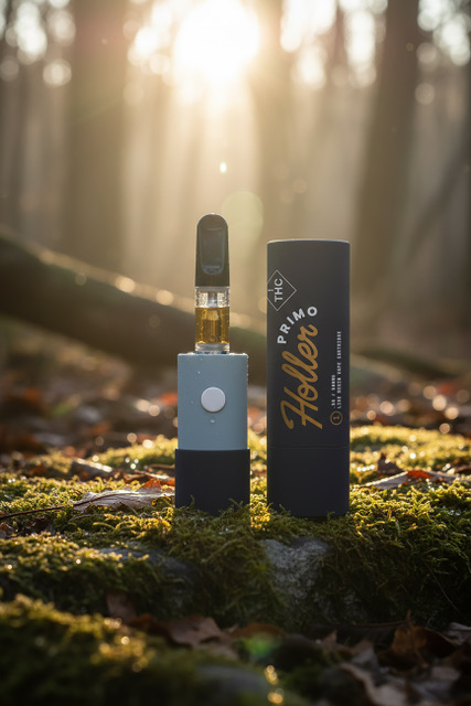
Because Holler will be one of the first and only Kentucky-based cultivators, every element of the branding seized on the land as a symbol to distinguish Holler from outside cannabis brands that plan to import their product into the state. The wordmark features the brand name in down-home cursive lettering, the color a tawny gold that symbolizes the sun that gives life to the cannabis plants embedded in the rich Kentucky soil.
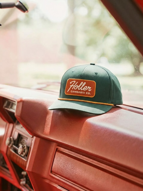
Green Kentucky hills and valleys, morning fog burning off the rising sun, a cap sitting on the dash of a vintage American pony car—all the imagery lends the brand a lived-in feel painted with colorful brush strokes of Kentucky-inspired Americana. The limited color palette—gold, deep orange, dark teal and white—suggest the strength and confidence of a brand that knows its place in local culture. The typography—the cursive wordmark and clear, sans serif typeface, lean into the brand’s simplicity, its down-home, true-blue, homegrown ethos.
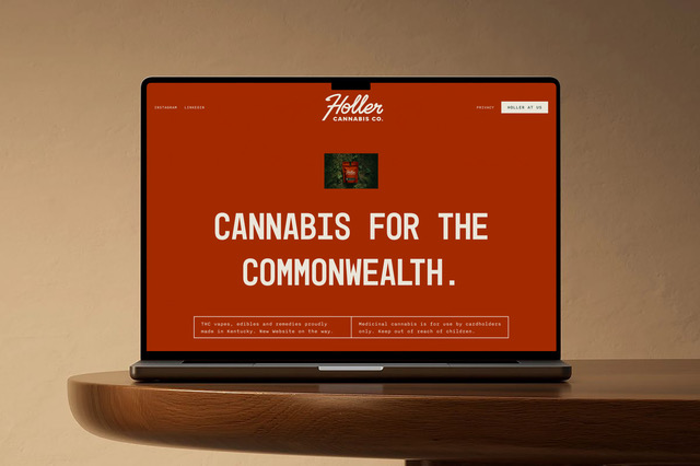
The brand tag line, “Cannabis For The Commonwealth,” deftly underlines the brand’s authentic roots and its corporate mission. “The whole brand ID is inspired by the lived experience of hard working Kentuckians, paying close attention to the little ways in which they find joy, respite and make long days a little shorter,” said Jason Majewski, Group Creative Director, Cornett. “Holler is a brand that lives naturally in back pockets and glove boxes.”
Holler was established as the company’s core brand. But it also produced Holler Primo, an elevated product line. In the branding portfolio, Holler Primo products have navy packaging with the gold logo and curved white “Primo” lettering, signifying a premiere product.
Limestone Processing, LLC, the parent company of the Holler cannabis company, hired Cornett to deliver brand guidelines, brand naming structure, brand personality, communications style and tone of voice, visual identity and logo, color palette, fonts, imagery/photography style and graphic design layout, as well as package design, website design and development and a communications plan.
“Cornett has spent decades betting on Kentucky,” Majewski said. “On its people, its culture, its potential. Helping launch Holler, one of the state’s first legal cannabis brands, is just the latest reminder that this place keeps surprising people.”
The agency is an independent, female-owned, full-service advertising agency. They help established brands in crowded spaces creatively outcompete through big, talkworthy ideas and brand moments layered over smart paid media campaigns. With a partner roster that includes brands like Nissin Foods, Conagra Brands, Busch Light, Natural Light, A&W Restaurants, LEGOLAND and VisitLEX, the agency has earned four Ad Age Small Agency of the Year awards.
Source: Cornett
CORNETT DEVELOPS BRANDING PLATFORM FOR HOLLER, KENTUCKY CANNABIS BUSINESS added by newsroom on
View all posts by newsroom →
You must be logged in to post a comment Login