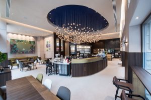
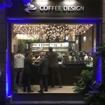
 Lavazza’s first flagship store in Milan spreads across approximately 1800 sq ft and is built to express the brand’s heritage of creativity and innovation for coffee. Designed by London-based retail design consultancy JHP Design, the space was created to effortlessly showcase Lavazza’s Italian character and authenticity.
Coffee First
The store, which opened recently in Milan, is designed to offer an immersive and innovative experience of the authentic world of Lavazza coffee allowing customers to discover its original aspects as part of a multisensory experience that embraces both tradition and innovation.
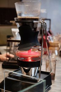
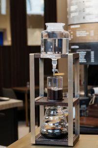
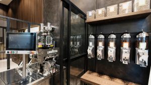 This offering ranges from the classic Italian espresso to exclusive Coffee Design creations, to demonstrating the entire process of making coffee, from the art of roasting to various extraction techniques.
JHP was tasked to take Lavazza’s worldwide brand building to another level and the vision was to go beyond the numerous stylistic waves of coffee presentation and celebrate Lavazza’s authenticity and spirit of innovation.
Here’s Brewing: Experience
 Consistently, the different areas were designed to present coffee in a surprising new way, allowing customers to discover its original aspects as part of a multisensory experience.
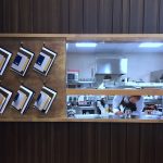
This offering ranges from the classic Italian espresso to exclusive coffee design creations, to demonstrating the entire process of making coffee from the art of roasting to various extraction and blending techniques. Equipped with an open kitchen, customers can watch a range of food, from gourmet to grab’n’go, being made by the store’s signature chef.
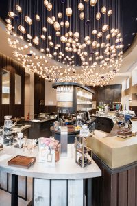
The central bar underneath offers three sections – slow coffee, cafeteria and coffee design area, where customers can enjoy everything from an espresso to coffee caviar. What’s more, its beautiful backlighting and glass presentation draws attention to a full range of coffee equipment and instruments.
The Visual Treat
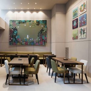 The angular planning creates tension between the spaces and enhances the customer journey. Modern authenticity, Milanese cool and Italian chic defines the experience, utilising finishes such as warm concrete, rich dark timbers, stone and zinc, all coming together to form a definitive authority in all things coffee. Wall treatments play rhythms of linear texture while wall panels are made of cement and decorated with bronze details.
At the centre of the room and inspired by the burst of flavour, a large waterfall chandelier resumes the shape of a coffee bean, which in turn consists of 250 smaller beans. The store’s furniture is toned in various colours from soft palette colours to brown and olive green. People strolling past the flagship are captured by its’ sophisticated window Visual Merchandising, for instance, showing Lavazza’s five signature coffee blends.
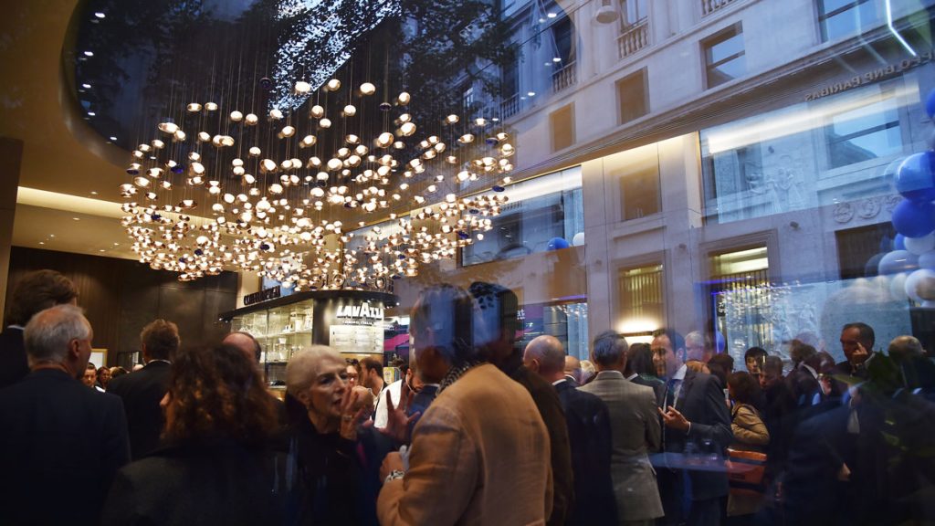
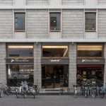
“We are delighted to work with such a prestigious family who has been involved in the coffee business for several generations. Whilst designing the store without a site was challenging, our close relationship to the Lavazza family allowed us to be involved in the process of appraising potential sites and ultimately finding such a premium location in the heart of Milan,” revealed Raj Wilkinson, Creative Director at JHP Design.
Giuseppe Lavazza, Vice Chairman of Lavazza said: “The opening in Milan, a city that has in recent years gained considerable global attention, is part of a wider-reaching international strategy with the important, yet challenging objective of helping to renew the brand’s image. This is the first phase of a process that will see the opening of new Flagship Stores in key markets for Lavazza.”
Source: JHP Design




You must be logged in to post a comment Login